Style Frames, Done Properly
Learn how to run the style frame stage: single direction, multiple directions or a motion test, how to choose between them and how to get approval that holds.
 Tomas Lindqvist
Style frames are fully designed still frames that show exactly how an animation will look before anyone starts moving anything. They lock the color palette, the typography, the composition and the rendering style, and they give a client something concrete to approve while changes are still cheap. A handful of well-chosen frames usually represents an entire piece, whether that piece is a 60-second product explainer, a broadcast bumper or a set of looping social ads.
They matter to two groups of people. Marketers and business owners commissioning animation need them because they are the last point where a change of mind costs hours rather than weeks: once animation starts, every change to a color, a character or a layout has to be carried through every shot that uses it. Designers and animators need them because a signed-off frame turns a vague brief ("modern, clean, a bit playful") into a reference they can check their work against, frame by frame.
This guide treats style frames as a decision rather than a deliverable. There is more than one sensible way to run the style frame stage, and the right one depends on how settled the brand is, how unusual the technique is, how many people need to agree and how much budget sits behind the animation. Below we set out the three main approaches, the criteria that separate them, a scored comparison and a recommendation for the situations studios meet most often.
What style frames decide, and what they leave to animation
A style frame is not a sketch and not a mood board. It is a finished-quality image at the delivery resolution, built with the final copy and the real brand assets, that looks like a paused frame from the finished film. If a viewer could not tell the difference between the style frame and a screenshot of the final video, the frame is doing its job.
That standard matters because the purpose of the stage is to settle four things before animation begins:
- Color. The exact palette, including how brand colors behave on dark and light backgrounds, which accent carries emphasis and how gradients, shadows or lighting shift the hues.
- Typography. Typefaces, weights, sizes relative to the frame, line lengths for on-screen copy and how text sits against imagery.
- Composition. Where the subject sits, how much negative space the layout leaves, the safe areas for each delivery format and how the eye travels across the frame.
- Style. The rendering approach: flat vector, textured illustration, 2.5D, full 3D, photographic compositing, or a hybrid, plus the level of detail that approach implies.
What style frames do not settle is how things move. Timing, easing, transitions and the rhythm of cuts belong to the storyboard, the animatic and the animation itself. A style frame can hint at motion, for example with a motion trail or a directional composition, but it cannot prove that a transition will feel right. That gap is the reason one of the approaches below pairs frames with a short motion test.
A useful distinction: the storyboard answers "what happens and in what order," the style frames answer "what does it look like," and the animatic answers "how long does each moment last." Keeping those questions separate stops each stage from reopening the others.
Where style frames sit between script, storyboard and animatic
Style frames are created after the script is written and before animation starts. In most pipelines they run in parallel with, or just after, the storyboard. The script fixes the words, and the storyboard fixes the sequence of shots; style frames then take a few of those shots and design them to final quality.
The order has consequences. If style frames are designed before the script is locked, the frames will almost certainly use placeholder copy, and placeholder copy lies: a two-word headline in the frame becomes a seven-word headline in the film, and the layout that looked elegant no longer fits. If style frames are designed after animation begins, they stop being a decision tool and become decoration, because the expensive work has already committed to a look.
A practical sequence for a typical commercial explainer looks like this:
- Script approved, including the exact on-screen text, not just the voiceover.
- Rough storyboard, often thumbnails, showing every shot. Our practical guide to storyboarding for animation covers how detailed these need to be.
- Style frames for the key moments selected from that storyboard.
- Written approval of the frames.
- Animatic, where the approved look can be dropped into timed boards, so the client sees pacing with the right visual language. The trade-offs at that stage are laid out in the decisions that matter for animatics.
- Asset build and animation.
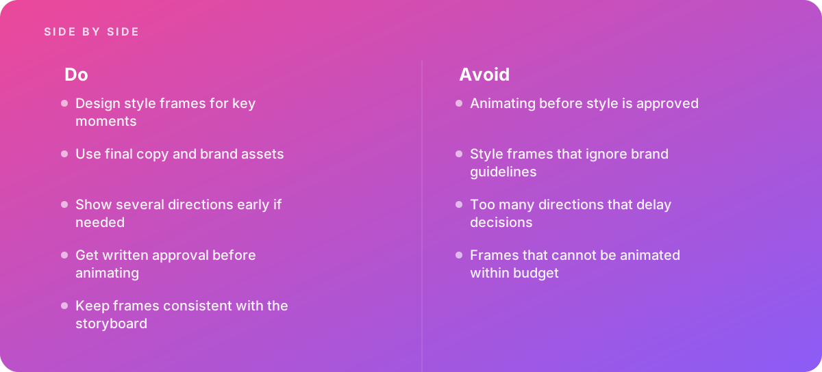
Keep the style frames consistent with the storyboard. A frame that quietly reframes a shot (a wide shot redesigned as a close-up because it looked better as a still) creates a hidden conflict: the client approves the frame, the animator follows the board, and nobody notices until review. If a frame improves on the board, update the board at the same time.
Choosing which moments become style frames
Because a few key frames represent the whole piece, the selection matters more than the count. Pick frames that each prove something different:
- The opening or title moment, which sets the tone and usually carries the heaviest typography.
- The densest frame, where the most information or the most elements share the screen. If the style works here, it works in simpler shots.
- A frame with a character, product or hero object at its largest, where the level of detail is most visible.
- A data or text-heavy frame, if the piece includes charts, lists or UI, since these break decorative styles quickly.
- The end card or call-to-action frame, where brand rules around logo placement are strictest.
Three to five frames chosen this way tell a client far more than ten frames of similar shots.
The criteria that decide between style frame approaches
There are three workable ways to run the style frame stage: a single direction developed across the key moments, several directions explored early and narrowed down, or style frames paired with a short motion test. A fourth path, skipping style frames and designing inside the animation timeline, is included in the comparison as a baseline because teams do it, usually under deadline pressure.
Six criteria separate these options. Weigh them according to the project rather than treating them as equal.
- Cost of late change
- How much rework a style change would cause once animation has started. High for long pieces, many shots, 3D or frame-by-frame work; lower for short, template-based pieces.
- Brand certainty
- How well defined the visual identity already is. A brand with detailed guidelines, an illustration style and a motion language leaves little to explore. A new product, a rebrand or a campaign with a deliberately new look leaves a lot.
- Stakeholder count
- How many people must agree. One marketing lead can approve a single direction quickly; a committee of product, brand, legal and regional teams tends to need options to react to.
- Technique risk
- How confident everyone is that the look can actually be animated. Flat vector work in familiar tools is low risk. Particle systems, simulated materials, hand-drawn textures on every frame or heavy depth-of-field in 3D are higher risk, both to feasibility and to render time.
- Schedule
- How many days the stage can occupy. Every extra direction or review round adds days, not hours, because feedback has to be gathered and consolidated.
- Style-stage budget
- How much of the total design and animation budget is available before production starts. Exploration is cheap relative to rework but not free.
If you are still setting those parameters, our article on scoping animation projects covers how duration, technique and revision rounds shape the overall budget, which in turn sets how much the style stage can absorb.
Option one: a single direction developed across key moments
In the single-direction approach, the designer (or art director) chooses one visual direction, informed by the brand guidelines, the brief and perhaps a short reference board, and develops it across three to five key frames. The client sees one coherent look applied to different kinds of shots and either approves it or asks for adjustments within that direction.
This is the default for most brand-led commercial work, and for good reason. When the client already has a defined palette, typefaces, an illustration or photography style and perhaps existing motion assets, the style frame stage is less about discovering a look than about translating a static identity into moving-image terms. The questions are practical: how does the secondary palette behave on screen, how large does the body typeface need to be for mobile viewing, how do icons from the brand library look when they have to move and scale?
How to run it well
- Start from the brand guidelines, not from mood. Build a working file with the brand color values, typefaces and approved assets before designing a single frame. Style frames that ignore brand guidelines are one of the most common reasons a direction is rejected outright.
- Use the final copy. On-screen text drives layout, and layout drives composition.
- Design at the delivery resolution and aspect ratio. If the piece ships in 16:9, 1:1 and 9:16, design at least one frame in the tightest format, because vertical crops break many horizontal compositions.
- Annotate each frame with the intent: what moves, what stays, where the transition goes. Annotation keeps the frame honest about motion without pretending to demonstrate it.
- Present the frames in story order alongside the relevant storyboard panels, so the client judges them as part of a sequence rather than as posters.
Pros
- Fastest route to approval when the brand is well defined.
- Lowest design cost at the style stage, since effort goes into depth rather than breadth.
- Keeps feedback focused on refinement rather than reopening the whole look.
- Easiest to keep consistent with the storyboard, because one designer controls one direction.
Cons
- If the direction misses, the team starts over with less time than it had.
- Gives stakeholders nothing to compare against, which some committees find hard to approve.
- Relies heavily on the designer reading the brief correctly.
- Does not test whether an ambitious look can be animated.
Option two: several directions explored early, then narrowed
The multi-direction approach develops two or three distinct looks, each shown in one or two frames, and asks the client to choose one before the chosen direction is developed across the remaining key moments. It front-loads the exploration so that the decision is made on evidence rather than on adjectives in a brief.
Showing several directions early is sound practice when the look genuinely is open: a new product without an established identity, a campaign that is meant to break from the brand's usual style, or a series where the client wants to see a range before committing. It also helps when the brief is ambiguous. "Premium" can mean dark and minimal, rich and textured, or bright and editorial; three frames resolve that faster than three meetings.
Keeping directions distinct but bounded
The risk is the one the reference material names directly: too many directions delay decisions. Every additional direction dilutes design effort and invites the worst kind of feedback, the request to combine elements of all of them. Studios manage this in a few ways:
- Cap the count at three. Two directions often become a binary vote; three give a real range. More than three rarely clarifies anything.
- Make each direction answer a different question. For example, one direction that stays close to existing brand assets, one that pushes the illustration style further, and one that changes the rendering approach (say, from flat to 2.5D). Directions that differ only in color are not really different directions.
- Use the same frame content for every direction. Designing the same one or two storyboard moments in each look lets stakeholders compare like with like.
- Name each direction by what it does, not by a label like "Option B," so the discussion is about intent.
- Agree in advance that hybrids are a second round, not a free request. If the client wants the palette of one direction and the illustration of another, that becomes a new direction with its own time.
Pros
- Reveals what stakeholders actually want, which briefs often fail to capture.
- Gives committees options to react to, which speeds agreement once a choice is made.
- Lowers the risk of a total miss, since at least one direction is likely to be close.
- Documents the rejected directions, which is useful if the look is revisited later.
Cons
- Costs more design time up front, often roughly double the single-direction stage.
- Adds at least one review round to the schedule.
- Invites "combine them" feedback that can produce an incoherent hybrid.
- Each direction is shown shallowly, so weaknesses in difficult shots may not surface until later.
Option three: style frames paired with a motion test
The third approach adds a short animated test, typically a few seconds long, to one or more approved or candidate frames. The motion test demonstrates the transitions, the texture of movement and any technically risky element: a liquid simulation, a hand-drawn boil, a particle burst, a camera move through a 3D environment, a data visualization that builds on screen.
It exists to close the gap noted earlier. Still frames cannot show how a look behaves in motion, and some looks that are beautiful as stills are expensive or unpleasant to animate. Frames that cannot be animated within budget are one of the costliest mistakes at this stage, because the problem is usually discovered after approval, when the client has fallen in love with an image the budget cannot deliver across the whole film.
What a motion test should prove
- Feasibility: that the technique can be produced with the team's tools and skills. In After Effects, for example, it shows whether a texture holds up when layers are scaled and rotated, or whether effects need to be precomposed and rendered in passes; the Adobe Help Center's After Effects user guide is a good reference for how effects, precomps and render settings interact.
- Cost per second: how long a representative few seconds take to build and render. That figure, multiplied across the running time, is the most honest estimate of whether the look fits the budget. Our practical guide to planning render time explains how to extrapolate from a test.
- Feel: the easing, weight and rhythm, so the client approves how the piece moves, not only how it looks.
- Technical side effects: for example whether a stylized look survives motion blur decisions, or whether fine line textures shimmer at the chosen frame rate.
For interface or product-UI animation, a clickable or animated prototype often plays the role of the motion test. Tools like Figma can link frames with transitions and smart animation, which is enough to show how screens move without committing to full production; the Figma Help Center's guide to prototyping covers the transition types available.
Pros
- Proves that the approved look can actually be animated, and at what cost.
- Lets the client approve motion character as well as appearance.
- Surfaces render-time and technical risks before they hit the schedule.
- Reusable: the test often becomes part of the final animation or a pitch asset.
Cons
- The most expensive style stage per frame, since animation effort starts early.
- Longer before approval, because the test is built after or alongside the frames.
- A polished test can raise expectations for every other shot.
- Unnecessary for simple, familiar techniques where feasibility is not in doubt.
Scoring style frame approaches side by side
The table below rates each approach against the six criteria on a five-point scale, where 5 means the approach handles that concern best. The scores are editorial judgments based on how the approaches behave in typical commercial projects, not measured data. Use them as a starting point and re-weight them for your own project.
| Criterion | Single direction | Multiple directions | Frames plus motion test | Skip style frames |
|---|---|---|---|---|
| Protection against late change | 4 | 4 | 5 | 1 |
| Fit when brand is well defined | 5 | 3 | 4 | 3 |
| Fit when brand or look is open | 2 | 5 | 3 | 1 |
| Handling many stakeholders | 2 | 5 | 4 | 1 |
| Managing technique risk | 2 | 2 | 5 | 2 |
| Speed of the style stage | 5 | 3 | 2 | 5 |
| Style-stage cost (5 = lowest) | 5 | 3 | 2 | 5 |
Two patterns stand out. First, skipping style frames looks attractive only on the criteria that measure the style stage itself: speed and cost. On every criterion that measures the project as a whole, it scores worst, because the cost has not disappeared; it has moved into animation, where it multiplies. Second, no single approach wins everywhere. The single direction is the efficient default, multiple directions buy agreement, and the motion test buys certainty. The right choice depends on which of those three is scarce on your project.
The approaches also combine. A common and sensible pattern for higher-stakes work is two or three directions in round one, a single developed direction in round two, and a motion test of the riskiest moment before animation begins.
Put simply, skipping style frames does not remove the cost of deciding how a film looks. It moves that cost into animation, where every change has to be carried through every shot.
Recommendations by situation
Most projects fit one of three situations. Each has a clear default, and each has a condition that should push you toward a different approach.
An established brand making a standard explainer or product video
The brand has guidelines, an illustration or photography library, and possibly earlier animations. The technique is familiar: 2D vector or light 2.5D in After Effects or a similar tool. One marketing lead approves, with a brand manager consulted.
Verdict Use a single direction across three to five key moments, built strictly from brand assets and final copy. Add a second direction only if the brief asks for something the guidelines do not cover, and skip the motion test unless a specific shot uses an unfamiliar effect.
A new product, rebrand or campaign that is meant to look different
The identity is still forming, or the campaign deliberately departs from the usual look. Several teams have opinions, and the brief uses adjectives rather than references.
Here the default is multiple directions: two or three distinct looks, each applied to the same one or two storyboard moments, followed by a second round in which the chosen direction is developed across all key frames. Set the rule on hybrids before the first presentation and name one person who makes the final call, so that the options lead to a decision rather than a debate.
An ambitious technique or a long, high-budget piece
The look relies on 3D rendering, simulation, heavy texture, frame-by-frame animation or a complex camera move, or the piece is long enough that a mid-production style change would be very expensive. The client is investing enough that feasibility risk matters more than a few extra days at the start.
Verdict Pair the style frames with a motion test of the riskiest moment, and use the test to confirm the cost per second before approving the look for the whole piece. If the look is also undecided, explore directions first as stills, then test only the chosen one.
One more situation deserves a note: very short, templated or high-volume work, such as a batch of social cutdowns built from an existing animation system. Here the system itself is the approved style, and a new round of style frames is usually unnecessary. Design one frame per new format to check crops and type sizes, and move on. The same applies to formats with strong conventions, such as whiteboard-style animation, where one or two frames confirming hand, line weight and color accents are often enough.
Worked example: planning the style frame stage for a 90-second explainer
The following example is illustrative. The project, hours and rates are assumptions chosen to show the reasoning, not figures from a real client or a published benchmark. Rates and hours vary widely by region, studio size and technique.
A software company commissions a 90-second explainer. The brand has a defined palette and typefaces but no illustration style; the company wants a 2.5D look with some textured surfaces. Three stakeholders approve: the head of marketing, a brand designer and the product lead. The storyboard has 18 shots. The design and animation budget, excluding voiceover and music, is assumed to cover roughly 220 hours of studio time at a blended rate.
The studio compares three plans for the style stage:
| Plan | What gets made | Assumed design hours | Review rounds | Assumed calendar days |
|---|---|---|---|---|
| A. Single direction | 4 key frames in one look | 16 to 20 | 2 | 6 to 8 |
| B. Three directions, then develop one | 3 directions x 1 frame, then 4 frames in the chosen look | 26 to 32 | 2 to 3 | 9 to 12 |
| C. Plan B plus motion test | As B, plus a 5-second test of the textured 2.5D transition | 36 to 44 | 3 | 12 to 15 |
Now weigh those against the cost of a late change. Suppose the animation phase is assumed at about 150 hours. If the look were changed halfway through animation (a palette shift and a texture rework, say), the studio estimates that roughly a third of the completed shots would need rework, plus re-rendering. That is on the order of 25 to 40 hours, and, more painfully, a slip of one to two weeks because the change lands on the critical path.
Read against the criteria, the choice becomes clearer:
- Brand certainty is partial. The palette and type are fixed, but the illustration style is not. That argues against Plan A, which bets everything on the designer guessing the right illustration style.
- Three stakeholders with different priorities benefit from comparing options.
- Technique risk is moderate. Textured 2.5D surfaces can shimmer or look muddy in motion and can add render time, which argues for testing at least the key transition.
- The cost difference between Plan A and Plan C is around 20 to 24 hours, which is similar to or smaller than the likely cost of one mid-production style change.
The studio recommends Plan C, but trims it: the motion test uses the frame chosen in round one rather than waiting for all four developed frames, which recovers two or three calendar days. If the budget could not absorb the extra hours, Plan B without the test would be the fallback, with the texture treatment simplified to reduce technique risk. The frame count stays at four, chosen to cover the title moment, the densest UI shot, the hero product shot and the end card.
The point of the exercise is not the specific hours. It is that the style stage should be priced against the rework it prevents, not against zero.
Designing style frames that can be animated within budget
A frame that cannot be animated within budget is worse than no frame, because it creates an approved expectation the production cannot meet. Designers who also animate tend to avoid this instinctively; designers who work only in stills need a few habits.
Build frames the way they will be animated
- Separate layers by motion, not by visual grouping. Anything that moves independently needs its own layer, with enough of the artwork drawn behind it to be revealed when it moves.
- Keep live type live. Outlined text cannot be edited when copy changes and cannot be animated with text tools.
- Use vector shapes for anything that scales, and note the maximum scale for raster textures so they do not soften on a push-in.
- Name layers and artboards to match storyboard shot numbers, so the animator can find the right asset without asking.
Watch for the expensive details
Certain choices look minor in a still and are costly in motion. Hand-drawn texture that must change on every frame (a "boil") multiplies drawing time. Heavy depth-of-field, reflections, volumetric light and soft shadows in 3D add render time for every frame. Complex masks on organic shapes need to be re-tracked whenever the shape moves. Dense line work can shimmer at lower frame rates, a trade-off discussed in frame rate and timing for animation. None of these are wrong, but each should be a deliberate, budgeted choice rather than a flourish added to make a still look richer.
A useful rule is that every element in a style frame should either appear in the finished animation at that quality or be clearly marked as simplified. If a frame shows a detailed character but the budget covers a simpler rig, design the simpler character.
A style frame approved at a richer level than the budget supports is effectively a price increase waiting to happen. Common warning signs include:
- Details that would need to be redrawn on every frame.
- Lighting or depth effects that only work from one camera angle.
- Typography too small to read on a phone once the frame is scaled for vertical delivery.
- Elements that exist only in the still and are absent from the storyboard.
Getting approval on style frames that holds through production
The most important rule in the reference material is simple: get written approval before animating. Animating before style is approved is the mistake that most often turns a profitable project into a loss, because every hour of animation built on an unapproved look is at risk.
"Written" matters. A thumbs-up in a meeting or a positive comment in a chat thread is easy to reinterpret later ("we liked the direction, but we never approved the colors"). Approval should be explicit, dated and attached to specific files.
What a sound approval covers
- The exact frames approved, by file name or version number, with a PDF or image export attached to the approval message.
- What the approval means: that color, typography, composition and rendering style are locked, and that later changes to those will be treated as change requests.
- What remains open, for example timing, transitions and any shots not yet designed, so nobody assumes more is fixed than it is.
- Who approved, and confirmation that they speak for the other stakeholders. If the product lead has not seen the frames, the approval is not complete.
- How changes will be handled after approval, in line with the contract or statement of work.
Running the review so approval is achievable
Present frames in story order next to the storyboard panels. Explain the intent of each frame before showing it. Collect feedback from all stakeholders in a single consolidated document rather than in separate threads, and ask the client to resolve conflicts between their own reviewers before returning it; otherwise the studio ends up arbitrating internal disagreements. Limit the number of included revision rounds in the scope, and say so at the start.
Once approved, the style frames become the reference for every later review. When a client comments on a shot in animation, the first question is whether the shot matches the approved frame. If it does, the comment is a change request; if it does not, it is a fix. That clarity protects both sides.
- Script and on-screen copy are final before frames are designed.
- Frames use real brand colors, typefaces and assets, checked against the guidelines.
- Each frame maps to a storyboard shot and matches its framing.
- Selected frames cover the title, the densest shot, the hero moment and the end card.
- At least one frame is checked in the tightest delivery aspect ratio.
- Expensive details are either budgeted or removed.
- Approval is written, dated, lists the approved files and names who approved.
- Change handling after approval is stated and agreed.
When style disagreements need outside help
Bring in help when style disagreements are delaying animation projects. The symptoms are recognizable: style frames revised through many rounds without converging, stakeholders who approve frames and then reject the animation built from them, directions multiplying rather than narrowing, or an in-house designer caught between a brand team and a product team with different ideas of what "on brand" means.
Outside help can take several forms, and the right one depends on the cause of the delay:
- If the problem is decision-making, an experienced art director or producer can restructure the process: fewer directions, clearer criteria, a single decision-maker and written approvals. This is often the cheapest fix.
- If the problem is brand translation, a motion designer who has adapted static identities for animation can propose how the guidelines extend into motion, including palette behavior, type scale and movement principles.
- If the problem is feasibility, a studio with production experience in the technique can run a motion test and price the look honestly.
- If the whole project is stalled, handing the style stage and production to a studio may be faster than fixing the internal process. Our guide on choosing an animation studio covers what to look for, including how studios run and document their style frame stage.
When evaluating outside help, ask to see style frames alongside the finished animations they led to. A studio whose finished films look like their frames is one whose frames you can trust. If you would rather hand the whole process to a team that runs style frames, animatics and production under one roof, see our animation and motion graphics service.
A short glossary for the conversation
Disagreements about style are often disagreements about words. It helps to agree on terms before the first review:
- Mood board: a collection of reference images that suggests a feeling. It is not designed with your content and should never be approved as a style.
- Style frame: a finished-quality still of a real moment in your film, with final copy and brand assets.
- Design board: a set of style frames covering many or all shots, used on longer or higher-budget pieces.
- Motion test: a short animated proof of how the style moves and what it costs to produce.
- Direction: a coherent visual approach that could be applied to the whole film; different directions should differ in approach, not only in color.
With those terms agreed and one of the three approaches chosen deliberately, the style frame stage becomes what it is meant to be: the point where the look of the film is decided once, in writing, before anyone spends a day animating it.
Where this comes from
- Adobe Help Center — After Effects user guide
- Figma Help Center — Guide to prototyping
The figures and practices above come from the sources listed.
Working on something like this?
We take on Motion Graphics & Animation work for teams who want it done once, properly. Tell us what you are building and we will tell you honestly whether we are the right studio for it. Start a project.
Where to go next
Spotted something wrong? Report an error on this page. We correct on the page and say what changed.