Motion Graphics Templates for Editors: What Actually Works
Compare stock packs, custom After Effects builds and native editor graphics, with a scored framework and a clear pick for each type of editing team.
 Tomas Lindqvist
Most editing teams hit the same wall sooner or later. The cut is locked, the client wants a name title on the second speaker, a stat callout at 1:40 and an end card with the new tagline, and the only person who knows how the brand graphics were built is on another job. Motion graphics templates for editors exist to remove that bottleneck: they package animated titles, lower thirds, callouts and bumpers so an editor can change the words, colors and timing inside Premiere Pro, Final Cut Pro or DaVinci Resolve without ever opening the animation software that produced them.
When templates work, they are invisible. Editors type a name, drag the clip to length and move on, and every video in the channel looks like it came from the same studio. When they fail, they fail in front of clients: a surname that runs off the edge of the box, a font substituted with a system default on a freelancer's laptop, a timeline that stutters because six heavy templates are stacked on one shot. The difference between those two outcomes is almost never the animation itself. It is how defensively the template was built, how many decisions it hands to the editor, and how it is maintained once it leaves the designer's machine.
This guide is written for marketing leads, in-house video teams and post-production managers deciding how to get repeatable branded graphics into their edits, and for motion designers who build the packages. It compares the three routes teams realistically take, sets out the criteria that separate them, scores each one, and ends with a recommendation for the situations we see most often.
What Editors Actually Need From a Motion Graphics Template
A motion graphics template is a pre-animated graphic with a deliberately limited set of editable properties. In the Adobe ecosystem the format is the Motion Graphics template file (.mogrt). A designer builds the animation in After Effects, chooses which properties to expose in the Essential Graphics panel, and exports the package. In Premiere Pro, editors drop the .mogrt on the timeline and see only those chosen controls in their own Essential Graphics panel. Adobe's documentation in the Adobe Help Center's guides to Motion Graphics templates covers the mechanics of authoring, installing and editing these files. Final Cut Pro has an equivalent model built around Apple Motion, where a designer publishes selected parameters that then appear in Final Cut's inspector, and DaVinci Resolve offers Fusion-built titles and macros with exposed controls.
The key idea in all three is the same: the template author decides what the editor can change. That single decision shapes almost everything else. An editor who needs to update a name and a job title needs two text fields, not a panel with 40 sliders for easing curves, blur amounts and shape layer offsets. Exposing too much invites accidental damage and slows the editor down; exposing too little forces a trip back to the designer for every small variation.
In practice, editors need four things from any template:
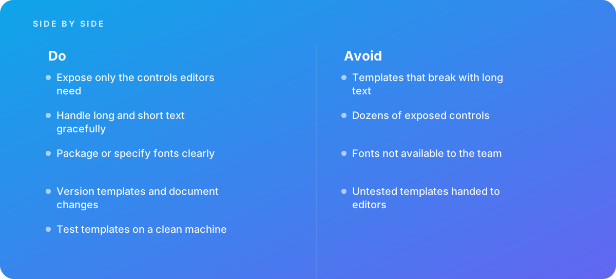
- Predictable behavior with real content. The graphic must survive a two-word name and a 38-character one, a single-line quote and a three-line quote, without anyone nudging keyframes.
- A short, well-labeled control surface. Controls named "Speaker Name" and "Accent Color (brand palette)" rather than "Text 3" and "Fill 2 Color."
- Reliable portability. The template must open and look identical on every workstation that will use it, including a freelancer's machine and a remote editor's laptop.
- Acceptable playback. A template that forces a render before the editor can review the cut costs time on every single use.
Everything in the comparison below comes back to those four needs, plus the business questions of what the package costs to build and who keeps it current.
Three Routes to Branded Graphics in the Edit
Teams generally end up on one of three paths, sometimes by design and often by drift. It helps to name them clearly, because each has a different cost profile and a different failure mode.
Route 1: Stock marketplace templates
These are pre-built packs sold on template marketplaces or bundled with subscription stock libraries: title packs, lower-third collections, social media kits, transitions. The editor downloads a pack, installs the .mogrt or Motion template files, and customizes colors and text to approximate the brand. The appeal is obvious. You can have something on screen the same afternoon, and the animation quality in the better packs is high.
Route 2: Custom templates authored in the animation tool
Here a motion designer builds a bespoke package in After Effects (for Premiere Pro teams), Apple Motion (for Final Cut Pro teams) or Fusion (for Resolve teams), designed around the brand guidelines and the team's actual content. The designer decides which controls to expose, engineers the layouts to handle variable text, and hands over a documented, versioned library. This is the route most studios mean when they talk about "building a template system."
Route 3: Native graphics built inside the editing software
Premiere Pro, Final Cut Pro and Resolve all have their own title and shape tools. An editor or designer builds the graphics directly in the editing application and saves them as reusable items: in Premiere Pro, a graphic built with the Essential Graphics tools can be exported as a .mogrt from inside Premiere itself; Final Cut Pro users save titles and effects presets; Resolve users save Text+ titles and Fusion compositions to their library. The animation vocabulary is more limited, but the graphics are lightweight and live entirely inside the editing environment.
A fourth pattern, having a motion designer render every graphic as a finished file with transparency and drop it into the edit, is worth mentioning because many teams start there. It gives perfect control and zero editor flexibility, and it scales badly once volume rises. We treat it as the baseline the other three are trying to beat rather than as a template strategy in its own right.
Six Criteria That Decide Between Them
Most template decisions go wrong because teams compare options on animation quality alone. Animation quality matters, but it is rarely the criterion that causes trouble in month three. These six carry more weight in practice.
1. Text resilience
This is the single most important criterion and the one most often skipped in evaluation. A lower third designed around "Jane Doe, CEO" will be asked to carry "Dr. Alexandra Montgomery-Whitfield, Vice President of Clinical Operations" within the first month. A resilient template either resizes its background box to fit the text, scales the text down within a defined minimum, wraps to a second line in a controlled way, or clearly signals a limit. A brittle template lets the text spill past the box, collide with another element or run off the title-safe area. In After Effects, designers typically handle this with expressions such as sourceRectAtTime(), which measures a text layer so shapes and positions can follow it. Test every candidate with the longest and shortest real strings your content will produce, not the placeholder text.
2. Control surface
Count the exposed controls and read their labels. For a lower third, four to eight controls is typically enough: name, title, perhaps a color choice from a fixed set, a position toggle and a checkbox for an optional logo. Once the list reaches dozens of controls, editors either ignore most of them or start changing things they should not, and brand consistency erodes one tweak at a time. Good templates also constrain choices. A dropdown of three approved brand colors is safer than a free color picker; current After Effects versions support dropdown menu controls for exactly this reason.
3. Font and asset portability
Missing fonts are the most common reason a template that looked perfect on the designer's machine breaks on an editor's. If a font is not installed or activated on the editing workstation, the software substitutes another, and the layout shifts. The criterion here is whether fonts are packaged or clearly specified, whether their licenses cover every seat that will use them, and whether any embedded images, logos or textures travel with the template. Brand typefaces delivered through a managed service such as Adobe Fonts can simplify activation, but only if every editor is signed in to an account with access. Custom or purchased desktop fonts need a documented install step and a license that covers the whole team.
4. Playback and render performance
Templates authored in a separate animation application generally carry more computational weight than graphics drawn natively in the editor, especially when they use effects, 3D layers, heavy expressions or embedded footage. On a single shot this rarely matters. On a 20-minute interview with a dozen lower thirds, stat callouts and a persistent logo bug, it can be the difference between real-time playback and constant rendering. Evaluate templates on the machines your editors actually use, not the designer's workstation. For the output side of this question, including codecs, alpha channels and render settings, see our guide to rendering and output for motion work.
5. Brand fidelity
How closely can the option reproduce the brand's actual motion language: its type hierarchy, spacing, easing, color system and the way elements enter and leave the frame? This is where bespoke work pulls ahead. A stock pack recolored to the brand palette still moves like the stock pack, and viewers who see the same pack on other channels notice. Brand fidelity also includes consistency: two editors using the same template on the same day should produce graphics that are indistinguishable.
6. Maintenance and versioning
Brands change. A new logo, a revised tagline, a tweaked color value or a new legal disclaimer all need to flow into every template. The criterion is how easily the package can be updated, how updates reach every editor, and whether anyone can tell which version a finished video used. Templates stored in a shared library with a naming convention and a change log score well. Templates scattered across individual download folders, each slightly modified, score badly and are one of the main sources of off-brand output.
A seventh factor, upfront cost and time to first use, sits alongside all six. It is real and it favors stock, but it is a one-time cost, while the six criteria above are paid on every video.
Scoring Motion Graphics Templates for Editors: The Comparison
The scorecard below rates each route from 1 (weak) to 5 (strong) against the criteria. These are editorial judgments drawn from how each approach typically performs, not measured benchmarks, and a specific stock pack or a specific custom build can land higher or lower than its row suggests. Use the scores to frame the decision, then test the actual candidates.
| Criterion | Stock marketplace templates | Custom templates (After Effects, Motion, Fusion) | Native in-editor graphics |
|---|---|---|---|
| Text resilience | 2 (varies widely by pack) | 5 (engineered for your real content) | 3 (simple layouts adapt; complex ones do not) |
| Control surface | 2 (often exposes too much) | 5 (limited to what editors need) | 3 (full tool access unless exported as a locked template) |
| Font and asset portability | 3 (fonts often linked, not bundled) | 4 (specified and documented by design) | 4 (fewer dependencies overall) |
| Playback performance | 2 (effect-heavy by default) | 4 (can be optimized for your hardware) | 5 (lightest option) |
| Brand fidelity | 2 (recolored generic motion) | 5 (built from brand guidelines) | 3 (limited animation vocabulary) |
| Maintenance and versioning | 2 (no upstream control) | 4 (versioned library, needs an owner) | 3 (easy to edit, easy to fork) |
| Upfront cost and speed to start | 5 (same day) | 2 (weeks, designer time) | 4 (days, editor time) |
Read the table by the criteria that matter most to your situation, not by adding the columns. A team publishing three videos a year can live with weak maintenance scores; a team publishing thirty videos a week cannot. A team whose editors work on older laptops should weight performance heavily. A regulated brand whose graphics include required disclosures should weight control surface and versioning above almost everything else.
Stock Marketplace Templates: Fast Start, Hidden Costs
Stock packs are the right answer more often than motion designers like to admit. For a new channel, a one-off campaign or a team testing whether video is worth investing in at all, a well-chosen pack gets graphics on screen for the cost of a download. The better packs are animated by skilled designers and include thoughtful touches such as auto-sizing boxes and organized control panels.
The problems show up over time. Many packs are built to demo well: the showcase uses short, perfectly balanced placeholder text, and the control panel exposes every property so the pack looks flexible in marketplace previews. That flexibility becomes a liability in a team setting. Three editors will interpret "make it on brand" three different ways, and the result is a channel where every video looks slightly different. Packs also tend to be effect-heavy, since visual richness sells, which hurts playback. And because the pack is sold to anyone, your competitors and unrelated channels may be using identical animation.
Licensing deserves a careful read. Marketplace licenses differ on whether a template may be used across multiple seats, in client work, in paid advertising or in broadcast, and whether the bundled fonts are licensed at all; often the pack only links to a font that must be licensed separately. Treat the license terms as a selection criterion, not an afterthought.
Pros
- Available immediately, with no design lead time.
- Low upfront cost compared with bespoke work.
- Good packs offer polished animation that would take days to build from scratch.
- Useful for testing formats before committing to a custom system.
Cons
- Text handling is often built for the demo, not your longest real names and titles.
- Large control panels invite inconsistent, off-brand edits.
- Fonts may not be included or licensed for the whole team.
- Generic motion that other channels also use, and no path for upstream updates.
If you do go this route, reduce the risk. Choose one pack per graphic family rather than mixing styles, make a locked copy with your brand colors and fonts preset, write a one-page usage note specifying which controls editors may touch, and store that copy in a shared library so nobody starts from the original download.
Custom-Built Templates: Engineering for the Editor
A custom package is built around your content from the start. The designer gathers real examples of the text the graphics will carry, the aspect ratios they will run in and the machines they will run on, and then designs defensively. That process starts with a proper brief; our guide to getting motion graphics briefs and scoping right covers what to put in it. The defensive techniques below are what separate a professional template package from a pretty animation with some text fields attached.
Text that adapts instead of breaking
The designer sets a maximum width for each text field and decides, in advance, what happens when the text exceeds it: scale down to a floor size, wrap to a second line, or both. Background boxes, underlines and accent bars are driven by the measured text bounds rather than fixed sizes, so a short name gets a short box and a long name gets a long one. Minimum sizes matter as much as maximums; a box that shrinks to fit a three-letter name can look like a mistake. Good templates also define padding in consistent units so the relationship between text and box never changes.
Timing that survives trimming
Editors change graphic durations constantly. If the animation's intro and outro are simply keyframed at fixed times, stretching the clip in the editor stretches the whole animation, or leaves the outro mid-air when shortened. After Effects supports protected regions for exactly this: the designer marks the intro and outro so they keep their original timing while the hold in the middle extends or contracts. Premiere Pro exposes the same idea for native graphics as Responsive Design for time. Every custom template with an entrance and an exit should use it.
A deliberately small control panel
Controls are grouped, labeled in plain language and limited to decisions an editor should make. Brand colors are offered as a dropdown or a checkbox rather than a free picker. Layout variants, such as left or right alignment or with or without a logo, are switches rather than position sliders. Anything the brand guidelines fix, such as easing, timing, stroke weight or corner radius, is not exposed at all. Where editors need to swap imagery, After Effects templates can expose media replacement fields so a headshot or logo can be dropped in without breaking the design.
Portability and performance by design
The designer specifies every font by exact family and weight, confirms licensing for all seats, and supplies an install checklist. Effects that are expensive to render are avoided or replaced with cheaper equivalents, and precomps are simplified. The package is then tested on a clean machine, one that has never had the designer's fonts, plugins or project files on it, to prove it works everywhere.
Pros
- Handles your real text lengths and aspect ratios because it was designed around them.
- Small, labeled control panels keep every editor on brand.
- Brand motion language is reproduced faithfully, not approximated.
- Versioned, documented libraries are straightforward to update when the brand changes.
Cons
- Weeks of lead time and meaningful designer hours before the first use.
- Needs a named owner to maintain and distribute updates.
- Poorly scoped builds can still expose too much or miss real-world cases.
- Tied to one editing ecosystem unless built separately for each.
The last point is easy to miss. A .mogrt from After Effects serves Premiere Pro teams; a Final Cut Pro team needs templates built in Apple Motion; a Resolve team needs Fusion-based titles. Mixed-platform teams either standardize on one editor for branded work or budget for parallel builds. If your graphics also run in multiple languages, plan for that in the same build; see our guide to localizing motion graphics for how text expansion and right-to-left scripts change template design.
Native In-Editor Graphics: Lightweight but Limited
Every modern editing application can produce clean titles, shapes and simple animation on its own. For graphics that mostly consist of text on a box with a slide or fade, building natively is often the most practical choice. The graphics play back smoothly, there is no dependency on a second application, and editors can build and adjust them without specialized skills.
In Premiere Pro, graphics built with the native tools can be saved as .mogrt files from inside Premiere, which lets a lead editor create a locked version for the rest of the team. Final Cut Pro can save title and effect presets, and Resolve can save Text+ titles and Fusion compositions for reuse. These are genuine template systems, just with a smaller animation vocabulary.
The limits are real, though. Complex motion such as staggered per-character animation, masked reveals, organic easing tuned to a brand's motion principles, or 3D elements are either impossible natively or awkward to build. Text resilience depends on how carefully the builder uses the application's responsive features; a native lower third built with fixed box sizes breaks with long text just as badly as a poorly built .mogrt. And because the tools are right there in the editor, nothing stops an editor from unlocking the graphic and "fixing" it, which leads to forks.
Pros
- Lightest option for playback, even on modest laptops.
- No second application or plugin dependency.
- Quick to build and adjust by a capable editor.
- Fewer moving parts to break when files move between machines.
Cons
- Limited animation vocabulary for distinctive brand motion.
- Resilience to long text depends entirely on how carefully it was built.
- Easy for editors to modify and fork the design.
- Rarely built with the documentation and versioning a template library needs.
Native graphics are a strong fit for simple, high-volume elements such as captions, basic name titles and chapter cards, especially where performance matters. They are a weak fit for signature pieces like opening titles and branded transitions, where distinctive motion is the whole point.
Worked Example: Sizing a Lower-Third and Callout Package
The following is an illustrative example, not a client case. The numbers are realistic planning figures to show how the decision works; your own volumes and hours will differ, so substitute them.
Imagine an in-house team of four editors producing around 30 videos a month: interviews, product explainers and social cutdowns in 16:9, 9:16 and 1:1. Each video averages five lower thirds, two stat callouts and an end card. That is roughly 150 lower thirds, 60 callouts and 30 end cards a month.
Today, the team works from an old project file. An editor copies a graphic, edits the text, fixes the box width by hand, adjusts the outro keyframes after trimming, and checks the result. Observed across a few projects, that averages about 8 minutes per lower third, 12 per callout and 10 per end card, before any fixes after review. With a well-built template, the editor types the text, picks a variant and trims the clip, which realistically takes 1 to 2 minutes per graphic.
| Graphic type | Monthly volume | Manual minutes each | Template minutes each | Monthly hours saved |
|---|---|---|---|---|
| Lower thirds (3 aspect ratios) | 150 | 8 | 1.5 | About 16 |
| Stat callouts | 60 | 12 | 2 | 10 |
| End cards | 30 | 10 | 1.5 | About 4 |
| Total | 240 | About 30 |
Roughly 30 editor-hours a month come back, before counting the review rounds that disappear when graphics are consistent in the first place. Now the build side. A custom package covering a lower third with two layout variants, a stat callout and an end card, each adapted for three aspect ratios, with protected-region timing, text resilience, a documented control panel, clean-machine testing and a revision round, might reasonably take a motion designer somewhere in the range of 40 to 70 hours depending on complexity and how settled the brand motion language already is. On these illustrative numbers, the build pays back in editor time within two or three months, and the consistency gains begin immediately.
Run the same arithmetic for a team producing four videos a month and the answer flips. The monthly saving drops to around 4 hours, the payback stretches past a year, and a carefully chosen stock pack or native build becomes the better investment. That is the heart of the decision: volume and consistency requirements drive the case for custom, not the appeal of bespoke animation.
Testing and Rollout: The Stress Test Every Template Should Pass
Whichever route you choose, no template should reach editors untested. Untested templates are how teams discover problems in client review. The protocol below takes a few hours per package and prevents most of the common failures.
- Build a text torture list. Collect the shortest and longest real names, job titles, headlines and numbers your content has used, plus deliberately awkward cases: hyphenated surnames, all-caps acronyms, accented characters, figures with currency symbols and percentages, and one field left empty. Run every template through the whole list.
- Test durations. Stretch each graphic to three times its default length and trim it to the shortest plausible length. Intros and outros should stay intact, and nothing should freeze mid-animation.
- Test on a clean machine. Use a workstation or user account that has never had the designer's fonts or project files. Install the package using only the written instructions. Any missing font warning, substituted typeface or missing image is a packaging failure to fix before rollout.
- Test playback on the slowest editing machine. Stack the templates the way a real edit would, for example a logo bug, a lower third and a callout over interview footage, and check real-time playback at the team's normal preview settings.
- Test every aspect ratio and safe area. Confirm that graphics clear title-safe margins and platform interface overlays in vertical and square formats, where captions and buttons cover parts of the frame.
- Hand it to an editor who did not build it. Watch them use the template without help. Every question they ask is a label to rewrite or a control to remove.
Rollout matters as much as testing. Store the approved package in one shared location, whether that is a team library, a synced folder or a Creative Cloud Library, and remove old versions from circulation. Name files with a version number and date, such as "Brand_LowerThird_v2.1_2026-09," and keep a short change log that says what changed and why. When the brand changes, update the source, bump the version, test again and announce the release. Accessibility belongs in the same review: check on-screen durations, text contrast and flashing elements against our practical guide to motion accessibility and photosensitivity.
Which Route Fits Your Team
With the options scored and the arithmetic done, most teams fall into one of three situations. Here is what we recommend for each, and why.
Scenario A: A small team or new channel with low volume
You publish a handful of videos a month, the brand's motion language is not yet defined, and one or two people do all the editing. The time savings from a custom system are small, and you may not yet know which graphic types you will actually use. Spend the effort on choosing well rather than building.
Verdict Start with one carefully chosen stock pack or simple native graphics. Test the pack against your real text before buying into it, preset your brand fonts and colors in a locked copy, and keep notes on which graphics you use most. Those notes become the brief for a custom package when volume grows.
Scenario B: An in-house team producing branded video every week
Several editors, possibly including freelancers, turn out a steady stream of interviews, explainers and social content. Consistency across editors matters, review rounds are eating time, and brand guidelines exist. This is where the worked example lands, and it is the situation custom templates were made for.
Verdict Commission a custom template package in the tool your editors use, covering the graphic types that appear in most videos first: lower thirds, callouts, end cards and a logo bug. Keep the control panels small, insist on clean-machine testing, and assign an owner for versioning. Use native in-editor graphics for simple, high-volume items like chapter cards where playback speed matters most.
Scenario C: Broadcast, events or multi-market output
Graphics carry names, scores, legal lines or translated text under deadline pressure, often in several languages and formats, and errors are public. Resilience and control are non-negotiable, and the package may need to feed into broadcast or live systems. Our guide to broadcast graphics and lower thirds goes deeper into the standards involved, and teams driving graphics from data or live inputs should read about real-time motion graphics in game engines.
Verdict Build custom, and build it with the strictest defensive rules: locked brand parameters, explicit text limits with tested overflow behavior, localization-ready layouts, and a formal version and approval process. Stock packs are not appropriate here, and native graphics should be limited to utility elements.
Mixed situations are common. A team might use custom templates for its signature graphics, native builds for captions and chapter cards, and a stock pack for a short-lived campaign with its own look. That is fine, provided each family has a clear owner and editors know which to use when.
When to Bring In a Motion Designer
Bring in specialist help when your video team needs repeatable branded graphics at a volume where inconsistency or rework is already costing time. The signs are usually visible: editors rebuilding the same lower third from an old project file, graphics that look slightly different from video to video, fonts going missing when freelancers join, reviews that keep flagging text running off boxes, or a brand refresh that nobody knows how to push into the existing graphics.
A good template engagement starts with an audit rather than animation. The designer reviews recent videos to find which graphic types occur most often and which break most often, gathers real text samples, checks the editing software and hardware in use, and agrees on the control panel before building anything. The deliverables should include the templates themselves, every font specification and license note, a written install and usage guide, a version log, and a test report showing the templates passed on a clean machine. If sound is part of the brand, align audio stingers and whooshes with the animation timing too; our guide to sound design for motion graphics explains how.
When you evaluate a designer or studio for this work, ask to see the Essential Graphics panel of a template they have shipped, not just the animation. A short, clearly labeled control list and a sensible answer to "what happens with a 45-character name?" tell you more than a showreel. If you would like a team that builds template systems this way, our motion graphics services include template packages for Premiere Pro, Final Cut Pro and Resolve teams, and you can browse more planning guides in our Motion Graphics & Animation articles.
Where this comes from
- Adobe Help Center — Premiere Pro User Guide
- Adobe Help Center — Motion Graphics templates
The figures and practices above come from the sources listed.
Working on something like this?
We take on Motion Graphics & Animation work for teams who want it done once, properly. Tell us what you are building and we will tell you honestly whether we are the right studio for it. Start a project.
Where to go next
Spotted something wrong? Report an error on this page. We correct on the page and say what changed.