How to Avoid Deceptive Design Patterns
Learn how to commission a review of deceptive design patterns: what to ask suppliers, what drives cost, how to compare quotes and how to judge the fixed flows.
 Priya Raghunathan

Deceptive design patterns are interface choices that steer people toward decisions they did not intend to make: a fee that appears only on the last screen, an add-on that is already ticked, a cancellation path buried five menus deep, or a consent banner where the "accept" button glows and the "decline" link is barely visible. They are sometimes called dark patterns, and they show up most often in the flows that touch money and data, which are checkout, subscriptions, sign-up and consent.
This handbook is written for the person commissioning the work: a product owner, marketing lead, founder or compliance manager who is about to hire a UX supplier to audit or redesign a checkout, a subscription journey or a consent flow. It covers what to ask for, what drives the cost of the work, how to compare quotes from different suppliers, the red flags that should end a conversation, and how to judge whether the finished flows are actually honest. Practitioners will find the detail useful too, because the same criteria you use to evaluate a supplier are the criteria a good designer uses to evaluate their own work.
The stakes are not just ethical. US regulators treat deceptive interfaces as a consumer protection problem, and California's privacy law says that agreement obtained through dark patterns does not count as consent. A flow that converts well because it confuses people is a liability on the balance sheet, not an asset, and the job of the supplier you hire is to remove that liability without destroying legitimate conversion.
What counts as a deceptive design pattern, and why buyers should care
A useful working definition: a design is deceptive when a reasonable person moving at normal speed would end up with an outcome they would not have chosen if the same information had been presented plainly. That definition matters for buyers because it moves the conversation away from intent. Most deceptive patterns are not created by villains. They accumulate through A/B tests that rewarded short-term conversion, through legal copy that was bolted on late, through a growth team's "quick win" that nobody revisited, and through templates copied from competitors.
In 2022 the Federal Trade Commission published a staff report, Bringing Dark Patterns to Light, which catalogued the tactics it was seeing across websites and apps. The categories it describes map closely onto the flows most businesses own:
- Disguised ads: advertising designed to look like editorial content, search results or neutral recommendations.
- Hidden fees: mandatory charges that are not shown with the headline price and appear late in the purchase, often called drip pricing.
- Difficult cancellation: subscriptions that are easy to start online but hard to stop, for example requiring a phone call, a chat with a retention agent or several confirmation screens.
- Misleading consent choices: privacy and cookie choices where the option that shares more data is visually dominant, pre-selected or framed as the only reasonable answer.
The Federal Trade Commission also enforces the Restore Online Shoppers' Confidence Act, which applies to recurring online charges. It requires clear disclosure of the material terms before billing information is collected, the customer's express informed consent before they are charged, and a simple mechanism to stop recurring charges. If your business sells anything on a subscription or auto-renewal basis, that law is the backdrop against which any redesign should be judged.
On the privacy side, the California Attorney General enforces the California Consumer Privacy Act, as amended, which states that agreement obtained through the use of dark patterns does not constitute consent. In practical terms, if your consent flow is engineered to push people toward "accept," the consent you collect may not be valid consent at all, which undermines whatever data processing depends on it.
- What it is Interface design that steers people into choices they did not intend
- Where it hides Checkout, subscriptions, sign-up, cancellation and consent flows
- Key US reference FTC staff report Bringing Dark Patterns to Light (2022)
- Recurring charges ROSCA requires clear disclosure, express consent and a simple way to stop
- California privacy Agreement obtained through dark patterns is not consent
- Who fixes it UX designers, content designers, engineers and legal reviewers working together
Terms you will see in proposals
These terms come up constantly in proposals and audit reports. Knowing them makes it easier to tell whether a supplier is being precise.
- Drip pricing
- Showing a partial price first and revealing mandatory fees later in the purchase flow.
- Confirmshaming
- Wording the decline option to make the user feel guilty or foolish for choosing it.
- Pre-checked add-on
- An optional product or service selected by default, so the user must notice it and opt out.
- Roach motel
- An informal name for a flow that is easy to enter and hard to leave, typically a subscription with a difficult cancellation path.
- False urgency
- Timers, deadlines or scarcity messages that do not reflect a real limit.
- Disguised ad
- Paid content styled to look like neutral results, reviews or editorial material.
- Visual parity
- Giving competing choices, such as accept and decline, equivalent size, contrast, position and effort.
None of this is legal advice, and a UX supplier is not a law firm. What a good supplier does is translate the principles regulators describe into specific, testable interface decisions, and produce evidence that those decisions were made deliberately. That evidence is what your legal team will want to see.
When to commission a deceptive design pattern review
Not every business needs a dedicated engagement. Many teams can catch the obvious problems with an internal review against the good-practice list later in this handbook. External help earns its cost in a few specific situations:
- A checkout, subscription or consent flow is under legal review. Lawyers can tell you what the rules require; they generally cannot redesign the screen. A supplier who can work alongside counsel turns requirements into layouts, copy and interaction patterns.
- Complaints mention unexpected charges or difficulty canceling. Support tickets, chargebacks, app store reviews and social comments that use words like "hidden," "tricked," "couldn't cancel" or "didn't know I'd be charged" are the clearest signal that a flow is misleading people, whether or not anyone intended it.
- You are launching or re-platforming a subscription product. It is far cheaper to build a clean cancellation path and an honest renewal notice into a new platform than to retrofit them later.
- You are adding a new market or language. Flows that are clear in one language can become ambiguous in translation, especially when button labels are shortened or layouts are mirrored. If you are expanding into Arabic or Hebrew markets, the issues raised in right-to-left interface design interact directly with button placement and visual emphasis in consent choices.
- Growth experiments have been running unchecked. If the checkout has been through dozens of A/B tests, nobody may have looked at the cumulative effect of all the "winning" variants together.
The trigger matters because it shapes the scope. A complaint-driven engagement starts with evidence from support data. A legal-review engagement starts with the requirements document. A re-platforming engagement starts with the new design system. Tell prospective suppliers which situation you are in; the good ones will tailor their proposal to it.
Defining the scope: what to ask a supplier for
The most common reason quotes are impossible to compare is that each supplier has quietly assumed a different scope. Before you request proposals, write a one-page brief that answers four questions.
Which flows are in scope?
List them explicitly. A typical list for an e-commerce or subscription business includes: product page to cart, cart to payment, account creation, free trial sign-up, plan upgrade and downgrade, renewal notices, cancellation, cookie consent, marketing email opt-in, and any in-app prompts that ask for permissions. Each flow should be counted separately and on every platform where it exists, because the iOS app, Android app and website versions of the same flow frequently differ.
What deliverables do you need?
Be specific about the outputs. A useful engagement usually produces some combination of:
- An audit report that lists every issue found, the screen it appears on, the pattern category, a severity rating and a recommended fix.
- Annotated screenshots or recordings of each flow as it currently behaves, including edge cases such as expired cards and failed payments.
- Redesigned screens and copy for the flows that need changes, delivered as files your team can build from.
- Updated components and guidance for your design system, so the fixes do not regress when someone builds the next feature. If your organization has a formal process, look at how design system contribution models handle new patterns before deciding who owns the updated components.
- Usability test findings, if testing is included.
- A short set of written principles the team can apply to future work.
What evidence of quality will you require?
Decide up front how you will judge the result. Options include moderated usability testing where participants are asked to find the total price or cancel a subscription, expert review against a written checklist, and before-and-after metrics such as cancellation-related support contacts. The evaluation method belongs in the brief, not in a conversation after the invoice arrives.
Who needs to sign off?
Deceptive pattern fixes often change revenue-sensitive screens, so sign-off usually involves product, marketing, legal and sometimes finance. Name the approvers in the brief and ask each supplier how they will run reviews with them. Advice on running those sessions well is covered in design reviews with executives, and it applies doubly when a fix may lower a short-term conversion number.
Questions to ask every supplier before you sign
The answers to these questions tell you more about a supplier than their portfolio does. A portfolio shows attractive screens; the answers show whether they understand the difference between persuasive and deceptive design, and whether they will stand behind that difference when a stakeholder pushes back.
- How do you define a deceptive design pattern, and which categories will your audit check for?
- Will you review every in-scope flow on every platform, including logged-in states, error states and renewal emails?
- How do you rate severity, and what distinguishes a critical issue from a minor one?
- Can you show an anonymized audit report or redacted sample of a past deliverable?
- How will you work with our legal counsel, and what will you need from them?
- Do you include usability testing, and if so, what tasks will participants attempt and how many sessions are planned?
- How will you handle a stakeholder who wants to keep a pattern because it performs well?
- Will your redesigned components be delivered in a form our design system can adopt?
- What happens if we find additional flows mid-engagement, and how are changes priced?
- Who on your team will actually do the work, and what is their experience with checkout, subscription or consent design?
- How will you measure whether the changes worked after launch?
Listen for specifics. A strong answer to the severity question sounds like: "Critical means a user can be charged or have data shared without a clear opportunity to decline; high means the information is present but materially harder to find than the alternative; medium means the design adds friction or pressure without hiding anything." A weak answer sounds like: "We use industry best practice."
The stakeholder question is the most revealing. Every supplier in this space will eventually be asked to keep a pre-checked box or a guilt-trip decline link because "it makes us money." You want a supplier who can make the business case for honest design, propose alternatives that preserve legitimate conversion, and document the disagreement if the business chooses to keep a risky pattern. You do not want one who will quietly comply to keep the account.
What drives the cost of a dark pattern audit and redesign
There is no standard price for this work, and any article that quotes one as a fact is guessing. What you can do is understand the variables, so you can see why two quotes differ and whether the difference is justified.
| Cost driver | Lower effort | Higher effort | Why it matters |
|---|---|---|---|
| Number of flows | One or two, such as checkout only | Eight or more, across purchase, subscription and consent | Each flow needs to be walked, documented and, where needed, redesigned |
| Platforms | Web only | Web, iOS, Android and email | Platforms drift apart; each needs its own review |
| Access to real states | Staging environment with test accounts | Production only, requiring real purchases and cancellations | Reaching renewal, failed-payment and cancellation states can take days without test tooling |
| Depth of deliverable | Audit report with recommendations | Audit, redesigned screens, copy, components and developer handoff | Redesign and handoff typically cost more than the audit itself |
| Research | Expert review only | Moderated usability sessions with recruited participants | Recruitment, incentives, facilitation and analysis all add time |
| Stakeholder process | One decision-maker | Product, marketing, legal and finance reviews | More approvers mean more review rounds and more revision |
| Localization | One language, one market | Several languages, including right-to-left scripts | Copy and layout must be verified in every language |
Two drivers are routinely underestimated. The first is access. A supplier cannot audit a cancellation path they cannot reach, and in many products the only way to see the day-before-renewal email or the failed-payment screen is to wait for it or have an engineer trigger it. If you can provide test accounts that can be moved into specific states on request, you will save the supplier time and yourself money. The second is sign-off. If three departments must approve every change to the checkout, the design phase will take longer than the audit, and suppliers who have done this before will price accordingly.
Some suppliers price the audit and the redesign separately; others bundle them. Separate pricing is often better for the buyer, because it lets you see the findings before committing to the redesign and gives you the option of having your in-house team implement the fixes.
Comparing quotes side by side
Once proposals arrive, resist the temptation to compare the totals first. Normalize each proposal against the same scope, then score it. The scorecard below is a template you can adapt; weight the criteria to your own situation.
| Criterion | Weight | What a strong proposal shows | What a weak proposal shows |
|---|---|---|---|
| Scope coverage | 20% | Every listed flow and platform named, with edge states included | "Review of key journeys" with no list |
| Method | 20% | Named pattern categories, severity scale and evaluation tasks | Generic "heuristic evaluation" with no detail |
| Deliverables | 15% | Itemized outputs, formats and number of revision rounds | "Recommendations deck" |
| Team and experience | 15% | Named people with relevant checkout, subscription or consent work | Agency credentials only |
| Legal collaboration | 10% | Clear process for working with your counsel, without claiming to be counsel | Claims of "guaranteed compliance" |
| Measurement | 10% | Proposed before-and-after measures tied to the problem | Conversion rate only |
| Price and change control | 10% | Fixed price per phase with a clear rate for additions | Open-ended time and materials with no estimate |
A worked example
Suppose a subscription meal-kit business asks three suppliers to quote on the same brief: audit and redesign of four flows (plan selection and checkout, account settings with upgrade and downgrade, cancellation, and cookie consent) across web and one mobile app, with five moderated usability sessions. The numbers below are illustrative, chosen to show the method rather than to suggest market rates.
- Supplier A quotes a single figure of $18,000 for "a UX review and recommendations." There is no list of flows, no mention of the mobile app and no usability testing.
- Supplier B quotes $26,000, split into an audit phase at $9,000 and a redesign phase at $17,000. The proposal lists all four flows on both platforms, includes five usability sessions and two revision rounds, and prices additional flows at $2,500 each.
- Supplier C quotes $41,000, including everything in B plus component updates for the design system, developer handoff support for six weeks and a post-launch review at 90 days.
Normalize first. Supplier A has not quoted the brief; to cover the mobile app and testing, you would need to ask for a revised quote, and the gap is likely to be substantial. Scoring on the template, A might score 40 out of 100 because of weak scope, method and deliverables. B scores well on scope and method and offers a clear change rate; call it 80. C scores highest on deliverables and measurement, perhaps 88, but $15,000 of its price covers work that your in-house team might handle, namely component updates and handoff support.
The decision then becomes a question you can actually answer: is your team able to absorb the component and handoff work? If yes, B offers the best value per point. If your design system team is already stretched, C may be cheaper overall than B plus several weeks of internal time. A is not in contention until it quotes the same brief. The point of the exercise is not the arithmetic; it is that a single lump-sum figure tells you almost nothing.
Red flags when hiring for dark pattern work
Some warning signs appear in the sales process, and some appear in the work itself. Both deserve attention.
Red flag: promises of guaranteed compliance. A design supplier cannot guarantee that your flows comply with the law. Only your counsel can advise on legal exposure, and even then, the outcome depends on facts and enforcement priorities. A supplier who guarantees compliance either does not understand the limits of their role or is overselling.
- Ask instead how they document design decisions so your legal team can review them.
- Ask whether they have worked alongside in-house or outside counsel before.
Other red flags during selection include a portfolio full of high-converting checkouts with no discussion of how the conversion was achieved, case studies that brag about "reducing churn" by making cancellation harder, and an unwillingness to test the redesigned flows with real people. Be especially cautious of any supplier who frames urgency timers, social-proof pop-ups or "only 2 left" banners as growth tactics without asking whether the underlying claims are true.
Once the work starts, watch for these signs:
- The audit report lists issues but gives no severity ratings, which makes prioritization impossible.
- Recommendations are phrased as "consider" or "may want to" rather than as specific changes to specific screens.
- The redesign replaces one pressure tactic with another, for example removing a pre-checked add-on but adding a full-screen interstitial that pushes the same add-on.
- The supplier reviews only the happy path and never reaches renewal, cancellation or error states.
- Fixes are delivered as one-off screens with no guidance on how to keep the pattern from returning.
Put simply, a flow that converts because it confuses people is a liability that has not been invoiced yet. The supplier's job is to remove the confusion and keep the conversion that was earned honestly.
Red flag: the redesign is judged only by conversion rate. Removing a hidden fee or a pre-checked add-on may lower a headline conversion or attach-rate figure in the short term. That is often the point: those numbers were inflated by people who did not mean to buy. If a supplier proposes conversion rate as the only success measure, the incentive runs toward the very patterns you are trying to remove. Pair it with measures such as refund requests, chargebacks, cancellation-related support contacts and the proportion of customers who can state the total they paid.
The patterns your supplier should find and fix
A competent audit goes flow by flow and names each problem precisely. The patterns below are the ones most businesses need to check, drawn from the categories regulators describe and the mistakes that come up most often in practice. Use this section to judge the thoroughness of an audit report: if a supplier's report is silent on a pattern that obviously exists in your product, that is a gap in their work.
Drip pricing and hidden fees
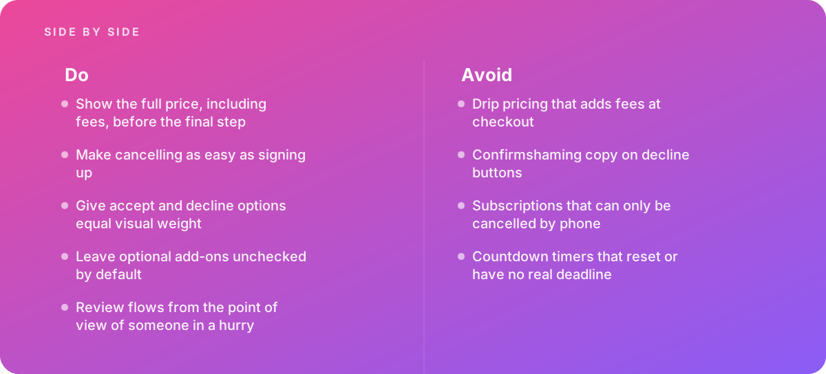
Drip pricing shows a low headline price and adds mandatory fees, such as service, booking, handling or "convenience" charges, as the customer moves toward payment. The fix is simple to state and sometimes hard to implement: show the full price, including all mandatory fees, before the final step, ideally from the first point where a price appears. Optional extras can still be added later, but anything the customer cannot avoid belongs in the headline figure.
Consider a concrete case. A ticketing page advertises a $49.00 ticket. At checkout, a $6.50 service fee and a $2.75 facility fee appear, bringing the total to $58.25. The customer has spent several minutes choosing seats and entering details before learning that the real price is about 19 percent higher than advertised. An honest version shows $58.25 on the seat selection screen, with a breakdown available on tap. The supplier's redesign should specify where the all-in price appears, how the breakdown is presented, and how rounding and taxes are handled where tax cannot be calculated until an address is known.
Pre-checked add-ons
Insurance, extended warranties, donations, priority shipping and newsletter subscriptions are frequently added by default, leaving the customer to notice and remove them. Good practice is to leave optional add-ons unchecked by default and let the customer opt in. The redesign should also make the add-on's price visible next to the choice, not only in the order summary.
Confirmshaming
Confirmshaming uses guilt or ridicule in the decline option: "No thanks, I don't like saving money" or "I'll stay uninformed." It is a small piece of copy with an outsized effect on how the brand is perceived. The fix is neutral, symmetrical labels: "Yes, send me offers" and "No thanks." A supplier with content design skills will rewrite these across the product, not just on the screen where you noticed the problem.
Cancellation obstacles
Subscriptions that can only be canceled by phone, that require a chat with a retention agent, or that hide the cancel option inside several layers of account settings are among the most complained-about patterns. The principle to hold your supplier to is that canceling should be as easy as signing up. If a customer can subscribe in three screens online, they should be able to cancel online in a comparable number of steps. A retention offer can be shown once, clearly, with an obvious way to continue canceling; it should not be a maze.
Fake urgency and scarcity
Countdown timers that reset when the page reloads, or that have no real deadline behind them, and stock warnings that are not tied to actual inventory, pressure people into decisions using false information. The fix is not necessarily to remove all timers; a genuine sale that ends at a genuine time is legitimate information. The fix is to make sure every urgency or scarcity claim is true and driven by real data. Your supplier should ask engineering how each claim is generated.
Asymmetric consent choices
Consent banners and permission prompts where "Accept all" is a large, colored button and "Reject" is a gray text link, or where rejecting requires opening a settings panel while accepting takes one click, are the patterns most directly affected by California's position that agreement obtained through dark patterns is not consent. Accept and decline options should have equal visual weight and equal effort. For the specific layout and wording decisions involved, see cookie banner design.
Disguised ads and misleading hierarchy
Sponsored placements styled to look like organic results or editorial recommendations fall into the FTC's disguised-ads category. The fix involves clear, consistently positioned labels and visual treatment that distinguishes paid from unpaid content. Visual grouping is doing much of the work here, which is why an understanding of Gestalt principles in interface design is a practical skill for this kind of audit rather than an academic one: proximity and similarity determine whether an ad reads as part of the list or apart from it.
A common objection is that if the information is technically on the page, the design cannot be deceptive. In practice, placement, contrast, timing and wording all shape whether people actually notice information. A fee disclosed in small gray text below the fold, or a renewal term buried in a paragraph the customer is never asked to read, may be present without being clear. Good audits judge what a hurried person actually perceives, not what a determined person could eventually find.
How to judge the finished work
When the supplier delivers, you need a way to decide whether the new flows are genuinely honest and genuinely usable, independent of the supplier's own assessment.
Walk the flows as someone in a hurry
The single most useful review technique is to go through each flow as a person who is distracted, on a phone, with a slow connection, trying to finish quickly. Can they tell the total price before paying? Do they know whether they are signing up for a recurring charge, how much it will be and when it will renew? If they decide to cancel next month, can they work out how from the account screen without searching the help center? If they want to decline tracking, is that as quick as accepting it? Ask at least two people who were not involved in the project to do this, and watch them rather than asking them afterward.
Check against the good-practice list
Every in-scope flow should pass five tests:
- The full price, including mandatory fees, is visible before the final step.
- Canceling is as easy as signing up, on the same channel.
- Accept and decline options have equal visual weight.
- Optional add-ons are unchecked by default.
- Every urgency or scarcity claim is true and tied to real data.
If any flow fails one of these, it is not finished, regardless of how polished it looks.
Verify the build, not just the design file
Deceptive patterns frequently reappear during implementation. A developer uses a default component that makes the secondary button look disabled; a marketing tool injects a pop-up after launch; a translated label becomes ambiguous. Include the redesigned flows in your release checks. The process described in design QA before release is the right place to add specific checks for price display, default states and button parity.
Measure the right outcomes
Agree on measures that reflect honesty as well as performance. Useful signals include the volume of support contacts mentioning unexpected charges or cancellation difficulty, refund and chargeback rates, completion rate for the cancellation flow itself, and task success in usability testing when participants are asked to state the total price or find the cancel option. Compare a stable period before launch with a comparable period after, and account for seasonality.
It is also worth asking the supplier to record short screen videos of every finished flow on every platform, including the cancellation and renewal paths. These become a reference for QA, a training aid for new team members and a record your legal team can review later.
Keeping deceptive patterns from coming back
A one-time cleanup decays. Six months after the redesign, a new growth experiment adds a pre-selected upsell, a seasonal campaign adds a countdown banner, and a new market launch copies an old checkout template. Ask your supplier to leave you with the structures that prevent regression, and budget for them.
- Written principles. A short, specific statement of how your product treats price, consent and cancellation gives designers something to point to when a stakeholder asks for a pressure tactic. Guidance on making principles usable rather than decorative is in writing design principles.
- Components with honest defaults. Checkbox components that default to unchecked, button pairs that default to equal weight and price components that require a fee-inclusive total all make the right choice the easy choice.
- Experiment review. Add a question to your A/B test approval process: "Could this variant win by confusing people?" A variant that wins because users miss information should not ship.
- Periodic re-audit. Schedule a review of the money and consent flows at a fixed interval, and whenever complaints spike. Treat new patterns found in these reviews the way you would treat any accumulated shortcut; the approach in managing design debt applies directly.
- Ownership. Name a person or team responsible for the integrity of each flow. When everybody owns the checkout, nobody notices when it drifts.
If you work with an external team on an ongoing basis, the handover matters as much as the design. The guidance on working with external design teams covers the practical side of briefing, feedback and handover that keeps a supplier's fixes alive after the contract ends.
A buyer's timeline for a typical engagement
Durations vary with scope and with how quickly your organization can make decisions, but the sequence below is common to most well-run projects. Knowing it helps you check whether a supplier's plan is realistic and spot missing phases.
- Before kickoff Write the scope brief, gather complaint data, arrange test accounts and confirm who signs off.
- Audit phase The supplier walks every flow on every platform, documents issues with screenshots, rates severity and presents findings.
- Prioritization Product, legal and marketing agree which issues to fix, in what order, and which, if any, will be accepted as risks with documented reasons.
- Redesign The supplier produces revised screens, copy and components, with review rounds as agreed in the contract.
- Validation Usability sessions test the redesigned flows on the tasks that matter: finding the total, understanding renewal, canceling and declining consent.
- Build and QA Engineering implements the changes; design QA checks price display, defaults and button parity in the real build.
- Post-launch review After a stable period, compare complaint, refund and cancellation measures with the baseline, and schedule the next re-audit.
The prioritization step is where engagements most often stall. If findings sit unaddressed for weeks because nobody has authority to trade a small conversion loss for lower risk, the project loses momentum and the supplier's team moves on. Set the decision rules before the audit begins: for example, anything rated critical will be fixed, anything rated high will be fixed unless legal and product jointly document a reason not to.
Making the final call on a supplier
By this point you should have a scope brief, three or more proposals normalized against it, a weighted score for each and a set of answers to the questions that reveal how each supplier thinks. The final decision usually comes down to two things that numbers cannot fully capture: whether the supplier will hold the line on honest design when your own stakeholders push back, and whether they can do so while still protecting the revenue that your product has earned legitimately.
For teams that want a supplier to take on the full audit and redesign, our UI and UX design service works from the same criteria set out in this handbook.
The best suppliers treat these as compatible goals. They will show you that a transparent all-in price reduces checkout abandonment caused by sticker shock at the last step, that an easy cancellation path reduces chargebacks and support load, and that a fair consent banner produces consent you can actually rely on. They will also be candid when a fix costs something in the short term, and explain why that cost is worth paying.
Verdict Hire the supplier who quotes your exact scope, names the patterns they will check, rates severity with a clear scale, tests with real people, works alongside your counsel without pretending to be counsel, and measures success by complaints, refunds and task success as well as conversion. Treat a low lump-sum quote with no list of flows as incomplete, and treat any promise of guaranteed compliance as a reason to walk away. The goal is a checkout, subscription and consent experience that a person in a hurry can understand the first time.
Where this comes from
- Federal Trade Commission — Bringing Dark Patterns to Light
- Federal Trade Commission — Restore Online Shoppers' Confidence Act
- California Attorney General — California Consumer Privacy Act
The figures and practices above come from the sources listed.
Working on something like this?
We take on UI & UX Design work for teams who want it done once, properly. Tell us what you are building and we will tell you honestly whether we are the right studio for it. Start a project.
Where to go next
Spotted something wrong? Report an error on this page. We correct on the page and say what changed.