Easing and Timing Curves: The Decisions That Matter
A checklist for easing and timing curves: how to read cubic Bezier values, pick a small token set, scale durations to distance, and review motion properly.
 Tomas Lindqvist
Easing and timing curves are the instructions that tell an animation how its speed changes between the first frame and the last. A panel can start slowly, accelerate and then settle; a logo can snap into place and drift to rest; a progress bar can crawl at a perfectly constant rate. The start point, end point and duration can be identical in all three cases, and yet each one communicates something different about weight, intent and quality. That is why the choice of easing and timing curves is one of the highest-leverage decisions in motion design, whether you are animating a product interface, a brand sting or an explainer video.
This guide is for the people who have to make those decisions stick: product and brand marketers who sign off on motion, in-house designers who hand animation specs to developers, and motion artists who want a defensible system rather than a pile of one-off keyframes. It is organized as a checklist. The master list comes first, then each item gets its own section explaining why it matters, how to do it well, and where teams typically go wrong.
None of this requires exotic tools. The same principles apply to a CSS transition, a Lottie file exported from After Effects, a SwiftUI spring or a keyframed title card in a promotional video. What changes is the vocabulary each tool uses, and one of the recurring themes below is translating that vocabulary so design and code describe the same curve.
The Easing and Timing Curves Checklist
Use this list when you audit an existing product's motion, write a motion brief, or review an animator's first pass. Every item maps to a section further down.
- Everyone on the team can read a cubic Bezier curve and knows what the two control points do.
- Linear timing is reserved for things that should feel mechanical or continuous, never for objects traveling across the screen.
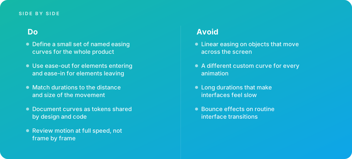
- The product uses a small, named set of easing curves instead of a custom curve per animation.
- Elements entering the screen ease out; elements leaving ease in; elements moving within the screen ease in and out.
- Durations scale with the distance traveled and the size of the element, inside a documented range.
- Springs and linear() approximations are used deliberately, where their physical feel adds meaning.
- Bounce and overshoot are kept for moments that earn them, not routine transitions.
- Curves and durations live as shared tokens used by design files, animation tools and code.
- Motion is reviewed at full speed, on target devices, with reduced-motion settings honored.
- There is a clear trigger for bringing in outside motion expertise.
1. Learn to Read a Timing Curve Before You Choose One
Most easing debates stall because people describe curves with adjectives: "snappier," "smoother," "less floaty." Those words mean different things to different people. The fix is to make sure everyone involved can read the curve itself.
What the graph actually shows
A timing curve plots progress against time. The horizontal axis runs from the start of the animation (0) to its end (1). The vertical axis runs from the starting value (0) to the final value (1). Linear timing is a straight diagonal line: equal slices of time produce equal slices of movement. Wherever a curve is steep, the element is moving fast; wherever it is flat, the element is moving slowly. A curve that starts flat and ends steep accelerates. A curve that starts steep and ends flat decelerates.
On the web and in most design tools, these curves are cubic Bezier curves. A cubic Bezier is defined by two control points between a fixed start at (0, 0) and a fixed end at (1, 1). The first control point shapes how the motion leaves the start; the second shapes how it arrives at the end. In CSS you write this as cubic-bezier(x1, y1, x2, y2). The x values must stay between 0 and 1, because time cannot run backward. The y values may go outside that range, which is how overshoot and anticipation effects are produced. MDN Web Docs' reference on the easing-function type documents the full syntax, including the keyword values and the newer linear() function.
The keywords you will meet most often
CSS ships with named curves that most tools either reproduce or imitate. Knowing their exact values stops a lot of guesswork when a designer says "just use ease-in-out."
| Keyword | cubic-bezier value | How it feels | Typical use |
|---|---|---|---|
| linear | cubic-bezier(0, 0, 1, 1) | Constant speed, no acceleration | Spinners, color and opacity loops, scrolling tickers |
| ease | cubic-bezier(0.25, 0.1, 0.25, 1.0) | Quick start after a brief ramp, long gentle settle | The CSS default; acceptable for small state changes |
| ease-in | cubic-bezier(0.42, 0, 1.0, 1.0) | Slow start, abrupt stop | Elements leaving the screen |
| ease-out | cubic-bezier(0, 0, 0.58, 1.0) | Fast start, soft landing | Elements entering the screen |
| ease-in-out | cubic-bezier(0.42, 0, 0.58, 1.0) | Symmetric acceleration and deceleration | Elements moving from one on-screen position to another |
Notice that the CSS default, ease, is not symmetrical. Its first control point (0.25, 0.1) gives a short, gentle ramp, and its second control point (0.25, 1.0) sits at full progress very early, which produces a long deceleration tail. That tail is why unstyled CSS transitions often feel slightly soft at the end: most of the visible movement happens in the first half of the duration.
Tip: When reviewing curves with non-specialists, open a curve visualizer and drag the control points live. Five minutes of seeing "steep means fast, flat means slow" replaces hours of arguing over the word "snappy." Record the agreed values, not the adjectives.
2. Retire Linear Easing for Anything That Travels
Linear timing moves at a constant speed from the first frame to the last. Physical objects almost never do that. A drawer, a car, a thrown ball and a hand reaching for a cup all have to accelerate from rest and decelerate to stop. When an interface element slides across the screen at a constant rate and then halts instantly, the eye reads the abrupt start and stop as mechanical, and the motion looks cheap even when every other design decision is sound.
Where linear still belongs
Linear is not banned; it is specialized. It is the right choice when the motion is continuous or the thing being animated has no mass:
- Loops and spinners. A rotating loading indicator should not speed up and slow down on every revolution, or it will appear to stutter.
- Tickers and marquees. Scrolling text at a constant rate is easier to read than text that surges.
- Progress that reflects real progress. If a bar represents a file upload, easing it would misrepresent the underlying process.
- Properties without spatial movement. Opacity cross-fades and color shifts are less sensitive to curve choice, though a gentle ease still often looks better.
- Keyframes that are part of a larger curve. In a multi-keyframe animation, a middle segment may be linear so the motion passes through without a speed dip.
The test is simple: if the thing on screen is supposed to feel like an object with weight, do not animate its position or scale linearly. If it is supposed to feel like a process or a machine, linear is often correct.
How linear sneaks back in
Teams rarely choose linear motion on purpose. It arrives by default. After Effects creates linear keyframes unless you apply easing. Some JavaScript animation helpers default to linear interpolation. A developer implementing a spec that says "slide in over 300 ms" without naming a curve will often leave the default in place. The fix is procedural: every motion spec names a curve token, and code review flags any animation of position or scale that has no explicit easing.
Motion blur interacts with this too. Constant-speed movement renders constant blur, which exaggerates the mechanical look; eased movement concentrates blur in the fast middle of the move, where it helps. If you are deciding how much blur to add to rendered animation, our guide to motion blur in animation covers the shutter settings that pair well with eased motion.
3. Define a Small Set of Named Easing Curves for the Whole Product
The single biggest difference between motion that feels designed and motion that feels accidental is consistency. When every animation uses a slightly different hand-tuned curve, users cannot perceive a pattern, and the product feels restless. When a handful of curves are used consistently, each one starts to carry meaning: this curve means "something arrived," that one means "something is leaving," another means "this moved within the page."
How many curves is enough
Most products can cover the overwhelming majority of their motion with three to five curves. A practical starting set looks like this:
- Standard. An ease-in-out style curve for elements that move from one on-screen position to another, such as reordering a list or expanding a card in place.
- Enter (decelerate). An ease-out style curve for elements arriving: menus, toasts, sheets and dialogs.
- Exit (accelerate). An ease-in style curve for elements leaving or being dismissed.
- Emphasized. A more pronounced curve, with a sharper start or a longer settle, reserved for hero moments such as onboarding transitions or a completed purchase.
- Linear. Named explicitly, so its use is a decision rather than an accident.
Established design systems follow the same logic. Material Design's guidance on easing and duration organizes motion into a small set of named easing and duration tokens rather than inviting a new curve for every component, and it pairs each curve with a purpose. You do not have to copy Material's values, but its structure is a good model: names that describe intent, a limited palette, and durations that travel with the curves.
Naming curves by intent, not shape
Name tokens for what they do, not how they look. "motion-ease-enter" survives a redesign; "curve-fast-slow-2" does not. Intent-based names also make specs easier to read. A developer who sees ease: enter in a handoff knows which token to reach for, and a reviewer who sees an exit animation using the enter token knows something is wrong without opening a graph editor.
What to do with legacy curves
If you are auditing an existing product, you will likely find far more curves than you expected, many of them near-duplicates. Export or grep every easing value in the codebase and every graph setting in the animation source files, cluster the ones that are visually indistinguishable at full speed, and map each cluster to one token. Curves that do not fit any cluster are either genuine special cases, which should be documented as such, or mistakes, which should be migrated.
4. Ease Out on Entry, Ease In on Exit
This is the most useful rule of thumb in interface motion, and also the one most often reversed by accident. It follows from what the user needs to see at each moment.
Why entering elements should decelerate
When something enters the screen, the user's attention goes to where it lands. An ease-out curve moves quickly at first, covering most of the distance in the early part of the duration, and then slows to a soft stop. The element becomes readable sooner, and the gentle arrival lets the eye settle on it. If the same element eased in instead, it would start slowly while the user waited for it, then accelerate and stop abruptly at the point where they are trying to read it. That feels both slow and jarring at once.
Why exiting elements should accelerate
When something leaves, the user no longer needs it. An ease-in curve starts gently, acknowledging the dismissal, then accelerates away. The element gets out of the way quickly and the final, fastest part of the motion happens off screen or at zero opacity, where nobody sees the abrupt ending. Exits can usually be shorter than entrances for the same reason: there is nothing to read on the way out.
Movement within the screen
When an element travels from one visible position to another, such as a card expanding into a detail view or an item sliding into a new slot, both ends of the move are visible. That calls for an ease-in-out curve, which accelerates from rest and decelerates to rest. The asymmetric variants used by many design systems, with a shorter acceleration and a longer deceleration, tend to look more natural than the perfectly symmetric CSS ease-in-out, because they spend more of the duration on the arrival the user is watching.
Watch the vocabulary: After Effects names easing from the keyframe's point of view, while CSS names it from the animation's point of view.
- In After Effects, "Easy Ease In" slows the motion as it arrives at a keyframe. That produces the same deceleration CSS calls ease-out.
- "Easy Ease Out" in After Effects slows the motion as it leaves a keyframe, which matches CSS ease-in.
- Always confirm curves in a graph or with cubic-bezier values rather than trusting the label when handing off between tools.
5. Match Duration to Distance and Size
Easing and duration are inseparable. The same ease-out curve can feel crisp at 200 milliseconds and sluggish at 600. The second most common motion complaint, after "it feels mechanical," is "it feels slow," and the cause is almost always a duration chosen for one situation and then applied everywhere.
The principle
Larger elements and longer distances need more time; small elements and short distances need less. A checkbox tick that takes as long as a full-screen sheet transition will feel lethargic, and a full-screen sheet that moves as fast as a checkbox will feel violent. Heavier-looking objects also read as more plausible when they take slightly longer to accelerate and settle.
For interface work, many teams land on durations in the range of roughly 100 to 500 milliseconds, with small state changes at the short end and large, screen-spanning transitions at the long end. Anything beyond that range in routine interface motion should be a conscious decision, because users repeat these interactions dozens of times a day and long durations accumulate into a product that feels slow. Brand and video work operates on different timescales, since the audience is watching rather than operating, and animators there think in frames at 24, 25, 30 or 60 frames per second rather than milliseconds.
If you animate for video, the classical tool for planning this is the timing chart, which marks where in-betweens fall and therefore how spacing expresses ease. Our article on animation timing charts shows how that traditional method translates into modern keyframe workflows.
Worked example: a duration scale for a web app
The following is an illustrative example, not a client project. Imagine a web app with four common transitions: a tooltip that fades and moves 8 pixels, a toast that slides up 80 pixels from the bottom edge, a navigation drawer that slides in 320 pixels from the left, and a full-screen sheet that rises about 800 pixels on a desktop viewport. The team wants one rule that produces sensible durations for all four.
They start with a base of 150 milliseconds and add time proportional to distance, capping the result so nothing routine exceeds 450 milliseconds. A simple rule they test is: duration = 150 ms + (distance in pixels × 0.35 ms), rounded to the nearest 25 ms, with entrances clamped between 150 and 450 ms. Exits use about 75 percent of the matching entrance duration.
| Transition | Distance | Calculated entry | Rounded entry | Exit (about 75%) | Curve token |
|---|---|---|---|---|---|
| Tooltip | 8 px | 152.8 ms | 150 ms | 112.5 ms, rounded to 100 ms | enter / exit |
| Toast | 80 px | 178 ms | 175 ms | 131 ms, rounded to 125 ms | enter / exit |
| Navigation drawer | 320 px | 262 ms | 250 ms | 187.5 ms, rounded to 200 ms | enter / exit |
| Full-screen sheet | 800 px | 430 ms | 425 ms | 319 ms, rounded to 325 ms | emphasized enter / exit |
They then review each transition on the target devices at full speed. The tooltip still feels slightly slow for something that appears on hover, so the team lowers the floor to 100 ms for non-spatial fades while leaving the formula intact for movement. The sheet feels right. The formula itself never ships as code; instead, the team snaps the results to a small set of duration tokens (100, 125, 150, 175, 200, 250, 325 and 425 ms), so developers pick from a list rather than calculating. The lesson is that the rule gets you close, and review at real speed decides the final values.
On mobile, the same sheet travels fewer pixels on a smaller screen but covers the same proportion of it, which is why some teams base the formula on the percentage of the viewport traveled rather than raw pixels. Either approach works, as long as it is written down and applied consistently.
Frame counts make durations concrete. At 60 frames per second, 150 ms is 9 frames and 300 ms is 18 frames. If an ease-out curve is doing most of its work in the first third of the duration, a 150 ms animation delivers the visible move in about three frames, which is why very short durations can look like a jump cut rather than motion.
6. Choose Deliberately Between Bezier Curves and Springs
Cubic Bezier curves are not the only way to describe easing. Native mobile frameworks and many JavaScript libraries also offer spring animations, which simulate a mass on a spring and are described by physical parameters such as stiffness, damping and mass, or by a perceived duration and a "bounce" amount. CSS has gained a middle path: the linear() easing function, which approximates springs and bounces with a series of points that the browser connects with straight segments.
What each model is good at
A Bezier curve has a fixed duration and a predictable shape. It is easy to specify, easy to reproduce across tools, and easy to put in a token file. What it cannot do is respond naturally when an animation is interrupted. If a user drags a sheet halfway and lets go, a Bezier animation restarts from the current position with a fresh curve, which can produce a visible hitch in velocity.
A spring carries velocity. When a gesture hands off to an animation, the spring can start at the speed the user's finger was moving and settle from there, which feels continuous and physical. Apple's Human Interface Guidelines on motion emphasize motion that feels realistic and responsive to the user's input, and spring-based animation is one of the main ways native platforms achieve that feel. The cost is that a spring's total duration depends on its parameters, so it is less predictable to schedule against other events, and harder to express in the same units as the rest of your motion system.
Where linear() fits
The CSS linear() function takes a list of progress values, optionally with positions, and interpolates between them. Given enough points, it can trace the shape of a spring's settle or a bounce's rebounds, which no single cubic-bezier can do. In practice, the point lists are generated by tools rather than written by hand, and the output is long. It is a good option for a web product that wants to match a native app's spring feel, provided the team treats the generated value as a token like any other, rather than pasting different point lists into different components.
Pros
- Cubic Bezier: fixed, predictable duration that is easy to coordinate with other animations and sound.
- Cubic Bezier: four numbers per curve, trivially shared between design tools, animation software and code.
- Springs: preserve velocity when a gesture hands off to animation, so interrupted motion stays smooth.
- Springs: a single spring definition adapts to different distances without separate duration tokens.
- linear(): brings spring and bounce shapes to CSS without a JavaScript animation library.
Cons
- Cubic Bezier: cannot express multiple oscillations, and restarts awkwardly when interrupted mid-motion.
- Springs: total duration is an outcome of the parameters, which complicates choreography and sound sync.
- Springs: parameter conventions differ between platforms, so "the same spring" needs translation per framework.
- linear(): long, generated values are hard to read or tweak by hand and are easy to fork accidentally.
- linear(): an approximation, so too few points can make the motion look faceted.
A practical split for many products is Bezier curves for standard transitions triggered by taps and clicks, and springs for gesture-driven motion such as dragging, swiping and pull-to-refresh. Document both in the same token file so the choice between them is visible.
7. Keep Bounce and Overshoot for Moments That Earn Them
Overshoot, where an element slightly passes its target and settles back, and bounce, where it rebounds several times, add personality. Used on routine transitions, they become noise. The tenth time a user opens a menu that wobbles into place, the wobble stops reading as delight and starts reading as a delay between them and the menu item they want.
Where expressive curves work
- Celebrations and completions. A success check after a purchase or a finished onboarding step is a moment users do not repeat many times per session.
- Brand and marketing motion. Logo reveals, campaign stings and explainer videos are watched rather than operated, and character is part of the brief.
- Playful products. Games, children's apps and some consumer tools have a voice that supports springy motion throughout, as long as it is consistent.
- Direct manipulation feedback. A subtle overshoot when a dragged item snaps into a slot can communicate the snap, provided the settle is quick.
How to keep them in check
If you use overshoot in interface motion, keep it small and fast: the element should pass its target by a few percent and settle within a fraction of the main duration. In cubic-bezier terms, overshoot comes from a y value above 1 on the second control point; small increases produce noticeable overshoot, so adjust in small steps. Multiple rebounds require linear() or a spring. Put expressive curves in the token set with names that make their purpose explicit, such as "motion-ease-celebrate," so nobody applies them to a dropdown by accident.
Brand work that is reused across many variants benefits from locking expressive timing into templates. If your team produces the same animated elements in many versions, our guide to reusing rigs and templates explains how to bake approved curves into controls so every variant inherits them. The same logic applies to seasonal campaign variants, where a holiday refresh should change the look without quietly changing the timing personality of the brand.
Tip: Timing an overshoot to a sound effect makes it feel intentional. If a logo lands with a small overshoot, align the audio hit with the moment it first reaches its target, not with the final settle. Our article on sound design for motion graphics covers syncing audio to eased motion in more detail.
8. Document Curves as Tokens Shared by Design and Code
A curve that exists only in a designer's prototype file is a suggestion. A curve that exists as a named token, used in the design tool, the animation software and the codebase, is a standard. Motion tokens are what turn the decisions in this checklist into something that survives staff changes, redesigns and deadline pressure.
What a motion token file contains
At minimum, each easing token needs a name, a cubic-bezier value (or spring parameters, or a linear() value), and a description of its intended use. Duration tokens need a name and a value in milliseconds. Many teams also document pairings, such as "enter curve with medium duration for drawers," because the pairing is what users actually experience.
| Token | Value | Use |
|---|---|---|
| motion.ease.standard | cubic-bezier(0.42, 0, 0.58, 1.0) | On-screen moves: reorder, expand in place |
| motion.ease.enter | cubic-bezier(0, 0, 0.58, 1.0) | Elements arriving: menus, toasts, dialogs |
| motion.ease.exit | cubic-bezier(0.42, 0, 1.0, 1.0) | Elements leaving or dismissed |
| motion.ease.linear | linear | Loops, spinners, true progress |
| motion.duration.short | 150 ms | Small state changes, tooltips |
| motion.duration.medium | 250 ms | Drawers, panels, cards |
| motion.duration.long | 425 ms | Full-screen transitions |
The values above use the standard CSS keyword curves for clarity; your own tokens may use tuned values, which is fine as long as they are the only values in circulation.
Getting tokens into every tool
- Code. Expose tokens as CSS custom properties, platform constants or theme values, generated from a single source file so web and native stay in sync.
- Prototyping tools. Most prototyping tools accept custom cubic-bezier values. Save the token set as presets so designers pick from the list rather than dragging handles.
- After Effects. The graph editor does not take cubic-bezier numbers directly; speed and influence settings or an easing extension map the curve. For teams producing many animations, scripts can apply token curves consistently. Our guide to automating After Effects with scripts covers the trade-offs of that approach.
- Exported animation. When motion ships as Lottie or animated SVG, the easing is baked into the exported keyframes. Check that exported curves match the tokens, especially after a designer has hand-adjusted keyframes. Our piece on animated SVG discusses how easing survives, or does not survive, different export paths.
Writing specs developers can implement
A good motion spec for a single interaction names the trigger, the properties that change, the start and end values, the duration token, the easing token, any delay or stagger, and what happens if the animation is interrupted. "Drawer slides in from left, translateX from -100% to 0, duration medium, ease enter, no delay; if closed mid-animation, reverse from current position with ease exit and duration short" is unambiguous. "Drawer slides in smoothly" is not.
9. Review Motion at Full Speed, on Real Devices
Animators spend much of their time scrubbing through frames and adjusting curves in a graph editor. That is necessary for building motion, but it is the wrong way to judge it. Users experience motion at full speed, often while doing something else, and a curve that looks elegant frame by frame can feel sluggish, busy or invisible in real time.
A review procedure that works
- Watch it in context at full speed. Play the animation inside the real screen or edit, with surrounding content, at its actual frame rate. Watch it several times without pausing.
- Use it, do not just watch it. For interface motion, perform the interaction repeatedly, as a user would, including quickly and out of order. Motion that feels fine once can feel slow on the fifth repeat.
- Test on target hardware. Check on a mid-range phone and an ordinary laptop, not only on a fast workstation. Dropped frames distort easing, because the fast middle of a curve is where frames are most likely to be skipped.
- Interrupt it. Tap again mid-transition, reverse a gesture, navigate away. Note any jumps in position or velocity.
- Check reduced-motion settings. Turn on the operating system's reduced-motion preference and confirm the product responds, typically by replacing large movements with fades or instant changes.
- Only then scrub. Use frame-by-frame inspection to diagnose a problem you already felt at full speed, not to go looking for problems nobody would notice.
Accessibility is part of the timing decision
Some users experience discomfort, dizziness or distraction from large or prolonged motion. Operating systems expose a reduced-motion preference, and the web exposes it through the prefers-reduced-motion media query. Honoring it is not only an accessibility obligation; it is also a good stress test of your motion system. If the product still makes sense with movement replaced by short fades, your motion was supporting the interface rather than carrying information that exists nowhere else.
Context also changes what "right" looks like. Motion on a lobby screen watched from across a room, or on a slide projected in a meeting, needs slower, clearer easing than a phone interface held at arm's length. If your work extends to those settings, see our guide to digital signage animation, which covers pacing for screens viewed at a distance.
10. Common Easing and Timing Curve Mistakes, and How to Fix Them
Most motion problems fall into a few recurring patterns. Each has a recognizable symptom and a direct fix.
- Linear easing on moving objects. Symptom: motion looks robotic, starts and stops with a jolt. Fix: apply the enter, exit or standard token depending on direction, and add a lint or review check for unset easing on transforms.
- A different custom curve for every animation. Symptom: the product feels restless and nobody can say why. Fix: audit, cluster and migrate to a named set of three to five curves.
- Long durations everywhere. Symptom: users describe the product as slow even when load times are good. Fix: re-derive durations from distance and size, and set a ceiling for routine transitions.
- Bounce on routine transitions. Symptom: menus and dialogs wobble; the effect is charming once and irritating by the tenth time. Fix: move overshoot into a clearly named expressive token used only for rare moments.
- Reversed entry and exit curves. Symptom: things arrive slowly then stop hard, and leave with a lingering drift. Fix: swap to ease-out on entry and ease-in on exit, and double-check any After Effects labels during handoff.
- Curves that drift during handoff. Symptom: the shipped product feels different from the approved prototype. Fix: compare exported or coded values against the token file, not against memory.
A related misconception is that smoother motion always means longer, softer easing. In practice, smoothness comes from continuous velocity and a consistent frame rate, not from length. A well-chosen 200 ms ease-out often feels smoother than a 600 ms one, because the longer version draws attention to its slow tail and makes the user wait for it.
Timing problems in video are sometimes fixed after the fact rather than in the original keyframes. If you are working with footage or pre-rendered animation, adjusting speed curves in the edit can rescue a move that feels flat; our guide to time remapping explains when that is a reasonable fix and when it is better to go back to the source.
11. When to Bring In Motion Specialists
Many teams can get from "no motion system" to "a consistent, documented set of curves and durations" on their own, using the checklist above. There are two situations where outside expertise usually pays for itself.
The first is when a product's motion already feels inconsistent and nobody on the team can articulate why. That usually means curves and durations have accumulated over years, across multiple teams and codebases, and untangling them requires someone who can audit motion across design files, animation sources and code, then propose a consolidated system without breaking what users have grown used to.
The second is when you are building motion guidelines for a design system. Guidelines outlive the people who write them, and the early decisions, such as how many curves, how durations scale, when to use springs and how tokens reach each platform, are expensive to change later. A motion specialist can prototype the options, test them at full speed on real devices, and write specs that designers and developers can both follow.
If either situation applies, our animation and motion graphics team can audit existing motion, define curve and duration tokens, and produce the animated assets that use them. When you are planning the engagement, our guide to scoping animation projects explains what to include in the brief so the motion system is part of the deliverables rather than an afterthought.
Verdict The decisions that matter most with easing and timing curves are few and repeatable: never move objects linearly, ease out on entry and in on exit, scale duration to distance, keep a small set of named curves, and store them as tokens that design and code share. Get those right, review everything at full speed on real devices, and reserve springs and bounces for moments that earn them. That is what makes motion feel designed rather than decorated.
Where this comes from
- MDN Web Docs — easing-function
- Material Design — Easing and duration
- Apple Human Interface Guidelines — Motion
The figures and practices above come from the sources listed.
Working on something like this?
We take on Motion Graphics & Animation work for teams who want it done once, properly. Tell us what you are building and we will tell you honestly whether we are the right studio for it. Start a project.
Where to go next
Spotted something wrong? Report an error on this page. We correct on the page and say what changed.