Financial Explainer Animation: The Decisions That Matter
Six myths about financial explainer animation, from late compliance review to flashed disclaimers, and the production practices that get videos approved.
 Tomas Lindqvist

A financial explainer animation is a short animated film that explains a financial product, an investing concept or a financial service: how a retirement account compounds, what an index fund actually holds, how a buy-now-pay-later plan charges fees, why a bond price falls when rates rise. Banks, brokerages, insurers, fintech apps, wealth managers and credit unions use them on landing pages, in app onboarding, in advisor meetings and in paid social. Done well, a financial explainer animation turns an abstract, anxiety-inducing topic into something a customer can follow in ninety seconds.
The difficulty is that animation is a medium built for simplification, and finance is a field where simplification is regulated. Financial promotion rules apply to an animated video exactly as they apply to a brochure or a web page. A smooth upward curve, a cheerful character retiring to a beach, or a disclaimer that flashes past in the last second can each turn a well-meant explainer into a communication that a compliance officer cannot approve, or worse, one that gets published and later has to be pulled. The medium's strengths are the same features that create the risk.
This guide is written for marketers, product teams and compliance-minded founders commissioning this kind of work, and for the animators and scriptwriters who make it. It is organized around the misconceptions we see most often on financial projects. Each one is debunked with the reasoning behind it and the practice that works instead, followed by an illustrative worked example with a realistic schedule and a checklist you can use on your next brief. Nothing here is legal advice; it is production practice designed to make your compliance team's job easier rather than harder.
Why a financial explainer animation is held to a different standard
Most explainer videos are judged on clarity and persuasion. A financial explainer is judged on clarity, persuasion and fairness, and the third criterion is not negotiable. In the United States, broker-dealers are governed by FINRA Rule 2210 on communications with the public, which requires communications to be fair and balanced, to provide a sound basis for evaluating the facts, and to avoid false, exaggerated, unwarranted, promissory or misleading statements or claims. Registered investment advisers answer to the SEC's investment adviser marketing rule, which sets its own conditions on how performance, testimonials and hypothetical results may be presented. Other countries have their own financial promotion regimes built on similar principles. None of these rules carve out an exception because the content happens to be animated.
Four practical consequences follow for anyone producing this work, and they shape every decision in the rest of this article:
- Balance. Benefits and risks must both be presented, and presented with comparable prominence. A voiceover that spends forty seconds on upside and four seconds on risk is not balanced, even if every sentence is technically true.
- Approval. Financial communications often need compliance sign-off before they are used. For a broker-dealer, many retail communications require approval by an appropriately qualified principal before first use, and some categories must also be filed with the regulator.
- Disclaimers. Required disclosures must be legible and on screen long enough to read. A disclosure the viewer cannot physically read does not do its job, regardless of whether it technically appeared.
- Records. Published communications are retained. Firms must be able to produce the exact version that ran, when it ran and who approved it.
The animation brief therefore has to carry obligations that a product explainer does not. If you have produced general explainers before, our guide to getting explainer video animation right covers the craft fundamentals: script length, pacing and visual metaphor. Everything in that guide still applies. What changes in finance is that the script, the charts, the on-screen text and the edit decisions all become part of a regulated record.
It helps to recognize that financial explainers sit in a family of regulated or high-stakes animation. Health content has the same tension between clarity and accuracy, which is why our piece on healthcare explainer animation reaches many of the same conclusions about review cycles and claim substantiation. The difference in finance is that the most dangerous content is usually numerical and visual rather than verbal: the chart, not the sentence.
Myth 1: Compliance review happens once the animation is finished
Myth: The creative team makes the video, then compliance watches the final cut and approves it.
Reality: Compliance review that starts at final render is the most expensive point at which to discover a problem. Scripts, storyboards and chart designs should go through review before animation begins, and the final cut is then a confirmation step, not a first look.
This is the single most costly misconception on financial animation projects, and it is easy to understand why it persists. In most marketing work the approval chain is linear: brief, script, design, animate, review, publish. Legal review, where it exists at all, is a formality applied at the end. Applied to financial content, that sequence routinely produces a finished animation containing a claim, a chart or a character action that compliance cannot approve.
The cost is structural. In animation, changes get more expensive the further they are from the script. Rewording a sentence in a script costs minutes. Changing the same sentence after voiceover has been recorded means a pickup session, and if the new line is a different length, the animation timed to the old line has to be retimed. Changing a chart after it has been animated can mean rebuilding a whole scene. A compliance comment that says "the growth line implies a guaranteed return" is a quick fix at storyboard and a multi-day rebuild at final render.
Where compliance should enter the pipeline
On financial projects we treat compliance as a reviewer at three gates, not one:
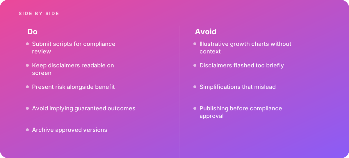
- Script gate. The full narration and every line of on-screen text, including supers, chart labels, and the disclosure copy, go to compliance as a document. This is where claims, qualifiers and risk language get settled. Submitting scripts for compliance review is the most valuable single practice in this whole field.
- Storyboard or animatic gate. Compliance sees the visuals in sequence with the approved narration. This is where visual implications get caught: an arrow that only points up, a piggy bank that overflows, a character who looks visibly wealthier after opening an account. Visuals can make claims the script never makes.
- Final cut gate. Compliance confirms that the final render matches what was approved, checks disclosure legibility and duration at actual playback size, and signs off the exact file that will be published.
If your organization has an established approval workflow, map the animation milestones onto it at kickoff, and put the compliance turnaround time in the schedule as a real task with a real duration. The planning side of this is covered in more depth in our guide to scoping animation projects; for financial work, the extra review gates are usually the biggest variable in the timeline.
What to send the reviewer
Reviewers work faster when the material is easy to review. Send the script as a two-column document, narration on the left and on-screen visuals and text on the right, with scene numbers. Flag every factual claim and number with its source. Send animatics as a watchable file with burned-in scene numbers and timecode so that comments can reference exact moments. Keep a running log of every compliance comment and how it was resolved, because that log becomes part of the approval record.
Myth 2: A disclaimer at the end covers everything the video says
Myth: As long as the required disclosures appear somewhere in the video, typically on an end card, the communication is covered.
Reality: A disclosure has to be readable, placed near the claim it qualifies and on screen long enough to be read. A dense paragraph shown for two seconds at the end does not qualify a claim made thirty seconds earlier, and a disclaimer flashed too briefly is one of the most common reasons financial video fails review.
Disclosures in video are a design problem, and they deserve the same attention as any other piece of typography in the piece. The classic failure is familiar from broadcast advertising: a block of small, light gray text across the bottom of the screen for a second or two while the voiceover moves on. The viewer cannot read it, and the purpose of a disclosure is that the viewer can.
Legibility: size, contrast and position
Treat disclosure text as body copy, not as a legal afterthought. It should be set in the same brand typeface as other supers or a clean sans serif, at a size that is readable at the smallest viewing size the video will realistically reach. For a video that will run in a social feed, that is a phone screen held at arm's length, not a 27-inch monitor in an edit suite. Contrast should meet the same accessibility standard you would apply to any on-screen text, which means no thin light text over busy animated backgrounds. If the scene behind the disclosure is moving, put the text on a solid or heavily blurred panel.
Position matters too. Keep disclosures inside the title-safe area and away from the zones that platforms cover with their own interface elements, such as captions, progress bars, like and share buttons, and account names. A disclosure hidden under a platform's caption bar has not been shown.
Duration: time it, do not guess it
Regulators do not generally publish a fixed number of seconds that a disclosure must stay on screen, so the practical standard is whether a typical viewer can read it. The reliable method is empirical. Have someone who has never seen the text read it silently at a normal pace while you time them, repeat with a second person, and hold the disclosure for at least the longer of those two times plus a margin. Legal language reads more slowly than marketing copy, and a viewer who is also listening to narration reads more slowly still.
When the timing comes out long, that is a signal to change the design, not to shrink the text. Options include splitting a long disclosure across two cards, moving the full disclosure to a static end card that holds for its full reading time while the narration pauses, pairing on-screen text with narration that says the same words, and shortening the underlying copy with compliance's agreement.
Proximity: qualify the claim where it is made
A disclosure is most effective when it sits beside the claim it qualifies. If scene four says an account has no monthly fee, and that is true only above a minimum balance, the condition belongs in scene four, as a super under the claim or in the narration itself, not in an end card a minute later. End cards are appropriate for general disclosures such as regulatory status, membership statements and "investing involves risk, including possible loss of principal" style language. Specific conditions attached to specific claims belong at the claim.
| Disclosure type | Where it belongs | Typical treatment |
|---|---|---|
| Condition on a specific claim (minimums, eligibility, fees) | In the same scene as the claim | Super beneath the claim, or spoken in the same narration line |
| Basis of an illustration (assumed rate, period, fees included or not) | On the chart itself, for the whole time it is on screen | Chart label or caption, set as readable text rather than a footnote |
| General risk statement | Near the first mention of returns, and repeated on the end card | Narrated and shown as text, with equal pacing to benefit lines |
| Regulatory and firm identification | End card | Static card held for its full measured reading time |
| Links to fuller terms | End card and in the host page or post copy | Short readable URL, never a QR code alone |
Myth 3: A growth chart labeled "illustrative" is safe to use
Myth: An animated growth curve is fine as long as a small label says it is illustrative or hypothetical.
Reality: The word "illustrative" does not neutralize a misleading picture. An illustrative chart needs visible context: the assumptions behind it, the period, whether fees and taxes are included, and an honest sense that outcomes vary and can be negative. Without that context, the animated curve is the claim.
Charts are where financial explainer animation gets into the most trouble, because animation makes charts persuasive in ways static charts are not. A line that draws itself from left to right, smoothly accelerating upward while music swells, communicates certainty and momentum. The viewer remembers the shape long after they forget the caption. Illustrative growth charts without context are, in practice, one of the most common mistakes in the category.
How animated charts mislead without anyone intending it
- Smoothing. Real market returns are volatile. A compounding curve drawn as a clean exponential line implies a steady, predictable path. If the point is to explain compounding, that is a legitimate teaching device, but it should be framed as a mathematical illustration of compounding, not as what an investment will do.
- Cropped axes. Starting the vertical axis above zero exaggerates change. Animators do this for visual drama without thinking of it as a claim.
- Selective endpoints. Choosing a start date after a market low and an end date at a high produces a flattering line from genuine data.
- Missing costs. A projection that ignores fees, inflation or taxes overstates the outcome, and the omission is invisible to the viewer.
- One path only. Showing a single outcome, always a positive one, implies that is the outcome. Showing a range, including a poor one, is more honest and often more instructive.
Correct practice for charts in motion
Decide early whether the chart is teaching a concept or depicting a product. A concept chart, such as how compounding works at a fixed hypothetical rate, can use round numbers and a clean curve provided it is clearly framed as arithmetic rather than a forecast, and the assumptions are printed on the chart for as long as the chart is on screen. A product chart, meaning anything that shows or implies what this fund, this account or this plan did or will do, falls under the performance presentation rules that apply to your firm, and those rules are specific. Under the SEC's adviser marketing rule, for example, hypothetical performance comes with its own conditions, and in broker-dealer communications projections of performance are generally restricted. Have compliance decide which category a chart falls into before anyone animates it.
Then animate honestly. Keep the vertical axis at zero unless there is a clear reason and a visible axis label. If the line is supposed to show volatility, let it wobble and dip. If you show a range of outcomes, animate the range as a band rather than a single line, and give the downside the same visual weight as the upside. Hold the finished chart on screen long enough to read its labels; a chart that animates in and immediately cuts away has only delivered its shape, which is the most misleading part.
Myth 4: The simpler the explanation, the better the explainer
Myth: The job of a financial explainer is to make a complicated product sound simple, so anything that adds complexity should be cut.
Reality: The job is to make the product understandable, which is not the same as making it sound simple. A simplification that leaves out how the product can lose money, what it costs or who it is not suitable for is a misleading simplification, and it is exactly what the rules on balance are designed to catch.
Explainer craft rewards ruthless editing, and in most categories that instinct is right. A ninety-second video cannot cover everything, and trying to will lose the viewer. The danger in finance is that the easiest things to cut are the caveats, because they slow the story down and do not look good. Cut enough of them and the explainer describes a product that does not exist: one with the upside and none of the conditions.
Simplify the structure, not the substance
The way through is to simplify how the information is organized rather than what information is included. Some practical techniques:
- Narrow the scope. Instead of one video that explains a whole product, make one video per concept: how the account works, what it costs, what the risks are. Each can be complete within its narrower scope.
- Use the right metaphor. A metaphor has to break in the right places. A savings account as a jar that fills up works because savings do accumulate. An investment portfolio as a jar that fills up fails because a jar never empties on its own. For an investment, a metaphor that can plausibly shrink, such as a garden that has good and bad seasons, carries the risk inside the image.
- Layer the depth. Keep the video focused on the core idea and point to the fuller documentation on the page that hosts it, but never use that link as a substitute for including material risks in the video itself.
- Test comprehension. Show the animatic to a few people outside the project and ask them to explain the product back. If they describe a guaranteed return or miss the main cost, the simplification has gone too far.
The same discipline applies to character-driven explainers. A character who opens an account and is immediately shown on a yacht implies an outcome. Characters are powerful precisely because viewers identify with them, and our guide to designing characters for animation explains how much emotional weight small choices of pose and expression carry. In financial work, the rule is to show characters making decisions and understanding their options, not being rewarded with a particular result.
Public-sector communicators face a similar challenge when simplifying benefits, taxes or pensions for a broad audience, and the approaches in our article on public information animation translate well to consumer finance: plain language, one idea per scene, and explicit statements of who a thing does and does not apply to.
Myth 5: Risk language should be kept to a minimum so it does not scare people off
Myth: Mentioning risk once, briefly, near the end is enough; dwelling on it will damage conversion and brand perception.
Reality: Benefits and risks must both be presented, with comparable prominence. Treating risk as a design and writing problem to solve well, rather than as text to minimize, produces explainers that pass review and that customers trust.
Fair balance is not satisfied by the presence of risk language. It is about prominence: how much time, emphasis and visual weight the risks receive compared with the benefits. A video where the benefits are narrated warmly over rich animation and the risks are read quickly over a static card has not balanced anything, even if the words are all there.
Practical ways to give risk equal weight
Give risk its own scene. If the explainer has a scene on how returns work, it should have a scene of comparable length and production value on how losses happen. Animate it with the same care. Use the same narrator, the same pace and the same visual language. If returns are shown as a plant growing, losses can be the same plant in a dry season. Continuity of metaphor keeps the risk part of the story rather than a legal interruption.
Place the first mention of risk near the first mention of benefit. The worst structure is benefit, benefit, benefit, end card. A better structure introduces the trade-off early, so the viewer understands from the start that the product has two sides, and then explains both.
Avoid implying guaranteed outcomes anywhere. Words like "will," "guaranteed," "safe," "secure" and "risk-free" deserve scrutiny in every line of narration and every super. So do visual equivalents: a lock icon over an investment, a line that only goes up, a character who is always smiling. Compliance teams are trained to catch the words. The visuals are where production teams can help most, by catching them before the reviewer has to.
Voiceover delivery matters here as well. A narrator who slows down, drops their pitch and sounds reassuring during the risk section can inadvertently soften it into a formality, and a narrator who speeds up to fit it in makes it sound unimportant. Direct the voice artist to read benefits and risks in the same register, and record them in the same session so the performance is consistent.
Myth 6: Once the video is approved, the job is done
Myth: Approval is a one-time event; after that, the video can be cut down, resized, re-voiced or updated freely.
Reality: Approval attaches to a specific version. Every cutdown, aspect-ratio variant, subtitle file and translation is a new communication that may need its own review, and approved versions should be archived together with the approval record.
Modern distribution multiplies versions. A single ninety-second explainer typically becomes a 16:9 master, a 9:16 vertical cut for stories and short-form platforms, a 1:1 square for feeds, a fifteen-second teaser, a six-second bumper, a silent autoplay version with burned-in captions, and perhaps a translated version. Each of these is a separate edit with separate decisions, and any of them can break compliance even when the master was approved.
How variants break compliance
A vertical reframe can crop a disclosure out of the frame or shrink it below readable size. A fifteen-second cutdown will naturally keep the benefit and drop the risk scene, because the benefit is the hook. A six-second bumper can carry a single message at most, and whether that message can stand on its own without its qualifiers is a question for compliance, not the editor. Our guide to six-second bumper animation covers what the format can realistically hold; for financial work, the answer is often a brand or awareness message rather than a product claim. Silent versions depend on captions and supers to carry what the voiceover said, including spoken risk statements, which means the captions must include them.
The fix is to plan variants at the script stage and put each through review as a separate item. Many teams find it efficient to write and approve the short versions first, because a compliant fifteen-second message is harder to write than a compliant ninety-second one, and the master can then be built around the same approved language.
Archiving approved versions
Published communications are retained, and a firm must be able to show exactly what ran. For animation that means keeping more than a folder of MP4 files. A useful archive record for each published version includes:
- The final rendered file exactly as published, with a unique version identifier in the filename.
- The approved script and on-screen text as a document.
- The approval record: who approved it, when, and any conditions attached.
- The dates and channels where it was used, and the date it was withdrawn.
- The source files, or a pointer to them, so the piece can be updated from the approved state rather than rebuilt from memory.
Retention periods and filing obligations depend on the type of firm and communication, so the details belong to your compliance function. The production team's job is to deliver files and documentation in a form that slots into that system without extra work, and to never publish before compliance approval, including for the "small" variants.
Worked example: planning a 90-second retirement account explainer
The following project is illustrative. It is not a client story, and the numbers are a realistic planning scenario rather than a quote or a benchmark. It shows how the practices above translate into a schedule and a set of production decisions.
A mid-sized online brokerage wants a ninety-second 2D animated explainer about a tax-advantaged retirement account for first-time investors. It will sit on the product page, run as a vertical cut on social platforms, and be used by customer service. The brokerage has a two-person compliance team that commits to a five-business-day turnaround on each review.
Script decisions
Ninety seconds of narration at a comfortable explainer pace comes to roughly 200 to 230 words. The team allocates them deliberately: about 30 words to introduce the problem, about 60 to explain how the account works, about 40 to show compounding with an illustrative chart, about 40 on risks and costs, and about 40 on eligibility and how to start. Risk and costs therefore get roughly the same space as the compounding illustration, which is the section most likely to impress, so balance is built in at the word-count level before any visuals exist.
The compounding chart shows a hypothetical contribution of a fixed monthly amount at a fixed hypothetical annual rate over a set number of years. On screen for the whole time the chart is visible, a caption states that the example is hypothetical, that the rate is assumed and not guaranteed, that fees and taxes are not included, and that actual returns vary and can be negative. The chart shows a shaded band of possible outcomes around the central line, including a lower path, rather than a single smooth curve.
Disclosure timing
The end-card disclosure drafted by compliance is 46 words. Two people unfamiliar with it take 14 and 17 seconds to read it silently. The team holds the end card for 20 seconds, which does not fit inside ninety seconds of narration, so the video becomes 90 seconds of narrative followed by a 20-second static end card with a quiet music tail. The chart caption, at 24 words, needs about 9 seconds to read, so the chart scene is extended to hold the completed chart for 10 seconds after it finishes drawing.
Schedule with review gates
| Phase | Production time | Compliance review | Notes |
|---|---|---|---|
| Brief, research and script | 1 week | 5 business days | Two-column script with sources for every number |
| Script revisions | 2 days | 3 business days | Usually one round; allow for a second |
| Style frames and storyboard | 1.5 weeks | Included with animatic | Chart design locked here |
| Voiceover record and animatic | 1 week | 5 business days | Visual implications reviewed in sequence |
| Animation and sound | 3 weeks | None mid-phase | No script or chart changes without re-review |
| Final cut and variants | 1 week | 5 business days | Master, 9:16, 1:1 and 15-second cut reviewed as separate items |
| Fixes, archive package, delivery | 3 days | 2 business days | Final sign-off on exact published files |
Adding it up, production work runs a little under nine weeks, and the compliance reviews add roughly four more weeks of elapsed time if nothing overlaps. In practice the team overlaps some tasks, for example designing style frames while the script is in review, and lands at around ten to eleven weeks from kickoff to delivery. A team that skipped the early review gates might plan seven weeks and then lose three or four to rework after the final cut is rejected, with less predictability and a larger bill.
For the look, the brokerage chooses flat 2D motion graphics rather than 3D, because the content is mostly diagrams, charts and simple characters, and 2D makes late text changes quick. That choice is typical for this category; our team's 2D animated video production is where most financial explainers are made for exactly that reason.
Building a production workflow that keeps financial animation compliant
The myths above share a root cause: treating compliance as something applied to a finished animation rather than something designed into it. A few structural habits in the production pipeline prevent most problems before anyone has to argue about them.
Lock numbers and claims in a single source
Create one claims register for the project: a simple spreadsheet listing every number, rate, fee, date and factual claim in the video, with its source and the scene where it appears. Compliance approves the register along with the script. Animators build charts from the register, not from the script, and any change to a number is made in the register first. This prevents the common problem of a corrected figure in the script and an outdated one in a chart.
Build text so it can change
Financial text changes late more often than most. Rates move, product names change, disclosures are rewritten. In After Effects or similar tools, keep all on-screen text as live, editable text layers, drive chart values from expressions or data rather than hand-keyed shapes where practical, and avoid baking text into rendered pre-comps. A disclosure revision should be a text edit and a re-render, not a rebuild.
Design for every aspect ratio from the start
If the piece will be delivered in 16:9, 1:1 and 9:16, design the key frames for all three at the style-frame stage, with disclosures placed so they survive every crop. Retrofitting a vertical cut from a horizontal master is where disclosures get lost. The same thinking applies to where the video will be seen: an explainer looped silently on a branch screen has different constraints, since the screen is often muted and viewed in passing, and needs its disclosures to work without sound.
Version control and naming
Adopt a naming convention that encodes project, variant, version and approval status, and never overwrite an approved file. Keep a changelog. When compliance asks which version ran on a given date, the answer should take seconds.
Accessibility is part of fairness
Captions, sufficient contrast, readable type sizes and audio descriptions of important visual information are good accessibility practice, and in financial content they also serve the purpose of disclosure: making sure every viewer receives the full message, including the risks. If a chart carries information the narration does not state, a viewer who cannot see it has received an incomplete and potentially unbalanced message. Where charts carry important information, say it in the narration too.
These habits are not unique to finance. Training and e-learning content that must be accurate and auditable uses the same disciplines, as described in our guide to animation for e-learning. Financial projects simply make the consequences of skipping them more visible.
What to do instead: a checklist for your next financial explainer
Use this list at kickoff and again before each review gate. It condenses the correct practices from every myth above into actions a producer or marketing lead can check off.
- Agree the review gates (script, animatic, final) and compliance turnaround times before production starts, and put them in the schedule.
- Submit the full script, including every super, chart label and disclosure, for compliance review before any animation begins.
- Keep a claims register with a source for every number and claim, and build charts from it.
- Decide with compliance whether each chart is a concept illustration or a product performance depiction before designing it.
- Print chart assumptions on the chart for as long as it is on screen, and show a range of outcomes rather than a single upward line.
- Give risks and costs a scene of comparable length, pace and production value to the benefits.
- Check every line and every visual for implied guarantees: words like "will" and "safe," upward-only arrows, reward imagery.
- Place specific conditions next to the claims they qualify, not only on the end card.
- Time every disclosure with real readers and hold it for the longer reading time plus a margin; redesign rather than shrink if it runs long.
- Check disclosure size, contrast and position at the smallest real viewing size and inside each platform's interface-safe zones.
- Plan and review every cutdown, aspect ratio, caption file and translation as a separate communication.
- Never publish any version before compliance approval of that exact file.
- Archive each approved version with its script, approval record, usage dates and source files.
When to bring in specialist help for financial explainer animation
Many organizations can produce simple internal animation in-house, and for low-stakes material such as a staff update or a brand sting that is sensible. Bring in help when you are explaining regulated financial products to customers or prospects. At that point the work needs people who understand both the craft and the constraints: scriptwriters who can write balanced copy that still holds attention, designers who know how charts mislead, animators who build text and data to change late, and producers who plan review gates as part of the schedule rather than an obstacle to it.
A specialist partner will not replace your compliance function and should not try to. What a good studio brings is fewer compliance comments, because the most common problems have been designed out, and faster resolution of the comments that remain, because the project files were built to be changed. When evaluating a partner, ask to see how they handle a disclosure revision late in production, how they version files, and whether they have worked within an approval workflow before. Their answers will tell you more than their showreel.
It also helps to be clear about which style suits the job. Most financial explainers are best served by clean 2D motion graphics, but a product walkthrough for a banking or trading app may be closer to a UI demo, which we cover in our practical guide to product UI demo animation. Whichever route you take, our animation and motion graphics team can scope the review gates, schedule and deliverables with you before a single frame is drawn.
One final reminder: everything in this article describes production practice, not legal advice. The regulatory requirements for your communications depend on your firm type, jurisdiction and product, and your compliance or legal team has the final word on what can be published. The best financial explainers come from projects where the studio and the compliance reviewers are working toward the same goal from the first draft of the script.
Where this comes from
- FINRA — Rule 2210 Communications with the Public
- U.S. Securities and Exchange Commission — Investment Adviser Marketing
The figures and practices above come from the sources listed.
Working on something like this?
We take on Motion Graphics & Animation work for teams who want it done once, properly. Tell us what you are building and we will tell you honestly whether we are the right studio for it. Start a project.
Where to go next
Spotted something wrong? Report an error on this page. We correct on the page and say what changed.