Color Grading, Done Properly
Six common color grading myths, from LUT-first workflows to uncalibrated screens and unchecked SDR versions, and the practice that replaces each one.
 Tomas Lindqvist

Color grading is the stage after picture lock where every shot in a finished edit is first balanced to match its neighbors and then given a deliberate look, all inside a defined color space. It is the difference between a video that feels like one continuous piece and one that visibly jumps every time the camera, the day or the light changes. For a marketer approving a brand film, an in-house team cutting interviews from three cameras, or an editor delivering to broadcast and streaming at once, grading is where technical consistency and creative intent meet.
It is also one of the most misunderstood stages of post-production. Much of what circulates about color grading comes from preset marketplaces and tutorial thumbnails, which focus on dramatic before-and-after looks. Those looks are the smallest and least important part of the job. The work that decides whether a grade holds up is quieter: matching shots, protecting skin tones, reading scopes, monitoring on a calibrated display and checking every deliverable on the screens people will actually watch on.
This guide works through the misconceptions we see most often, explains why each one leads to worse results, and sets out the practice that replaces it. Each section ends with a myth-and-reality summary, and the closing checklist pulls the correct practice into a list you can use on your next project.
What Color Grading Actually Involves Before Any Look Is Applied
Before tackling the myths, it helps to be precise about what the job contains. A professional grade is built in two stages, and they are done in a fixed order for good reasons.
Primary correction: balance
Primary correction works on the whole frame. The colorist sets black level, white level and overall contrast, removes color casts so neutral objects read as neutral, and brings exposure into a consistent range. Then, crucially, each shot is matched to the shots around it. If a two-camera interview cuts from the A camera to the B camera, the subject's face, the wall behind them and the shadow density should not change at the cut. Primary work uses tools such as lift, gamma and gain (or their log-style equivalents: offset, shadows, midtones and highlights), white balance and temperature controls, and curves.
Secondary correction: selective and stylistic work
Secondary correction isolates parts of the image. That can mean a qualifier that selects a hue range (for example, a sky that is too cyan), a power window that brightens a face or darkens a distracting corner, or a tracked mask that follows an object through a move. The creative look, whether warm and soft, cool and contrasty, or muted and filmic, sits in this stage, usually on its own node or layer so it can be adjusted globally without disturbing the balance underneath.
Where grading sits in the pipeline
Grading comes after the edit is locked. Once shots are trimmed and ordered, the colorist can match each one to its actual neighbors. Grading before lock wastes time on shots that get cut and forces rework when a new shot is inserted between two that were matched. Our guide to picture lock and the edit stages covers how to define lock so that grading, sound and finishing can all proceed from the same timeline.
The whole process happens inside a declared color space. For HD broadcast and most online delivery that is Rec. 709. For HDR delivery it is Rec. 2020 primaries combined with an HDR transfer function, either PQ or HLG. Many facilities use ACES as an interchange system between cameras, visual effects and grading. Knowing which space you are working in, and which spaces you are delivering to, is the foundation that every myth below tends to ignore.
Myth One: Color Grading Means Picking the Right LUT or Preset
The most widespread misconception is that grading is choosing a look. Preset packs, "cinematic" LUT bundles and one-click filters have made this belief very easy to hold. Drop a LUT on the timeline, adjust intensity, and the job looks finished in the preview window.
The problem is that a look applied to unmatched footage amplifies the mismatch. A LUT is a fixed mathematical transform: it maps each input value to an output value. It has no idea that shot 14 was underexposed by a stop, that the B camera has a green bias under fluorescent light, or that the afternoon interview was shot with the sun moving behind clouds. Feed it two shots that differ and it returns two shots that differ, often more visibly, because stylized LUTs usually add contrast and saturation that exaggerate existing differences.
What LUTs are actually for
LUTs have legitimate and important roles. A technical conversion LUT transforms log footage from a specific camera into a display space such as Rec. 709, and it is designed for footage exposed to that camera's specification. A show LUT can give the director and editor a consistent preview during the edit. A creative LUT can be a starting point for a look. In every case, the LUT sits in a controlled position in the pipeline, with balancing work happening before it in the chain. Our practical guide to LUTs in post-production explains the difference between technical and creative LUTs and where each belongs in a node tree.
The correct order of operations
A reliable node or layer structure looks something like this: input transform (or technical LUT), then primary balance per shot, then any per-shot secondary fixes, then a shared look applied at the group or timeline level, then an output transform. Balancing sits before the look, so the look receives consistent input. Because the look lives on a shared group node, changing it once changes it everywhere, and every shot stays matched.
The practical test is simple. Disable the look and scrub through the timeline. If the shots already feel like one piece with the look switched off, the grade is sound. If they only feel consistent with the look on, or not even then, the balancing has not been done.
Myth: Grading is choosing a LUT or preset, and a good one will make any footage look professional.
Reality: A LUT is a fixed transform that cannot see differences between shots. Balance every shot to match first, then apply the look on a shared group so the whole piece moves together.
Myth Two: Any Good-Looking Screen Is Fine for Grading
Modern laptop and phone displays are bright, sharp and saturated, and it is natural to assume that if a grade looks good on one, it will look good everywhere. It will not. Consumer displays are tuned to look impressive, not accurate. Many ship with wide-gamut panels that oversaturate Rec. 709 content, blue-shifted white points, dynamic contrast, automatic brightness and "true tone" or night-mode features that shift the white balance with the room or the time of day.
When you grade on such a screen, you correct for the screen's errors, not the footage's. If the panel runs cool, you warm the image to compensate, and every accurate display downstream shows it too warm. If the panel oversaturates, you desaturate, and the grade looks dull everywhere else. This is the root cause of the classic complaint that a grade "looks wrong on every screen except the one it was made on."
What a reference setup requires
Professional grading uses a calibrated reference display, fed by a dedicated video output card or interface rather than the computer's desktop graphics path, so that operating-system color management cannot alter the signal. For SDR Rec. 709 work the conventional targets are a D65 white point, a peak luminance of around 100 nits, and a display gamma following BT.1886 (commonly treated as 2.4 in a dim grading room). The display is profiled with a measurement probe and calibration software, and recalibrated on a regular schedule because panels drift.
The room matters as much as the monitor. A neutral gray wall behind the display, a dim and consistent ambient level, and a bias light of D65 color temperature behind the screen all help the eye stay adapted to the reference rather than to a warm desk lamp or a window. Grading next to a sunny window means your perception changes through the day even if the monitor does not.
If a reference display is not available
Not every project justifies a full grading suite. If you must grade on a computer display, choose one that can be hardware-calibrated, calibrate it to the target space, disable every automatic adjustment, set a fixed brightness, and lean heavily on scopes for technical decisions. Then accept that final sign-off on a demanding project belongs on a proper reference display, which is one of the main reasons teams hand grading to a facility or a studio such as our video editing and production team.
Myth: If the grade looks great on my laptop or phone, it is ready to deliver.
Reality: Consumer screens are tuned for impact, not accuracy, so you end up correcting for the panel instead of the footage. Grade on a calibrated reference display in the target color space, in a controlled room.
Myth Three: Shoot Anything, the Colorist Will Fix It in Post
Grading can do a great deal, but it works only with the information the camera recorded. Once highlights clip, there is no detail left to recover. Once shadows fall into noise, lifting them lifts the noise. Once an 8-bit, heavily compressed file has baked in the camera's contrast and color decisions, strong adjustments break the image into banding and blocky artifacts.
Why log and raw matter when the grade matters
Log encoding stores a camera's full dynamic range in a flat-looking image, placing more code values in the shadows and highlights than a display-ready video gamma would. Raw formats go further, recording sensor data before white balance and many processing decisions are baked in. Both give the colorist latitude: room to rebalance exposure, reposition white balance and build a look without breaking the image. That latitude is the reason to shoot log or raw on any production where the grade will do real work, such as mixed-camera shoots, stylized brand films or anything with HDR deliverables.
Log is not magic, and it has its own demands. It must be exposed carefully, usually with a false-color or waveform tool on set, because underexposed log footage becomes noisy when normalized. It also needs enough bit depth and a sufficiently robust codec, typically 10-bit or better, to survive the stretch back to a normal contrast. Our guide to log footage covers exposure targets and codec choices in detail.
What grading cannot fix
Some problems are decided on set and cannot be solved later at reasonable cost:
- Clipped highlights on faces or windows. The detail is gone, and pulling the level down only produces flat gray patches.
- Mixed light sources of very different color temperature on the same face, such as window daylight on one cheek and tungsten on the other. Secondary work can reduce it, but rarely makes it look natural.
- Severe underexposure, which forces a gain push that brings up noise. Noise reduction can help, as our practical guide to video noise reduction explains, but it costs detail and render time.
- Mismatched camera settings across a multi-camera shoot, such as different picture profiles, white balance presets or shutter angles. Some can be matched; others leave a visible difference in texture.
The practical answer is to involve color thinking in pre-production. Agree on camera profiles, white balance, exposure targets and whether cameras will be matched with a chart at the start of each setup. A few minutes of chart shooting on the day can save hours of matching in the suite. Planning notes like these belong in the documents covered in our guide to storyboarding and pre-production.
Myth: The colorist can fix anything, so exposure and camera settings on set do not matter much.
Reality: Grading works with recorded information only. Shoot log or raw where the grade matters, expose it properly, and match camera settings on set so the grade can refine the image instead of rescuing it.
Myth Four: Trained Eyes Are Better Than Scopes
Experienced colorists do have trained eyes, and final creative judgments are always made by eye. But human vision adapts constantly. Look at a warm image for thirty seconds and it starts to seem neutral. Stare at a dark scene and your perception of black shifts. Switch between two shots repeatedly and you lose track of which one was the reference. Scopes do not adapt, tire or get distracted, which is why professionals use them for every technical decision.
Which scope answers which question
Each scope measures something specific, and knowing which one to open saves time:
- Waveform (luma) shows brightness across the frame from left to right. Use it to set black and white levels, check highlight clipping and compare exposure between shots.
- RGB parade shows red, green and blue channels side by side. When a neutral object is truly neutral, the three channels sit at the same height for that object. It is the fastest way to spot and remove a color cast.
- Vectorscope shows hue as an angle and saturation as a distance from the center. It reveals oversaturation, and most grading applications offer a skin tone indicator line, since healthy skin of every complexion clusters near that line in hue even though brightness varies widely.
- Histogram shows how pixel values are distributed. It is less precise for grading than the waveform but useful for quick exposure reads.
Scopes also enforce delivery limits
Broadcast and many distribution specifications require the signal to stay within legal range. In 10-bit video that generally means luma between code values 64 and 940, with limits on chroma excursions too. A grade that looks fine on screen can still fail a quality-control check if highlights or saturated colors exceed those limits. Our article on legal range and broadcast-safe levels explains how to monitor and limit the signal without crushing the image. The standards themselves come from the International Telecommunication Union, whose BT.709 recommendation defines HD color and whose BT.2100 recommendation defines HDR signals.
The working rule is to split decisions by type: scopes for technical ones (levels, neutrality, matching, legality) and eyes on a calibrated display for creative ones (mood, emphasis, taste). Most grading errors come from using eyes for the first category.
Myth: An experienced eye does not need scopes; they are for beginners.
Reality: Vision adapts within seconds, so eyes are unreliable for levels, neutrality and matching. Use waveform, parade and vectorscope for technical decisions and reserve visual judgment for the creative ones.
Myth Five: A Bolder Look Always Reads as More Cinematic
Heavy teal-and-orange splits, crushed blacks, faded shadows and aggressive saturation shifts are often presented as the shortcut to a "cinematic" result. Used with restraint and for a reason, stylistic grading can support a story. Pushed too far, it breaks the most important thing in almost every commercial video: people's faces.
Why skin tone is the anchor
Viewers are extremely sensitive to skin. A landscape can be pushed toward blue or amber and still feel plausible, but a face that drifts green, gray or orange immediately reads as wrong, ill or artificial. That is why experienced colorists protect skin even inside strong looks. They build the look, then isolate skin with a qualifier or key, and pull it back toward a natural hue while leaving the rest of the frame stylized. On the vectorscope, skin should stay near the skin tone line after the look is applied, even if the background has moved far from neutral.
Look intensity should serve the brief
A bank's investor explainer and a fashion brand's campaign film call for very different levels of stylization. Financial and healthcare clients usually need trustworthy, natural color, where the grade is felt rather than seen; our piece on financial services video decisions discusses why restraint pays in regulated sectors. A music video or fashion film can carry a much stronger look. Deciding the intensity before grading, ideally with a small set of agreed reference frames, avoids the cycle where each review round pushes the look further until faces break.
A useful discipline is to build the look at full strength, then back it off to the point where it still reads but no longer draws attention to itself, and review it on a different day. What felt striking at the end of a long session often looks overdone the next morning. When a project does call for a strongly stylized result, specialists in mood enhancement and stylistic grading can build a look that keeps faces believable.
The same principle applies to contrast. Crushing blacks can feel dramatic, but it also removes detail in dark hair, dark clothing and darker skin tones, and compressed streaming encodes tend to band in heavily crushed shadow areas. Keep some separation just above black unless the story specifically needs deep, featureless shadows.
Myth: The stronger the look, the more cinematic and professional the result.
Reality: Overpushed looks break skin tones and crush shadow detail. Set look intensity from the brief, protect skin with a key, and keep faces near the skin tone line however far the rest of the frame moves.
Myth Six: An HDR Master Automatically Covers SDR Delivery
HDR delivery is increasingly common, and it is tempting to believe that grading once in HDR produces every version you need. In practice, most viewers still watch in SDR on at least some screens, and the SDR version derived from an HDR master can look very different from what was approved.
How HDR and SDR differ
SDR Rec. 709 is mastered for a reference peak of around 100 nits. HDR, defined in ITU-R BT.2100, uses Rec. 2020 primaries with one of two transfer functions. PQ (perceptual quantizer) is absolute: each code value corresponds to a specific luminance, up to a theoretical 10,000 nits, and HDR masters are commonly graded on displays capable of 1,000 nits or more. HLG (hybrid log-gamma) is relative and designed for backward compatibility, so a single signal can display acceptably on SDR and HDR sets, which makes it popular in live broadcast.
Converting from HDR to SDR means compressing a much larger brightness range and a wider gamut into a smaller container. Automatic tone mapping handles average scenes reasonably well, but it can dull specular highlights, clip saturated colors, shift skin, or make bright scenes look flat. Proprietary systems address this with trim passes, where the colorist adjusts the SDR derivation shot by shot, and those trims have to be reviewed rather than assumed.
The practice that avoids surprises
Plan HDR and SDR deliverables together from the start. Grade in a wide-gamut, scene-referred working space, monitor HDR on an HDR-capable reference display, and review the derived SDR version on a calibrated SDR display as a routine part of the grade, not as a final export step. Mark any shots where the SDR derivation fails and apply trims. The color management documentation from Blackmagic Design for DaVinci Resolve describes how its color-managed projects handle working spaces and output transforms, and it is worth reading before setting up any dual-delivery project. Our practical guide to video color spaces explains the relationship between gamut, transfer function and container in plainer terms.
Where ACES fits
For projects with several camera formats, visual effects vendors or multiple deliverables, ACES provides a common, well-documented interchange system. Each camera's footage enters through an input transform into a shared scene-referred space, the grade happens there, and output transforms render each deliverable. Documentation and community guidance are published by the Academy Color Encoding System project, and our article on running an ACES color pipeline properly walks through when it is worth adopting and when a simpler camera-specific workflow is enough. ACES does not remove the need to review each deliverable; it makes the conversions consistent and predictable.
Myth: Grade once in HDR and the SDR version will take care of itself.
Reality: Tone-mapping to SDR can dull highlights, clip saturated colors and shift skin. Plan both deliverables from the start, review the derived SDR version on a calibrated SDR display, and trim the shots that need it.
A Worked Example: Grading a Three-Camera Brand Interview
The following is an illustrative project, not a client case, built to show how the correct practice plays out in time and decisions. The numbers are realistic ranges for a project of this shape; your own will vary with footage quality, the number of looks and the review process.
The project
A company is producing a six-minute brand film built around interviews with four staff members, intercut with B-roll of the office and production floor. The interviews were shot with two matched cinema cameras (A and B) recording log, plus a third mirrorless camera (C) used for a wide, recording a flat picture profile at 10-bit. B-roll was shot across two days, one overcast and one sunny. Deliverables are a Rec. 709 master for the website and social cut-downs, with an HDR version requested for a trade show screen.
The locked edit contains 142 shots. Of those, 96 are interview shots and 46 are B-roll.
How the time was budgeted
| Stage | What happens | Illustrative time |
|---|---|---|
| Conform and project setup | Import the locked timeline, relink to camera originals, set the color-managed working space and input transforms for each camera | 1.5 to 2 hours |
| Camera matching | Using chart shots from the day, build a correction that brings camera C closer to A and B before any shot work | 1 to 1.5 hours |
| Primary balance, interviews | Balance a hero shot per setup, then match every other interview shot in that setup to it using parade and waveform | 4 to 6 hours |
| Primary balance, B-roll | Neutralize both days so overcast and sunny footage sit together, and match to the interview white point | 3 to 4 hours |
| Secondaries | Face windows, sky qualifiers, a tracked mask on a distracting monitor screen | 2 to 3 hours |
| Look development | Build the shared look on a group node, protect skin with a key, agree reference frames with the client | 2 to 3 hours |
| Review rounds | Two rounds of client notes, each addressed and re-exported | 2 to 4 hours |
| HDR version and SDR check | Render HDR output, review on an HDR display, compare the SDR derivation, apply trims | 3 to 5 hours |
| QC and delivery | Legal range check, consumer screen check, exports for web and social | 1.5 to 2 hours |
That totals roughly 20 to 30 hours of grading time, or around three to four working days. Notice where the time goes: balancing and matching take far longer than the look itself. If the client had asked only for "a nice LUT", the look stage alone might have taken two hours, but the result would have jumped visibly every time the edit cut to camera C or from an overcast shot to a sunny one.
Decisions that changed the outcome
Three decisions made the biggest difference. First, the camera operator shot a color chart at the start of each interview setup, which turned camera matching into a measured operation instead of an eyeballed one. Second, the colorist established a hero shot per setup and matched everything to it before building the look, so the look could be adjusted in review without re-matching anything. Third, the SDR version was checked alongside the HDR version during grading, which revealed that two sunny B-roll shots with bright windows lost detail in the automatic SDR conversion. Trims fixed them in minutes; finding them after delivery would have meant a re-export and possibly a missed deadline.
The project also shows where on-set choices would have saved time. The sunny-day B-roll had some clipped highlights on reflective surfaces that no grade could recover. A reshoot was not worth it for such short shots, but on a larger project the call might go the other way; our guide to pickup shoots and reshoots discusses how to make that decision.
Color Spaces and Standards You Will Meet in a Grade
Much of the confusion around grading comes from the vocabulary. The table below sets out the standards named in this guide, what each one defines and where it is typically used.
| Standard | What it defines | Typical use |
|---|---|---|
| Rec. 709 (ITU-R BT.709) | Primaries and white point for HD video, paired with BT.1886 display gamma | HD broadcast, most web and social delivery |
| Rec. 2020 (ITU-R BT.2020) | Wide-gamut primaries for UHD and HDR | HDR masters, used together with PQ or HLG |
| PQ (in ITU-R BT.2100) | Absolute HDR transfer function, mapping code values to specific luminance | Streaming HDR, HDR10 and Dolby Vision style deliverables |
| HLG (in ITU-R BT.2100) | Relative HDR transfer function designed for backward compatibility | Live and broadcast HDR |
| ACES | Interchange system with input and output transforms around a common scene-referred space | Mixed-camera, VFX-heavy or multi-deliverable projects |
| Camera log formats | Manufacturer-specific encodings that store wide dynamic range | Acquisition where the grade will do real work |
Two principles tie these together. First, working space and delivery space are different things. You can grade in a wide, scene-referred working space and output to Rec. 709, or to Rec. 2020 PQ, through output transforms. Second, metadata matters. A file graded for Rec. 709 but tagged incorrectly can be displayed with the wrong gamma or gamut by players and browsers, which produces the familiar "washed out on upload" problem. Checking the export's color tags is part of delivery, not an afterthought.
Grading in the wider post-production chain
Grading interacts with other finishing work. Noise reduction is usually applied early in the node tree, before sharpening and heavy contrast, so it works on cleaner data; our team's video cleanup and noise reduction service handles footage where that step is substantial. Composited elements such as screen replacements, graphics or visual effects need to be graded to sit inside the plate's look, which is a distinct skill from grading camera footage alone. Speed changes can also reveal flicker or exposure shifts that need attention, a subject covered in our article on speed ramping and slow motion.
Two Smaller Misconceptions Worth Correcting
Beyond the six major myths, two smaller beliefs cause regular trouble on projects.
"Auto color match will do the matching"
Most grading applications include shot-match or auto-balance tools, and they are useful as a starting point, especially with chart shots. But they analyze the whole frame, so a shot with a red wall or a blue sky can be "corrected" toward gray even though the wall and sky should stay colored. Treat automatic matching as a first pass, then confirm on the parade and vectorscope that neutrals and skin actually line up with the reference shot.
"If the export looks different, the export settings are wrong"
Sometimes they are, but often the difference comes from the viewing chain. Browsers, operating systems and media players make different assumptions about gamma and color tags, and phones apply their own display processing. The fix is to check the delivered file on a representative set of consumer screens, compare it to the reference display, and correct tagging if the file is being misinterpreted. Changing the grade to compensate for one player usually makes it worse on the others.
A consistent review routine catches most delivery surprises. Keep a short list of target screens, such as a recent phone, a typical office laptop and a television, and view every final export on each one before it is signed off.
What to Do Instead: A Working Practice for Reliable Grades
Put together, the corrections above form a practice that works on anything from a thirty-second social clip to a long-form documentary. The order matters: each step makes the next one quicker and more predictable.
Start in pre-production by agreeing camera profiles, exposure targets and deliverables, including whether HDR is needed. On set, shoot log or raw where the grade matters, expose carefully and record a chart at each setup. In post, lock the edit before grading, set up a color-managed project in the right working space, and balance every shot before any look is applied. Build the look on a shared group, protect skin, and watch the scopes for technical decisions. Finish by checking legal range, every deliverable version and a set of consumer screens.
When a project combines graded footage with composited elements, grading and compositing need to be planned together, which is why we offer color grading integration as part of compositing work.
- Confirm picture lock before starting the grade, and conform to camera originals rather than proxies.
- Declare the working color space and every delivery space before touching a shot.
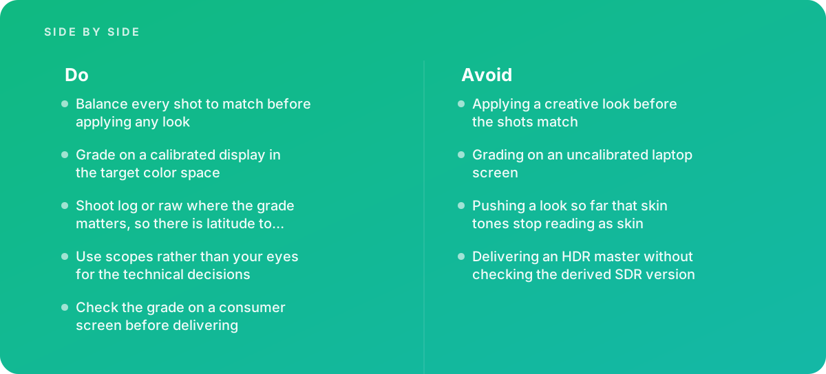
- Shoot log or raw for any project where the grade will do real work, and expose it to the camera's specification.
- Record a color chart at the start of each setup on multi-camera shoots.
- Grade on a calibrated reference display in a controlled room, with automatic display features turned off.
- Balance and match every shot to a hero shot before applying any creative look.
- Apply the look on a shared group or timeline node so one change updates the whole piece.
- Use waveform, parade and vectorscope for levels, neutrality, matching and skin tone.
- Protect skin inside strong looks with a key, and check it sits near the skin tone line.
- Keep the signal within legal range for broadcast and distribution specifications.
- Review the derived SDR version alongside any HDR master, and trim shots that fail.
- Check color tags on every export and view finals on a phone, a laptop and a television before sign-off.
When Color Grading Needs Outside Help
Many straightforward projects can be graded well in-house, particularly single-camera pieces in consistent light with a Rec. 709 web deliverable. The balance shifts when the job gets more complex, and there are clear signs that bringing in a specialist will save time and money.
The first sign is mixed sources. Footage from several camera brands, lighting conditions or shoot days takes skill and time to match, and the matching is invisible when it is done well and very visible when it is not. The second is dual delivery. If you need HDR and SDR versions, or broadcast and web versions with different specifications, the pipeline decisions and review work multiply. The third is the persistent symptom that a grade looks right only on the screen where it was made, which almost always points to a monitoring or color management problem rather than a creative one.
Other triggers include strict broadcast QC requirements, projects with composited or VFX shots that must sit inside the grade, and brand work where color consistency across a campaign of many videos matters. In those cases, an outside colorist working on calibrated equipment usually costs less than the internal hours spent chasing inconsistencies. You can see how we approach these projects on our video editing and production services page, and browse more practical guides in our video editing and production articles.
Whoever does the work, the same questions are worth asking up front: what working space and deliverables are planned, what display the grade will be approved on, how many review rounds are included, and how the SDR and consumer-screen checks will be handled. Clear answers to those questions are a better predictor of a good result than any showreel of dramatic looks.
Where this comes from
- International Telecommunication Union — ITU-R BT.709 and BT.2100
- Academy Color Encoding System — ACES documentation
- Blackmagic Design — DaVinci Resolve color management
The figures and practices above come from the sources listed.
Working on something like this?
We take on Video Editing & Production work for teams who want it done once, properly. Tell us what you are building and we will tell you honestly whether we are the right studio for it. Start a project.
Where to go next
Spotted something wrong? Report an error on this page. We correct on the page and say what changed.