A Practical Guide to Scroll-Triggered Animation
Learn how to plan, build and test scroll-triggered animation that guides attention without hurting speed or accessibility, with a checklist for every step.
 Tomas Lindqvist

Scroll-triggered animation is motion on a web page that starts, or progresses, as the visitor scrolls. A headline fades up as it enters the viewport, a product diagram assembles itself as you move down the page, a chart draws its bars once the section is actually on screen. Done with restraint, scroll-triggered animation works like a good editor: it paces the story, points the eye at what matters next and rewards attention. Done carelessly, it produces pages that stutter on phones, hide content behind effects that never fire and make some visitors physically uncomfortable.
This guide is for the people who commission, design and build these pages: marketers planning a launch page, in-house designers specifying motion, developers implementing it, and business owners trying to judge whether a studio's proposal is sensible. It is organized as a checklist. The master list comes first, and each section after it explains why one item matters and how to do it well, with the specific APIs, numbers and test procedures involved.
The underlying principle is simple. Scroll is the visitor's control, not yours. Every decision below follows from respecting that: animation should respond to scrolling, never fight it, and the page should be complete and usable even if none of the animation ever runs.
- Every animated moment has a stated job: guiding attention, explaining a sequence or marking a transition.
- All content is visible, readable and usable with JavaScript off and animation disabled.
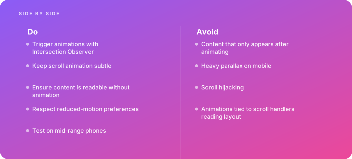
- Entrance effects are triggered with Intersection Observer, not with scroll event listeners.
- Scroll-linked (scrubbed) effects use CSS scroll-driven animations where supported, behind a feature check.
- Only transform and opacity are animated on scroll; nothing that forces layout or heavy repaint.
- Motion is subtle: short distances, short durations, calm easing, and each effect plays once.
- The prefers-reduced-motion setting is honored with a genuinely reduced experience.
- Native scrolling is never hijacked, and heavy parallax is removed or simplified on mobile.
- The page is tested on a mid-range Android phone with a recorded performance trace, not only on a desktop.
- A plan exists for review, handoff and maintenance of the motion system.
1. Give Every Scroll Animation a Job Before Anyone Builds It
The most common failure in scroll-triggered animation is not technical. It is animating things because the tooling makes it easy. When every card, heading and image slides in, nothing stands out, the page feels slower to read, and the effects that actually carry meaning are lost in the noise. So the first checklist item is editorial: write down, for each animated moment, what it is for.
In practice, legitimate jobs fall into a short list:
- Directing attention. A key figure or call-out gains emphasis when it arrives, so the reader notices it at the right moment in the argument.
- Explaining a sequence. A process, assembly or cause-and-effect chain is revealed step by step as the reader moves through the matching text. This is where scroll storytelling earns its cost.
- Showing change over a dimension. A chart that fills in, a timeline that advances or a before-and-after comparison can map naturally to scroll progress.
- Marking a transition. A section change, a new chapter or a shift in tone can be signaled with a restrained transition so the reader knows the context has changed.
Anything that does not fit one of these jobs is decoration, and decoration should be cut first when performance or accessibility is at stake. A useful exercise is to write a one-line motion note next to each section of the wireframe, for example, "Section 3: the four steps highlight in order as the text for each step scrolls into view; purpose: sequence." If a section's note reads "fades in because the others do," that is a candidate for removal.
This also shapes the budget. Explanatory sequences, such as the kinds of builds covered in our guide to getting product assembly animation right, need storyboards, asset preparation and several rounds of review. Simple entrance fades need a shared rule in the stylesheet and nothing more. Separating the two in the plan makes quotes and timelines far more honest, a point we come back to in scoping animation projects.
Tip: Limit yourself to one "hero" scroll sequence per page and a single, consistent entrance treatment for everything else. Readers learn the pattern quickly, and your engineering and testing effort goes where the story needs it.
2. Make Content Readable Without the Animation
A page that uses scroll-triggered animation should be finished and fully readable before any animation code runs. This sounds obvious, but a widespread pattern breaks it: elements are hidden in CSS (for example, set to zero opacity and shifted down) and only revealed when a script adds a class. If that script fails to load, errors out, loads slowly on a poor connection, or never sees the element intersect, the content simply stays invisible. The same thing can happen to search engine renderers, screenshot tools, print stylesheets, and readers using in-page find to jump straight to a paragraph.
Hide content only when you know you can reveal it
The robust pattern is progressive enhancement. The default state in CSS is fully visible. Only once JavaScript has run and confirmed that it can observe elements does it add a class to the root element, such as motion-ready, and only styles scoped under that class set the pre-animation state. If anything in the chain fails, the class is never added and the content stays visible. A second safeguard is to reveal all pending elements after a timeout, or when the page is printed, so an edge case never leaves text hidden.
Avoid effects that change meaning
Some effects do more than delay visibility; they make the content depend on the animation. Text that is only legible once letters fly into place, charts whose values are only shown as the bars grow, and comparisons that only make sense mid-transition all fail readers who cannot or do not want to watch the motion. The test is to take a screenshot of each section in its final state and in its initial state. The final state must be complete on its own, and the initial state should never be something a reader could get stuck looking at.
Layout stability matters here too. If animated elements take up no space until they arrive, the page jumps as they appear, which is both disorienting and measurable as layout shift. Reserve the space for every element from the start and animate only its appearance, not its footprint.
Content that only appears after animating is the single most damaging scroll animation mistake, because it fails silently. The page looks perfect in the designer's browser and is blank for the visitor whose script was blocked.
3. Trigger Entrance Effects With Intersection Observer
For most scroll-triggered animation, the question the code needs to answer is simple: has this element come into view yet? The browser has a purpose-built API for exactly that. As documented in MDN Web Docs on the Intersection Observer API, an observer lets the browser notify your code asynchronously when a target element starts or stops intersecting the viewport (or another container), without your script having to measure anything on every scroll.
Why not a scroll listener?
The older approach attached a function to the scroll event and, inside it, asked each element where it was, typically with getBoundingClientRect or offsetTop. Scroll events can fire many times per frame on some devices, and every one of those layout reads can force the browser to recalculate layout if anything has changed since the last frame. Multiply that by dozens of elements and you get the stutter, often called jank, that makes a page feel broken. Intersection Observer moves the geometry work into the browser's own pipeline, where it is done efficiently, and only calls your code when something meaningful happens.
Configuring the observer well
Three options shape how an observer behaves, and each is a design decision, not just a technical detail:
- threshold sets how much of the element must be visible before the callback fires. A value around 0.15 to 0.25 works well for entrance effects: the element is clearly arriving but the animation starts before the reader's eye is on it. A threshold of 1.0 on a tall element may never fire on a short phone screen, which is a common source of "invisible section" bugs.
- rootMargin grows or shrinks the effective viewport. A negative bottom margin, such as minus 10 percent, delays triggering until the element is a little way up the screen. A positive margin can be used to start loading heavy assets before they are needed.
- root defaults to the viewport. Set it only when the animated content scrolls inside its own container, such as a horizontal carousel.
Two implementation habits prevent most problems. First, use one observer for many elements rather than one observer per element; the callback receives a list of entries, so a single observer scales cleanly. Second, for one-time entrance effects, call unobserve on each element once it has animated. That stops further callbacks, prevents elements from animating again every time the reader scrolls back up, and keeps the page's work to a minimum.
Finally, keep the observer callback tiny. It should add a class or set a data attribute, and let CSS transitions do the actual motion. Logic-heavy callbacks reintroduce the main-thread work you were trying to avoid.
4. Use CSS Scroll-Driven Animations for Scrubbed Effects
Intersection Observer answers "is it in view?" Some effects need a different question: "how far through this section is the reader?" A progress bar across the top of an article, an image that zooms slightly as its section passes, or a diagram whose parts move in step with the reader's position are scrubbed effects, meaning the animation's progress is tied directly to scroll position and reverses when the reader scrolls back.
These used to require a scroll listener that computed progress and updated styles on every frame, which is the pattern most likely to cause jank. CSS now offers a declarative alternative. As explained in web.dev's guide to scroll-driven animations, you can bind an ordinary CSS keyframe animation to a scroll timeline instead of a clock, using the animation-timeline property with the scroll() function (progress through a scroll container) or the view() function (progress of an element through the viewport). The animation-range property then sets where in that journey the animation starts and ends, for example, from when the element enters until it is fully in view.
Why the CSS route is better when it is available
- The browser can run animations of transform and opacity off the main thread, so they stay smooth even while scripts are busy.
- There is no JavaScript to load, parse or debug for the effect itself, which removes an entire category of failure.
- Scrubbed motion stays perfectly in sync with the scroll, because it is driven by the same position the browser is already tracking.
Ship it as an enhancement
Browser support for scroll-driven animations has been arriving at different times in different engines, so check current support before relying on it, and treat it as progressive enhancement. Wrap the rules in a feature query such as @supports (animation-timeline: view()) so that browsers without support simply show the static, final state. If an effect is essential to the story and must work everywhere, the fallback can be a simple Intersection Observer trigger that plays the animation once in time rather than scrubbing it. Libraries that offer scroll-linked timelines are also an option, but weigh the added script weight against what CSS already does natively.
Keep scrubbed effects rare. Because they respond to every pixel of scrolling, they draw more attention than entrance effects and create more work for vestibular-sensitive readers. A reading progress bar or a single explanatory diagram is plenty for most pages.
5. Animate Only Transform and Opacity
Which properties you animate matters as much as how you trigger them. Browsers render a page in stages: they calculate styles, work out layout (the size and position of every box), paint pixels, and composite layers together. Changing a property like width, height, top, margin or font-size forces layout to be recalculated, which can ripple through the whole page. Changing properties like box-shadow, filter blur or background may force expensive repainting. Changing transform and opacity can usually be handled at the compositing stage alone, which is the cheapest path and the one the browser can often run on a separate thread.
In practice this means translating an element rather than changing its top offset, scaling it rather than changing its width, and fading with opacity rather than toggling visibility with a color change. Clip-path reveals can look elegant but are more expensive than a simple transform on many devices, so test them before committing. Large blur filters, animated shadows and full-screen background changes are the usual suspects when a page that felt smooth on a laptop stutters on a phone.
Use will-change sparingly
The will-change property tells the browser to prepare an element for animation, typically by promoting it to its own layer. Applied to a handful of elements just before they animate, it can help. Applied to every animated element on a long page, it can consume a large amount of graphics memory and make things worse, particularly on phones. A sensible rule is to add it only for elements that animate continuously, such as a scrubbed hero image, and remove it after one-off animations finish.
Never read layout in the middle of writing it
If your code must measure elements, read all measurements first and then write all style changes, and do both inside a requestAnimationFrame callback. Interleaving reads and writes, such as reading an element's height, changing its style, and then reading the next element's height, forces the browser to recalculate layout repeatedly within a single frame. This pattern, often called layout thrashing, is the direct cause of the "scroll handlers that read layout cause jank" problem, and it is worth searching any inherited codebase for it.
6. Keep Scroll Motion Subtle and Consistent
Subtle scroll animation is not a compromise; it is what makes the effect feel polished rather than gimmicky. Large movements draw the eye away from the text, slow the reader down and are the effects most likely to trigger discomfort. The guidance below reflects common practice in interface motion design and is a starting point to tune by eye, not a rule set in stone.
| Parameter | Subtle starting point | Signs it is too much |
|---|---|---|
| Entrance travel distance | Roughly 8 to 24 pixels | Elements visibly slide across the column; text is unreadable mid-move |
| Entrance duration | Roughly 200 to 500 milliseconds | Readers wait for content; fast scrollers see a queue of pending animations |
| Stagger between items | Roughly 40 to 100 milliseconds | The last item in a list arrives long after the reader has moved on |
| Scale change | A few percent at most | Content appears to lunge toward the viewer |
| Easing | Ease-out curves that decelerate into place | Bounces and overshoots on body content |
| Repetition | Play once per page view | Elements re-animate every time the reader scrolls back |
Consistency matters as much as restraint. Define a small set of motion tokens, such as two or three durations, one or two easing curves and a standard travel distance, and use them everywhere. This gives the page a coherent feel and makes changes cheap: if review feedback says entrances feel sluggish, one variable changes rather than forty. The same thinking applies to interface feedback, which we cover in microinteraction animation done properly; scroll motion and interaction motion should feel like they come from the same system.
Also consider the fast scroller. Many readers flick quickly down a page to scan it. If every element waits for its own staggered entrance, a fast scroller arrives at a section that is still mostly blank. Short durations, small staggers and a cap on how many items in a group animate individually (for example, animate the first four cards and let the rest appear together) keep the page responsive to how people actually read.
Always review motion at real reading speed and at fast scanning speed. A sequence that looks elegant when scrolled slowly in a design review often feels sluggish to someone skimming for a single answer.
7. Respect Reduced-Motion Preferences Properly
Every major operating system lets users ask for less motion, and browsers expose that choice to web pages through the prefers-reduced-motion media query. People turn it on for many reasons: vestibular disorders, in which on-screen movement can cause dizziness or nausea; migraine; attention-related conditions in which motion is distracting; or simple preference. Scroll-linked motion is a particular concern, because the movement is tied to the reader's own action and can create a sense of the page moving differently from how their hand is moving. The Web Content Accessibility Guidelines address this in success criterion 2.3.3, Animation from Interactions, which asks that motion triggered by interaction can be disabled unless it is essential.
What "reduced" should mean
Honoring the preference does not have to mean removing all change. A good reduced-motion mode typically:
- Removes parallax, scrubbed movement, zooms and any translation or scaling tied to scroll.
- Replaces entrance slides with a simple, short opacity fade or with no transition at all.
- Shows scrubbed explanatory sequences as a series of static states, for example, the diagram at each step placed beside its paragraph.
- Keeps functional feedback, such as a focus state or a progress indicator that updates without motion.
Build it in from the start
The simplest implementation is to write motion rules inside a @media (prefers-reduced-motion: no-preference) block, so motion is opt-in and the reduced state is the default. In JavaScript, check window.matchMedia for the same query before initializing any animation library, and listen for changes so a user who switches the setting mid-session gets the reduced experience immediately. Some sites also add a visible "reduce motion" toggle, which helps people who have not found the operating system setting or who want less motion on one site only.
Myth: Reduced motion is a niche setting, so a quick global rule that sets every animation duration to near zero is enough.
Reality: Zeroing durations can leave elements stuck in their hidden starting state, break scripts that wait for animation-end events, and still show content jumping into place. Design the reduced experience deliberately, and test it with the setting actually turned on.
8. Never Hijack Scrolling, and Tame Parallax on Mobile
Scroll hijacking means taking control of scrolling away from the browser: snapping the page a full screen at a time on each wheel tick, slowing or accelerating scroll speed, converting vertical scroll into horizontal movement, or locking the page while an animation plays. It is usually introduced to make a storytelling sequence feel cinematic, and it is almost always a mistake. It breaks the momentum and inertia people expect from their trackpad or finger, interferes with keyboard navigation, screen readers and browser find, disrupts the back button's scroll restoration, and feels different on every device. When a reader's scroll does not produce the movement they expect, the natural response is to leave.
The better pattern for cinematic sequences is the sticky scene. A tall section contains a child element set to position: sticky, which stays pinned in view while the reader scrolls through the section's height. The reader's normal, native scroll drives progress through the scene, typically with a scroll-driven animation or an observer on step markers, and when the section ends the page carries on scrolling normally. The reader never loses control, and scroll speed remains exactly what they are used to. For linear structure without hijacking, CSS scroll snap is also available, but use it gently and test it with keyboards and assistive technology.
The parallax trade-off
Parallax, where background and foreground layers move at different speeds, is the most requested scroll effect and the one most likely to cause trouble on phones. The decision is a genuine trade-off, so it helps to lay it out plainly.
Pros
- Adds a sense of depth and craft to hero sections and chapter openers.
- Can separate a narrative layer from supporting imagery in long-form storytelling.
- Subtle, single-layer parallax built with scroll-driven animations is inexpensive on modern desktop browsers.
Cons
- Multi-layer parallax on large images is a frequent cause of dropped frames on mid-range phones.
- Scroll-linked movement is a known trigger for vestibular discomfort.
- Implementations using scroll listeners or background-attachment: fixed behave inconsistently across mobile browsers.
- Large offset images add download weight that competes with content.
A workable policy for most commercial sites: allow at most one subtle parallax layer per page on larger screens, implemented with transform through CSS scroll-driven animations; replace it on small screens (for example, below a tablet-width breakpoint) with a static image or a single entrance fade; and remove it entirely under reduced motion. That keeps the atmosphere where devices can afford it and protects the readers who cannot.
9. Test Scroll-Triggered Animation on a Mid-Range Phone
Scroll animation is usually designed and approved on fast laptops and flagship phones, which hide performance problems. Most of your visitors are not on the fastest hardware. The reliable fix is a testing routine that includes a mid-range Android phone, a couple of years old, over a realistic connection. Emulated CPU throttling in desktop developer tools is useful for quick checks, but it does not reproduce a real phone's graphics hardware, memory limits or thermal throttling, so it should supplement real-device testing rather than replace it.
- Set a frame budget. At a 60 Hz refresh rate the browser has about 16.7 milliseconds to produce each frame; at 120 Hz, about 8.3 milliseconds. Scripts, style recalculation, layout, paint and compositing all have to fit inside that window.
- Record a performance trace while scrolling. Connect the phone to a desktop browser's remote debugging tools, start a recording, scroll through the page at a normal pace and then quickly, and stop.
- Look for long frames and their causes. Check for long tasks on the main thread, repeated forced layouts, and large paint areas during scroll. Each points to a specific fix covered earlier in this checklist.
- Test the edge cases. Try a fast flick to the bottom, a jump via an anchor link, the browser's back button, landscape orientation, text zoomed to 200 percent, and the reduced-motion setting turned on.
- Test with scripts failing. Block the animation script or disable JavaScript and confirm every piece of content is still visible.
- Retest after content changes. New images, extra sections and third-party tags change the performance picture, so repeat the trace before each major release.
Worked example: fixing a stuttering launch page
The following example is illustrative, with realistic but hypothetical numbers, to show how the checklist turns into decisions. A software company's launch page has a hero with three parallax layers, a features section where twelve cards slide in, a scrubbed product diagram, and a pricing section. On the team's laptops it looks smooth. On a mid-range test phone, the recorded trace shows the problems below.
| Section | Original approach | Observed on test phone (illustrative) | Change made | After change (illustrative) |
|---|---|---|---|---|
| Hero | Three parallax layers moved by a scroll listener that read each layer's position | Frames often taking 30 to 45 ms while scrolling, well over the 16.7 ms budget | One layer kept on large screens via CSS scroll-driven animation; static image on phones | Scrolling frames within budget in the trace |
| Features | Twelve cards, each with its own observer, 600 ms slide of 80 px, 150 ms stagger | Last card appeared about 2.3 seconds after the section arrived; fast scrollers saw blank space | One shared observer, 16 px travel, 300 ms, 60 ms stagger capped at four cards | Whole group visible in well under a second |
| Product diagram | Scrubbed with a script animating width and top of each part | Repeated forced layouts on every scroll event | Parts moved with transform only, driven by a view() timeline inside a sticky scene | No forced layouts during scroll |
| Pricing | Hidden until an animation class was added | Pricing invisible when the script was blocked | Visible by default; pre-animation state only under a motion-ready class | Readable with scripts off |
The arithmetic behind the features fix is worth spelling out, because it applies to any staggered group. With a 150 ms stagger across twelve cards, the last card starts 11 × 150 = 1,650 ms after the first, and with a 600 ms duration it finishes at about 2,250 ms. With a 60 ms stagger capped at four individually animated cards (the remaining eight appear together with the fourth), the last animation starts at 3 × 60 = 180 ms and, at 300 ms duration, finishes at about 480 ms. The page keeps its sense of motion, but the reader never waits for content.
None of these changes removed the story. The hero still has depth on large screens, the features still arrive with a sense of rhythm, and the diagram still assembles as the reader moves through it. What changed is that each effect now costs a fraction of what it did and fails safely.
10. Plan Review, Handoff and Maintenance of the Motion System
Scroll-triggered animation lives inside a website that will keep changing. Copy gets longer, sections get reordered, new components are added by people who never saw the original motion spec. Without a plan for how motion is reviewed, documented and maintained, a carefully tuned page slowly drifts back toward the problems this checklist is designed to prevent.
Reviewing scroll motion with stakeholders
Scroll animation is hard to review from static mockups or exported videos, because its feel depends on the reader controlling the pace. Review on a staging link, on a phone as well as a desktop, and ask reviewers to comment on specific moments rather than general impressions: "the diagram step two arrives before I have read its caption" is actionable, while "make it more dynamic" is not. Our guide to reviewing animation with clients covers how to structure those rounds so feedback converges rather than expanding the scope.
Documenting and handing off
The motion system should be written down: the purpose of each scroll sequence, the motion tokens (durations, easing, distances), the reduced-motion behavior, which effects are enhancements behind feature queries, and the performance budget the page was tested against. When animated assets such as illustrations, Lottie files or rendered sequences are part of the page, their source files and export settings belong in the handoff too, as described in our guide to delivering animation source files. Well-organized artwork makes this easier from day one; see preparing artwork for animation for how layers and naming should be set up before motion work starts.
Maintaining it
- Add a performance check for key pages to the release process, repeating the mid-range phone trace when content or scripts change significantly.
- Keep the motion code in one place, driven by tokens and shared classes, so that new sections inherit sensible behavior.
- Audit third-party scripts periodically; analytics and marketing tags added later often compete for the same main-thread time as your animation.
- Revisit browser support for scroll-driven animations from time to time, since fallbacks written today may become unnecessary as support widens.
11. When Scroll Storytelling Needs a Specialist Team
Many teams can implement the basics in this checklist themselves: a shared Intersection Observer, a small set of entrance transitions, a reduced-motion block and a round of phone testing. The picture changes when scroll storytelling is the centerpiece of the page, for example, an interactive product explainer, an annual impact report, or a data story in which charts and diagrams must build in step with the narrative. These projects combine illustration or 3D assets, animation craft, front-end engineering and accessibility testing, and they must stay fast and accessible while doing it.
That is the point at which bringing in help usually pays for itself. Signs you have reached it include a sequence that needs custom assets animated frame by frame, a requirement for scrubbed 3D or complex diagram builds, a tight launch date with no time for performance iteration, or an in-house team without front-end motion experience. Data-heavy stories have their own accuracy demands, which we cover in scientific data animation done properly, and when you are evaluating partners, our guide to choosing an animation studio lists the questions to ask about process, testing and handoff.
When you brief a studio or freelancer, share the checklist in this article as part of the requirements. Ask how they will handle reduced motion, which effects will use CSS scroll-driven animations with fallbacks, what their performance budget and test devices are, and what documentation you will receive. A partner who answers those questions specifically is one who has shipped this kind of work before. If you would like to talk through a project with us, our motion graphics and animation services cover both the animated assets and the craft of putting them on the page.
Verdict Use scroll-triggered animation as an editing tool, not as decoration. Give each effect a job, keep content visible without it, trigger with Intersection Observer, scrub with CSS scroll-driven animations behind a feature check, animate only transform and opacity, honor reduced motion, never hijack scrolling, and prove the result on a mid-range phone. Pages built this way keep the storytelling benefit of motion without paying for it in speed, accessibility or trust.
Where this comes from
- MDN Web Docs — Intersection Observer API
- web.dev — Scroll-driven animations
The figures and practices above come from the sources listed.
Working on something like this?
We take on Motion Graphics & Animation work for teams who want it done once, properly. Tell us what you are building and we will tell you honestly whether we are the right studio for it. Start a project.
Where to go next
Spotted something wrong? Report an error on this page. We correct on the page and say what changed.