How to Get Instructions for Use Animation Right
Learn how to plan, script, pace and review an instructions for use animation so it mirrors approved instructions, keeps every warning and stays in sync.
 Tomas Lindqvist

An instructions for use animation shows a person, step by step, how to use a device or product correctly. It usually sits alongside a printed leaflet, a quick reference guide or an on-pack diagram, and it is watched at the moment someone is about to use the product for the first time, or when they have forgotten how. Typical examples include a patient preparing an autoinjector at home, a caregiver assembling a nebulizer, a technician priming a pump, or a consumer setting up a water filter. The job of the animation is narrow and serious: help a real person perform the right actions, in the right order, with the right precautions.
That narrowness is what separates this work from marketing video. Animated steps genuinely improve comprehension, especially for people who struggle with dense text, but for regulated products such as medical devices the animation is not decoration. It becomes part of the official instructions, which means it must match the approved written instructions, carry the same warnings, go through the same review, and change when they change. A beautifully made animation that drifts from the leaflet is a liability, not an asset.
This field guide is for product managers, regulatory and quality teams, medical and technical writers, marketers who have inherited the request, and the animators who build the result. It moves from fundamentals (what the animation is and where it sits) through scripting, visual language, warnings, accessibility and review, to the advanced practice of version control and comprehension testing. Along the way it includes a worked example, a glossary and a clear view of when to bring in specialist help.
- What it is Animated, step-by-step instructions showing how to use a device or product correctly, usually alongside printed instructions.
- Source of truth The approved written instructions. The animation mirrors them; it never leads them.
- Regulated status For medical devices, instructions are regulated content, so the animation is reviewed and controlled like the leaflet.
- Who benefits most First-time users, people with limited literacy or reading fluency, and people using the product under stress.
- Non-negotiables Every step, in order, at a followable pace, with every warning and caution intact.
- Lifecycle Versioned with the instruction documents and updated whenever they change.
What an instructions for use animation is, and what it is not
The phrase "instructions for use" (often shortened to IFU) comes from regulated industries, where it names the document that tells the end user how to operate a product safely and effectively. An animated version takes that same content and presents it as moving pictures: a hand removes a cap, a dial turns to a dose, a device is held against the skin for a count of ten. The animation can be delivered on a product website, through a QR code on the carton, inside a companion app, on a clinic tablet, or as part of a training session.
It helps to be precise about the boundaries, because most problems start when a project drifts into a neighboring genre.
- It is not a promotional video. A launch film sells benefits and mood. An instructions animation teaches actions. If a shot exists to make the product look desirable rather than to show a step, it probably belongs elsewhere.
- It is not a mechanism explainer. Showing how a drug acts in the body, or how a sensor measures glucose, is a different brief with a different audience and a different review route. Our guide to getting mechanism of action animation right covers that territory.
- It is not a general explainer. A classic explainer simplifies an idea so it sticks. An instructions animation must not simplify away anything that affects safe use. The craft overlaps with explainer video animation, but the rules on completeness are stricter.
- It is not a replacement for the written instructions. In most regulated contexts the printed or electronic document remains the governing text. The animation supports it.
The closest cousin is assembly animation, which also depends on clear spatial sequences and consistent parts. If your product is mostly about putting components together rather than operating them, the guide to product assembly animation is a useful companion. The difference is that an IFU animation usually includes timing, dosing, body contact, disposal and warnings, which raises the stakes on accuracy.
Three questions that define the project
Before anyone opens an animation tool, answer three questions in writing. First, is the product regulated, and if so, is the animation considered part of labeling or of promotion in your jurisdiction and by your company's procedures? Second, which exact version of the written instructions does the animation represent? Third, who is the intended user, and in what setting will they watch it? The answers determine the review path, the script, the pacing and the delivery format, so they belong at the top of the brief.
Where the animation sits in the regulatory picture
For medical devices and similar regulated products, instructions are regulated content. In the United States, the U.S. Food and Drug Administration oversees device labeling as well as advertising and promotion, and material that tells users how to operate a device can fall under labeling requirements. Other jurisdictions have their own frameworks. The practical consequence for an animation project is the same almost everywhere: the content must be consistent with the approved instructions, it must not introduce claims or uses that are not in them, and it must pass through the company's formal review before publication.
This guide is not legal or regulatory advice, and classification questions should go to your regulatory affairs team. What it can do is describe how that status changes day-to-day production decisions.
- Scope is fixed by the approved text. The animator cannot add a helpful tip that is not in the instructions, however sensible it seems, without it going through the same approval.
- Wording is controlled. On-screen text and voiceover usually need to reproduce the approved wording, or an approved short form of it, rather than a paraphrase.
- Claims are off limits. Phrases such as "painless," "easy" or "fast" are claims. If they are not in the approved instructions, they do not belong in the animation.
- Records matter. Scripts, storyboards, review comments and final files become part of a documented trail. Plan for this from the first draft.
Products that are not regulated still benefit from the same discipline. A kitchen appliance or a power tool that is used wrongly can hurt someone, and consumer product safety expectations and liability exposure both reward animations that match the manual exactly. Treat the regulated workflow as the gold standard and scale it down deliberately, rather than starting from a marketing workflow and hoping it is enough.
Warning: Do not let an instructions animation be approved through a marketing-only review. If the product is regulated, the animation must be reviewed by the same functions that approve the written instructions, typically regulatory, clinical or medical, quality and legal, before it is published anywhere.
- Confirm in writing which review route applies before scripting starts.
- Keep the approved instruction version number on every script and storyboard page.
- Never publish a "draft for feedback" link on a public channel.
Starting from the approved written instructions
The single most important rule is to mirror the approved written instructions exactly. In practice, that means the written document is the input to the script, not a reference the writer glances at. The most reliable method is a traceability matrix: a table that maps each numbered step, warning and caution in the written instructions to a scene, a line of voiceover and an on-screen text element in the animation.
Building the traceability matrix
Take the approved document and give every instruction element an identifier, such as S3 for step three or W2 for the second warning. Then create a table with columns for the identifier, the approved text, the scene number, the voiceover line, the on-screen text, and the visual action. Every row must be filled. If an element has no scene, the animation is incomplete. If a scene has no element, the animation is adding content that has not been approved.
| Element ID | Approved text (summary) | Scene | Voiceover | On-screen text | Visual action |
|---|---|---|---|---|---|
| S1 | Wash and dry hands | 01 | Approved wording, verbatim | Step 1: Wash your hands | Hands washed and dried at a basin |
| W1 | Do not use if seal is broken | 02 | Approved wording, verbatim | Warning icon plus approved text | Close-up of intact seal, then a broken seal marked as unusable |
| S2 | Check expiry date and liquid | 03 | Approved wording, verbatim | Step 2: Check the date and liquid | Label close-up, then window showing clear liquid |
| C1 | Do not shake | 03 | Approved wording, verbatim | Caution icon plus approved text | Device held still; no shaking motion shown |
The matrix does three jobs. It lets reviewers check completeness quickly, it makes the order of steps visible and hard to scramble, and it becomes the change-control tool later, because when a line in the written instructions changes you can find every scene that depends on it.
Resolving ambiguities without inventing content
Written instructions often leave visual details open. The leaflet may say "hold the device at 90 degrees" without saying which hand, or "pinch the skin" without showing how much. The animator has to decide something, and every decision is a potential new instruction. Handle these by logging each ambiguity, proposing a visual interpretation, and getting it approved by the owner of the written instructions. Where the written instructions include diagrams, match them: the same grip, the same angle, the same orientation of the device. Users often move between the leaflet and the video, and any visible difference reads as a contradiction.
Tip: Ask for the source files behind the leaflet's line drawings, not just the PDF. Matching the exact device orientation, hand position and callout labels used in print is the fastest way to make the animation feel like the same set of instructions, and it removes a whole category of review comments.
Scripting and sequencing the steps
Steps out of order are one of the classic failures, and they usually creep in during editing, when a scene is moved to improve flow or a shot is reused. The defense is structural: one numbered step per scene, numbered on screen, in the same order as the written instructions, with no scene reordering after script approval unless the matrix is updated and re-reviewed.
One action per shot
Each shot should show one action with one outcome. "Remove the cap" is a shot. "Remove the cap and check the needle cover is off" is two shots, even if they flow together. This granularity makes the animation easier to follow and easier to review, because a reviewer can confirm each action against a single line of approved text.
Writing the voiceover
The voiceover is usually the approved text, read aloud. Where the approved text is too long to read over a single action, work with the instruction owner on an approved spoken version rather than trimming it in the edit. Plain language principles apply: short sentences, active voice, the imperative mood, and one instruction per sentence. The Microsoft Writing Style Guide is a useful public reference for this style of procedural writing, with guidance on writing numbered procedures, using consistent terms for interface elements, and keeping instructions direct.
A few scripting habits make a measurable difference to how easy the result is to follow:
- Name the part before you act on it: "Find the orange cap. Pull it straight off." The viewer's eye finds the part, then watches the action.
- Use the same name for a part every time. If the leaflet says "cap," never say "cover" or "lid" in the animation.
- State the success condition: "You will hear a click." "The window turns yellow." Users need to know when a step is complete.
- Put time-sensitive instructions where they happen, with a visible count or timer, rather than in a summary at the end.
Pacing that people can follow
Show each step at a followable pace. Instructions animations are often watched while the viewer is holding the product, which means they are glancing between the screen and their hands. That demands more time per step than a typical explainer, clear pauses between steps, and a way to replay or navigate by step. There is no universal number, but the following ranges are sensible starting points to test with real users, not rules.
| Element | Starting range to test | What drives it longer |
|---|---|---|
| Simple single action (remove cap) | 4 to 6 seconds | Small parts, unfamiliar grip, older users |
| Action with a success check (listen for click) | 6 to 10 seconds | Sound cues that need to be heard, visual indicators that change slowly |
| Timed action (hold for a count) | The full real-time duration plus 2 to 3 seconds | Never compress a timed step; show it in real time with a counter |
| Warning or caution card | Long enough to read the text aloud twice at a relaxed pace | Longer warning text, translation into longer languages |
| Pause between steps | 1 to 2 seconds | Viewers who follow along with the device in hand |
Timed steps deserve special attention. If the written instructions say to hold a device in place for ten seconds, the animation must show ten real seconds, ideally with a visible count. Speeding this up to keep the film short teaches the wrong behavior.
Keeping warnings and cautions intact
Animation that simplifies away warnings is the most dangerous mistake in this genre, and it is also the easiest to make, because warnings are inconvenient. They interrupt flow, they add length and they can make a product feel intimidating. None of that matters. Every warning and caution in the approved instructions belongs in the animation, at the point where it applies, with the same meaning.
Placing warnings where they act
A warning is most effective at the moment the risk arises. "Do not touch the needle" belongs on the shot where the needle is exposed, not in a list at the beginning. Some instructions also include a block of general warnings up front; if they do, reproduce that block too, and repeat the specific warnings in context. Reviewers should check both.
Visual conventions for hazards
Use a consistent visual treatment for warnings and cautions throughout: the same icon, the same color, the same position on screen and the same hold time. If the written instructions or packaging use standard symbols, such as those in ISO 15223-1 for medical device labeling or the ANSI Z535 or ISO 3864 conventions for safety signs, use the same symbols the printed material uses rather than inventing new ones. Consistency between print and screen matters more than visual novelty.
Showing the wrong action is sometimes useful, for example a seal that is already broken, or a device held upside down. When you do this, make the "do not" state unmistakable with a clear cross or stop symbol, a distinct color, and approved text, and follow it immediately with the correct action. Never leave the incorrect action as the last thing on screen. The broader techniques of making risk visible without scaring the viewer are covered in our guide to safety training animation.
Warning: Do not soften warning language to fit the tone of the animation. "Be careful with the needle" is not the same instruction as "Do not touch the needle," and a reviewer or regulator will treat it as a change in meaning.
- Use the approved warning text verbatim on screen.
- Do not cut a warning to hit a target runtime.
- Do not bury a warning under music or a busy background.
Visual language: style, perspective and on-screen text
The style of an instructions animation should serve legibility first. That rarely means the most elaborate style available. It means the style that makes each part, each action and each state change unmistakable.
2D, 3D or a hybrid
Both approaches work. 3D animation is often the right choice for physical devices, because a model built from CAD data guarantees accurate proportions, lets you rotate the product to the exact viewing angle the user will have, and makes updates easier when a component changes. Flat, simplified 2D animated video works well when the instructions already use line drawings, when the product is simple, or when the animation must be produced in many languages quickly. A hybrid, with 3D renders styled to look like the leaflet's line art, is a common way to get accuracy and visual continuity at once.
| Consideration | 2D | 3D |
|---|---|---|
| Match to leaflet line drawings | Very close if drawn from the same art | Achievable with line-art rendering styles |
| Geometric accuracy of the device | Depends on the illustrator | Strong when built from CAD data |
| Cost of a design change to the device | Redraw affected frames | Update the model, re-render affected shots |
| Hands and body contact | Simplified hands read clearly | Realistic hands need careful art direction to avoid distraction |
| Localization of visuals | Straightforward | Straightforward if text is kept out of textures |
Camera and perspective
Show actions from the user's point of view whenever possible. If the user holds the device in front of them, the camera should look over their shoulder or from their eye line, so that left and right on screen match left and right in their hands. Mirrored views cause mistakes. Avoid dramatic camera moves; a slow push-in to reveal a detail is useful, but orbiting shots that look impressive in a product film disorient someone trying to copy an action.
Hands, people and characters
Most IFU animations need hands, and hands are hard. They should look neutral and competent, grip the device the way the instructions describe, and never obscure the part being operated. Where full characters appear, keep them simple and representative of the intended users, and avoid expressions that imply a claim, such as a relaxed smile during an injection. Guidance on building characters that read clearly is in our article on designing characters for animation.
On-screen text
Text on screen should be large, high-contrast and on screen long enough to read. Number every step to match the written instructions. Keep text out of the 3D scene itself, in a separate layer, so it can be translated and updated without re-rendering. Use a sans-serif typeface with clear letterforms, and test legibility on the smallest screen the animation will realistically be watched on, which is usually a phone held at arm's length.
Designing for literacy, language and accessibility
One of the strongest reasons to animate instructions is that animation helps users who struggle with text. Someone with limited literacy, low reading fluency in the language of the leaflet, a cognitive impairment, or simply high stress in the moment can often follow a demonstrated action more reliably than a paragraph. That benefit is only realized if the animation is designed for those users rather than for a reviewer reading a storyboard at a desk.
Designing for low literacy
- Let the visuals carry each step on their own. Test by watching the animation with the sound off and the text hidden: can you still tell what to do?
- Keep on-screen text to the step number and a short approved label, with longer approved text in the voiceover and captions.
- Use consistent colors for parts, and refer to those colors if the written instructions do.
- Avoid idioms, metaphors and humor, which do not translate and can confuse.
Accessibility requirements to plan for
Plan for captions that reproduce the voiceover accurately, an audio description or a descriptive voiceover for people with low vision, a text transcript, and a player that supports pause, replay and step-by-step navigation. Check color contrast of text and warning elements, and never rely on color alone to signal a state change: pair a color change with a shape, symbol or sound. If the animation will be hosted on a website, the relevant accessibility standards for web content apply to the player and page as well. Techniques used in public information animation, which also has to work for everyone, transfer well here.
Localization
Translated instructions are usually approved separately, market by market. The animation must match the approved translation for each market, not a translation of the English animation script. Build the project so voiceover, captions and on-screen text are swappable layers, leave extra time in scenes for languages that run longer, and include each language version in the same review and version control as the source.
Tip: Run a "silent pass" review before any voiceover is recorded. Play the animatic with no audio and no text and ask someone unfamiliar with the product to describe each step. Every place they hesitate is a place where the picture is not doing its job, and fixing it at animatic stage costs far less than after final render.
Review, approval and version control
Publishing without review and versions that drift from the written instructions are two faces of the same problem: the animation is being treated as a creative asset rather than a controlled document. Fixing that is mostly process.
A staged review path
Review at every stage where a change is still cheap. For a regulated product, a sensible sequence is: script and traceability matrix; storyboard; animatic with scratch voiceover and timing; first render with final voiceover; final render with captions and localization. At each stage, the reviewers who approved the written instructions check the animation against the matrix. Creative reviewers can comment on clarity and craft, but they do not have authority over content.
Versioning the animation with the instructions
Version animations with the instruction documents. The animation file name, its metadata and ideally a small, unobtrusive end card should carry the identifier of the instruction version it represents, for example the leaflet document number and revision. Maintain a register that lists each animation, each language version, the instruction revision it matches, where it is published, and its approval record.
Instruction changes must propagate to the animation. When the written instructions are revised, the change control process should automatically trigger a check of every dependent animation. Because the traceability matrix maps each instruction element to scenes, the impact assessment is quick: find the changed element IDs, list the affected scenes, and decide whether the change needs new animation, new voiceover, new text or a full re-review.
Controlling where it is published
Drift often happens downstream. A sales team downloads an old version for a presentation, a distributor uploads it to their own channel, or a QR code points to a URL that nobody updates. Use a single canonical hosting location for each version, point QR codes and links to a stable address that you control and can redirect, and include retirement of old versions in the change process. Where a partner must host a copy, make updating it a contractual obligation.
Worked example: a prefilled pen animation (illustrative)
The following example is illustrative. It describes a plausible project for a generic single-use prefilled injection pen to show how the numbers and decisions fit together. It is not a real product or client.
The approved written instructions contain 9 numbered steps, 4 warnings and 3 cautions, for 16 instruction elements in total. Two steps are timed: a 30-minute wait for the pen to reach room temperature after removal from the refrigerator, and a 10-second hold during injection. The intended users are adults injecting at home, many for the first time, and some with limited reading fluency. The animation will be published in two languages and linked by a QR code on the carton.
Planning the runtime from the steps up
Rather than picking a target length and squeezing the content into it, the team estimates duration step by step using the starting ranges above.
| Segment | Count | Seconds each (estimate) | Subtotal (seconds) |
|---|---|---|---|
| Opening: product name, instruction version, "have your pen ready" | 1 | 8 | 8 |
| General warnings block | 1 | 15 | 15 |
| Simple steps | 5 | 6 | 30 |
| Steps with a success check | 2 | 9 | 18 |
| Room-temperature wait (shown with a time-lapse card stating 30 minutes) | 1 | 8 | 8 |
| 10-second hold, shown in real time plus lead-in | 1 | 13 | 13 |
| In-context warnings and cautions | 7 | 6 | 42 |
| Pauses between steps | 8 | 1.5 | 12 |
| Disposal and end card with version identifier | 1 | 12 | 12 |
| Total | 158 (about 2 minutes 40 seconds) |
Note the treatment of the two timed steps. The 30-minute wait is not shown in real time, because nobody would watch it; instead, a clearly labeled card states the approved instruction and shows a clock. The 10-second hold, by contrast, is shown at full length with a visible count, because it is an action the user performs while watching.
Review and change
The team reviews the script and matrix, the storyboard, the animatic and two renders. At animatic stage, a silent-pass review reveals that viewers confuse the needle cover with the cap, so the storyboard adds a labeled close-up of both parts, matching the leaflet's parts diagram. Six months later, the written instructions are revised to change the hold time. The matrix shows that this change affects one step element and one caution, which appear in two scenes. Those scenes are re-rendered with the new count, the voiceover lines are re-recorded in both languages, the end card is updated to the new instruction revision, and the full animation goes back through approval. The old version is retired from the QR code destination on the same day the revised leaflet ships.
The numbers in this example are planning estimates, not benchmarks. The point is the method: runtime is derived from the approved content and the user's pace, not imposed on it.
Testing comprehension with real users
An animation that passes internal review can still fail in use, because reviewers already know how the product works. Testing comprehension with real users is the only way to find out whether the animation actually teaches.
Who to test with
Recruit people who match the intended users: the right age range, experience level, and where relevant, dexterity, vision and literacy. Include first-time users. For regulated devices, your human factors or usability engineering team may already run formative and validation studies under standards such as IEC 62366-1, and the animation can be included in or aligned with that work. Coordinate with them rather than running a parallel study.
How to test
- Give each participant the product (or a training version of it) and the animation, in the setting where they would normally use it.
- Ask them to perform the task while using the animation, and observe without helping.
- Record where they pause, replay, look confused, skip ahead, or perform a step incorrectly.
- Afterward, ask open questions: what did the animation tell you to do at this point, what does this symbol mean, what would you do if the seal were broken?
- Map every observed error or hesitation back to a scene and an instruction element.
Small numbers of well-chosen participants reveal most of the serious usability problems in formative testing, and the fixes are usually specific: a longer hold on a step, a clearer close-up, a changed camera angle. If a problem traces back to the written instructions themselves, report it to their owners; the animation should not quietly fix a flaw in the approved text, because that would create a mismatch.
What to measure
Useful measures include task completion without assistance, the number of use errors per step, the number of replays per step, time on task, and correct answers to knowledge questions about warnings. Set acceptance criteria before testing, agree what counts as an error, and record results so the next revision can be compared against them.
Terms that matter in instructions animation
Teams working on these projects often come from different disciplines, and a shared vocabulary avoids expensive misunderstandings. The terms below are the ones that come up most often.
- Instructions for use (IFU)
- The document that tells the end user how to operate a product safely and effectively. For regulated products it is approved, controlled content.
- Labeling
- In regulated industries, the written, printed or graphic material that accompanies a product. Instruction content presented in other media may be treated similarly; your regulatory team confirms the classification.
- Traceability matrix
- A table that maps each element of the approved instructions to the scene, voiceover and on-screen text that presents it, used for review and change control.
- Warning
- A statement alerting the user to a risk of serious harm. It must appear with its approved wording, where the risk arises.
- Caution
- A statement alerting the user to a risk of minor harm or damage to the product, or to special care needed for safe and effective use.
- Animatic
- A timed sequence of storyboard frames with scratch audio, used to review pacing and comprehension before full animation.
- Use error
- A user action, or lack of action, that leads to a different result from the one intended by the manufacturer or expected by the user.
- Change control
- The formal process for proposing, assessing, approving and implementing changes to controlled documents and the materials that depend on them.
- Formative evaluation
- Usability testing done during development to find and fix problems, as opposed to validation testing that confirms a finished design is safe and effective to use.
When to bring in specialist help
Bring in help when instructions are regulated content. At that point the project needs people who understand controlled documents, review workflows and the difference between instructions and promotion, as well as animators who can build accurate, updateable assets. The signals that you have reached that point are usually clear.
- The product is a medical device, drug-device combination, or other regulated product. You need an animation partner who will work within your review and change control procedures rather than around them.
- You need many languages or markets. Localization multiplies versions, and each needs to match its own approved instructions.
- The product changes often. A CAD-driven 3D pipeline with text in separate layers makes revisions predictable instead of painful.
- You have no internal usability testing capability. Comprehension testing needs careful recruitment and neutral observation.
- The animation will sit alongside other patient or user education. A partner experienced in healthcare explainer animation can keep tone and terminology consistent across the set.
When evaluating a studio for this work, ask to see how they manage traceability and versioning, not just their showreel. Ask how they handle a mid-project change to the written instructions, how text and voiceover layers are structured for localization, and how they archive source files so that an update two years from now does not mean starting over. A studio offering animation and motion graphics services for regulated clients should be able to answer all of these concretely.
What to prepare before the first meeting
- The approved written instructions, with document number and revision.
- The source artwork and diagrams from the leaflet or quick reference guide.
- CAD files or accurate reference photos of the device.
- A description of the intended users and the setting where they will watch.
- The review route and the names of the approvers.
- The list of markets and languages, and where the animation will be hosted.
The short list to hold on to
An instructions for use animation succeeds when a real person, holding the product, can follow it correctly the first time, and when every frame of it can be traced to approved text. Those two tests pull in the same direction far more often than teams expect. Clear, one-action shots at a followable pace are easier to review. Warnings shown where they apply are easier to understand. A project built with separate text layers and a traceability matrix is easier to update when the instructions change, which they will.
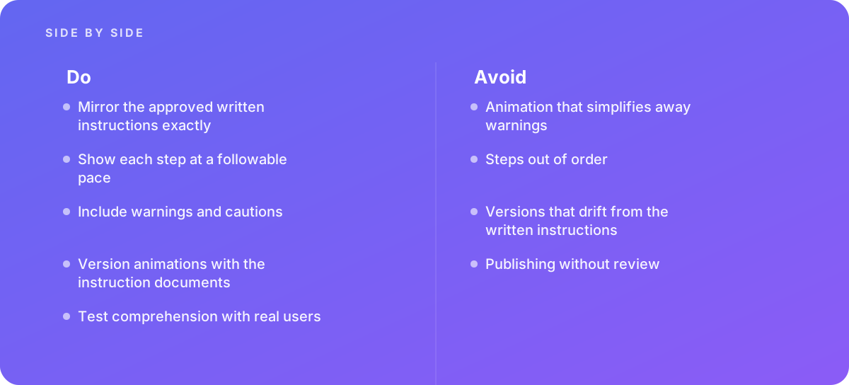
The discipline comes down to a short list: mirror the approved written instructions exactly, show each step at a pace people can follow, include every warning and caution, version the animation with the instruction documents, test comprehension with real users, and never publish without the same review the written instructions receive.
Verdict Treat an instructions for use animation as a controlled version of the approved instructions, not as a video about them. Build it from a traceability matrix, pace it for someone following along with the product in hand, keep every warning intact, and tie its version to the document it represents. When the product is regulated, bring in a team that already works this way.
Where this comes from
- U.S. Food and Drug Administration — Medical device advertising and promotion
- Microsoft Learn — Microsoft Writing Style Guide
The figures and practices above come from the sources listed.
Working on something like this?
We take on Motion Graphics & Animation work for teams who want it done once, properly. Tell us what you are building and we will tell you honestly whether we are the right studio for it. Start a project.
Where to go next
Spotted something wrong? Report an error on this page. We correct on the page and say what changed.