Transitions and Scene Changes: What Actually Works
Learn what cuts, dissolves, wipes and match cuts tell viewers, how to time them against sound, and how to build a consistent transition vocabulary.
 Tomas Lindqvist

Transitions and scene changes are the moments where one shot, scene or state becomes the next. In a live-action edit that might be a straight cut from a wide shot to a close-up. In an explainer animation it might be a chart morphing into a map. In a product interface it might be a card expanding into a full screen. Every one of those moments makes a claim to the viewer: that time has passed or has not, that we are still in the same place or somewhere new, that the subject is the same or has changed. A transition is a piece of grammar, and like any grammar it can be used precisely or carelessly.
This field guide is for the people who make and approve that grammar: editors and motion designers who build transitions every day, marketers and producers who sign off on cuts without always knowing why one feels right and another feels cheap, and in-house teams trying to give a video series or brand a consistent feel. It moves from fundamentals (what each type of transition means) through craft (timing, match cuts, sound) to advanced practice (interface motion, transition systems for series and brands, and diagnosing an edit that feels disjointed).
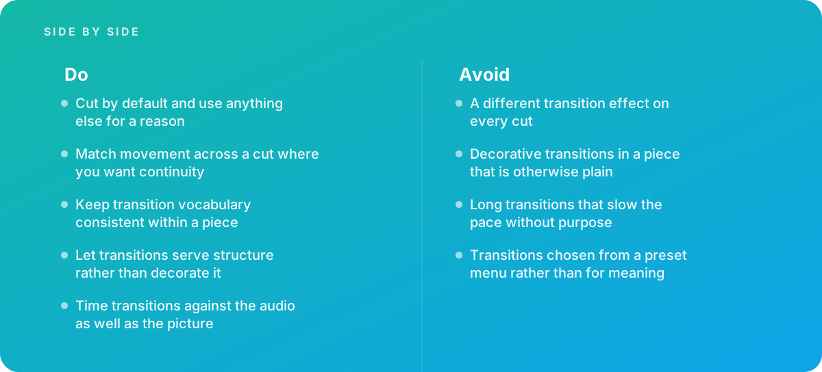
The short version is simple enough to fit on a sticky note: cut by default, and use anything else for a reason. The rest of this guide explains what those reasons are, how to execute them well, and how to spot the common failure where transitions are chosen from a preset menu rather than for what they say.
- Default choice The straight cut, which implies continuity and costs the viewer nothing to read.
- Dissolve Conventionally signals that time has passed or that two ideas are being linked.
- Wipes and graphic transitions Draw attention to themselves, so use them when the transition itself is the point.
- Match cut Links two shots through a shared shape, motion or composition.
- Audience literacy Viewers read these conventions whether or not they can name them.
- Consistency rule Keep one transition vocabulary per piece, and time every transition to the audio as well as the picture.
How Transitions and Scene Changes Communicate Meaning
Film and video editing developed a shared vocabulary over roughly a century of practice, and audiences absorb it by watching. Nobody teaches a viewer that a slow dissolve between a character asleep and the same character eating breakfast means "the next morning," yet almost everyone reads it that way. That shared literacy is what makes transitions useful, and it is also what makes misusing them costly. If you put a dissolve between two shots that happen at the same moment, the audience will still read "time passed," and the piece will feel slightly wrong even if no one can say why.
It helps to think of each transition as answering three questions for the viewer:
- Time: Is this the same moment, a moment later, or a different time altogether?
- Place: Are we in the same location, a new location, or an abstract space such as a graphic or diagram?
- Subject: Are we still following the same person, product or idea, or has the focus shifted?
A straight cut between two angles of the same conversation answers "same time, same place, same subject." A dissolve from a city skyline at dusk to the same skyline at night answers "later, same place, same subject." A wipe from a product demo to a pricing graphic answers "we are changing topic, and we want you to notice." When the answer the transition gives matches the answer the content needs, the viewer does not notice the transition at all. When they conflict, viewers experience friction without knowing its source.
The table below summarizes the common families and what they conventionally say. Treat it as the baseline meaning audiences bring with them; you can play against it, but only deliberately.
| Transition | What it conventionally says | Typical use | Main risk |
|---|---|---|---|
| Straight cut | Continuity: same flow of time, attention moves | Almost everything | Jarring if angles or action do not match |
| Dissolve (cross-fade) | Time has passed, or two things are linked | Montage, time jumps, reflective moments | Softens pace; implies a time jump you did not intend |
| Fade to or from black | A chapter ends or begins; a strong pause | Openings, act breaks, endings | Feels final; kills momentum mid-piece |
| Dip to white | A flash, memory, or bright reset | Flashbacks, energetic resets, some brand styles | Reads as cliché when overused |
| Wipe, push, slide | "We are changing section," and the transition wants to be seen | Topic changes in explainers, split screens, retro styling | Draws attention away from content |
| Match cut | These two things are connected by shape or motion | Linking ideas, eras, products or places | Feels forced if the match is weak |
| Morph or shape transition | One idea becomes another | Motion graphics, data stories, logos | Slow and self-indulgent if overlong |
| Hidden or whip transition | Seamless continuity, energy | Social video, travel, sports, one-take illusions | Distracting when used as a trick without purpose |
Editing software documentation reflects this vocabulary too. Tools such as those described in Adobe's help documentation on applying video transitions offer dozens of effects, but the core families above cover the choices that carry meaning. Everything else is a stylistic variation on one of them.
The Straight Cut: Why It Should Be Your Default
The cut is the transition audiences have seen most often, so it is the one they process with the least effort. It says "keep watching; the story continues." That is why most professional edits are overwhelmingly made of cuts, and why an edit that feels polished often contains fewer effects than one that feels amateur. A cut is invisible when it is done well, and invisibility is usually what you want.
That does not mean every cut is easy. Cuts go wrong for predictable reasons, and most of them are about continuity rather than the cut itself.
What makes a cut feel smooth
- Cutting on action. If a person stands up in a wide shot, cut to the medium shot while they are in the middle of standing, not before or after. The eye follows the motion across the cut and does not register the change of angle. A useful practice is to overlap the action slightly, letting a few frames of the movement repeat, because the brain tends to lose a fraction of the motion at the moment of the cut.
- A meaningful change of size or angle. Cutting between two shots that are nearly identical in framing produces a jump cut, where the subject appears to twitch. Unless you want that effect, change shot size clearly (wide to medium, medium to close-up) or change camera angle substantially.
- Screen direction and eyelines. If a character exits frame left, they should usually enter the next shot from frame right to preserve direction of travel. If two people are talking, their eyelines should look toward each other across the cut. Breaking this without intent confuses geography.
- Motivation. The best cuts answer a question the viewer has just started to ask. Someone looks off-screen; we cut to what they see. A presenter says "here is the result"; we cut to the result.
Cuts in animation and motion graphics
Motion designers sometimes avoid cuts because the software makes continuous animation feel natural and every scene seems to need a flourish in and out. But cuts work just as well in animation. A hard cut from a wide illustrated cityscape to a close-up of one window reads instantly, costs nothing to produce, and keeps pace brisk. In explainer animation, a clean cut between scenes often reads as more confident than a morph, because it trusts the viewer to keep up.
Tip: Before adding any transition effect, try the plain cut first and watch it at full speed, not scrubbing. If the cut works, keep it. Only reach for another transition when you can say in one sentence what it adds, such as "shows that three months passed" or "signals we are moving from problem to solution."
One more reason to default to cuts is pacing. Every non-cut transition has a duration, and those durations accumulate. A 90-second piece with fifteen one-second dissolves has spent fifteen seconds, a sixth of its running time, in the space between shots. For short social formats this matters even more; our guide to pacing for social video animation explains why every second of a feed video has to earn its place.
Dissolves, Fades and Dips: Transitions That Mark Time
The dissolve blends the end of one shot into the start of the next, with both images visible for a period. Its conventional meaning is the passage of time, and a secondary meaning is association: two things are being linked in the viewer's mind. Documentaries use dissolves to compress a long process into a few seconds. Corporate films use them in montages to suggest a broad range of activity without implying a sequence. Music videos use them for mood.
Choosing a dissolve length
There is no single correct duration, but the length changes what the dissolve says. As a working guide rather than a rule:
- Very short dissolves (a handful of frames): Often used to soften a cut that is slightly rough, such as a small jump in an interview. They read almost as cuts and imply little or no time jump. Editors sometimes call these soft cuts.
- Medium dissolves (roughly half a second to a second): Signal a modest shift, such as a later moment in the same scene or a gentle move between montage images.
- Long dissolves (well over a second): Feel reflective, dreamlike or significant. They can suggest a large time jump or a memory. Used casually, they slow a piece to a crawl.
Frame counts depend on your project frame rate, so it helps to think in frames once you know the timebase. At 24 frames per second, twelve frames is half a second; at 30 frames per second, fifteen frames is half a second. If you work across different frame rates, especially for web delivery, our guide to frame rates for web animation covers how timing translates between them.
Fades and dips
A fade to black is a dissolve into nothing. It says "this part is over," which makes it powerful at the ends of acts or at the very end of a piece and awkward in the middle of a flowing sequence. A fade from black opens a piece or a chapter. A dip to black (fade out, then immediately fade in) marks a stronger break than a dissolve without the finality of a full fade and hold.
A dip to white or a flash frame is louder. It can suggest a camera flash, a memory, an impact or a burst of energy. Some brand styles use white dips deliberately as part of their identity. Used without that intention, they tend to read as dated.
Blend quality and technical traps
Dissolves between images with very different brightness can pass through a muddy midpoint, where neither image is legible. Editors often address this by adjusting the curve of the dissolve, choosing a non-additive or film-style dissolve where the software offers one, or choosing a moment where the two shots share a similar tonal range. Dissolves also need handles: extra frames beyond each clip's in and out points. If the source clip ends at the exact frame you cut to, the software has nothing to blend with and will either shift the transition or freeze a frame.
Warning: Dissolves between two shots that happen at the same moment in time will make the audience think time has passed. This is the most common misuse of the dissolve in corporate and explainer video, usually introduced because an editor wanted to "smooth" a cut between two interview angles. Use a straight cut, a cutaway, or a very short soft cut instead.
Wipes, Pushes and Graphic Transitions: When Drawing Attention Is the Point
Wipes, pushes, slides, zooms, spins and graphic transitions share a defining trait: they draw attention to themselves. That is not automatically bad. It is simply what they do. The question is whether you want the audience to notice the change at that moment.
Good reasons to use a visible transition include:
- Marking a change of section. In a long explainer or training video, a branded wipe between chapters tells the viewer "new topic." It works like a heading in a document.
- Style and period. Iris wipes and hard-edged horizontal wipes evoke particular eras of film and television. A retro piece may use them for texture.
- Brand identity. If a brand's motion system includes a signature shape, such as a diagonal band from the logo or a particular color panel, carrying that shape into transitions can reinforce identity, provided it is used consistently and sparingly.
- Split-screen and comparison. A push or slide that holds both images on screen for a moment can set up a before-and-after comparison.
Poor reasons include "the edit felt boring," "the client asked for something more dynamic," and "the software has a new pack." A visible transition used decoratively in a piece that is otherwise plain draws the eye to the one element that carries no information.
Designing a graphic transition that earns its place
When a graphic transition is justified, design it like any other piece of motion rather than dropping in a preset. Consider the direction of travel (left to right often reads as forward in cultures that read left to right, which matters when localizing), the easing (a transition that accelerates in and decelerates out feels physical; one with linear motion feels mechanical), and whether the transition shape relates to anything else in the piece. Our guide to localizing motion graphics covers how directional motion and reading order interact in right-to-left markets.
Duration matters too. Many graphic transitions work well at somewhere between a third of a second and just under a second. Much longer and they stop being a transition and become a scene of their own. Long transitions that slow the pace without purpose are one of the most common reasons an edit feels sluggish.
Match Cuts and Motivated Transitions
A match cut links two shots through something they share: a shape, a movement, a color, a composition or a sound. The classic examples in film history match a spinning object with another spinning object from a vastly different time or place, and the audience understands the connection instantly. In commercial and motion work, match cuts are one of the most effective tools you have, because they create continuity and meaning at the same time.
Types of match
- Graphic match: Two shots share a shape or composition. A round coffee cup seen from above becomes a round clock face. A product silhouette becomes the same silhouette in a different color.
- Movement match: Motion continues across the cut. A hand swipes left across a phone, and the next shot continues the leftward movement in a different setting.
- Color or tone match: A dominant color carries across, linking two spaces or moods.
- Sound match: A sound in one shot is echoed by a similar sound in the next, such as a door slam matching a gavel.
Match cuts depend on planning. It is possible to find them in existing footage, but the strongest matches are designed at the storyboard or shoot stage, with position, scale and direction of movement specified so the two shots line up. In animation you have complete control, which makes match transitions one of the best reasons to storyboard carefully.
Tip: To align a match cut precisely, put a guide or a temporary marker on the key shape in the outgoing shot, then position, scale and rotate the incoming element to sit on that marker for the first frame after the cut. Check it at full speed: a match that lines up perfectly when paused can still feel off if the motion speeds differ across the cut.
- Match speed as well as position; a slow pan cutting into a fast pan breaks the illusion.
- Match direction of motion unless you deliberately want a reversal.
- Keep the shared shape in a similar part of the frame so the eye does not have to travel.
Hidden and whip transitions
Hidden transitions conceal a cut inside a moment when the frame is obscured: the camera passes behind a pillar, someone walks close to the lens, or a whip pan blurs the image. They create the feeling of continuous action and are popular in travel, sports and social content. They work best when the motion that hides the cut is motivated by the content. When they are added purely as a trick, audiences quickly recognize the pattern and the novelty wears off.
In animation, the equivalent is a transition driven by an element in the scene: a character walks toward camera until their jacket fills the frame, and the jacket color becomes the background of the next scene. These feel natural because they obey the rule of motivated movement: something in the picture causes the change.
Timing Transitions Against Sound and Music
A transition that looks right in silence can feel wrong with audio, and vice versa. Viewers experience picture and sound together, so transitions have to be timed against both. This is one of the least discussed and most consequential parts of transition craft.
Split edits: J-cuts and L-cuts
In a split edit, the audio and picture change at different moments. In a J-cut, the audio of the next scene begins before the picture changes: we hear waves before we see the beach. In an L-cut, the audio of the outgoing scene continues after the picture has changed: an interviewee keeps speaking as we cut to footage of what they describe. Split edits are among the most effective ways to make cuts feel smooth, because sound carries the viewer across the visual change. Most professional editing systems, including those documented in Avid's editing resources, make split edits a routine trim operation rather than a special effect.
Cutting to music
Cutting on the beat is intuitive, and cutting on every beat is exhausting. Stronger edits usually cut on meaningful musical moments, such as the downbeat of a bar, a change of section, or an accent, and let other cuts fall off the beat to avoid a mechanical feel. Dissolves and graphic transitions often feel best when the transition midpoint, not the start, lands on the musical accent, because that is when the new image becomes dominant.
Sound design for transitions
Graphic transitions in motion design are frequently paired with whooshes, swishes or hits. A sound cue can make a transition feel intentional and physical, but it can also make it louder than the content. Keep transition sounds lower than dialogue and voiceover, and vary them subtly across a piece so the same whoosh does not repeat identically dozens of times. For chapter transitions in a series, a consistent sonic cue can become part of the brand identity.
Voiceover-led pieces add another constraint: avoid putting a busy transition under an important phrase. If the narrator is delivering the key message, let the picture hold or cut cleanly so attention stays on the words. Planning transitions against the script is easier when the animation is timed from the start; our guide to animation timing charts shows how to plan motion against audio at the frame level.
Transitions in Motion Graphics and Interface Animation
In motion graphics and user interfaces, "scene changes" are often state changes: a chart updates, a card expands, a menu opens, a screen gives way to the next. The grammar still applies. A transition should tell the viewer how the new state relates to the old one.
Interface design systems have formalized this. The Material Design guidance on transition patterns describes a small set of patterns, each tied to a relationship between elements:
- Container transform: One element visibly becomes another, such as a card expanding into a detail view. This says "the thing you tapped is now the thing you are looking at."
- Shared axis: Elements move together along an axis, which signals a spatial or navigational relationship, such as stepping forward through an onboarding flow.
- Fade through: The old content fades out before the new content fades in, for changes between elements that have no strong relationship.
- Fade: Used for elements entering or leaving within the bounds of the screen, such as a dialog appearing.
These map neatly onto film grammar. A container transform is a kind of match transition. A shared-axis move is a directional push that preserves geography. Fade through works much like a dip, marking a clean break between unrelated content. The lesson for motion designers producing explainers, product videos and UI demos is that the same principle governs both worlds: choose the transition based on the relationship between the before and after states.
Morphs and shape transitions
Motion graphics can do something live action rarely can: turn one object directly into another. A bar chart becomes a line, a map pin becomes a location card, a logo assembles from the shapes of the previous scene. Morphs are powerful for showing that one idea leads to another, and they are expensive to execute well. Shapes need compatible point structures or carefully planned intermediate states, or the morph will twist and tangle. They also take time on screen, so they suit key moments rather than every scene change.
Easing and duration in motion work
Easing does more to make a transition feel professional than almost any other variable. Linear motion looks robotic. An ease-in-out curve looks natural, but the default presets in most applications are fairly gentle; many designers push the curve so that objects accelerate quickly and settle slowly, which feels more responsive. Keep the easing language consistent: if scene transitions use a sharp deceleration, element animations inside scenes should share that personality.
For editors who receive motion graphics as reusable templates, consistency often lives in the template itself. Our guide to motion graphics templates for editors covers how to build transitions into templates with limited, well-documented controls so editors use them consistently rather than improvising.
Building a Consistent Transition Vocabulary for a Series or Brand
One of the clearest signs of an amateur edit is a different transition effect on every cut: a page turn here, a spin there, a dissolve, a zoom blur, a cube. Each might be defensible alone, but together they make the piece feel unmoored, because the viewer can no longer learn what each transition means. Consistency is what turns transitions from effects into language.
What a transition vocabulary contains
A transition vocabulary is a short list of allowed transitions, each assigned a job. For most pieces, three or four entries are plenty. A typical set might look like this:
| Job | Transition | Duration guide | Audio treatment |
|---|---|---|---|
| Continuity within a scene | Straight cut, often with split edits | Instant | Dialogue or music carries across |
| Time jump or montage | Dissolve | Roughly half a second to a second | Music continues; no transition sound |
| New chapter or topic | Branded graphic wipe | Under a second | Consistent, subtle sound cue |
| Open and close | Fade from and to black or brand color | About a second | Music in and out |
Once the vocabulary exists, apply it without exception within the piece. If a moment seems to need something outside the vocabulary, that is a signal to reconsider the structure, or to add the new transition to the vocabulary deliberately, with a defined job.
Extending brand motion into editorial transitions
Brands with a motion identity often have logo animations, typographic behaviors and color systems but no guidance on editorial transitions. Filling that gap is worth doing when a brand produces a series, a YouTube channel, a training library or regular social content. A good transition specification includes the allowed set, durations in frames at each delivery frame rate, easing curves, direction rules, sound cues, and examples of correct and incorrect use. It should also say explicitly when not to use the branded transition, because the most common failure is overuse.
Consistency matters across the end of a piece too: the transition into an end card should belong to the same vocabulary as the rest of the edit. Our guide to end cards and calls to action covers how that final transition affects whether viewers stay for the call to action.
- Cut
- An instant change from one shot to the next; the default transition, implying continuity.
- Dissolve
- A gradual blend of one image into another, conventionally implying passage of time or association.
- Fade
- A dissolve to or from black (or another solid color), usually marking a beginning or ending.
- Wipe
- A transition in which a moving edge or shape replaces one image with another, drawing attention to the change.
- Match cut
- A cut linking two shots by a shared shape, movement, color or sound.
- J-cut and L-cut
- Split edits where the next scene's audio starts early (J) or the previous scene's audio runs late (L).
- Handles
- Extra frames beyond a clip's in and out points, needed for dissolves and other overlapping transitions.
- Easing
- The acceleration and deceleration curve applied to motion, which determines whether a transition feels mechanical or natural.
Worked Example: Re-Cutting a 90-Second Explainer
The following example is illustrative, built to show the decision process rather than to describe a real project. Imagine a 90-second animated explainer for a software product, produced quickly with transitions chosen from an effects pack. Its structure is problem, solution, three features, and a closing call to action. Stakeholders say it "feels busy but slow," a common and revealing complaint.
The audit
Counting the transitions reveals the issue. The piece has 22 scene changes. Of those, 9 are different graphic effects (spin, cube, zoom blur, page curl, diagonal wipe and others), 8 are one-second dissolves, and only 5 are straight cuts. Several dissolves sit between shots that happen at the same moment, implying time jumps that do not exist. Adding up the transition durations shows how much running time is spent between scenes.
| Measure | Before | After |
|---|---|---|
| Scene changes | 22 | 20 |
| Distinct transition types | 11 | 3 |
| Straight cuts | 5 | 14 |
| Dissolves (average about 1 second) | 8 | 2 |
| Graphic wipes (average about 0.8 seconds) | 9, all different | 4, one branded wipe |
| Time spent in transitions | About 15 seconds | About 5 seconds |
| Match or morph transitions | 0 | 2 (problem to solution; feature three to call to action) |
The decisions
- Straight cuts within sections. Every change within a section, such as moving between two views of the same feature, became a cut. Where a cut felt abrupt, the animator added motion leading into it so the cut landed on action.
- One branded wipe for section changes. The four section breaks (problem to solution, then into each feature) got the same wipe, built from the brand's diagonal band, with a single subtle sound cue at a consistent level.
- Dissolves only for real time jumps. Two dissolves survived, both in a mini montage showing a team using the product over a working week.
- Two match transitions at the key moments. The tangled cluster of icons representing the problem morphs into the clean product interface, and the final feature's dashboard shape becomes the frame of the end card.
- Audio alignment. Section wipes were moved so their midpoints fall on phrase boundaries in the voiceover, never under a key phrase.
The result
With about ten seconds of transition time recovered, the team could either shorten the piece or give the key messages more room. In this illustration they kept the 90-second length and extended holds on the three feature screens, which had been rushed. The piece now has fewer effects and feels both calmer and faster, because the viewer's attention is spent on content rather than decoding transitions. The same approach applies to explainers in regulated fields; our guide to healthcare explainer animation discusses why clarity at scene changes matters even more when accuracy is at stake.
Diagnosing an Edit That Feels Disjointed
When a piece "doesn't flow," transitions are often the cause, but not always in the obvious way. A structured diagnosis saves time and avoids swapping one decorative effect for another.
Questions to ask at each scene change
- What does this transition claim? Same time or later, same place or new, same subject or different? Write it down for each change.
- Does the content agree? If the transition says "time passed" and it did not, change it.
- Is this transition in the vocabulary? If not, is there a structural reason it needs to be different?
- Is the duration justified? Would it work at half the length, or as a cut?
- Is it timed to the audio? Does the sound carry the viewer across, or does the transition fight the voiceover or music?
- Is movement continuous? Does motion in the outgoing shot lead naturally into the incoming one?
Common failure patterns
- The preset sampler. A different effect on every cut. Fix by defining a vocabulary and replacing everything outside it.
- The lone flourish. One decorative transition in an otherwise plain piece, which draws disproportionate attention. Remove it, or make it part of a pattern that recurs at structural points.
- The slow drift. Long dissolves and slow graphic transitions throughout, making a piece drag. Shorten them or cut.
- The rough cut hidden under dissolves. Dissolves used to cover continuity errors. Better options are a cutaway, a reframed shot, or a genuine jump cut used with intent.
- The silent transition. Picture transitions timed without reference to audio, so music hits and visual changes miss each other by a few frames. Re-time against the waveform.
Warning: Do not diagnose transitions only by scrubbing the timeline or reviewing still frames. Transition problems are problems of time. Watch the piece at full speed with sound, ideally on the target device and at the target size, because a transition that feels smooth on a large monitor can feel frantic in a small vertical feed.
Keep project files organized so these fixes stay possible later. Transitions built as precompositions, adjustment layers or templates are much easier to revise if they are named clearly and archived with their sources; our guide to archiving animation projects covers practical structures for that.
Advanced Practice: Transitions Across Formats and Platforms
Transitions behave differently depending on where the piece will be seen. The grammar stays the same, but the right execution varies.
Short vertical social video
Feed content tends to use more energetic transitions, such as whip pans, hidden cuts and quick pushes, because audiences scroll quickly and the format rewards momentum. Even so, the most effective pieces usually still cut most of the time and reserve showy transitions for a few beats. Short durations are essential: a one-second dissolve is a large share of a fifteen-second video.
Long-form training and education
In longer instructional pieces, transitions act as navigation. A consistent chapter transition, a title card, and a predictable rhythm help learners know where they are. Novelty is less important than clarity, and viewers benefit from knowing that a particular wipe always means "new module."
Presentations, exhibits and live graphics
Transitions in exhibit loops, broadcast graphics and live overlays must work without a narrative editor controlling every moment. They need to be robust: legible at any entry point in a loop, and not distracting when repeated many times per day. Designers working in these contexts often favor simple fades and cuts with a single signature move, because anything elaborate becomes tiresome on repetition.
Real-time and interactive contexts
In game engines and interactive installations, scene changes can be triggered by the viewer. The transition then has to acknowledge the viewer's action (a tap, a movement) quickly, which means short durations and clear cause and effect. The interface patterns described earlier apply directly here.
When to Bring in Specialist Help
Most teams can apply the principles in this guide themselves: cut by default, assign each other transition a job, keep the vocabulary consistent, and time against audio. There are situations where specialist input pays off, though.
- The piece feels disjointed and nobody can say why. An experienced editor or motion designer can usually identify within one viewing whether the problem is transition grammar, pacing, continuity, or structure, and those need different fixes.
- A series needs a consistent transitional language. If you are producing a recurring video series, a course, or a channel, defining the vocabulary once, with templates and documentation, saves time on every episode and keeps quality consistent when different editors work on it.
- Brand motion must extend into editorial transitions. Translating a logo animation or motion identity into transitions that work under footage, voiceover and text is a design problem in its own right, and the result should be tested across formats before rollout.
- Morphs and match transitions at key moments. These are high-impact and technically demanding, and are often where a professional's time adds the most visible value.
If you want support on any of these, our animation and motion graphics services cover transition systems, template builds and full edits, from a single explainer to a recurring series.
Verdict Transitions and scene changes work when they carry meaning and fail when they decorate. Cut by default. Use dissolves for time, visible wipes and graphic transitions for deliberate section changes, and match cuts to connect ideas. Keep the vocabulary small and consistent, time every transition against the sound as well as the picture, and cut any transition you cannot justify in one sentence. The best-edited pieces are rarely the ones with the most effects; they are the ones where every change of scene tells the viewer something true.
Where this comes from
- Avid — Editing grammar documentation
- Adobe Help Center — Transitions
- Material Design — Transition patterns
The figures and practices above come from the sources listed.
Working on something like this?
We take on Motion Graphics & Animation work for teams who want it done once, properly. Tell us what you are building and we will tell you honestly whether we are the right studio for it. Start a project.
Where to go next
Spotted something wrong? Report an error on this page. We correct on the page and say what changed.