How to Get Spacing Scales in Interfaces Right
A consistent set of spacing values used for padding, margins and gaps across an interface.
 Priya Raghunathan

At a glance
- Base units many systems use a 4 or 8 pixel base unit
- Tokens spacing values are stored as named tokens
- Density compact interfaces use tighter scales
- Consistency shared scales make components fit together
Why it matters
Why it matters: Ad hoc spacing makes interfaces look untidy and makes components hard to combine.
Best practice
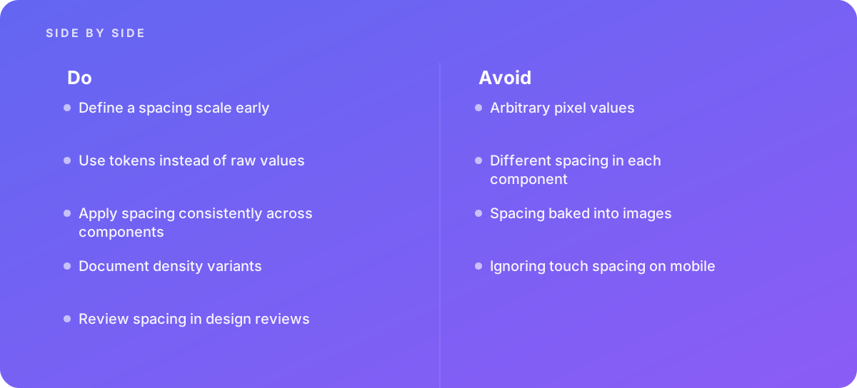
- Define a spacing scale early
- Use tokens instead of raw values
- Apply spacing consistently across components
- Document density variants
- Review spacing in design reviews
Common pitfalls
Watch out for:
- Arbitrary pixel values
- Different spacing in each component
- Spacing baked into images
- Ignoring touch spacing on mobile
When to call in a specialist
Bottom line Bring in help when interfaces look inconsistent across teams.
Where this comes from
- Material Design — Layout
- Apple Human Interface Guidelines — Layout
The figures and practices above come from the sources listed.
Working on something like this?
We take on UI & UX Design work for teams who want it done once, properly. Tell us what you are building and we will tell you honestly whether we are the right studio for it. Start a project.
Where to go next
Spotted something wrong? Report an error on this page. We correct on the page and say what changed.