Error Summaries in Forms: What Actually Works
A summary of validation errors shown at the top of a form, linking to each field that needs attention.
 Marcus Adeyemi

Where most projects go wrong
The usual mistakes:
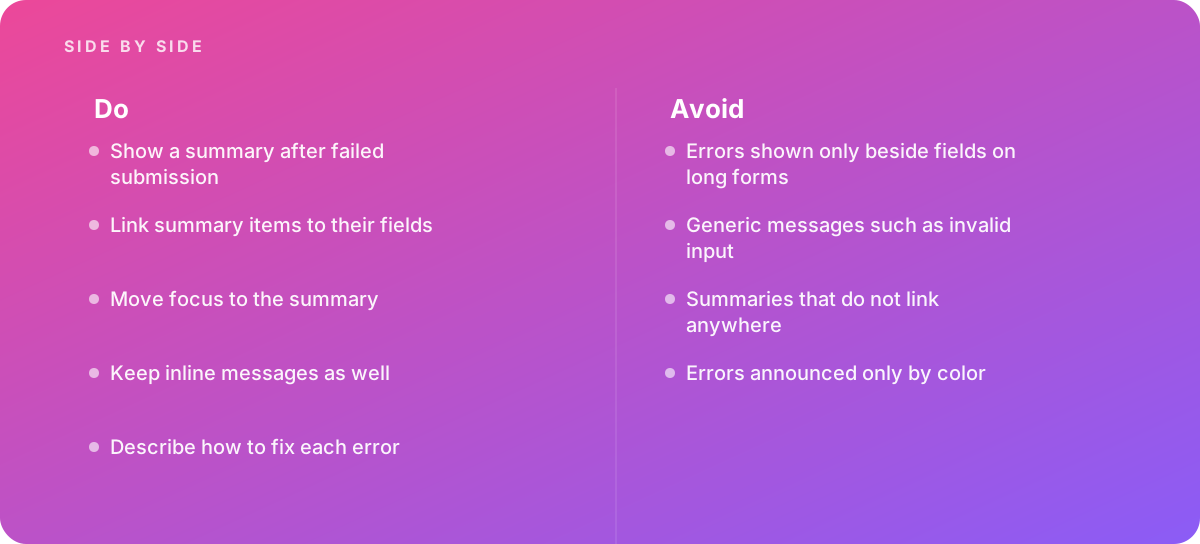
- Errors shown only beside fields on long forms
- Generic messages such as invalid input
- Summaries that do not link anywhere
- Errors announced only by color
What good looks like instead
- Show a summary after failed submission
- Link summary items to their fields
- Move focus to the summary
- Keep inline messages as well
- Describe how to fix each error
Why it matters
Long forms scatter errors across the page, and a summary tells people what went wrong in one place.
The specs that matter
| Measure | Figure |
|---|---|
| Placement | summaries appear at the top of the form |
| Links | each item should link to the relevant field |
| Focus | focus usually moves to the summary after submission |
| Individual messages | fields still need their own error text |
Knowing when to hand it over
Tip: Bring in help when long forms frustrate users.
Where this comes from
- GOV.UK Design System — Error summary
- W3C Web Accessibility Initiative — Understanding SC 3.3.1 Error Identification
The figures and practices above come from the sources listed.
Working on something like this?
We take on Performance & Accessibility work for teams who want it done once, properly. Tell us what you are building and we will tell you honestly whether we are the right studio for it. Start a project.
Where to go next
Spotted something wrong? Report an error on this page. We correct on the page and say what changed.