Accessible Autocomplete Fields: What Actually Works
Search and form fields that suggest options as the user types, built so screen reader and keyboard users can use them.
 Marcus Adeyemi

Where most projects go wrong
The usual mistakes:
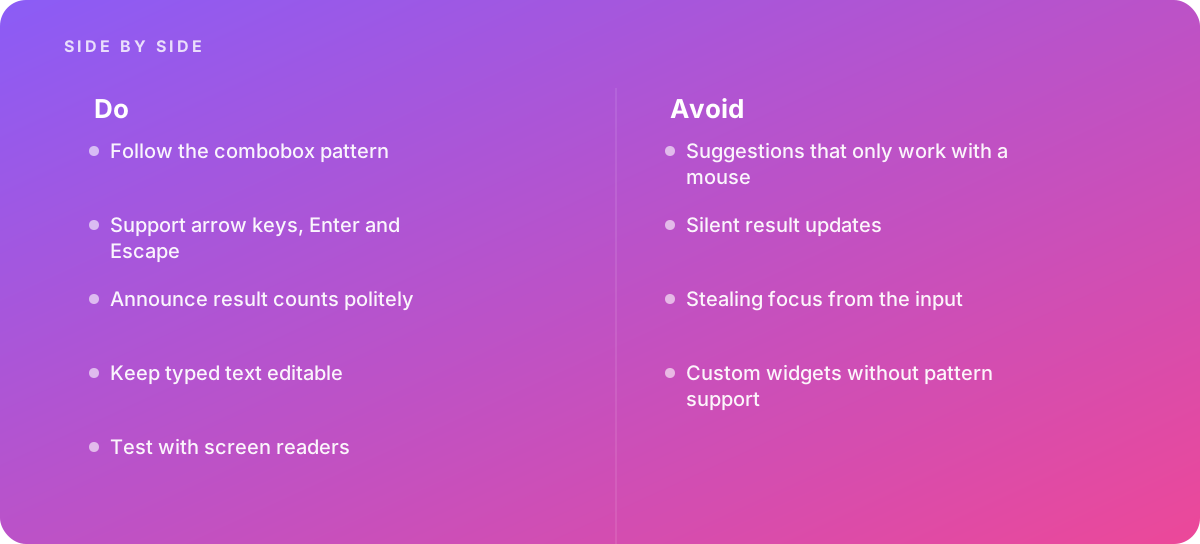
- Suggestions that only work with a mouse
- Silent result updates
- Stealing focus from the input
- Custom widgets without pattern support
What good looks like instead
- Follow the combobox pattern
- Support arrow keys, Enter and Escape
- Announce result counts politely
- Keep typed text editable
- Test with screen readers
Why it matters
Custom autocomplete widgets are a common accessibility failure, because suggestions appear silently and cannot be reached by keyboard.
The specs that matter
| Measure | Figure |
|---|---|
| Combobox pattern | the ARIA Authoring Practices Guide defines expected behavior |
| Keyboard | arrow keys move through suggestions and Escape closes them |
| Announcements | live regions can report the number of results |
| Native options | the datalist element offers a simpler alternative |
Knowing when to hand it over
Tip: Bring in help when search suggestions must be accessible.
Where this comes from
- W3C ARIA Authoring Practices Guide — Combobox pattern
- W3C Web Accessibility Initiative — Understanding SC 4.1.3 Status Messages
The figures and practices above come from the sources listed.
Working on something like this?
We take on Performance & Accessibility work for teams who want it done once, properly. Tell us what you are building and we will tell you honestly whether we are the right studio for it. Start a project.
Where to go next
Spotted something wrong? Report an error on this page. We correct on the page and say what changed.