Blend Modes: What Actually Works
A buyer's guide to blend modes in retouching: what to ask suppliers, what drives cost, how to compare quotes, red flags, and how to check layered files.
 Imogen Clarke

Blend modes are the settings that decide how a layer's pixels combine with the layers beneath it. Set a layer to Multiply and it can only darken what is underneath; set it to Screen and it can only lighten; set it to Overlay or Soft Light and it pushes contrast in both directions; set it to Color and it changes hue and saturation while leaving the brightness of the image alone. Those four behaviors, and a handful of relatives, sit underneath almost every professional retouch, composite, product shadow and recolor you will ever commission.
This handbook is written for the person paying for that work: the e-commerce manager ordering a catalog of cut-out products with natural shadows, the marketer who needs one hero shot turned into eight color variants, the agency producer buying a composite for a campaign. You do not need to operate Photoshop to use it. You need to know enough about blend modes to write a clear brief, recognize what drives the quote, compare suppliers on the things that matter, and open a delivered layered file and tell whether it was built well or merely made to look right on the day.
The reason it matters to a buyer is simple. Blend-mode work that is done properly is non-destructive: every shadow, glow, color change and dodge-and-burn move lives on its own named layer that can be adjusted next month when the brand color shifts or the marketplace changes its background rules. Work that is done with guesswork and destructive shortcuts can look identical in the flattened JPEG, but it becomes expensive the moment anyone needs to change it. The sections below show you how to buy the first kind and avoid paying for the second.
What You Are Really Paying For When a Supplier Uses Blend Modes
A supplier who quotes for retouching is not charging you for knowing where the blend mode dropdown is. You are paying for judgment: choosing the mode that produces the intended effect with the fewest side effects, controlling it with opacity and masks rather than piling on extra layers, and organizing the result so that someone else can understand it. The flattened output is only half of the deliverable. The other half is the layered master file, and that is where the quality of blend-mode work is either visible or hidden.
It helps to think about blend modes in families, because a competent retoucher does. The darkening family, led by Multiply, is used for anything that should only take light away: cast shadows under products, contact shadows where an object meets a surface, vignettes, and deepening folds in fabric. The lightening family, led by Screen, is used for anything that should only add light: glows, highlights on glass and metal, light leaks, and lifting shadow detail. The contrast family, Overlay and Soft Light, is used for dodge and burn, texture blending and local contrast. The component family, of which Color is the workhorse, is used to change hue and saturation without disturbing the tonal structure that makes an object look three-dimensional.
When you understand those families, a lot of supplier language becomes checkable. If someone tells you they recolored a jacket by painting the new color over it, you know that approach (Normal mode, which simply replaces pixels) will flatten the folds and highlights. If someone tells you they added the product shadow on a Multiply layer at reduced opacity, you know it will darken the background naturally and can be dialed up or down later. Adobe's own documentation on layer opacity and blending in the Adobe Help Center describes what each mode does; you do not need to memorize it, but it is a neutral reference to point to if a supplier's explanation does not match what the mode actually does.
The Blend Modes That Matter in Commercial Retouching
Photoshop and comparable editors offer more than two dozen modes. In commercial retouching, a small set does most of the work, and the rest are specialist tools. The table below is the practical short list, with what each mode does, where it earns its keep, and what goes wrong when it is misused. Use it when you read a supplier's process description or open a layered file.
| Mode | What it does to the image below | Typical commercial use | Common misuse |
|---|---|---|---|
| Normal | Replaces pixels according to opacity | Cleanup patches, cloned repairs, solid backgrounds | Recoloring products, which flattens folds and highlights |
| Multiply | Darkens; white becomes invisible | Added shadows, contact shadows, vignettes, line art over texture | Stacking several Multiply layers until shadows go muddy |
| Screen | Lightens; black becomes invisible | Glows, reflections on glass, light beams, lifting dark areas | Using it to fix underexposure globally, which washes out blacks |
| Overlay | Increases contrast, weighted by the layer below | Strong texture blending, punchy dodge and burn | Heavy application that crushes shadows and clips highlights |
| Soft Light | Gentler contrast change than Overlay | Subtle dodge and burn on skin and product surfaces | Expecting it to do large tonal corrections it is too gentle for |
| Color | Applies hue and saturation, keeps luminosity | Product recolors, color variants, toning | Recoloring very light or very dark areas without checking the result |
| Luminosity | Applies brightness, keeps hue and saturation | Sharpening or curves without color shifts | Rarely misused; often simply forgotten |
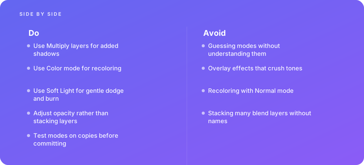
Two points from the table deserve emphasis for buyers. First, Multiply and Screen are one-directional by design. A Multiply shadow cannot accidentally brighten anything, and a Screen glow cannot accidentally darken anything. That predictability is exactly why they are the right choice for shadows and glows, and why a supplier who uses Normal-mode gray paint for shadows is making the job harder to control. Second, Color mode is the correct default for recoloring precisely because it leaves luminosity alone. The creases, stitching and soft highlights that tell a shopper what a material feels like survive the color change.
Why Overlay and Soft Light are not interchangeable
Both modes are used for dodge and burn, the technique of selectively lightening and darkening areas to shape form. The difference is intensity. Overlay reacts strongly and can quickly push midtones into crushed shadows or blown highlights, especially on already contrasty images. Soft Light behaves more gently, which is why it is the usual choice for skin and for polished product surfaces where the adjustments should be invisible. A common professional setup is a separate layer filled with 50 percent gray set to Soft Light, painted with low-opacity white and black brushes; the neutral gray has no visible effect until it is painted. When you see that structure in a file, you are looking at a controllable, reversible dodge and burn. When you see dodge and burn done directly on the image pixels, you are looking at work that cannot be dialed back.
Where the other modes fit
Modes such as Linear Burn, Color Dodge, Hard Light, Difference and Hue appear in specialist workflows. Difference, for example, is a practical checking tool: set a layer to Difference over an identical copy and any mismatched pixels show up as non-black, which is useful for confirming that two versions of a file really are aligned. You do not need to police these. What you want to know is that the supplier can explain why a mode was chosen when you ask, and that the explanation matches the behavior. A useful rule of thumb when reading a file: the first control a retoucher should reach for is opacity on an existing layer, not another layer on top of it.
How to Brief Blend-Mode-Heavy Retouching
A good brief does not tell the retoucher which modes to use. It tells them what the image must do, what must stay editable, and what you will receive. The blend-mode decisions then follow from those requirements, and you can check them against the brief when files arrive. The weakest briefs describe only the look ("natural shadow, make it pop"); the strongest describe the look, the constraints and the deliverable.
Describe the effect, the reference and the tolerance
For shadows, say what kind: a soft drop shadow directly beneath the product, a reflection on a glossy surface, a directional cast shadow matching a light source, or the original shadow preserved from the shoot. Supply a reference image you have approved before. For recolors, supply the target color as a numeric value (a Pantone reference, a hex or RGB value, or better, a physical swatch measured in Lab) and say how close is close enough. Our guide to Delta E and color accuracy explains how to express that tolerance in a way both sides can measure, rather than arguing over whether a red looks right on two different monitors.
State what must remain editable
This is the single most important line in a blend-mode brief, and it is the one most often left out. If you will need to change the shadow density for a different marketplace, or produce new color variants next season, say so. Ask for shadows on their own named layer, recolors on their own named adjustment or Color-mode layers with masks, and dodge and burn on separate layers rather than painted into the base image. Suppliers price this correctly when they know about it up front; they grumble, reasonably, when it is requested after delivery.
Specify the deliverables precisely
List the formats (layered PSD or TIFF plus flattened exports), color space and bit depth, pixel dimensions, background, file naming, and whether you want a layer-naming convention followed. If the flattened files are for a website, reference your export standard; our article on exporting images for the web covers the settings that keep carefully blended shadows from banding or shifting color once they are compressed.
Questions to ask every supplier
Put these questions in writing before you accept a quote. The answers tell you more about how a supplier handles blend modes than any portfolio of flattened before-and-after images.
- Which blend mode do you use for added product shadows, and how do you control their density?
- How do you recolor products, and can you show a before-and-after where the fabric texture and highlights are preserved?
- Will dodge and burn be on separate layers, and which mode do you use for it?
- Do you name and group every layer, and can you send a sample layered file from a comparable past job with client details removed?
- How do you check that Overlay or contrast layers have not crushed shadows or clipped highlights?
- What bit depth and color space do you work in, and when do you convert?
- If we change the shadow opacity or a variant color later, is that a paid revision or included?
- Who reviews files before delivery, and what do they check?
What Drives the Cost of Blend-Mode Work
Blend modes themselves cost nothing; they are a dropdown. What varies is the time needed to use them well, and that depends on the image, the effect and the level of editability you require. When two quotes differ widely for what looks like the same job, one of the following factors is usually the explanation. For a fuller treatment of how retouching jobs are sized, see our guide on estimating retouching work.
Subject complexity
A matte cardboard box on white needs a single Multiply shadow and little else. A glass bottle needs Screen highlights, Multiply edges, careful masking of transparency and often a refraction pass, which is why retouching glass and transparent products is priced as a separate category by most studios. Jewelry, chrome and glossy electronics fall in the same demanding group. Soft goods sit in the middle: fabric recolors are straightforward with Color mode, but deep folds, sheen and mixed materials need more masking.
Type of shadow
Preserving the original shadow from the shoot, by extracting it and placing it on a Multiply layer over a new background, is usually quicker than building one from scratch, provided the photographer lit for it. Building a convincing cast shadow or a reflection on a glossy floor takes longer, because the retoucher has to match the direction and softness of the light in the photo. If you want consistent shadows across a catalog shot on different days, expect time for a template and per-image adjustment.
Recolor difficulty
Color mode handles midtones well. It struggles at the extremes: a white garment has almost no saturation for Color mode to work with, and a near-black one has too little luminosity for a new hue to show. Recoloring white to navy or black to red often requires additional Curves or Levels adjustments beneath the Color layer, sometimes with a Multiply layer to deepen tone. Suppliers who know this will quote extreme recolors higher, and they are right to. Our guide to product color variants covers when it is cheaper to reshoot a variant than to build it in post.
Editability and file hygiene
Naming layers, grouping them logically, keeping masks clean and avoiding stacked duplicates takes time. On a single image the overhead is small; across a catalog it adds up. A quote that is noticeably cheaper than the others may simply be skipping this, delivering flattened files or layered files that no one else can edit efficiently.
Volume, consistency and turnaround
Large, uniform batches reward templates: one well-built shadow group or recolor setup can be adapted across hundreds of images. Mixed batches with different angles, lighting and products do not. Rush turnaround usually costs more because it pulls people off scheduled work or adds a shift. When you are comparing prices, ask each supplier which of these factors they have assumed, because two quotes built on different assumptions are not really quoting the same job.
Worked Example: Budgeting a 40-Product Catalog With Shadows and Variants
The following example is illustrative. It is not a client project and the time figures are planning assumptions, not published benchmarks, but they show how the cost drivers above combine into a quote you can reason about.
A home-goods retailer has 40 product photographs: 30 matte ceramic items and 10 glazed items with reflective surfaces. Every product needs a clean white background and a natural soft shadow on a Multiply layer. Twelve of the ceramic items also need three additional color variants each, built with Color-mode layers, for a total of 36 variants. The retailer wants layered masters with named layers so the shadow density can be changed later for a marketplace that prefers lighter shadows.
A sensible supplier might plan the work like this:
| Task | Quantity | Assumed minutes each | Total minutes |
|---|---|---|---|
| Background cleanup and masking, matte items | 30 | 10 | 300 |
| Background cleanup and masking, glazed items | 10 | 20 | 200 |
| Multiply shadow from template, adjusted per item | 40 | 5 | 200 |
| Screen and Multiply highlight control on glazed items | 10 | 10 | 100 |
| Color-mode variants, midtone colors | 30 | 6 | 180 |
| Color-mode variants needing extra tonal adjustment (very light or dark targets) | 6 | 15 | 90 |
| Layer naming, grouping and quality check | 40 | 3 | 120 |
| Template setup for shadow and variant groups | 1 | 60 | 60 |
The total comes to 1,250 minutes, or roughly 21 hours of retouching time. At whatever hourly rate the supplier works to, that figure lets you sanity-check the quote. If a competing quote implies eight hours for the same scope, one of three things is happening: they have a faster template-driven pipeline (ask to see it), they are planning to skip the layer organization and quality check, or they have underestimated the glazed items and the extreme recolors. If a quote implies forty hours, ask which items they consider difficult; they may have spotted something you missed, such as inconsistent lighting across the shoot.
Notice where the time goes. The Multiply shadows themselves are cheap once a template exists. The expensive lines are the reflective items, the difficult recolors and the housekeeping. Those are exactly the lines a low bidder is tempted to cut, and exactly the ones that determine whether the files are still useful in six months.
Where the retailer could save money
Asking the photographer to shoot every item under the same lighting setup, on the same surface, would let the retoucher keep the original shadows instead of building them. Supplying measured target colors for the 36 variants would reduce back-and-forth. Grouping the extreme recolors together, or reshooting the white-to-navy variants, would remove the most uncertain line on the estimate.
What the later change costs
Now suppose that six months later the retailer lists the same range on a marketplace that wants lighter shadows. With properly built masters, the change is an opacity adjustment on one named Multiply layer per file, followed by a batch re-export: minutes per image, much of it automatable. With flattened files or merged shadows, each image has to be re-masked and the shadow rebuilt, which is close to repeating the background and shadow lines of the original estimate. That difference, not the first invoice, is the real price gap between a well-built and a poorly built job.
Comparing Supplier Quotes Side by Side
Quotes for retouching are notoriously hard to compare because each supplier describes the work differently. One lists a per-image price, another a day rate, a third bundles revisions and a fourth charges for them separately. The way through is to score each quote against the same criteria, most of which relate directly to how the supplier handles blend modes and layered files.
| Criterion | What a strong quote shows | What a weak quote shows | Weight |
|---|---|---|---|
| Process clarity | Names the approach: Multiply shadows, Color-mode recolors, separate dodge-and-burn layers | Only "natural shadow" and "color change" with no method | High |
| Layered deliverables | Layered masters included, named and grouped, with the format stated | Flattened files only, or layered files "available on request" at extra cost | High |
| Sample file | Offers a layered sample or test image | Portfolio of flattened before-and-afters only | High |
| Difficult items identified | Flags reflective, transparent or extreme-recolor items and prices them separately | One flat rate for everything | Medium |
| Color accuracy method | Explains how target colors are matched and checked | "Matched by eye" | Medium |
| Revision terms | Defines what counts as a revision and how many are included | Silent or open-ended | Medium |
| Quality check | Describes a second-person review before delivery | No mention | Medium |
| Turnaround | Realistic schedule with batch milestones | Promises everything faster than others without explaining how | Low to medium |
Score each supplier on a simple scale, say one to five per criterion, weight the high-priority rows double, and compare totals alongside price. The cheapest quote often loses points on layered deliverables and process clarity, and those losses translate directly into future cost when you need changes. The most expensive quote is not automatically the best; it should earn its premium on identified difficulties and a credible quality process.
Run a paid test before committing a large batch
For any batch larger than a few dozen images, commission a paid test of three to five representative images, including at least one of the hardest items. Ask for the layered file as well as the export. The test tells you more than any sales conversation: how the supplier names layers, which modes they chose, whether their shadows respond sensibly when you change opacity, and how their recolors hold up in the highlights. The cost of the test is small compared with reworking a full catalog.
Normalize the pricing units
Convert every quote to the same unit before comparing. If one supplier quotes per image and another per hour, use your own worked estimate, like the one above, to translate between them. Separate the base retouch from variants, from difficult items and from revisions, so that a low headline price that excludes variants does not look cheaper than an all-inclusive one.
Red Flags in Proposals and Delivered Files
Most blend-mode problems are invisible in a small preview and obvious in a layered file or a large, color-managed view. These are the warning signs worth looking for, first in the proposal and then in what arrives.
Red flag in the proposal: the supplier cannot explain their approach.
- They describe recoloring as "painting the new color on," which suggests Normal mode and lost texture.
- They cannot say which mode they use for shadows or why.
- They refuse to share any layered sample, even a redacted one.
- Layered files are priced as a costly extra rather than a standard deliverable.
An inability to explain the method is the clearest proposal-stage warning. Experienced retouchers talk about blend modes the way a carpenter talks about joints: briefly, confidently and with reasons. Guessing modes until something looks right is a habit that produces inconsistent results across a batch, because the guess that worked on image one will not behave the same way on image twenty.
Red flags you can see in the flattened image
Look at the image at 100 percent on a calibrated screen, and ideally at 200 percent in the areas that matter. Recolored areas that look flat, plasticky or uniformly saturated suggest Normal-mode painting or an overdone Color layer without tonal support. Shadows that look like gray smudges rather than darkened versions of the background suggest Normal-mode gray paint instead of Multiply. Faces or products where the dark areas have lost all detail, or bright areas have turned to flat white, often point to Overlay contrast layers applied too strongly. Halos, light or dark fringes along edges, frequently come from dodge and burn applied with a brush that crossed the edge of a mask.
A common belief among buyers is that if the flattened image looks good, the layered file does not matter. It does. The flattened file is a snapshot; the layered master is what you pay to change later. A file built with named Multiply, Color and Soft Light layers can be adjusted in minutes, while a file with effects painted into the pixels may need to be rebuilt from the original.
Red flags you can see in the layered file
Open the layered master and look at the layers panel. Dozens of layers called "Layer 1 copy 3" are a problem in themselves: stacking many blend layers without names makes the file almost impossible for anyone else to edit, and often signals that the retoucher was fixing effects with more effects instead of adjusting opacity. Several Multiply layers stacked on top of one another to deepen a shadow, instead of one layer at a higher opacity, is a related symptom; it works, but it compounds darkening in ways that are hard to predict when anything underneath changes.
Red flag in the delivered file: effects baked into the base layer.
- Dodge and burn painted directly onto the photograph rather than on a separate Soft Light or Overlay layer.
- Recolors applied to a merged copy of the image, with the original hidden or deleted.
- Shadows merged into the background, so their density cannot be changed.
- Unnamed, ungrouped layers with no evident order.
None of these guarantees a bad result today, but each one moves cost into the future. If your brief asked for editable layers and the file shows these patterns, you are within your rights to ask for corrections before accepting the batch.
How to Judge the Result Without Being a Retoucher
You do not need to be a Photoshop expert to inspect a delivered file, but it helps to follow the same sequence every time. The steps below take a few minutes per image and catch most blend-mode problems before the files go live.
- View the flattened export at full size Check on a calibrated display at 100 percent, then zoom into shadows, highlights and edges. Look for crushed blacks, clipped whites, halos and flat recolors.
- Open the layered master Confirm the layer structure matches the brief: separate, named layers or groups for shadows, recolors, dodge and burn and cleanup.
- Toggle each effect layer off and on Every effect should switch cleanly on and off without leaving remnants on the base image. If turning off the shadow layer leaves a shadow behind, it was baked in.
- Change opacity on key layers Drop the shadow layer to half opacity and back. A well-built Multiply shadow simply lightens; a poorly built one may reveal hard edges or gray patches.
- Check blend mode settings Confirm shadows use a darkening mode, glows a lightening mode, recolors Color mode and dodge and burn Soft Light or Overlay. Anything unexpected is worth a question, not necessarily a rejection.
- Measure color on variants Sample the recolored area with an eyedropper or a color-checking tool and compare against the target values in your brief, using the tolerance you agreed.
- Compare across the batch Place several images side by side. Shadow density, direction and softness should be consistent unless the brief said otherwise.
If you find a problem, describe it in terms of the effect rather than the tool: "the shadow under item 14 is darker and harder-edged than the others" is more useful than "use a different blend mode." A good supplier will translate that into the right fix, usually an opacity or mask adjustment rather than a new layer.
Judging dodge and burn on people
For portraits and model shots, dodge and burn should reshape light without anyone noticing it happened. Skin should keep its pores and texture, which is also why dodge and burn is often paired with frequency separation in beauty work rather than replaced by blur. If faces look airbrushed, or cheekbones have obvious light and dark stripes, the dodge-and-burn layers are too strong or the wrong mode was used; Overlay at high opacity is a frequent cause, and switching to Soft Light or lowering opacity usually fixes it.
Composites: Where Blend Modes Make or Break Believability
Composites put the most pressure on blend-mode skill because every element has to look as if it was lit by the same light, in the same air, at the same moment. A cut-out product placed on a lifestyle background, a sky replacement, or a group shot assembled from several frames all depend on shadows, highlights and color casts that tie the pieces together. When composites look flat, it is usually because those connecting layers are missing or weak.
The layers a believable composite usually needs
A contact shadow on a Multiply layer where the object meets the surface, darkest right at the join and falling off quickly. A softer cast shadow, also Multiply, following the direction of the main light in the background plate. Highlights and rim light on a Screen layer where the background light would strike the inserted element. A color-matching layer, often a Color or Soft Light layer, or a Curves adjustment clipped to the element, to pull its color temperature toward the background. Sometimes a subtle haze or atmosphere layer on Screen for distant elements. Each of these is small, and each contributes to the sense that the pieces belong together.
Group and family composites add a further challenge: heads and bodies taken from different frames have to share the same skin tones and lighting. Our guide to group and family shot compositing covers how retouchers approach that, and blend modes are central to the color and tone matching involved.
What to put in a composite brief
Supply the background plate and every element at the highest resolution available. Say where the main light comes from if it is not obvious. Say whether the result should look photographic or stylized. Ask for the composite to be delivered with each element and its supporting shadow, highlight and color layers grouped together and named, so that an element can be moved or swapped later without rebuilding its lighting.
Blend Modes Versus Other Techniques: Accepting the Right Alternatives
Blend modes are not the answer to every retouching problem, and a supplier who uses something else is not necessarily cutting corners. What matters is that the chosen technique is controllable and appropriate. Knowing the common alternatives helps you tell a sensible substitution from a shortcut.
Adjustment layers
Hue/Saturation, Curves, Levels and Color Balance adjustment layers are non-destructive and maskable, and they are often combined with blend modes. A Curves adjustment set to Luminosity mode, for example, changes contrast without shifting color. A Hue/Saturation adjustment clipped to a masked product is a perfectly valid recolor method, particularly for small hue shifts. If a supplier recolors with adjustment layers rather than a Color-mode fill layer, the result can be just as good; ask how they preserve texture and handle very light or dark targets.
Automated and AI-assisted tools
Generative fill, automatic sky replacement and filters such as those covered in our look at Photoshop neural filters can speed up parts of the job. They frequently produce results that still need blend-mode work to finish: an automatically replaced sky usually needs a Color or Soft Light layer to match the foreground's color cast, and an AI-generated shadow may need a Multiply layer at a controlled opacity to sit correctly. Automation is fine; unedited automation that cannot be adjusted is the thing to avoid.
Destructive edits
Some retouching is necessarily destructive, such as cloning out a dust spot. That is acceptable as long as it happens on a duplicate or a separate layer, and the original remains in the file. What you should not accept, for work you have specified as editable, is effects like shadows, recolors or dodge and burn merged into the pixels.
Pros
- Blend-mode layers are fast to adjust with opacity and masks.
- Darkening and lightening modes behave predictably for shadows and glows.
- Color mode preserves the texture that makes products look real.
- Named, grouped layers make files reusable for new variants or channels.
Cons
- Results depend on what is underneath, so changes to base layers can alter the effect.
- Overlay and similar contrast modes are easy to overdo.
- Color mode needs extra help on very light or very dark targets.
- Layered files are larger and take longer to organize properly.
Keeping Blend-Mode Work In-House or Bringing In Help
Many in-house teams handle simple blend-mode tasks themselves: a Multiply shadow on a product shot, a Color-mode tint on a social graphic, a quick Soft Light dodge and burn. That is reasonable, and a short internal standard covering the mode families and layer naming goes a long way. The question is when the work stops being routine.
Bring in help when composites consistently look flat, when recolors keep losing texture or failing color checks, when edits have become hard to control because files are cluttered with unnamed layers, or when volume makes consistency across a batch difficult to hold. Those are signs that the work needs either more skill or more process than the team can currently provide. Specialist categories such as glass, reflective products and high-end beauty work also justify outside help early rather than after a few attempts.
What a good handover looks like
Whether you are sending work out or taking it back in, agree on a layer-naming convention, a group structure and a set of standard modes for standard jobs. Something as simple as "SHADOW contact (Multiply)", "SHADOW cast (Multiply)", "COLOR navy (Color)" and "D&B (Soft Light)" is enough. It lets anyone on either side open a file and understand it in seconds, which is most of the value of a layered master. Keep one approved layered file per job type as a reference and send it with every new brief; it communicates your expectations faster than a written specification.
If you would rather hand the whole problem to a team that does this every day, our image editing and retouching services are built around exactly this kind of layered, documented delivery, and the broader image editing and graphic design offering covers campaigns where retouching and design work have to fit together.
File, Color and Delivery Standards to Put in Writing
The last part of buying blend-mode work well is agreeing on the technical details that affect how blended effects survive the trip from the retoucher's screen to your website, catalog or print run. These are not glamorous, but disputes about them are common and avoidable.
Bit depth and color space
Soft shadows and smooth gradients are where banding appears first. Working in 16 bits per channel gives the retoucher more tonal steps to blend with, which reduces banding in Multiply shadows and dodge-and-burn transitions. Many studios work in 16-bit for masters and convert to 8-bit only for final exports. Agree on the working color space as well. Blend modes calculate from the values they receive, so converting color space after the effects are built can shift their appearance; it is better to convert once, at export, and check the result.
Master formats
Layered PSD and layered TIFF both preserve blend modes, masks and groups. PSD is the usual choice for files that will be edited in Photoshop; very large files may need the large-document format. If you have old retouched files in formats that did not preserve layers, converting them to a modern format will not bring back the separate effects, so keep whatever originals you still have. Other editors support many common blend modes, but their math and names do not always match exactly, so a file moved between applications should be checked visually.
Exports and final checks
Flattened exports should be produced from the master with the agreed color profile embedded and at the agreed dimensions. Check exports against the master side by side, particularly light shadows on white backgrounds, which can disappear or turn gray when compression or profile conversion goes wrong. For print work, ask for a proof, because blended effects that look subtle on screen can print heavier or lighter depending on paper and ink.
Verdict Buy blend-mode work on the layered file, not the flattened preview. Ask suppliers to name their approach (Multiply for shadows, Screen for glows, Soft Light for dodge and burn, Color for recolors), insist on named, separate layers controlled by opacity rather than stacks of duplicates, run a paid test on your hardest images, and inspect deliveries by toggling and adjusting layers. A supplier who explains their modes clearly and hands over an organized master is usually cheaper over the life of the images, even when the first quote is higher.
Where this comes from
- Adobe Help Center — Blending modes
- Adobe Help Center — Layer opacity and blending
The figures and practices above come from the sources listed.
Working on something like this?
We take on Image Editing & Retouching work for teams who want it done once, properly. Tell us what you are building and we will tell you honestly whether we are the right studio for it. Start a project.
Where to go next
Spotted something wrong? Report an error on this page. We correct on the page and say what changed.