Trapping and Overprint: The Decisions That Matter
Learn who should own trapping and overprint, what to ask printers, what drives prepress cost, how to compare quotes and how to check proofs before press.
 Imogen Clarke

Trapping and overprint are the two prepress controls that decide what happens where one printed color meets another. Trapping creates a small, deliberate overlap between adjoining colors so that when the printing plates shift slightly on press, the paper does not show through as a thin white line. Overprint tells the press to lay one ink on top of another instead of cutting a hole for it, which is called knocking out. Get them right and nobody notices. Get them wrong and you see halos around logos, black text that looks fuzzy, white type that vanishes, or a whole print run with a hairline gap around every spot-color panel.
This handbook is for the person commissioning the work: a brand manager sending packaging to press, a marketer ordering a run of brochures, an in-house designer handing files to a printer for the first time, or a procurement lead comparing prepress quotes. It explains what to ask for, what actually drives the cost, how to compare suppliers, which warning signs to act on, and how to judge the result before thousands of sheets are printed. It stays practical: the decisions are few, but each one has consequences you pay for at the press.
The short version is that trapping and overprint are responsibility questions as much as technical ones. Many printers apply trapping themselves, in their own prepress systems, tuned to their presses and substrates. Your job is to know who is doing it, to supply artwork that does not fight it, and to check the proof that shows the result.
What trapping and overprint actually control on press
A conventional offset or flexographic press prints each ink from its own plate, one after another. A four-color process job has four plates (cyan, magenta, yellow and black); a packaging job might add two or three spot colors and a varnish plate. Each plate has to land in exactly the same place on every sheet or every meter of web. In practice it never does perfectly. Paper stretches with moisture and pressure, plates are mounted with tiny tolerances, and film or foil substrates can move under tension. That small shift is called misregistration, and it is a normal feature of printing, not a sign of a bad press.
When two colors butt exactly against each other in the artwork, any misregistration pulls them apart and leaves a sliver of unprinted substrate between them. On white paper that sliver shows as a white line; on kraft board it shows as brown; on a metallic film it shows as a flash of silver. Trapping solves this by making one of the two colors slightly larger so that the colors overlap. If the plates shift, the overlap absorbs the movement and no gap appears.
Spreads and chokes
There are two directions a trap can go. A spread enlarges a foreground object so it extends slightly into the background around it. A choke enlarges the background slightly into the foreground object, which makes the hole for the object smaller. The standard rule is that the lighter color moves into the darker one. The darker color defines the visible edge, so if the lighter color extends under it, the eye still reads the edge where the darker color sits and the object keeps its shape. A yellow logo on a navy panel is spread; a navy logo on a yellow panel is handled by choking the yellow background.
Knockout versus overprint
By default, design software knocks out: when a red circle sits on a blue panel, the blue plate gets a circle-shaped hole so the red prints on bare paper and stays pure red. Overprint switches that off for a chosen object, so the blue prints solid and the red prints on top of it. Because printing inks are largely transparent, the result is a mix of the two inks, here a dark purple-brown, not red. That is exactly why overprint is useful for black and dangerous for almost everything else. Black on top of another color still looks black, and because there is no hole beneath it, there is nothing to misregister. Red on top of blue does not look red.
Adobe's documentation for Illustrator describes both mechanisms and the Attributes panel settings that control them; the Adobe Help Center Illustrator user guide is the reference to hand to anyone on your team who builds the artwork.
- Misregistration Plates shift slightly during printing; it is normal and cannot be eliminated.
- Trapping Slightly overlaps adjacent colors so a shift does not open a gap.
- Overprint Prints one ink on top of another rather than knocking out a hole for it.
- Spread and choke The lighter color is expanded into the darker one so edges keep their shape.
- Who traps Many printers apply trapping themselves, in their own prepress workflow.
- Proof check Overprint preview and a proof show the result before plates are made.
Who should own trapping: the printer, a prepress studio or your designer
The single most important commissioning decision is who applies the traps. The answer changes what you ask your designer for, what goes in the quote, and who is accountable if a gap appears in the finished job.
The printer traps in the RIP or prepress system
Most commercial and packaging printers run a prepress workflow that can apply trapping automatically, either in the raster image processor (RIP) that turns your PDF into plates or in a dedicated trapping step before it. This is often the best arrangement, because the printer knows how much its presses move on a given stock and can set trap widths accordingly. Trap values that suit coated paper on a sheetfed offset press are not the ones that suit corrugated board on a flexo press, and only the printer has that data from its own runs.
If the printer traps, your designer should supply clean, untrapped artwork: colors butted exactly, overprint set only where deliberately intended, and no homemade overlaps. Ask the printer to confirm this in writing, and ask what their default settings do with black text and black strokes, because some workflows add automatic black overprint on top of whatever the file says.
A prepress or repro studio traps the files
In packaging, brand owners often use a separate repro or prepress studio that prepares print-ready files for several printers. The studio applies trapping in the artwork or through its own trapping software, based on a specification from each printer. This keeps the files consistent across suppliers and puts the technical decisions in the hands of specialists. The trade-off is coordination: the studio needs each printer's trap specification, and the printer must be told that files arrive already trapped so it does not trap them again.
Your designer traps manually
For simple jobs, a designer can build traps by hand, usually by adding a stroke set to overprint around a lighter object, or by using the trap tools in layout and illustration software. This is reasonable for a single-color-plus-black job or a logo that is sent to many different printers as a finished file. It is the least reliable option for complex artwork, because manual traps are easy to miss, easy to set at the wrong width, and invisible without overprint preview.
Red flag: nobody can tell you who is trapping the job. If your designer assumes the printer traps and the printer assumes the files are print-ready, the job may print with no traps at all. If both apply traps, you get the opposite problem.
- Trapping applied twice produces thick, dark outlines where colors meet, which is most visible around light spot colors and small type.
- Resolve ownership before artwork is finalized, not after proofs arrive.
What to ask for when you brief and request quotes
A good brief removes guesswork on both sides. It tells the supplier what press process and substrate the job is for, which colors are involved, and who is responsible for which prepress step. It also tells you, from the answers you get back, whether the supplier understands the problem.
Start with the production facts. Name the printing process (sheetfed offset, web offset, flexography, gravure or digital), the substrate (uncoated paper, coated board, corrugated, film, labels), the ink set including every spot color by name, and any special finishes such as foil, embossing, spot varnish or white ink on clear or metallic stock. Each of these changes how much trapping is needed and where overprint is appropriate. A white ink underlayer on clear film, for example, has to be choked back from the edges of the colors above it so that white does not peek out around them, which is itself a trapping decision.
Then ask about responsibility and deliverables. Specify the file format you expect, usually a PDF/X standard agreed with the printer, and whether it should be trapped or untrapped. Ask for a written list of overprint settings in the file. Ask what proof you will see and whether it simulates overprint.
- Do you apply trapping yourselves, and if so, in which system and with what default settings for this press and stock?
- Do you want our files trapped or untrapped? Will you confirm that in writing?
- What trap width do you use for this process and substrate, and does it change for spot colors, metallic inks or white underlayers?
- Does your workflow automatically overprint black text and strokes, and below what size or tint?
- How do you handle large areas of black: plain black, rich black, or a black with a knockout?
- Which PDF standard do you want (for example PDF/X-1a or PDF/X-4), and how do you treat live transparency?
- What proof will we receive, and does it show overprint and trapping as they will print?
- Will you flag hairline gaps, thin colored lines and small reversed type before platemaking?
- For packaging: how are dielines, varnish plates and white ink set up, and should they overprint?
- What happens, and who pays, if a trapping error is found on press or after delivery?
Suppliers who answer these questions specifically, with numbers and system names, are usually the ones who will catch problems. Vague answers such as "we check everything" or "the RIP takes care of it" deserve a follow-up question. If you are also evaluating the supplier for image work more broadly, our guide to choosing a retouching partner covers the wider questions about process, communication and quality control.
What drives the cost of trapping and overprint work
Trapping is rarely a separate line on a commercial print quote; it is usually folded into prepress or file preparation. On packaging, and whenever a repro studio is involved, it may be itemized. Either way, the effort, and therefore the price, depends on a handful of variables. Understanding them helps you compare quotes that look very different on paper.
The number of inks and where they meet
Every pair of colors that touch is a potential trap. A two-color job with black text on a single spot panel has a handful of edges to consider. A carton printed in four process colors plus three spot colors, with a metallic ink and a white underlayer, has dozens of color pairs and far more edges. Automated trapping handles the routine ones, but a specialist still has to review the difficult ones: a light spot color against a vignette, a metallic against a rich black, fine type against a multi-color background.
Artwork complexity
Gradients, transparency effects, drop shadows, placed images that butt against vector shapes, and complex patterns all make trapping harder. A gradient that runs from a light tint to a dark tone against a flat spot color needs a trap that changes direction along the edge: at one end the gradient is lighter than the spot, at the other end it is darker. Good trapping software handles this, but it must be checked. Repeating patterns on packaging have the same challenge multiplied across every repeat; our article on seamless pattern creation covers how pattern artwork is built so that seams and edges behave predictably.
Versions and SKUs
A range of twelve product flavors that share one layout but change color panels and copy is twelve sets of trapping, even if most of it is repeated. Suppliers price this differently: some charge per version, some per master design with a lower rate for derivatives. Ask which approach a quote uses.
Process and substrate
Flexography on corrugated board or flexible film generally needs wider traps and more attention than sheetfed offset on coated paper, because the plates and substrates move more. Digital presses that image all colors in one pass, with tight registration, may need little or no trapping at all. If you are quoting the same artwork on different processes, expect the prepress effort to differ.
Proofing and revision rounds
A soft proof on screen, a contract-quality hard proof, a wet proof on the actual stock and a press check are very different costs. So are the revision rounds that follow if the artwork has problems. Clean artwork, supplied with overprint settings already checked, is the cheapest input you can give any supplier.
Because these drivers vary so much, it is not meaningful to quote a single typical price. What you can do is ask each supplier to state which of these drivers their quote assumes, then compare like with like.
Worked example: an illustrative packaging job, costed in effort rather than price
The following example is illustrative, not a real client project. It shows how the decisions in this handbook translate into work and risk for a realistic brief, using effort ranges rather than prices, because rates vary widely by region and supplier.
A food brand is launching a folding carton for a range of four products. Each carton is printed sheetfed offset on coated board in four process colors plus two spot colors: a brand red and a metallic silver. A spot gloss varnish plate highlights the product photograph and the logo. The front panel has a product photo that runs into a flat brand-red band, a white-reversed product name across the red band, 6-point black ingredient text on a pale tint panel on the side, and a barcode on the base. The four versions share the layout and change only the photo, the product name and a colored flavor stripe.
Mapping the edges
Before anyone traps anything, the prepress operator lists where colors meet and what each edge needs.
| Edge or element | Colors involved | Decision | Reason |
|---|---|---|---|
| Photo meets brand-red band | Process image against spot red | Trap, direction varies along the edge | Parts of the photo are lighter than the red and parts darker |
| Reversed product name in red band | Paper white inside spot red | Knockout, no overprint; keep type bold | White cannot overprint; only one plate forms the letters, so no registration risk inside them |
| 6 pt black ingredient text on tint panel | Black over a pale process tint | Overprint black | Removes any chance of a white halo around fine type |
| Metallic silver logo on brand red | Two spot colors | Trap per printer specification | Metallic inks are opaque and behave differently; printer decides direction |
| Flavor stripe against brand red | Process build against spot red | Trap, lighter into darker | Changes per version, so check each file |
| Varnish plate | Varnish over photo and logo | Overprint, set as a separate plate | Varnish must never knock a hole in the colors below |
| Dieline | Technical layer | Overprint, non-printing on final plates | A knocked-out dieline would leave a line of bare board |
| Barcode | Black on white base | No trap on bars; confirm bar width reduction with printer | Trapping bars would change their widths and affect scanning |
Estimating the effort
Illustrative effort for a specialist working on this job, assuming the printer supplies a trap specification and the designer supplies clean artwork, might look like this: an hour or two to audit the master file and set overprint attributes correctly; a similar amount to apply and review traps on the master, especially the photo-to-red edge; a shorter time per derivative version, because each shares most of the master's decisions; and time to produce and review a proof with overprint simulation. The total for four versions might be somewhere in the range of a working day, and could be half that for a clean, simple file or double it if the artwork arrives with hairline gaps, rogue overprint settings or live transparency that interacts badly with the spot colors.
The key lesson is where the effort goes. Most of it goes into the master and into the edges that do not follow the simple lighter-into-darker rule. The versions are cheap if the master is right and expensive if every version has to be repaired separately.
What would go wrong without these decisions
Leave the photo-to-red edge untrapped and a thin white line appears wherever the red plate drifts. Leave the ingredient text knocking out of the tint and any shift gives each letter a pale halo on one side, which at 6 points reads as blurry type. Set the reversed product name to overprint by mistake and it disappears completely, because white ink is not being printed; overprinting "paper white" simply means printing nothing on top of the red. Knock the varnish out of the colors and the photo prints with a hole where the gloss was meant to sit. Each error is invisible in a normal on-screen view of the artwork and obvious on the carton.
Comparing supplier quotes line by line
Quotes for print-ready file preparation arrive in very different shapes. One printer includes trapping in a single prepress fee; another itemizes file checking, trapping, proofing and plate changes; a repro studio might price per version with a separate rate for color proofs. To compare them, score each quote against the same criteria rather than comparing the totals.
| Criterion | What a strong quote shows | What a weak quote shows | Weight |
|---|---|---|---|
| Trapping ownership | States who traps, in which system, and whether files should arrive trapped or untrapped | Silent on trapping or says "standard prepress" | High |
| Trap specification | Gives trap widths or a written spec for this process and substrate | No numbers; "we adjust as needed" | High |
| Overprint policy | Explains black overprint rules, rich black handling and treatment of white | No mention of overprint | High |
| Proof type | Names the proof, confirms it simulates overprint and traps, and ties it to a color standard | "PDF proof" with no detail | Medium to high |
| Preflight and flagging | Commits to flag hairlines, thin colored lines, small reversed type and rogue overprints before plates | Only checks fonts and image resolution | Medium |
| Version pricing | Separates master from derivative versions | One flat price per file regardless of reuse | Medium |
| Error liability | Says who pays for new plates and reprints if a prepress error causes a fault | Liability not addressed | Medium |
| Turnaround | Realistic time for proofing and one revision round | Very fast turnaround with no proof stage | Low to medium |
Score each quote on each line, weight the high-impact lines more heavily, and only then look at price. A cheaper quote that skips the proof stage or leaves trapping ownership undefined is not cheaper once you account for the risk of a reprint. Where the numbers are close, the supplier who asked you the most specific questions during quoting is usually the safer choice.
Questions that separate specialists from generalists
Two questions quickly reveal depth. First, ask how the supplier handles a gradient that meets a spot color. A specialist will talk about trap direction changing along the edge, or about their software's handling of vignettes. Second, ask what they do with white ink on clear or metallic substrates. A specialist will mention choking the white back from the colored edges so it does not show. A generalist will often not have an answer, which is fine for a simple brochure and a problem for packaging.
Red flags in artwork files and supplier behavior
Most trapping and overprint failures are predictable. They come from a small set of artwork habits and a small set of process gaps. Knowing them lets you spot trouble in a file review or a supplier conversation, well before plates are made.
Artwork habits that cause problems
White objects set to overprint. This is the classic disappearing-element error. A designer applies overprint to a whole group, or copies an object from an earlier file, and a white logo or line of text comes with it. On screen, without overprint preview, it looks fine. On press it simply does not exist, because white is the absence of ink. Some printer workflows remove overprint from white automatically, but you should not rely on that.
Thin colored lines between solid areas. A 0.25-point line of spot color separating two process-color panels is a registration nightmare. Any shift makes it thicken on one side and vanish on the other. Either make such lines heavier, build them from a color that shares ink with its neighbors, or remove them.
Hairline gaps in the artwork itself. Sometimes shapes do not quite meet in the file: a panel stops a fraction of a millimeter short of the next one, perhaps after scaling or path editing. Trapping cannot fix a gap that is already in the artwork; it traps the edges it sees. Zoom in on every color boundary before sending files, or have a prepress check do it.
Small type built from several colors. Fine text in a four-color build, such as a dark blue made from cyan, magenta and black, depends on three plates landing together. Any misregistration makes the letters look blurred or colored at the edges. Keep small text in a single ink where possible, usually black or one spot color.
Reversed type too fine for the background. White type reversed out of a four-color background needs all four plates to register around each letter. Light serifs and thin strokes fill in. Use heavier weights, larger sizes, or reverse out of a single ink.
Red flag: a file arrives with overprint applied broadly, or with no overprint anywhere, and nobody has looked at it in overprint preview.
- Broad overprint usually means an entire layer or group was set to overprint, which will mix colors that were meant to stay pure.
- No overprint at all on small black text means each letter depends on perfect registration against the background.
- Either way, the fix takes minutes in the file and costs plates and press time if found later.
Supplier behavior that should concern you
Be wary of a supplier who cannot say whether they trap, who describes trapping as unnecessary without asking what process or stock you are using, or who offers no proof that simulates overprint. Be cautious, too, when a supplier asks you to supply trapped files but cannot give you a trap specification. That usually means the decision will be made by whichever designer handles the file, with no link to how the press behaves.
Another warning sign is a supplier who treats every color the same. Metallic and opaque inks, white underlayers, fluorescent spot colors and varnishes all need specific decisions. A supplier who has not asked about them has not thought about them.
The overprint decisions that matter most
Overprint is a tool with a narrow set of good uses. Knowing which elements should overprint, and which must never do so, covers the large majority of real-world decisions.
Small black text and fine black lines
Setting small black text to overprint is the most common and most valuable overprint decision. Black printed over a light background still reads as black, and because the background has no letter-shaped holes in it, there is nothing to misregister. Many layout applications and printer workflows overprint 100 percent black automatically; others do it only for text below a certain size. Ask your printer where they want the line drawn, and set small black text to overprint where advised.
Large black areas
Large solid blacks are a different case. A black ink on its own often looks slightly weak and uneven over large areas, so designers use a rich black that adds some cyan, magenta or yellow underneath. If a large 100 percent black area overprints a colored background or an image, the background shows through and the black looks patchy, darker where it sits over the image and flatter over paper. Large blacks should usually knock out, sometimes with a rich-black build agreed with the printer and a keyline of plain black at the edge so that the colored inks underneath do not peek out when plates move. Your printer will have a preferred rich black build and a maximum total ink coverage for the stock; use theirs.
Varnishes, white underlayers and technical layers
A spot varnish plate should overprint the colors beneath it. So should any technical layer such as a dieline, cutting guide or fold mark that shares the file with printing artwork, so that if it accidentally ends up on a printing plate it does not knock a line out of the design. White ink on clear or metallic stock is its own separation and is usually choked slightly from the edges of the colors above it.
Deliberate color mixing
Occasionally designers use overprint to create a third color from two spot inks, such as a blue printed over a yellow to make a green without adding a plate. This is legitimate but only predictable when proofed on the actual stock, because the result depends on ink transparency and sequence. The same thinking applies to spot-color image work; our article on duotones and gradient maps explains how two-ink images build color by printing one ink over another.
What never overprints
White never overprints, because there is no ink to print. Light colors almost never overprint darker ones, because the dark color will show through and change them. Any object whose exact color is important to the brand should knock out unless the overprint effect has been proofed and approved.
How to judge the result: overprint preview, proofs and press checks
Trapping and overprint are hard to see in a normal screen view. Judging them properly takes a sequence of checks, each catching different errors, from the design file to the press sheet.
- Turn on overprint preview in the design file. Illustrator and InDesign both offer an overprint preview view that shows how overprinting objects will mix. Check every page before sending files. Missing white elements and unexpected color mixes show up immediately.
- Run output or separations preview on the PDF. In Acrobat's output preview, view each separation on its own. Check that small black text sits on the black plate only, that the background plates have no holes where overprinting text sits, and that varnish, white and dieline plates contain what they should.
- Zoom into color boundaries. At high magnification, look at the edges where colors meet, especially around the logo, product name, spot panels and gradients. Look for hairline gaps in the artwork and thin colored lines that will be hard to hold on press.
- Review the printer's trapped proof. If the printer traps, ask for a proof generated after trapping, ideally one where you can see the trap objects. Confirm traps exist where you expect them and are not doubled.
- Check a calibrated hard proof for color. A contract proof made under a recognized color management workflow shows color and overprint effects as the printer expects them to print. The International Color Consortium maintains the profile standards that make these proofs comparable between systems.
- Proof critical registrations on press. For packaging and spot-color work, attend a press check or ask for press sheets. Look at the tightest registrations with a loupe: small reversed type, fine lines, metallic edges and white underlayers.
What to look for on the press sheet
Check the registration marks first; they tell you how well the plates are aligned on that sheet. Then look at your critical edges. A good trap is barely visible; you might see a very thin darker line where two colors overlap, but never a white line or a pronounced outline. Small black text should be crisp with no colored fringe. Reversed type should be open and legible. Metallic and spot colors should meet their neighbors cleanly, and white underlayers should not show around the edges of colored areas on clear film.
If you see a pronounced dark outline around light spot colors throughout the job, suspect double trapping. If you see white gaps on one side of objects and heavy overlaps on the other, the plates are misregistered beyond what the traps can absorb, and that is a press adjustment, not a file problem.
Screen artifacts versus print problems
Not every odd line on screen is a print problem. Thin white lines between objects can be display artifacts from anti-aliasing, especially in PDF viewers, and disappear at higher zoom or on the proof. Moiré and rosette patterns on proofs are a separate topic from trapping, related to how screen angles interact; our guide to moiré patterns in photos covers that side. When in doubt, check the separations: if the gap is in the plates, it will print.
How the decisions change by job type
The same principles apply to every printed job, but the balance of risk shifts with what you are printing and how.
Brochures, catalogs and stationery
Sheetfed offset on coated paper usually registers tightly, and most commercial printers apply automatic trapping and black overprint in their workflow. For these jobs the main commissioning task is to supply clean, untrapped files, set small black text to overprint where the printer advises, avoid thin multi-color lines and fine reversed type, and check overprint preview. Images butting against color panels are the main place to look closely. If the catalog relies on product photography, consistency in how products are cut out and placed against color panels matters too; clean clipping paths and edges reduce trapping headaches.
Packaging and labels
This is where trapping and overprint matter most. Flexography on film and board, many spot colors, metallic inks, white underlayers and multiple SKUs combine to make trapping a genuine specialist task. Bring in prepress expertise when packaging or spot-color work goes to press, and insist on a trap specification from the printer, a trapped proof and a press check or press sheets for the first run.
Large format and signage
Much large-format work is printed on inkjet devices that lay all colors down in a single pass with tight registration, so trapping is often unnecessary. Screen-printed and some offset-printed large format are exceptions. Ask the printer, and read our guide to large format image preparation for the resolution, color and file-size decisions that usually matter more for big prints.
Art prints and reproductions
Fine art reproductions are usually image-based with few vector color edges, so trapping plays a smaller role. Overprint still matters for any text, borders or spot varnishes added to the design. The larger decisions are about color fidelity, covered in our article on art reproduction editing.
Digital short runs
Digital presses generally register all colors very tightly, and many digital workflows do not need traps. But the same file may later go to offset or flexo for a larger run. Build artwork clean and untrapped, keep overprint settings deliberate, and let each printer apply what its process needs.
When to bring in specialist help
For a straightforward four-color brochure, a good designer and a competent commercial printer can handle trapping and overprint between them. The situations that justify specialist prepress help are specific.
- Packaging and labels going to press, especially flexo, film, metallic or white-ink jobs, where trapping is complex and a reprint is expensive.
- Spot-color work with several spot inks touching each other or meeting process images and gradients.
- Multi-SKU ranges where the same decisions must be applied consistently across many versions and several printers.
- Artwork from many sources, such as files from agencies, freelancers and suppliers that need to be checked and normalized before printing.
- A history of problems, such as halos, fuzzy text or disappearing elements on previous runs, which points to a workflow gap worth fixing properly.
A specialist can audit your existing artwork and templates, set up overprint correctly in master files, coordinate trap specifications with printers, and review proofs before approval. Our image editing and retouching services include this kind of print-ready file preparation alongside image work, and our broader image editing and graphic design offering covers packaging and print design built with production in mind from the start.
How to hand over a job cleanly
Whoever does the work, a clean handover saves time. Supply the native artwork files and the PDF you would have sent to press, all linked images and fonts, the printer's specification including trap widths and overprint rules, the ink list with spot color names, a note of which elements must match brand color exactly, and any past proofs or press sheets showing problems. Tell the specialist which printer and process each version is going to, and whether the printer will trap. That information turns a guess into a specification.
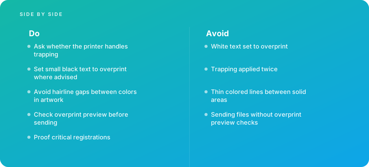
Verdict Trapping and overprint are rarely where a print budget goes, but they are often where a reprint comes from. The decisions that matter are few: decide who traps before the artwork is finished, supply clean artwork without hairline gaps or thin colored lines, set small black text to overprint where the printer advises, never let white overprint, check overprint preview before sending, and proof critical registrations. For routine commercial print, ask your printer the right questions and review the proof. For packaging and spot-color work, bring in prepress specialists who can show you their trap specification and their proofing process, and compare quotes on those details before you compare them on price.
Where this comes from
- Adobe Help Center — Illustrator User Guide
- International Color Consortium — Color management
The figures and practices above come from the sources listed.
Working on something like this?
We take on Image Editing & Retouching work for teams who want it done once, properly. Tell us what you are building and we will tell you honestly whether we are the right studio for it. Start a project.
Where to go next
Spotted something wrong? Report an error on this page. We correct on the page and say what changed.