Product Color Variants: What Actually Works
A ten-point checklist for product color variants: when to recolor or reshoot, sourcing references, masking trims, keeping texture and checking accuracy.
 Imogen Clarke

Product color variants are images of the same item in each of its colorways, produced by digitally recoloring one photograph instead of shooting every version. A sneaker offered in nine colors, a sofa available in fourteen fabrics or a phone case sold in six finishes can all be shown from a single well-lit hero shot, with the other colors built in post-production. Done well, the approach saves days of studio time, keeps every angle and crop identical across the range and lets a new colorway go live before samples even arrive in bulk.
Done badly, it is one of the quickest ways to generate returns. A customer who orders "forest green" and receives something closer to olive does not care that the image was recolored; they only know the photo was wrong. Inaccurate color is a common reason for complaints and returns in apparel, home goods and accessories, and recolored variants are especially exposed because nobody photographed the real thing. The problem is rarely the software. It is the process around it: where the target color comes from, what the base image looks like, how the masks are built and who checks the result.
This guide is written for ecommerce managers, marketers and in-house retouchers who produce or commission recolored product images. It starts with a master checklist and then works through each item in order: why it matters, how to do it properly and where it usually goes wrong. If you are still deciding how retouching fits into your wider image pipeline, our overview of the decisions that matter in product photography retouching is a useful companion.
The Product Color Variants Checklist at a Glance
Every item below maps to a section later in this article. Use the list as a brief for a retoucher, as a quality gate for an outside supplier or as a self-check before a range goes live. The order is deliberate: most failures in recolored imagery are decided before anyone opens an editing application, so the early items carry the most weight.
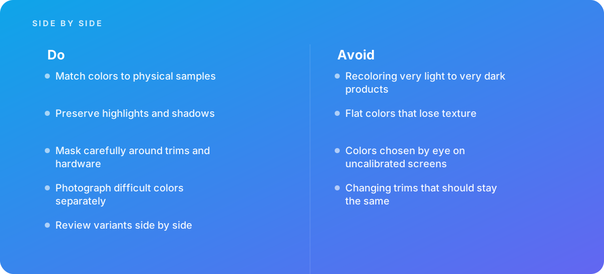
- Decide per colorway whether to recolor or photograph, based on how far the target is from the base in lightness and material behavior.
- Obtain an authoritative color reference for every variant: a physical swatch, the manufacturer's measured values, or both.
- Shoot a base image designed for recoloring, with neutral lighting, a color target in frame and a mid-tone sample.
- Build separate masks for the recolorable surface, the trims and hardware, and the stitching and labels that must stay unchanged.
- Choose the recoloring method per material rather than using one technique for everything.
- Preserve the original luminance structure so highlights, shadows and texture survive the color change.
- Check every variant numerically against its reference on a calibrated, profiled display.
- Review the complete colorway set side by side, at listing size and at zoom, before approval.
- Export with correct color space conversion, embedded profiles and SKU-based file names.
- Know the triggers for bringing in specialist help, and track returns that cite color.
A retoucher who follows all ten will not produce perfect results every time, because some products simply cannot be recolored convincingly. What the checklist does is make those cases visible early, when reshooting a single sample is cheap, instead of after launch, when the fix is a batch of refunds.
Item 1: Decide Which Colorways to Recolor and Which to Photograph
The first decision is not how to recolor but whether to. Recoloring works by shifting hue and saturation while keeping the underlying tonal structure of the photograph. That structure, the pattern of light and dark that describes folds, seams, grain and gloss, was captured for one specific surface lightness. The farther the target color sits from that lightness, the more the structure has to be stretched, and the more obviously artificial the result becomes.
Lightness distance is the main risk factor
A practical way to judge this is to compare the CIELAB lightness value, L*, of the base color and the target. L* runs from 0 (black) to 100 (white). A mid-gray fabric might measure around L* 50, a navy around L* 20 to 30, and a cream around L* 85 to 90. Shifting a red sweater to a blue sweater of similar lightness is mostly a hue change, and hue changes are forgiving. Shifting a white sneaker to black is almost entirely a lightness change, and lightness changes are not: the highlights that were bright and broad on a white surface become implausibly strong on a black one, and the shadow detail that was visible in white disappears into mush when darkened.
Many studios work with an informal threshold: recolor when the target is within roughly 20 to 25 L* units of the base, treat 25 to 40 units as case-by-case, and photograph anything beyond that. These are working rules of thumb rather than standards, and they shift with material. Matte cotton tolerates bigger jumps than satin; brushed metal tolerates less than painted plastic.
| Situation | Typical risk when recoloring | Usual decision |
|---|---|---|
| Hue change at similar lightness (red to blue, both mid-tone) | Low; texture and shading carry over naturally | Recolor |
| Moderate lightness change (mid-gray to navy or to sand) | Moderate; highlights and shadow density need adjustment | Recolor with tonal remapping, then verify |
| Very light to very dark, or the reverse (white to black) | High; specular highlights and shadow detail look wrong | Photograph separately |
| Change in finish (matte to gloss, suede to patent) | High; reflections cannot be invented convincingly | Photograph separately |
| Fluorescent, metallic or iridescent targets | Very high; often outside the display gamut and dependent on viewing angle | Photograph separately |
| Printed or multi-color patterns | High; each color region needs its own mask and reference | Usually photograph; recolor only simple two-tone prints |
Material behavior matters as much as color
Some materials change how they look with color, not just what color they are. Dyed velvet and suede show different pile contrast in dark and light shades. Translucent plastics transmit more light when pale. Heathered knits are made of mixed fibers, so a "charcoal heather" is not a darker version of "light gray heather"; the ratio of fiber colors changes. In each of these cases a recolor from the wrong base produces an image that is technically the right average color but visually the wrong product.
Pros
- One shoot covers the whole range, so angles, crops and lighting are identical across colorways.
- New or late colorways can be listed before physical samples are available in quantity.
- Reshoots for a color correction are unnecessary; the file can be adjusted.
- Studio time, sample shipping and styling effort scale with products, not with colors.
Cons
- Accuracy depends on having a reliable reference for every color, which someone has to source.
- Large lightness or finish changes look artificial no matter how skilled the retoucher.
- Errors are systematic: a bad base or reference corrupts every variant built from it.
- Complex masks around trims, hardware and stitching can take longer than a quick reshoot.
The trade-off, in short, is consistency and speed against the risk of a believable but wrong image. Most well-run programs are hybrids: they photograph the lightest and darkest colorways and any unusual finishes, then recolor everything in between from whichever photographed base sits closest in lightness.
Item 2: Get an Authoritative Color Reference for Every Variant
A recolored image can only be as accurate as the target it was matched to. "Make it look like the swatch in the line sheet PDF" is not a reference; that PDF was produced on someone else's monitor, possibly converted between color spaces several times and may never have been checked against the product. Every variant needs a reference that traces back to the physical item.
Physical samples are the gold standard
The most reliable reference is a physical swatch or production sample of each colorway. Ideally that means fabric cut from the actual production lot, a painted chip from the actual finish, or the finished product itself. Dye lots vary, so a swatch from sampling may differ slightly from bulk production; when that difference is significant the brand should decide which one the images represent, usually production.
Physical samples need a controlled way to look at them. A viewing booth or a daylight-balanced lamp around 5000K to 6500K, with neutral gray surroundings, lets a retoucher compare sample and screen without the warm cast of office lighting distorting judgment. Better still, the sample can be measured.
Measured values beat eyeballed values
A spectrophotometer or a good colorimeter measures a swatch and reports its color as numbers, typically CIELAB values under a stated illuminant such as D50 or D65. Those numbers can be compared directly with the values in the recolored image, which removes most of the argument from approval meetings. If the manufacturer already supplies Lab values, or references a color system such as a textile color standard, those are useful too, provided you know the illuminant they refer to and convert them properly rather than typing an RGB approximation found online.
Where no instrument is available, a disciplined workaround is to photograph each swatch under the same lighting as the base product, with a color target in the frame, and sample the corrected swatch image. It is less precise than direct measurement but far better than choosing colors by eye.
- Record for each colorway: the name, the SKU, the source of the reference (swatch, lot number, manufacturer data), the Lab values and the illuminant.
- Store swatches flat, away from light and labeled; many dyes fade measurably with exposure.
- Re-measure when a new production lot arrives rather than assuming it matches the last one.
Item 3: Shoot a Base Image Built for Recoloring
A base image intended for recoloring is not simply the nicest-looking photograph of the product. It is a photograph whose tonal structure will survive being pushed into other colors. That changes a few decisions on set.
Choose the right base colorway
Pick a base that sits in the middle of the lightness range you need to cover, and that is moderately saturated rather than intense. A mid-gray, mid-blue or mid-tan usually recolors more convincingly in both directions than a pure white or a vivid primary. Very saturated bases can clip in one or more RGB channels, and clipped channels hold no texture information to recover. If the range spans pale to very dark, plan two bases, one light and one dark, and recolor from whichever is closer.
Light for information, not drama
Recoloring rewards even, controlled lighting. Hard specular highlights are the hardest thing to make plausible in a new color, so diffuse sources and a moderate lighting ratio give the retoucher more to work with. Keep highlights below clipping; check the histogram or the capture software's clipping warning on the brightest part of the product, not just the background. Shoot raw, at base ISO, with a consistent white balance set from a gray card.
Include a target and a swatch
Photograph a color checker target in the same light at the start of the session, and ideally a frame with the physical swatches of each colorway next to the product. That frame is invaluable later: it lets the retoucher build or verify a camera profile, confirm that the neutral balance is correct and see how each real color renders under exactly the same conditions as the base.
Tip: Shoot one or two "anchor" colorways for real even when you plan to recolor the rest, and choose them from opposite ends of the range.
- They act as a reality check: a recolored variant that sits between two photographed ones should look like it belongs between them.
- They give you a better base for the variants closest to them in lightness.
- If a buyer questions accuracy, you can show that the recolors were calibrated against real captures.
Framing, angle and styling should follow your existing product standards, because the whole point is that variants line up perfectly. If those standards are not yet written down, our guide to consistent product image framing covers the decisions worth fixing before the shoot.
Item 4: Build Masks That Respect Trims, Hardware and Stitching
Most products are not a single color. A backpack in "olive" may have olive body fabric, black webbing, gunmetal zippers, a tonal logo patch and contrast stitching. A sofa in "teal" may have wooden legs and piping that stays gray in every colorway. The colorway specification describes which of these parts change and which do not, and the masks must follow it exactly.
Map the components first
Before any masking, list each component and its color in every colorway. This takes a few minutes with the product spec sheet and avoids the most common recoloring error: changing parts that should stay the same. Zipper pulls, buttons, rivets, soles, embroidered logos, care labels and contrast stitching are the usual casualties. A single wrong zipper color across twelve listings is an easy way to generate complaints from customers who ordered specifically for that detail.
Mask by component, not by color
Selection tools that pick pixels by color are tempting because they are fast, but they grab everything within the color range, including trims of a similar hue and reflections of the main fabric on hardware. Build masks around physical components: one for the recolorable body, one for each trim that changes independently and a protection mask for anything that must stay fixed. Use paths or precise brush work for hard edges such as hardware and piping, and softer, refined edges for fabric boundaries, fur, fleece and frayed edges.
- Edges: check mask edges at 200 to 300 percent zoom; halos of the original color along seams are the most visible artifact at listing size.
- Stitching: tonal stitching usually changes with the fabric; contrast stitching usually does not. Confirm which applies.
- Reflections: polished hardware reflects the surrounding fabric. When the fabric changes color, the reflection should too, which is a separate, small adjustment inside the hardware mask.
- Reuse: save masks as named channels or layer masks so every variant uses the identical selection.
Complex masking is often the largest single time cost in a variant project, and it is paid once per product rather than once per color. That is one reason recoloring pays off most for products with many colorways and hurts least when the masks are built carefully at the start.
Item 5: Match the Recoloring Method to the Material
There are three broad families of recoloring technique, and each suits different materials and color changes. Using one method for everything is a common reason variants look flat or plasticky.
Hue and saturation adjustments
Adjusting hue and saturation inside a mask is the simplest method and works well when the base and target share similar lightness and the base is moderately saturated. It keeps texture intact because it leaves the tonal structure largely alone. It struggles when the base is near-neutral (there is little hue to rotate), when the target needs a large lightness change, or when the fabric contains subtle multi-hue variation that rotates in unexpected ways.
Color replacement
Color replacement tools select a color range and shift it to a new hue, saturation and lightness in one step. Adobe documents this workflow in its Help Center guidance on replacing colors, and it is a fast way to handle products where one color dominates. Because the selection is driven by color rather than by component, it should be combined with a component mask so it cannot bleed into trims or background.
Blend modes and color layers
A fill of the target color on a layer set to the Color or Hue blend mode, clipped to the component mask, applies the target's hue and saturation while keeping the base image's luminance. Paired with a separate curves or levels layer to set lightness, this gives the most control: color and tone are adjusted independently, and each can be measured. Many retouchers prefer working in Lab mode or with Lab-based adjustments for the same reason, since L* and the a*/b* color channels are separated by design.
Gradient maps for tricky neutrals
When the base is white, gray or black, there is little color to shift. A gradient map clipped to the mask can remap the base's tonal range onto a new color ramp, with the shadow, midtone and highlight colors set individually. This is the usual approach for heathered or near-neutral materials, although the results need close checking in the highlights, which tend to pick up too much saturation.
| Method | Best for | Watch out for |
|---|---|---|
| Hue and saturation | Similar-lightness hue changes on matte materials | Near-neutral bases, uneven hue rotation in mixed fibers |
| Color replacement | Single dominant color, quick turnaround | Selection bleeding into trims and reflections |
| Color blend layer plus curves | Precise matching to measured targets | Needs a separate lightness adjustment to look right |
| Gradient map | White, gray and black bases; heathered fabrics | Oversaturated highlights, posterized shadows in 8-bit files |
Whatever the method, work non-destructively on adjustment layers in a 16-bit file. Large tonal shifts in 8-bit data produce banding in smooth areas such as leather panels and molded plastics.
Item 6: Preserve Highlights, Shadows and Texture
The most common visual giveaway of a recolored product is flatness. The color is right on average, but the fabric looks like a vinyl print of itself: weave pattern softened, folds reduced to smooth gradients, highlights either gone or oddly tinted. Preserving texture is mostly about protecting the luminance detail of the base image while the color changes.
Remap tone, do not replace it
When a target is darker than the base, the temptation is to darken everything with a single levels move. That compresses the shadows until they fill in and scales the highlights down proportionally, which reads as dull. A better approach is to use curves to lower the midtones to the target L*, hold some separation in the shadows so fold detail survives, and reduce highlights less than midtones, because real darker fabrics still catch light at the same places. For lighter targets, the reverse applies: lift midtones, protect the highlights from clipping and keep enough shadow density that the form still reads.
Keep highlights appropriately neutral
On many materials, specular highlights are close to the color of the light rather than the color of the surface. Glossy leather, coated fabrics and plastics are good examples. If a color layer tints those highlights as strongly as the midtones, the product looks painted. Masking the brightest highlights out of the color layer, or reducing the layer's effect with a blend-if range, keeps them closer to neutral. Matte fabrics behave differently; their highlights carry more of the surface color, and they should stay tinted.
Separate texture from color when needed
For difficult cases, it can help to split the image into a low-frequency layer that carries color and broad tone and a high-frequency layer that carries weave, grain and fine detail. The color change is then applied to the low-frequency layer while the texture layer stays untouched. This is the same principle used in skin retouching, and our article on frequency separation and what actually works explains how to choose the blur radius so texture and tone separate cleanly.
Tip: Compare the recolor and the base at 100 percent zoom with the color removed. Convert both to grayscale temporarily, or view only the luminance channel. If the recolored version has visibly less texture or flatter folds, the tonal adjustment is too aggressive, and no amount of color tweaking will fix it.
Shadows cast onto the background or a surface also deserve attention. A contact shadow under a pale product may pick up a little of its color from bounced light; when the product becomes dark, that tint should change or disappear. Our guide to getting product shadows and reflections right covers how to rebuild them consistently across a range.
Item 7: Measure Variants Against the Reference on a Calibrated Screen
Choosing colors by eye on an uncalibrated screen is one of the classic mistakes in variant work, and it is easy to see why it persists: the image looks right to the person making it. But an uncalibrated display can be off in white point, gamma and saturation, and the retoucher's eye adapts to it within minutes. A variant approved on one screen may look noticeably different on the customer's phone and wrong again on the merchandiser's laptop.
Calibrate and profile the editing display
The editing display should be calibrated and profiled with a hardware device at regular intervals, commonly every few weeks for critical work, with a target white point of D65 and a luminance appropriate to the room, often in the range of 80 to 120 candelas per square meter for a dim, controlled environment. The profile tells the operating system and the editing software how the display actually behaves so colors are shown correctly. Our guide to color management done properly walks through the full chain from camera to screen to file.
Sample numbers, not impressions
Use the color sampler or info panel to read Lab values from the recolored surface, averaging over an area rather than a single pixel so the texture does not skew the reading. Sample a flat, evenly lit midtone area, not a fold or a highlight, because that is where the swatch measurement is most comparable. Then compare with the reference Lab values using a color difference formula; CIEDE2000, written as ΔE00, is the usual choice because it tracks perceived difference better than the older formulas.
Tolerances depend on the product and the brand. As a general guide, differences below about 1 ΔE00 are very hard to see even side by side, differences around 2 to 3 are visible to a trained eye in direct comparison, and larger differences are usually obvious to customers. Many teams set a tighter tolerance for hero products and signature colors than for accessories. Our deeper look at Delta E and color accuracy explains how to set and apply those thresholds without chasing numbers that no one can perceive.
Accept the limits of the medium
Some real colors cannot be displayed in standard web color spaces at all. Very saturated oranges, cyans and greens, and fluorescent colors in particular, can fall outside sRGB. In those cases, the goal is the closest in-gamut representation that preserves the relationship between colorways, and the reference sample remains the authority. Documenting which colorways are affected helps customer service answer questions honestly.
Item 8: Review the Whole Colorway Set Side by Side
Each variant can pass its individual check and the set can still look wrong. Customers rarely see a single color in isolation; they see a row of swatches on a product page or a grid of thumbnails in a category listing. If "navy" and "midnight" look identical, or if the "sand" reads as warmer than the "camel", the range fails even when the numbers are within tolerance.
What to look for in a set review
- Order and spacing: colors that are distinct in the range should be distinct on screen, and a light-to-dark sequence should look evenly stepped.
- Consistency of texture: all variants should show similar weave, grain and fold detail; one flatter variant stands out immediately.
- Unchanged elements: trims, hardware, labels and backgrounds should be identical across the set, pixel for pixel where possible.
- Swatch chips: if the site displays small color chips, they should be sampled from the final images, not typed in from a separate list.
- Photographed anchors: recolored variants should sit convincingly alongside any colorways that were shot for real.
Review at the sizes customers actually use: a thumbnail grid, a product page image and a zoomed detail. Problems in mask edges show at zoom; problems in color relationships show in the grid. Our practical guide to matching color across images includes techniques for bringing a set into line without breaking individual matches.
Tip: Place the physical swatches in a viewing booth next to the display during the set review and have someone other than the retoucher approve the set. A fresh pair of eyes that has not adapted to the images for hours will catch relationships the retoucher no longer sees.
Item 9: Export, Name and Manage Variant Files Correctly
An accurate master file can still produce an inaccurate listing if the export is careless. The usual failure is a file saved in a wide-gamut working space, such as Adobe RGB or ProPhoto RGB, without conversion or without an embedded profile. Browsers and apps then interpret the numbers as sRGB, and colors shift, usually becoming duller or more saturated depending on the case.
Convert, embed and check
For most web and marketplace use, convert final images to sRGB with a perceptual or relative colorimetric rendering intent and embed the profile. The ICC profile is what tells software how to interpret the numbers in the file; the International Color Consortium's introduction to the ICC profile format explains the mechanism if your team needs to understand why a missing profile causes shifts. If your platform supports wider-gamut images and your audience largely uses capable displays, Display P3 delivery may be worth considering for saturated colorways, with an sRGB fallback; our article on wide gamut color for the web covers when that is worth the extra complexity.
After export, open a sample of the final files in a browser and on a phone, next to the master, to confirm nothing changed in conversion or compression. Aggressive compression can also shift color in fine textures, particularly in reds and blues, so check a detail crop as well as the full image.
Name and store by SKU
Variant projects multiply files quickly: one product in eight colors and six angles is 48 finished images, plus masters. Name files by SKU and colorway code, not by color name alone, because color names change between seasons and marketing teams. Keep the layered master with its masks so a future colorway can be added in minutes, and record which variants were recolored and from which base. Our guide to organizing image libraries by product sets out naming and folder structures that keep variants traceable.
Worked Example: One Jacket, Six Colorways
The following example is illustrative, not a client project, but the numbers are realistic for a matte technical fabric. A brand launches a lightweight jacket in six colorways and needs five angles of each, 30 images in total. Swatches from production are available and have been measured with a spectrophotometer under D50.
Step one: plan the shoot
The colorways and their measured lightness are: Cream (L* 88), Sand (L* 72), Slate (L* 52), Olive (L* 44), Navy (L* 24) and Black (L* 14). Applying the lightness-distance rule of thumb, Slate is chosen as the main base because it sits in the middle. Cream and Black are more than 35 L* units away from Slate and are photographed separately. Sand is 20 units from Slate and 16 from Cream; Navy is 28 from Slate but only 10 from Black. So the plan becomes: shoot Cream, Slate and Black (15 images), then recolor Sand from Cream, Olive from Slate and Navy from Black.
| Colorway | Target L* | Source | Base L* | Lightness distance | Illustrative result, ΔE00 |
|---|---|---|---|---|---|
| Cream | 88 | Photographed | n/a | n/a | 0.9 after correction |
| Sand | 72 | Recolored from Cream | 88 | 16 | 1.4 |
| Slate | 52 | Photographed | n/a | n/a | 0.8 after correction |
| Olive | 44 | Recolored from Slate | 52 | 8 | 1.1 |
| Navy | 24 | Recolored from Black | 14 | 10 | 1.7 |
| Black | 14 | Photographed | n/a | n/a | 0.7 after correction |
Step two: mask and recolor
The jacket has a body fabric that changes with colorway, black zipper tape and pulls that never change, a reflective logo that stays silver and tonal stitching that follows the body. The retoucher builds one body mask per angle, with the zipper and logo excluded, and saves it in each base file. Because the three bases share identical framing, the masks transfer between them with minor edge corrections.
Olive is created from Slate with a color layer set to the Color blend mode plus a curves layer that lowers midtones by about 8 L* units while holding shadow separation. Sand from Cream needs a larger tonal move downward and more saturation, so a curves adjustment handles tone and a color layer handles hue. Navy from Black is the hardest: lifting a near-black base tends to reveal noise and flatten the fabric, so the retoucher works on a 16-bit file, lifts midtones gently and uses a gradient map to introduce the blue without tinting the highlights too strongly.
Step three: verify and review
Each variant is sampled over a flat midtone area on the back panel and compared with the swatch values. In this illustration all three recolors fall under the team's tolerance of 2 ΔE00 for this product. The six colorways are then laid out as a thumbnail grid and at full size, with the physical swatches in a viewing booth beside the display. The reviewer notices that the Navy looks slightly flatter than the others in the folds under the arms; the retoucher restores some shadow contrast with a local curves adjustment, and the set is approved.
The saving here is not the whole range. Three of six colorways still had to be photographed. What the brand gains is 15 fewer studio images, perfectly matched framing across all 30 and a documented base for any colorway added next season. For a range of twelve colors, the proportion of recolored images would typically rise, because more targets would fall close to an existing base.
Item 10: Know When to Bring In Specialist Help
Recoloring a single product in two or three similar colors is well within reach of a competent in-house retoucher with a calibrated display and measured references. The picture changes as ranges grow or as color complaints appear. The clearest triggers are:
- Many colorways across many products. Once a season involves dozens of products in multiple colors, the work becomes a production process. Consistent masks, shared bases, documented references and a structured review step matter more than any one retoucher's skill.
- Returns or reviews citing color. If customers mention that the color "was not as pictured," treat it as a process signal. Track which SKUs attract the comments and whether they were recolored or photographed; the pattern usually points to a particular base, material or colorway family.
- Difficult materials. Metallics, glossy leather, translucent plastics, velvets and heathered knits are all harder to recolor convincingly and often benefit from a hybrid of reshoots and specialist retouching. Transparent and glass items are a separate discipline again, because their color depends on what is behind and beneath them.
- No color-managed workflow in house. Without calibrated displays, measured references and a defined export pipeline, even talented retouchers are working blind.
When evaluating an outside supplier, ask how they obtain references, whether they measure results numerically, how they handle trims and hardware and whether they will tell you when a colorway should be photographed instead of recolored. A supplier who recolors everything without question is not saving you money if it shows up as returns. Our color correction and replacement service is built around those checks, with reference-matched recolors and side-by-side set review as standard.
Verdict Product color variants work when recoloring is treated as a measured process rather than a creative guess. Recolor hue changes and moderate lightness shifts from a well-shot, mid-tone base; photograph extreme lightness jumps, finish changes and difficult materials; match every variant to a physical or measured reference on a calibrated display; and review the full set side by side before anything goes live. Follow those rules and recoloring delivers consistent, accurate images at a fraction of the shoot effort. Skip them and it becomes a reliable source of returns.
Where this comes from
- Adobe Help Center — Replace colors
- International Color Consortium — Introduction to the ICC profile format
The figures and practices above come from the sources listed.
Working on something like this?
We take on Image Editing & Retouching work for teams who want it done once, properly. Tell us what you are building and we will tell you honestly whether we are the right studio for it. Start a project.
Where to go next
Spotted something wrong? Report an error on this page. We correct on the page and say what changed.