A Practical Guide to Variant Selectors
The controls on product pages that let shoppers choose options such as size, color and material, and how the page updates when they do.
 Marcus Adeyemi

Where most projects go wrong
The usual mistakes:
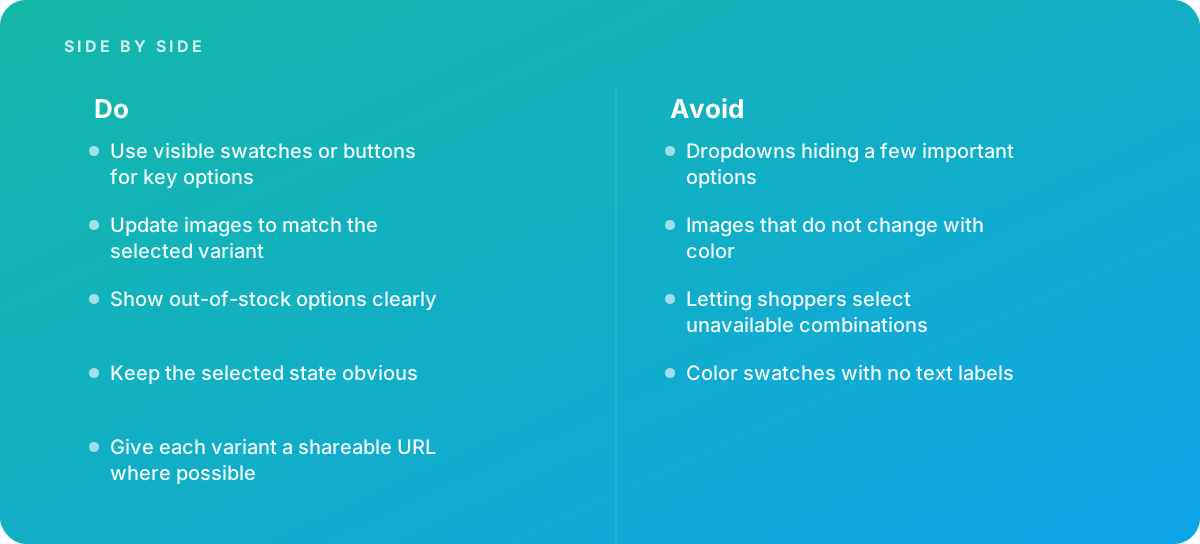
- Dropdowns hiding a few important options
- Images that do not change with color
- Letting shoppers select unavailable combinations
- Color swatches with no text labels
What good looks like instead
- Use visible swatches or buttons for key options
- Update images to match the selected variant
- Show out-of-stock options clearly
- Keep the selected state obvious
- Give each variant a shareable URL where possible
Why it matters
Confusing variant selectors cause wrong orders and lost sales, especially when stock differs by option.
The specs that matter
| Measure | Figure |
|---|---|
| Controls | swatches, buttons or dropdowns |
| Availability | out-of-stock options should be clearly marked |
| Updates | price, images and stock should change with the selection |
| Accessibility | controls must expose selected states |
Knowing when to hand it over
Tip: Bring in help when orders for the wrong variant are common.
Where this comes from
- Baymard Institute — Product page UX research
- W3C ARIA Authoring Practices Guide — Radio group pattern
The figures and practices above come from the sources listed.
Working on something like this?
We take on E-commerce Development work for teams who want it done once, properly. Tell us what you are building and we will tell you honestly whether we are the right studio for it. Start a project.
Where to go next
Spotted something wrong? Report an error on this page. We correct on the page and say what changed.