White Balance and Color Accuracy: What Actually Works
Setting the neutral reference so that whites look white and every other color follows correctly.
 Imogen Clarke

What is at stake
Color accuracy in product photography is commercially significant: inaccurate color drives returns, particularly in clothing and homeware.
The playbook
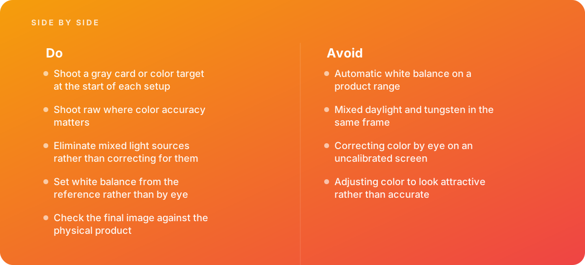
- Shoot a gray card or color target at the start of each setup
- Shoot raw where color accuracy matters
- Eliminate mixed light sources rather than correcting for them
- Set white balance from the reference rather than by eye
- Check the final image against the physical product
Where it goes wrong
Avoid:
- Automatic white balance on a product range
- Mixed daylight and tungsten in the same frame
- Correcting color by eye on an uncalibrated screen
- Adjusting color to look attractive rather than accurate
The numbers behind it
| Measure | Figure |
|---|---|
| Color temperature | measured in kelvin |
| Neutral reference | a gray card or color target |
| Raw advantage | white balance is fully adjustable afterward with no penalty |
| Mixed lighting | sources of different temperature cannot all be corrected at once |
| Profiling | a color target allows a camera profile to be built |
Getting outside help
When to hand it over: Bring in help when returns cite color, when images must match a physical sample, or when a catalog was shot under inconsistent lighting.
Where this comes from
- International Color Consortium — Color profiling
- Capture One — Color management documentation
- ISO — Color measurement standards
The figures and practices above come from the sources listed.
Working on something like this?
We take on Photography & Product Visuals work for teams who want it done once, properly. Tell us what you are building and we will tell you honestly whether we are the right studio for it. Start a project.
Where to go next
Spotted something wrong? Report an error on this page. We correct on the page and say what changed.