Toggle Switches: The Decisions That Matter
Controls that switch a setting on or off immediately, like a light switch, commonly used in mobile and settings interfaces.
 Priya Raghunathan

Where most projects go wrong
The usual mistakes:
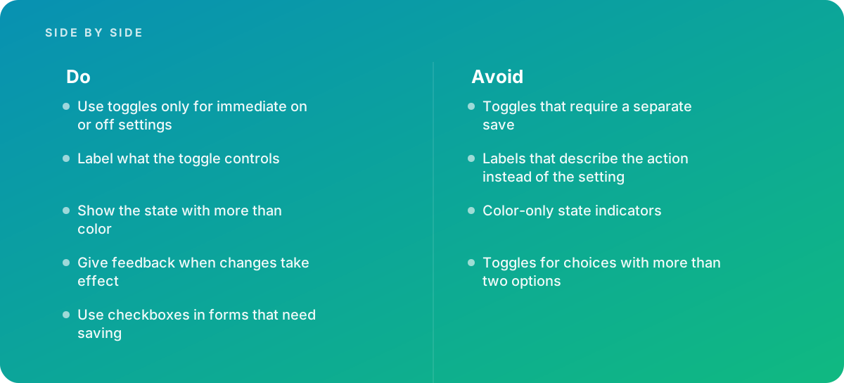
- Toggles that require a separate save
- Labels that describe the action instead of the setting
- Color-only state indicators
- Toggles for choices with more than two options
What good looks like instead
- Use toggles only for immediate on or off settings
- Label what the toggle controls
- Show the state with more than color
- Give feedback when changes take effect
- Use checkboxes in forms that need saving
Why it matters
Toggles imply an immediate effect, so using them where a save button is required, or with unclear states, confuses users.
The specs that matter
| Measure | Figure |
|---|---|
| Immediate effect | toggles should take effect as soon as they change |
| ARIA | role="switch" with aria-checked |
| State clarity | on and off should be clear without relying on color alone |
| Apple guidance | switches are used for binary settings |
Knowing when to hand it over
Tip: Bring in help when settings interfaces confuse users about what is on or saved.
Where this comes from
- Nielsen Norman Group — Toggle-switch guidelines
- W3C ARIA Authoring Practices Guide — Switch pattern
- Apple Human Interface Guidelines — Toggles
The figures and practices above come from the sources listed.
Working on something like this?
We take on UI & UX Design work for teams who want it done once, properly. Tell us what you are building and we will tell you honestly whether we are the right studio for it. Start a project.
Where to go next
Spotted something wrong? Report an error on this page. We correct on the page and say what changed.