Scientific Data Animation, Done Properly
Follow an illustrative flood-model project from brief to release and learn how to animate research data with honest scales, visible uncertainty and review.
 Tomas Lindqvist

Scientific data animation is animation built directly from research data: simulation output, model runs, sensor records and measured results, turned into moving images that a viewer can follow. Done well, it shows patterns that a static chart hides, such as how a plume spreads, how a signal drifts over a season or how a system responds when one input changes. Done carelessly, it does something more dangerous than confuse people. It persuades them of a level of certainty that the underlying data never had.
This guide matters to research groups, universities, public agencies, science communicators and the marketing teams at companies whose products rest on research. It also matters to the studios they hire, because the craft skills that make motion graphics feel polished (smooth interpolation, clean scales, confident camera moves) are exactly the ones that can overstate evidence. The discipline is to make the animation beautiful and honest at the same time, and to know which of the two wins when they conflict.
Rather than list principles in the abstract, this article follows one project from brief to delivery and explains each decision as it came up. The project is an illustrative example, a composite built to show a realistic workflow. The organization, the model and every number attached to it are invented for teaching purposes and are not a client story.
The Illustrative Brief: Animating a Coastal Flood Model for Three Audiences
In our illustrative scenario, a university coastal hazards group has run a hydrodynamic model of a storm surge hitting a mid-sized estuary town. The model produces water depth across the town on a regular grid, once per model hour, for a 72-hour window around the storm's landfall. The group ran the model as an ensemble: twelve runs with slightly different storm tracks and intensities, so they have a spread of outcomes rather than a single answer. Their paper is in review at a journal, and they want an animation to accompany the public release.
The brief named three audiences, and that shaped nearly everything that followed:
- Residents and local officials, who want to know whether their street floods, how deep and for how long, and who will watch on a phone, often without sound.
- Journalists, who will clip the animation, screenshot single frames and write captions without the paper in front of them.
- Other scientists and funders, who will judge whether the visual represents the study fairly and will notice immediately if it does not.
The group also gave us one hard constraint, written into the brief in a single line: the animation must not show anything the paper does not support. That sentence sounds simple and turns out to govern every choice about interpolation, color, camera and narration. We treated it as the acceptance criterion for the whole project, and we wrote it at the top of the production document so that every reviewer, including the editors and animators who never read the paper, saw it every time they opened the file.
Before quoting, we ran the scoping conversation we run on any animation job, covering deliverables, review rounds, formats and ownership of source files. Our general approach is described in the decisions that matter when scoping animation projects. For data work we add three scientific questions to that checklist: what exactly is the data, what is it valid for, and who on the research side has the authority to say a frame is wrong.
Deliverables we agreed
- A 90-second narrated main film, 16:9, for the university site and the press release.
- A 30-second silent vertical cut with burned-in captions for social platforms.
- Six still frames for press use, each with a caption block that carries the data source, date and scenario label inside the image.
- An interactive-ready image sequence and a data appendix, so the web team could later build a scrubbable version.
Project Timeline From Data Handover to Release
The schedule below is the illustrative plan we agreed at kickoff. The shape is more instructive than the exact dates: the data audit and the scientific review rounds take up a larger share of the calendar than they would on a brand animation, and the render stage is shorter than people expect because most of the heavy thinking happens before a single final frame is produced.
- Week 1 Kickoff, data handover and a written data audit covering provenance, grid resolution, time step, ensemble structure and stated scope.
- Week 2 Encoding decisions: color map, scale breaks, time compression, how uncertainty is shown. A one-page visual rules sheet is signed off by the lead scientist.
- Week 3 Script and animatic with placeholder data at final timing. First scientific review focused on claims, not looks.
- Weeks 4 to 5 Production: terrain and building geometry, data layers, typography, caption and source overlays.
- Week 6 Second scientific review on full-resolution frames, plus an accessibility pass and a plain-language read by a non-specialist.
- Week 7 Narration record, final render, third review of the locked cut, and packaging of the data appendix and source files.
- Release day Publication alongside the paper, with the underlying data link live on the same page as the video.
Two features of this schedule are deliberate. First, the lead scientist signs the visual rules sheet in week two, before anything looks finished. Arguments about color maps and scale breaks are cheap in week two and very expensive in week six, when changing a scale means re-rendering every data layer. Second, the release date is tied to the paper, not to the animation. If the journal asks for changes that alter the findings, the animation waits. A film that contradicts the final paper is worse than a late film.
Auditing the Data Before Designing a Single Frame
The first week was spent reading, not designing. We asked for the model output files, the methods section of the draft paper and a short call with the modeler who actually ran the simulations, not only the principal investigator. The goal was a written data audit: a two-page document stating what the data is, where it came from, how fine it is in space and time, and what it is valid for. Every later decision references this document.
Provenance: source and date on the record
Every data layer in the film needed a clear origin. In our example, the model used a terrain elevation dataset from a public mapping agency, a building footprint layer from the town's planning office, and storm forcing derived from a historical storm with modified tracks. Each of those has a source and a date, and each ended up in the on-screen source line. The date matters as much as the source: a terrain survey from several years before a seawall was built describes a different town. We recorded the version and date of each input in the audit so that anyone could reconstruct exactly what the film shows.
Resolution in space and time
The model grid in our example was 10 meters, and output was saved once per model hour. Those two numbers set hard limits on what the animation can honestly show. A 10-meter grid cannot tell you whether water reaches one side of a house and not the other, so the film must not zoom to a level where a viewer reads that kind of detail from it. Hourly output means that anything happening between hours, such as the precise minute a road first overtops, is an estimate made by the animation software, not a model result.
Stated scope
The paper was explicit about scope: the model covers one storm scenario family, present-day sea level, and does not include rainfall flooding or failure of the existing flood defenses. That scope statement became a design input. It meant we could not label the film as showing "what will happen in the next big storm," because the model does not include rainfall and many real storms bring both. The title became a scenario, not a forecast.
Decision: We wrote the model's scope limits into the film itself, not only into the press notes.
- An opening title card states the scenario: one modeled storm family, present-day sea level, storm surge only.
- A persistent corner label reads "Model scenario" throughout, so any screenshot carries the framing.
- The narration names what the model leaves out in one plain sentence, rather than burying it in the credits.
The reason for putting scope inside the frame is practical. Journalists and social media users will crop, clip and screenshot. Whatever context lives only in a caption beneath the video, or in a press release, is lost the moment a single frame travels on its own. If the frame cannot carry its own caveat, assume the caveat will be lost.
Choosing Scales, Color and Axes That Keep Scientific Data Animation Honest
Once the audit was done, the next step was encoding: deciding how each number in the data turns into something visible. This is where most of the interpretive power of an animation sits, and it is also where honest data can be made to look alarming or reassuring depending on choices a viewer never sees.
The depth color scale
Flood depth is a sequential quantity, running from zero upward, so it needs a sequential color scale in which lightness changes steadily with the value. Rainbow-style scales, which cycle through many hues, create visual boundaries where none exist in the data: a viewer sees a sharp edge where yellow turns to green and assumes something important happens at that depth. We chose a single-hue blue scale, light to dark, and checked it against common forms of color vision deficiency. Perceptually uniform maps such as viridis or cividis are good defaults when a single-hue scale does not suit the subject.
The harder question was whether to use a continuous scale or bands. Residents think in practical thresholds, such as ankle-deep, knee-deep or deep enough to stall a car, and the research group already reported results in depth bands. We used four bands with boundaries taken from the paper, so every color on screen corresponded to a category the scientists had defined. That made the legend readable at phone size and kept the film aligned with the paper's own vocabulary.
Vertical exaggeration and camera angle
Coastal terrain is flat. Shown at true scale in an oblique 3D view, a meter of water is almost invisible, which is why many flood visualizations exaggerate vertical scale. Exaggeration is legitimate, but it changes interpretation: at five times exaggeration, a half-meter flood looks like a wall of water. We limited the 3D sections to establishing shots, labeled the exaggeration on screen whenever it was active, and did the depth storytelling in a top-down map view where the color scale, not the apparent height, carries the value.
Time compression
Seventy-two model hours had to fit into roughly sixty seconds of the main film, with the rest given to title, context and closing. That works out to about 1.2 seconds per model hour. The time readout on screen shows the model hour and the day, and it ticks in whole hours so that the clock never displays a time resolution the model does not have.
The table below records the main encoding decisions and the reasoning, as they appeared in the signed visual rules sheet.
| Element | Option rejected | Option chosen | Reason |
|---|---|---|---|
| Depth color | Rainbow continuous scale | Single-hue blue, four bands from the paper | No false boundaries; legend matches the study's categories |
| 3D terrain | Exaggerated 3D for the whole film | 3D for establishing shots only, exaggeration labeled | Height would otherwise overstate depth |
| Time readout | Running clock in minutes | Whole model hours with day label | Model output is hourly |
| Map zoom | Street-level close-ups on single houses | Minimum view width of several grid cells per building block | 10-meter grid cannot resolve individual properties |
| Scenario label | Caption beneath the video only | Persistent on-screen label and source line | Screenshots and clips keep the context |
| Uncertainty | Single "central" run only | Central run plus ensemble agreement layer | The study's result is a spread, not one line |
Axis and legend labeling followed one rule: if something is measured, the unit is on screen. Depth bands carried their meter values, the time readout carried its unit, and the scale bar on the map carried distance. An unlabeled axis in a scientific animation is not a style choice; it forces the viewer to guess, and viewers guess generously in favor of drama.
Showing Uncertainty Without Drowning the Story
The ensemble was the scientific heart of the study and the hardest thing to animate. Twelve runs produce twelve flood maps per hour. Showing all of them at once is unreadable; showing only the middle one hides the finding that matters most, which is that the flood extent in some neighborhoods depends heavily on the storm track.
We tested three approaches in the animatic stage:
- Central run with a probability overlay. Show the median run in the depth colors, and outline areas where fewer than half of the runs flood with a dashed boundary.
- Agreement shading. Replace depth with the share of runs in which each cell floods, so the map shows how confident the model is rather than how deep the water is.
- Small multiples. Pause the animation at peak surge and show three runs side by side: a lower, a central and a higher outcome.
In the review, the scientists were clear that option two answered the question residents actually ask ("will my area flood?") most honestly, while option one was easier to read on a phone. We used both in sequence: the main flood progression plays with the central run and a dashed "possible in some runs" boundary, then at peak surge the film pauses on a small-multiples comparison of lower, central and higher runs before switching to the agreement map. The narration explains the difference in one sentence each.
Survey researchers have long handled a similar problem with margins of error, and organizations such as the Pew Research Center publish their methods alongside their findings so that readers can judge how much weight a number will bear. The same principle applies to a model animation: the spread is part of the result, and the viewer deserves a way to see it without reading the paper.
Trap avoided: Presenting the central run as "the" flood.
- A single run animated with confidence looks like a forecast of a specific event.
- Viewers outside the dashed boundary would reasonably conclude they are safe, which the ensemble does not support.
- If you can only show one layer, show agreement across runs rather than one member of the ensemble.
One more uncertainty decision is easy to miss: model skill. The paper validated the model against water level gauges from a past storm and reported where it performed well and poorly. Areas with weak validation, in our example a tidal creek network where the grid was too coarse, received a light hatch pattern and a short note in the legend. This is the visual equivalent of a footnote, and scientists recognize it immediately as a sign that the studio understood the study.
Interpolation, Frame Rate and the Point Where Smoothing Becomes a Claim
This is the section where motion graphics habits and scientific honesty collide most directly. The model gave us 72 real states, one per hour. At 30 frames per second and about 1.2 seconds per model hour, each hour spans roughly 36 frames, so only about one frame in 36 is a model output. Every other frame is invented by the software.
Standard animation practice would interpolate smoothly between states and add easing, so the water appears to flow. The result looks wonderful and implies that the model knows where the water edge is at every moment between hours. It does not. Worse, linear blending between two raster states can create intermediate shapes that no physical flood would produce, such as water appearing in a cell that is cut off by a levee, because the software is averaging pixels, not simulating flow.
We considered three options and weighed them with the scientists:
- Hard steps. Hold each hourly state for 36 frames, then cut. Completely honest, but the jumps are jarring and viewers read them as glitches.
- Short crossfade. Hold each state for most of the hour, then dissolve to the next over a few frames. The dissolve reads as a transition, not as motion, so it does not suggest flow the model did not compute.
- Full interpolation. Smooth morphing across the entire hour. The most attractive and the least defensible.
We chose the short crossfade: each hourly state holds for about 28 frames, then dissolves over 8. We also added a small tick mark on the timeline bar that lights when the frame on screen is an actual model output. Few viewers will notice it; the scientists did, and it gave them a precise answer when journalists asked whether a given frame was "real."
The same thinking applies to anything that moves in a data film. Particle trails showing current direction should be generated from the model's velocity field at the saved time steps, not from a generic turbulence effect. Camera moves should not track a feature so closely that motion blur or depth-of-field hides the grid resolution. And a slow, dramatic push-in on a flooded street implies precision about that street the model cannot give. Many of these principles overlap with other technical explainer work, such as mechanism of action animation, where the line between what is known and what is illustrated has to be drawn just as carefully.
The Illustrative Numbers Behind the Film
The figures below describe the illustrative project, not industry benchmarks. They are here so readers can see how the pieces fit together and scale the same reasoning to their own data.
A few more details show where the effort went. The main film ran 90 seconds at 30 frames per second, or 2,700 frames. The data layers were rendered as separate passes (depth bands, agreement, validation hatching, particle currents) and composited, so changing one layer did not mean re-rendering the terrain. That structure was chosen specifically because we expected the scientists to request changes to data layers late in the process, and it paid off when a corrected model run arrived in week five.
Budgets for projects like this vary widely, and it would be misleading to quote a single figure. The drivers are predictable: how clean and well-documented the data is when it arrives, whether the terrain and buildings need 3D modeling or can be shown as a flat map, how many ensemble or scenario variants need their own render, the number of review rounds, narration and translation, and whether an interactive version is in scope. In our experience the data audit and scientific review time are the items most often left out of early estimates, and they are the ones that protect the project. For a comparison of 2D map-based and 3D terrain approaches and how they affect scope, our 3D animation service and 2D animated video service pages describe what each involves.
How the render pipeline was structured
Model output arrived as gridded files with a defined coordinate reference system. We converted each hourly state to image tiles with a scripted pipeline in Python, applying the signed color bands in code rather than by eye in the compositor, so the mapping from value to color was reproducible and auditable. Terrain and buildings were built in a 3D package for the establishing shots, and the map view was assembled in a compositing tool. Keeping the color mapping in code meant that when the scientists asked "what depth does this exact blue represent?", we could answer by pointing to a line in a script rather than to a subjective grading decision.
Running Scientific Review Rounds That Catch Real Problems
Review is where data animation projects succeed or fail. A general client review asks "do you like it?" A scientific review asks "is this true, and does it say only what the study says?" Those are different questions, and they need different reviewers, materials and instructions. Our general method for structuring feedback is covered in how to review animation with clients; for scientific work we add the steps below.
Who reviews
We asked for two named scientific reviewers: the lead author, who owns the claims, and the modeler who ran the simulations, who knows the data's quirks. The modeler caught the most important problems in our illustrative project, including a projection mismatch that shifted the flood layer by roughly one grid cell against the building footprints. The lead author caught the framing problems, such as a narration line that described the scenario as "likely" when the paper never assigned a likelihood.
What they review
Round one reviewed the script and animatic against the paper, sentence by sentence. Round two reviewed full-resolution frames with the data layers in place, with a frame-numbered PDF of key stills so comments could be pinned to exact moments. Round three reviewed the locked cut with narration and captions. Each round had a written question list: Is every on-screen number traceable to the paper? Is anything shown at a finer resolution than the model supports? Does any word in the narration imply a probability, forecast or cause the paper does not state?
Decision: Scientific reviewers approve claims; the client team approves style.
- We split review comments into two columns: accuracy and presentation.
- Accuracy comments from the named scientists were binding; presentation comments went through the communications lead.
- This stopped a common failure where a well-meaning communications edit, such as a punchier headline, quietly changed a claim.
We also ran one plain-language check with a reader outside the project, asking them to describe what the film showed in their own words after one viewing. If their summary contained a claim the paper does not make, the film was implying it. In our example, the first viewer said "the whole waterfront will be under a meter of water," which led us to make the "possible in some runs" boundary clearer and to add a narration line about the spread of outcomes.
Accessibility, Captions and the Text Alternative
A data animation is a complex image in motion, and people who cannot see it, or cannot see its colors, still need its content. The W3C Web Accessibility Initiative guidance on complex images recommends pairing a short text alternative with a longer description that conveys the data itself. For our film that meant several concrete deliverables.
- Captions for the narrated film, and burned-in captions on the silent social cut, since most social viewers watch muted.
- A long description on the release page, written as prose and a simple table: which areas flood in the central run, which only in some runs, peak depth bands and timing by neighborhood.
- Color independence. The dashed "possible in some runs" boundary and the validation hatching carry meaning through pattern as well as color, so the key information survives in grayscale.
- Legibility at phone size. Legend text and the source line were tested on a small phone screen at arm's length. The source line is small but never below a size that can be read on a paused frame.
- Motion sensitivity. No flashing, and no rapid camera moves. The web embed respects reduced-motion preferences by offering the still-frame sequence as an alternative.
The long description had a second benefit: it forced us to write down, in plain words, exactly what the animation claims. Any sentence we could not write honestly in the description was a sign that the corresponding visual was saying too much. If the web team later builds the scrollable version, the approaches in our guide to scroll-triggered animation apply, with the same rule that each scroll position should map to a real model hour.
Publishing the Data and Delivering Files That Hold Up Later
The last step of the project was as much a scientific decision as a production one. Where possible, the underlying data should be published alongside the animation, so anyone who doubts a frame can check it. In our illustrative project, the research group deposited the model output in their institution's data repository with a persistent identifier, and the release page linked to it directly beneath the video. The film's closing card carried the same short link.
We also delivered a data appendix: the visual rules sheet, the color band values, the list of input datasets with versions and dates, the script that mapped values to colors, and a frame-to-model-hour table listing which frames are model outputs. That appendix answers most of the technical questions a journalist or reviewing scientist is likely to ask, without anyone needing to contact the studio.
- On-screen source line naming each dataset and its date
- Persistent scenario label that survives screenshots
- Uncertainty shown as a visible layer, not only in narration
- Units on every legend, readout and scale bar
- Vertical exaggeration labeled whenever it is active
- Frame-to-model-hour table showing which frames are real outputs
- Signed visual rules sheet and color mapping script in the handover
- Link to the published underlying data on the release page and closing card
- Captions, long description and grayscale-safe patterns
Source files were packaged with the render passes separated, so a future update, such as a new model run with updated sea level, can replace the data layers without rebuilding the film. Our general standards for handover are in the practical guide to delivering animation source files. Because research findings are revisited, we also agreed a retention plan with the group; archiving animation projects explains why a scientific film in particular should be archived together with the exact data version it shows, not just the final video.
Traps the Project Avoided and How to Spot Them in Your Own Work
Looking back across the illustrative project, most of the risk sat in a small number of recurring traps. None of them is exotic, and all of them look like good craft while you are making them.
Smoothness that implies precision
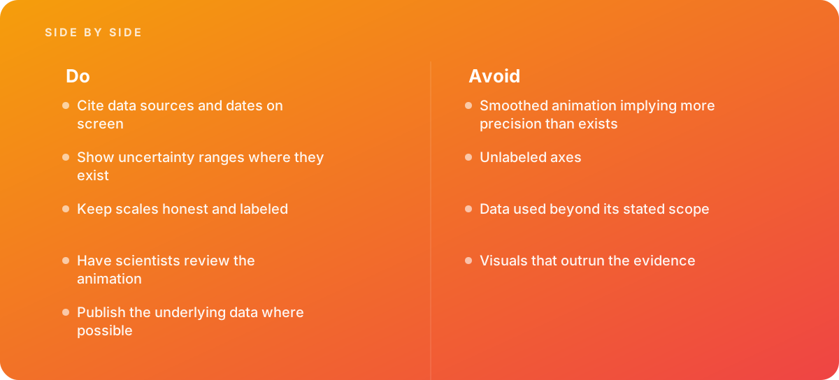
Fluid interpolation between sparse time steps makes the model look as if it knows more than it does. The fix is to decide, before animating, how many frames per second of the film are real data and to make transitions look like transitions, not like physics.
Data used beyond its stated scope
A storm-surge-only model shown under a title about "flooding" in general, or a present-day scenario presented as a future forecast, is data used beyond its scope. The scope statement from the paper should be one of the inputs to the script, not something checked at the end.
Visuals that outrun the evidence
Close-ups on individual houses, dramatic sound design, rising music at peak surge and a camera push-in all add emotional weight. Emotional weight is fine when the evidence supports it. When the grid is coarser than a house, or the peak is uncertain, the treatment should stay calmer than the most dramatic run.
Trap avoided: Late "clean-up" that removes the caveats.
- Near the end of a project, someone often asks to remove the source line, hatching or dashed boundary because the frame "looks busy."
- These elements are the honesty layer of the film. Simplify their design if needed, but do not delete them.
- Agree in the visual rules sheet which elements are mandatory, so removing one requires sign-off from the scientific reviewer.
Unlabeled axes and silent units
Every value on screen should carry a unit, every scale should be labeled, and any transformation, such as a logarithmic scale or vertical exaggeration, should be stated. The test is simple: pause on any frame and ask whether a stranger could read the numbers correctly from that frame alone.
Skipping the people who ran the model
The principal investigator knows the claims; the person who ran the model knows the data. Both need to review. Many of the problems that damage credibility, such as a misaligned projection, a wrong time zone on the clock or a mislabeled ensemble member, are invisible to anyone except the modeler.
When to Bring in a Specialist Studio for Research Animation
Research groups often have strong in-house visualization skills. Plotting libraries and scientific visualization tools can produce accurate animated figures, and for a conference talk or supplementary material that may be all you need. The case for outside help grows when the audience is public, when the film will be clipped and shared beyond your control, or when it needs narration, captions, multiple formats and a level of polish that people now expect from any video.
The right studio for this work is not simply the one with the most striking reel. Look for a team that asks about data provenance and scope in the first meeting, proposes a written visual rules sheet, expects named scientific reviewers, and is comfortable telling you that a shot you want would overstate the evidence. Ask to see how they handled uncertainty on a past project, and how they documented the mapping from data to color. Our broader advice on evaluating partners is in how to choose an animation studio, and the scope of what we offer is on our animation and motion graphics service page.
On the research side, prepare three things before approaching any studio: the data files with their documentation, the draft or published paper with its scope and limitations, and the name of the person who will be the final authority on accuracy. With those in hand, a good studio can plan a project like the one described here, where the film is attractive enough to be watched and restrained enough to be trusted.
A short test for any draft
Before approving a scientific animation, pause on five random frames and ask four questions of each. Can I tell where this data came from and when? Can I see how uncertain it is? Can I read every scale and unit? Would the study's authors agree with what this single frame implies if it were shared without context? If any answer is no, the film is not finished, however good it looks.
Where this comes from
- Pew Research Center — Methods
- W3C Web Accessibility Initiative — Complex images
The figures and practices above come from the sources listed.
Working on something like this?
We take on Motion Graphics & Animation work for teams who want it done once, properly. Tell us what you are building and we will tell you honestly whether we are the right studio for it. Start a project.
Where to go next
Spotted something wrong? Report an error on this page. We correct on the page and say what changed.