How to Get App Store Listing Design Right
Designing the icons, screenshots and preview videos that represent an app on the App Store.
 Priya Raghunathan
What is at stake
Store listings drive downloads, and Apple sets specifications for screenshots, previews and icons.
The playbook
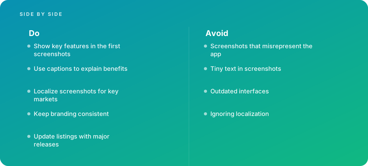
- Show key features in the first screenshots
- Use captions to explain benefits
- Localize screenshots for key markets
- Keep branding consistent
- Update listings with major releases
Where it goes wrong
Avoid:
- Screenshots that misrepresent the app
- Tiny text in screenshots
- Outdated interfaces
- Ignoring localization
The numbers behind it
| Measure | Figure |
|---|---|
| Screenshots | Apple allows up to 10 screenshots per device type |
| App previews | can run up to 30 seconds |
| Preview count | up to three app previews per localization |
| Icon | the App Store icon is 1024 by 1024 pixels |
Getting outside help
When to hand it over: Bring in help when launching apps in several markets.
Where this comes from
- Apple Developer — Screenshot specifications
- Apple Developer — App preview specifications
The figures and practices above come from the sources listed.
Working on something like this?
We take on Brand & Identity Design work for teams who want it done once, properly. Tell us what you are building and we will tell you honestly whether we are the right studio for it. Start a project.
Where to go next
Spotted something wrong? Report an error on this page. We correct on the page and say what changed.