How to Get Favicons and App Icons Right
The small icons that represent a brand in browser tabs, bookmarks, home screens and app stores, each with its own size and format requirements.
 Priya Raghunathan

At a glance
- Declaring a favicon link rel="icon" in the page head
- Web app manifest icons 192 and 512 pixels square are the commonly required sizes
- App Store icon supplied at 1024 by 1024 pixels
- Icon masks platforms apply their own shapes, such as rounded squares, to app icons
Why it matters
Why it matters: These are often the smallest and most frequently seen versions of a brand, and a full logo shrunk to 16 pixels usually becomes unrecognizable.
Best practice
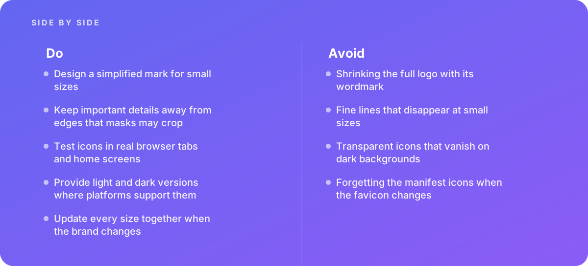
- Design a simplified mark for small sizes
- Keep important details away from edges that masks may crop
- Test icons in real browser tabs and home screens
- Provide light and dark versions where platforms support them
- Update every size together when the brand changes
Common pitfalls
Watch out for:
- Shrinking the full logo with its wordmark
- Fine lines that disappear at small sizes
- Transparent icons that vanish on dark backgrounds
- Forgetting the manifest icons when the favicon changes
When to call in a specialist
Bottom line Bring in help when launching an app or installable web app, or when the brand mark does not work at small sizes.
Where this comes from
- MDN Web Docs — Link types: icon
- web.dev — Add a web app manifest
- Apple Human Interface Guidelines — App icons
The figures and practices above come from the sources listed.
Working on something like this?
We take on Brand & Identity Design work for teams who want it done once, properly. Tell us what you are building and we will tell you honestly whether we are the right studio for it. Start a project.
Where to go next
Spotted something wrong? Report an error on this page. We correct on the page and say what changed.