Vector Graphics and Logos, Done Properly
Learn how to build, store and deliver vector logos properly: SVG, EPS and PDF formats, outlined type, SVG optimization and security, and raster fallbacks.
 Imogen Clarke

Vector graphics and logos belong together for a simple reason: a logo has to work everywhere, at every size, for as long as the business exists. Vector artwork is defined as shapes and paths rather than a grid of pixels, so the same file can print on a business card, fill the side of a delivery van or sit in a 32-pixel browser tab without going soft, jagged or blurry. A raster logo, by contrast, is locked to the pixel dimensions it was created at. Enlarge it and you enlarge its flaws.
This briefing is for business owners, marketers and in-house teams who hold responsibility for a brand's assets, and for the designers and developers who produce and publish them. It starts with an executive summary of the decisions that matter, moves into the technical depth a specialist needs (paths, formats, type handling, SVG optimization and security), and finishes with what it all means for cost, risk and planning. The core message is short: keep a vector master, deliver the right format for each job, and treat SVG files from outside sources with the same caution as any other code.
Most of the problems we see are not exotic. A logo that only exists as a JPEG pulled from an old website. A print file that arrives with live text in a font the printer does not have. A web SVG that weighs more than the photograph beside it because it is full of editor metadata. An upload form that accepts SVG and quietly lets script onto the site. Each of these is avoidable, and each is cheaper to fix before a deadline than during one.
Executive Summary: Five Decisions That Protect a Logo
If you read nothing else, read this section. Getting vector graphics and logos right comes down to five decisions, and most brand-asset headaches trace back to one of them being skipped.
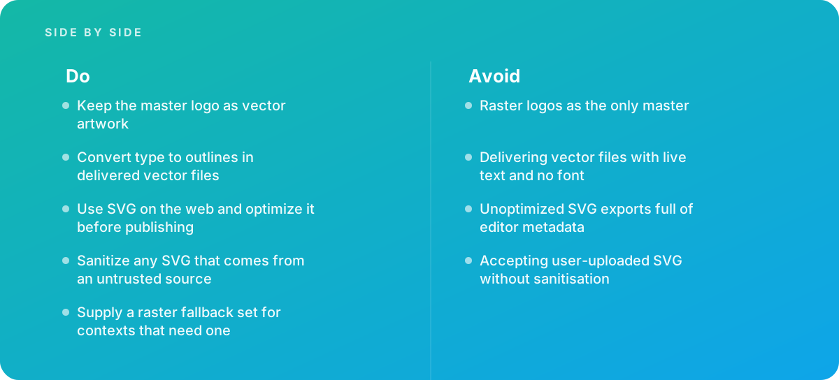
- Keep the master as vector artwork. The master logo should be a vector file with clean, closed paths, defined colors and nothing embedded that depends on the machine it was made on. Every PNG, JPEG, favicon and social avatar is an export from that master, never the other way around.
- Convert type to outlines in delivered files. When a vector logo leaves the studio, its lettering should be shapes, not live text. Otherwise the font must travel with the file, and on the recipient's machine it often does not.
- Use SVG on the web, and optimize it first. SVG is usually small and always sharp on any screen density, but only after the editor metadata, hidden layers and excessive decimal precision have been stripped out.
- Sanitize any SVG from an untrusted source. SVG is a markup format that can contain script. A logo uploaded by a user, a partner or a marketplace vendor must be cleaned before it is displayed on your site.
- Supply a raster fallback set. Email clients, office software, some social platforms and older systems still want PNG or JPEG. A prepared set of raster exports at known sizes stops people from screenshotting the logo off your website.
For the business, the payoff is practical. A proper vector master means a sign maker, a printer, a web developer or an embroidery shop can each get what they need in minutes instead of commissioning a redraw under time pressure. It also means the logo looks the same in all those places, which is the whole point of having one.
Insight: The expensive moment for a logo is rarely its creation. It is the first time someone needs it large, in a format nobody kept, a week before an event. A vector master is a cheap insurance policy against that week.
What Makes Artwork Vector: Paths, Anchors and Curves
A raster image is a grid. Each cell (pixel) stores a color, and the picture is only as detailed as the number of cells. A vector image is a set of instructions: start at this point, draw a curve to that point with this much bend, close the shape, fill it with this color. The file stores geometry, and the software that displays it calculates the pixels fresh at whatever size is needed. That is why vector artwork is resolution-independent by definition; there is no native resolution to exceed.
Anchor points and Bézier handles
The building blocks are anchor points joined by segments. Straight segments need only the two anchors. Curved segments are described by Bézier curves, where each anchor carries handles that control the direction and tension of the curve leaving it. Good vector drawing uses as few anchors as possible, placed at the extremes of curves (the top, bottom, left and right of a bowl in a letter, for instance), with handles kept horizontal or vertical wherever the shape allows. The result is smooth curves that scale cleanly and edit easily. Poor drawing, which is what automatic tracing often produces, scatters dozens of anchors along a curve, and each one is a potential wobble when the logo is enlarged.
Fills, strokes and compound paths
Shapes can have a fill, a stroke (an outline of set width) or both. Strokes are convenient while designing but can cause trouble in production: a 1-point stroke stays 1 point when the logo is scaled in some applications and scales in others, and cutting machines generally ignore stroke width entirely. For delivered logo files, strokes are usually expanded into filled shapes so the geometry is fixed. Letters and symbols with holes, such as an O or an A, are compound paths: an outer shape with inner shapes knocked out. If the compound relationship breaks, the counter of the O fills in solid, a classic sign of a badly prepared file.
Where raster still belongs
Vector is not better than raster in general; it is better for flat, geometric, color-defined artwork like logos, icons, typography and diagrams. Photographs, painted textures and complex gradients with noise are naturally raster, and forcing them into vectors produces bloated, posterized results. A logo that includes a photographic element needs a hybrid approach: the vector parts stay vector, and the photographic part is handled as a high-resolution raster placed inside the layout. The techniques for isolating such elements cleanly are covered in our guide to clipping paths and cut-outs, which, fittingly, are themselves vector paths applied to raster images.
The Format Map: SVG, EPS, PDF and the Working File
Choosing the format is not a matter of taste. Each format exists for a destination, and sending the wrong one causes predictable problems. The reference split is straightforward: SVG for the web, EPS and PDF for print, with a native working file kept alongside as the editable master.
| Format | Best use | Strengths | Watch for |
|---|---|---|---|
| SVG | Websites, apps, UI icons, animated or interactive graphics | Text-based, usually small, sharp on every screen density, styleable with CSS | Can contain script; editor exports carry metadata; not accepted everywhere (email, some office tools) |
| PDF (vector) | Print shops, document layouts, sharing proofs | Widely supported, can embed fonts, supports print standards such as PDF/X | Must be exported as vector, not as a flattened image inside a PDF wrapper |
| EPS | Legacy print workflows, sign makers, promotional product vendors | Long-standing compatibility with older RIPs and vendor systems | Older format; no native live transparency, so effects are flattened; increasingly replaced by PDF |
| Native working file (for example AI) | The editable master kept by the brand owner and designer | Layers, artboards, color swatches, live type for future edits | Requires the authoring software; not a delivery format for most vendors |
| PNG / JPEG | Fallback set for email, office software, social platforms | Universally accepted; PNG supports transparency | Fixed resolution; never a substitute for the master |
SVG in more detail
SVG, Scalable Vector Graphics, is an XML-based format standardized by the W3C, which publishes the Scalable Vector Graphics specification. Because it is text, it compresses well with standard server compression, can be inlined directly into HTML, and can have its colors and hover states controlled by CSS. Practical documentation of the elements and attributes, including how browsers handle the viewBox and presentation attributes, is maintained in the MDN Web Docs SVG reference. For a logo, the relevant parts are small: a root element with a viewBox, a handful of path elements, and fill colors.
PDF and EPS for print
For print, a vector PDF is the modern default. It can carry spot color definitions, bleed information and embedded fonts, and print-oriented variants (the PDF/X family) exist specifically to make files predictable at press. EPS is still requested by sign makers, embroidery digitizers and promotional-product vendors whose systems were built around it. It is worth keeping an EPS in the delivery package, but anything with transparency effects should be checked after export, because EPS flattens transparency into opaque shapes and the result can differ from what was designed.
The trap of the fake vector
A file ending in .pdf, .eps or even .svg is not necessarily vector. Any of these formats can wrap a raster image. A quick test: open the file in a vector editor and switch to outline or wireframe view. If you see the letter shapes as thin paths, it is vector. If you see a single rectangle, it is a picture in a vector envelope, and scaling it will expose the pixels just as a JPEG would.
A file extension is a promise, not a proof. Only the outline view tells you whether a logo is really vector.
Building a Master Logo File That Survives Every Use
The master is the file everything else is exported from. It deserves more care than any single delivery file, because its mistakes are copied into every derivative.
Structure
A well-built master typically holds each logo version on its own artboard: the primary lockup (symbol and wordmark together), a stacked or horizontal alternative, the symbol alone, and the wordmark alone. Each version then exists in full color, one-color dark and one-color reversed (white on a dark background). That is a small matrix, often a dozen artboards, but it covers the vast majority of real-world uses without anyone improvising a version on the fly. Artboards should be trimmed to the artwork or to a defined clear-space boundary, consistently, so exports land with predictable padding.
Geometry hygiene
- All paths closed, with no stray anchor points or zero-area shapes left over from editing.
- Strokes expanded to fills in the delivery versions; live strokes kept only where the design depends on them and documented.
- Overlapping shapes merged where they share a color, so cutting and engraving machines do not trace the same edge twice.
- Compound paths intact, so counters in letters remain knocked out.
- No hidden layers, locked leftovers or off-artboard objects that will appear in some exports and not others.
Color definitions
A logo's color should be defined once per color space and written down: a spot color reference where the brand uses one, a CMYK build for process print, an RGB and hex value for screens. These are not automatic conversions of each other. A vivid screen blue may have no close CMYK equivalent, and a designer should choose the nearest acceptable print build by eye against a proof rather than accept whatever the software computes. The master should hold named swatches for each, and the one-color versions should use a true single ink, not a four-color black made of CMYK mixed together, which can misregister on press and blur fine detail.
Minimum size and clear space
Resolution independence does not mean a logo works at any size in practice. Thin strokes, tight letter spacing and small counters can close up when a logo is printed tiny or rendered in a favicon. Part of building the master is testing the smallest realistic use and, if needed, drawing a simplified small-size version with heavier strokes and opened-up spacing. The same exercise defines clear space: the minimum empty margin around the logo, usually expressed as a proportion of some element of the logo itself so that it scales with it.
Type in Vector Artwork: Outlines Versus Live Fonts
Fonts are the most common reason a vector logo file "looks wrong" on someone else's computer. When a file contains live text, it stores the characters and a reference to the font. If the recipient does not have that exact font installed, their software substitutes another one, and the logo changes shape without warning.
Converting to outlines
Converting type to outlines (also called creating outlines or converting to curves) turns each letter into a vector shape. The text is no longer editable as text, but it no longer depends on any font being installed. For delivered vector files, this is the rule: convert type to outlines, or ensure the font travels with the file. In practice, outlining is almost always the right choice for logos, because many font licenses restrict distributing the font files themselves, and a sign shop or printer should never need to edit the lettering of your logo anyway.
Keep a live-type working copy
Outlining is one-way. Once the letters are shapes, changing a tagline or fixing a typo means retyping it in the original font. So the master set should include a working file with live type, clearly labeled as such, alongside the outlined delivery files. Label both unambiguously in file names, for example with "outlined" or "live-type" in the name, so nobody sends the wrong one out.
Custom lettering and kerning
Many logos start from a typeface and are then adjusted: letters redrawn, spacing tightened, a ligature invented. Those adjustments only exist in the outlined version. A useful check before signing off a logo is to compare the outlined wordmark to the same words set in the plain font. If they are identical, the wordmark is essentially a font setting and could be regenerated; if they differ, the outlined file is the only record of the design and must be protected accordingly.
- Vector
- Artwork described as mathematical shapes and paths, redrawn at whatever size it is displayed.
- Raster
- An image made of a fixed grid of pixels, with detail limited by its pixel dimensions.
- Anchor point
- A point on a path where a segment begins or ends; curves are shaped by the handles attached to it.
- Compound path
- Two or more paths combined so that inner shapes cut holes in outer ones, as in the letter O.
- Outlines
- Text converted into vector shapes so it no longer depends on an installed font.
- viewBox
- The SVG attribute that defines the coordinate system of the drawing, letting it scale cleanly to any container.
- Spot color
- A specific premixed ink specified by reference, as opposed to a color built from CMYK process inks.
- Sanitization
- Removing scripts, event handlers, external references and other unsafe content from a file before it is displayed.
SVG on the Web: Optimization, Accessibility and Delivery
SVG is the right web format for logos and icons: usually small, always sharp, and scriptable or styleable when you need it. But the file a design tool exports is rarely the file you should publish.
What editors leave behind
Design applications write SVG for round-tripping, not for delivery. Typical exports include the editor's name and version, XML comments, internal layer names, empty groups, unused definitions, style blocks with class names nobody references, and coordinates written to six or more decimal places. None of that changes what the logo looks like. All of it adds bytes, and some of it (layer names, file paths, occasionally author details) leaks information about how the file was made.
- Export cleanly. Export only the artboard you need, with type already outlined and strokes expanded, using the editor's presentation or minimal SVG settings rather than options that preserve editing capability.
- Run an optimizer. A tool such as SVGO, or a front end built on it, removes metadata, comments, empty groups and redundant attributes, merges paths and rounds coordinates.
- Set precision sensibly. Two or three decimal places are usually enough for a logo drawn on a sensible coordinate grid; check at large zoom that curves have not visibly shifted.
- Keep the viewBox, drop fixed sizes where appropriate. The viewBox is what makes the SVG scale; fixed width and height attributes can be removed or overridden so CSS controls the display size.
- Add an accessible name. Give the logo a title element or use it in an image element with meaningful alt text, typically the company name.
- Compare before and after. Render both versions side by side at several sizes. Optimization should change the file size, not the drawing.
Inline versus image element
There are two common ways to put an SVG logo on a page. As an image element referencing an .svg file, it behaves like any other image: cached, simple, and isolated from the page, which also means scripts inside the SVG do not run in that context and CSS on the page cannot restyle its internals. Inlined into the HTML, the SVG becomes part of the document: its fills can respond to a dark-mode setting or a hover state, but it is no longer cached separately and any script inside it runs with the page's privileges. For a static site logo, the image element is usually the simpler and safer choice; inline makes sense for icons that need to change color with the interface, provided the markup is your own, cleaned code.
Where SVG fits among other web images
SVG is not a replacement for photographic formats; it is a complement. The same discipline that goes into choosing JPEG, WebP or AVIF quality levels applies here, and our guide to image compression and quality settings covers the raster side of that decision. For social platforms, which typically require PNG or JPEG at fixed dimensions, the vector master is simply the source you export from, following the size rules in our piece on getting social media image dimensions right.
SVG Security: Why a Logo File Can Carry Script
This is the section most businesses have never been told about. Because SVG is a markup language, it can contain script elements, event-handler attributes that run code on load or on mouse movement, links, and references to external resources. A file that looks like a harmless logo can therefore carry code. When such a file is displayed in a context where its script executes (inlined into a page, or opened directly in the browser from your domain), that code runs with your site's authority. That can mean stealing session information, redirecting visitors or defacing pages.
This matters wherever SVG arrives from outside your control: customer profile images, vendor logos on a marketplace, sponsor logos submitted through a form, user-generated content in a CMS, or even a file emailed by a partner and uploaded by a well-meaning editor. The principle is simple and non-negotiable: SVG from an untrusted source must be sanitized before it is displayed.
A layered defense
- Decide whether you need SVG uploads at all. If users only need to upload avatars or photos, restrict uploads to raster formats and reject SVG outright. The safest SVG is the one you never accept.
- Validate the file properly. Check the actual content, not just the extension or the declared content type, following the guidance on validating and restricting uploads published by OWASP, which maintains widely used file upload security recommendations.
- Sanitize with an allow-list. Use a maintained sanitizer that supports SVG (DOMPurify is a common choice in JavaScript environments) configured to keep only drawing elements and attributes, and to strip script elements, event handlers, foreign objects and external references.
- Rasterize where fidelity allows. For thumbnails and avatars, converting the uploaded SVG to PNG on the server removes any active content entirely, at the cost of losing scalability for that copy.
- Serve user files defensively. Host uploads on a separate domain or subdomain without access to your main site's cookies, send correct content-type headers, consider forcing download for files not meant to be viewed inline, and use a Content Security Policy to limit what any injected script could do.
- Display through image elements. Referencing user SVGs through an image element rather than inlining them keeps any leftover script from running in your page context, as an additional safeguard rather than the only one.
Insight: Security reviews often check forms, logins and payment flows, then wave SVG through as "just an image." Treat an SVG upload field as a code upload field until it has been sanitized, and the risk mostly disappears.
Raster-Only Logos: Redrawing Versus Auto-Tracing
A surprising number of established businesses do not have their own logo in vector form. The original designer kept the files, the agency closed, the old website was rebuilt, and what survives is a PNG or a JPEG at a few hundred pixels wide. A raster logo that is the only master is a logo that cannot go on a van, a sign or a large print without being redrawn.
Why auto-trace disappoints
Every major vector editor has an automatic tracing function, and it is tempting to run the JPEG through it and call the job done. On simple, high-contrast, high-resolution sources it can give a usable starting point. On a small, compressed logo it tends to produce lumpy curves, corners that are rounded where they should be sharp, straight lines that wobble, letterforms that no longer match any font, and hundreds of unnecessary anchor points. Compression artifacts get traced as shapes. The output may look acceptable at the size of the original, which is exactly the size you did not need it for; enlarged onto a sign, every flaw grows with it.
What a proper redraw involves
A professional redraw treats the raster file as reference, not as source. The designer identifies the typeface (or confirms that the lettering is custom), sets it and adjusts it to match; rebuilds geometric shapes with precise primitives, so circles are true circles and parallel lines are parallel; draws organic shapes by hand with minimal, well-placed anchors; and matches colors to the best available references, ideally an old printed piece rather than a screen image. The result is not a copy of the pixels but a faithful reconstruction of what the designer originally intended. That is the core of a proper raster to vector conversion service, and it is a different job from pressing a trace button.
Improving the source first
When the only surviving copy is on paper, such as letterhead, a brochure or a sign photo, the quality of the reference matters. A flat, high-resolution scan of the cleanest printed example beats a phone photo of a faded sign every time; our practical guide to scanning photos and artwork covers settings that preserve the edge detail a redraw depends on.
A raster logo that is the only master is not really a logo file. It is a picture of a logo, and pictures do not scale.
Production Output: Vans, Signs, Embroidery and Print
Each physical output process wants something slightly different from the vector file. Knowing the differences prevents the round trip of "the vendor says the file doesn't work."
Vehicle wraps and large-format print
Wrap and banner printers typically want a vector PDF or EPS with type outlined and colors specified, plus details of the finished size. Because the logo is vector it can be scaled to the panel without loss, but any raster elements in the wider design, such as photographs, still need adequate resolution at final size. Printers usually advise on the effective resolution they need for the viewing distance, and it is worth asking rather than assuming.
Cut vinyl, routing and engraving
Cutting plotters, CNC routers and laser engravers follow paths literally. They need closed paths, no overlapping duplicates, strokes expanded to fills, and no gradients or effects, since a blade cannot cut a gradient. Very fine details that print well may be too small to weed from vinyl or to route in acrylic, so a production-specific simplified version is sometimes needed.
Screen printing and spot color work
Screen printers separate artwork by ink. A logo built from spot colors, with each color on distinct shapes, separates cleanly. Gradients, transparency effects and colors defined inconsistently across the file cause extra screens, halftones or rework. The one-color versions in the master set are often exactly what a screen printer or promotional-product vendor needs.
Embroidery
Embroidery machines do not read vector files directly; the logo has to be digitized into a stitch file that describes stitch types, directions and densities. A clean vector is the best starting point for a digitizer, but thin lines and small text may need simplifying because thread has a physical minimum width. Expect to review a stitched sample before a large order.
Packaging and brand collateral
On packaging, the logo sits inside a dieline with folds, glue flaps and bleed, and must stay clear of cut and fold lines. Our guide to dielines and packaging artwork covers that context, where a clean vector logo with defined spot colors is a prerequisite rather than a nice-to-have.
The Raster Fallback Set: Exports You Will Actually Need
Vector is the master, but many everyday contexts still require pixels. Email signatures (support for SVG across email clients is limited and inconsistent), presentation and word-processing templates, some social platforms, marketplace listings and third-party directories all expect PNG or JPEG. Without a prepared set, people fill the gap themselves by screenshotting the logo from the website or copying it out of a PDF, and within a year there are a dozen slightly different, slightly blurry logos in circulation.
A sensible fallback set, exported directly from the vector master, usually includes:
- Transparent PNGs of the primary lockup in full color, dark and reversed, at a few widths covering small web use through presentation slides.
- A square symbol-only version for avatars and app contexts, exported at the sizes your main platforms request, with padding so it survives circular crops.
- Favicon and touch-icon sizes, including a 180 by 180 pixel apple-touch-icon and small favicon PNGs, drawn from the simplified small-size version if one exists.
- A JPEG on a solid background for contexts that do not handle transparency well.
- An email-signature version at the displayed size and at double that size for high-density screens, with the file size kept modest.
Name these files consistently, including version, color treatment and pixel size, and keep them next to the vector files in one shared location. Pair them with a one-page usage sheet listing colors, clear space and minimum sizes, and most requests for "the logo" can be answered by sending a link.
Worked Example: Rescuing and Packaging a Raster-Only Logo
This is an illustrative scenario, not a client case, but the numbers are typical of what arrives on a studio's desk.
A regional bakery wants its logo on two delivery vans and a shopfront sign. The only files it has are a 400 by 160 pixel JPEG taken from its old website and a printed menu from several years ago. The van side panel available for the logo is about 2.4 meters wide.
Why the JPEG cannot be used
2.4 meters is roughly 94 inches. Even at a modest 100 pixels per inch, a figure large-format printers sometimes accept for graphics viewed from a distance, the logo would need around 9,400 pixels across. The JPEG has 400. Stretching it means enlarging each original pixel more than twenty times in each direction, and the JPEG compression blocks around the lettering would be clearly visible from the pavement. Auto-tracing the JPEG is not a solution either; at that source size the lettering and the wheat-ear symbol would come out lumpy and inaccurate.
The rebuild
- The menu is scanned flat at high resolution to give a cleaner reference than the web JPEG.
- The wordmark's typeface is identified; two letters turn out to be customized, so those are redrawn by hand and the spacing is matched to the printed piece.
- The wheat-ear symbol is redrawn with minimal anchor points and symmetrical curves, and the enclosing circle is rebuilt as a true circle.
- Colors are matched against the printed menu and defined as a spot color reference, a CMYK build, and RGB and hex values, with the owner signing off a printed proof.
- A simplified symbol with thicker strokes is drawn for favicon and small-print use after the full symbol fills in at small sizes.
The delivery package
| File | Format | Destination |
|---|---|---|
| Master working file with live type and all artboards | Native editor file | Kept by the bakery and the studio for future edits |
| Primary, stacked and symbol versions, outlined, full color and one color | Vector PDF and EPS | Van wrap printer, sign maker, menu printer |
| Primary logo and symbol for the website | Optimized SVG | Web developer |
| Transparent PNGs at several widths, square avatar, favicon and touch icons | PNG | Social profiles, email signature, delivery platforms |
| One-page usage sheet | Anyone who asks for "the logo" |
Effort for a job like this varies with the complexity of the artwork: a simple wordmark might be a matter of a few hours, while a detailed illustrated emblem with custom lettering can take considerably longer. The main drivers are the number of custom-drawn elements, the quality of the reference material and how many rounds of proofing the owner wants. Once done, the van printer, the sign maker and the web developer each get the correct file the same day they ask.
Business Implications: Cost, Risk and When to Bring In Help
For a business, vector graphics and logos are less a design topic than an asset-management one. The logo is used by more people and more vendors than almost any other file the business owns, and every one of those uses depends on the master being right.
Where the costs really sit
Doing this properly once is a bounded, predictable piece of work. Doing it badly produces recurring, unpredictable costs: rush redraws before events, reprints when a sign comes back fuzzy or in the wrong font, inconsistent brand appearance across vendors, and time spent by staff hunting for files. The asymmetry is the argument: the proper version is paid for once, while the shortcuts are paid for repeatedly.
Risk that sits outside the design team
SVG security belongs on the development and security checklist, not only the design one. If your website, app or CMS accepts file uploads from customers, vendors or even staff, someone should be able to answer whether SVG is allowed and, if so, how it is sanitized. It is a quick question to ask and an unpleasant one to discover the answer to after an incident.
Ownership and handover
Make sure the business, not only a designer or agency, holds the master files and the fallback set. When commissioning a new logo, specify the deliverables in writing: vector masters with live-type working files, outlined delivery files in PDF, EPS and optimized SVG, a raster fallback set, and a usage sheet. When a design supplier changes, those files are what continuity depends on.
When to bring in help
Bring in help when a logo exists only as a raster image, when artwork must be redrawn for large-format print, or when SVG uploads on your platforms need handling safely. The first two are design jobs: a studio offering vector artwork and graphic design can rebuild the master and produce the full delivery package. The third is a development task that benefits from design input, because the right answer depends on how the graphics are used. For a broader view of related work, such as retouching and production artwork alongside vector jobs, see our overview of image editing and graphic design services.
Where this comes from
- MDN Web Docs — SVG
- W3C — Scalable Vector Graphics specification
- OWASP — File upload security
The figures and practices above come from the sources listed.
Working on something like this?
We take on Image Editing & Retouching work for teams who want it done once, properly. Tell us what you are building and we will tell you honestly whether we are the right studio for it. Start a project.
Where to go next
Spotted something wrong? Report an error on this page. We correct on the page and say what changed.