Skeleton Screens: What Actually Works
Placeholder layouts that show the shape of content, such as gray blocks for text and images, while the real content loads.
 Priya Raghunathan
Why does it matter?
Skeletons can make loading feel faster and reduce layout shift when they match the final layout, but they can also disguise slow pages.
What are the numbers?
- Purpose show the page structure before content arrives
- Layout shift skeletons sized like the final content prevent jumps
- Accessibility loading states should be announced with aria-busy or status text
- Best use short, predictable loading times
What should I do?
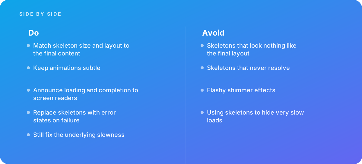
- Match skeleton size and layout to the final content
- Keep animations subtle
- Announce loading and completion to screen readers
- Replace skeletons with error states on failure
- Still fix the underlying slowness
What should I avoid?
Avoid:
- Skeletons that look nothing like the final layout
- Skeletons that never resolve
- Flashy shimmer effects
- Using skeletons to hide very slow loads
When should I get help?
Short answer Bring in help when loading states feel inconsistent across a product, or when layout shift appears as content loads.
Where this comes from
- Nielsen Norman Group — Skeleton screens 101
- web.dev — Cumulative Layout Shift (CLS)
The figures and practices above come from the sources listed.
Working on something like this?
We take on UI & UX Design work for teams who want it done once, properly. Tell us what you are building and we will tell you honestly whether we are the right studio for it. Start a project.
Where to go next
Spotted something wrong? Report an error on this page. We correct on the page and say what changed.