Confirmation Dialogs and Undo: What Actually Works
The choice between asking users to confirm a destructive action beforehand and letting them undo it afterward.
 Priya Raghunathan
At a glance
- Confirmation fatigue routine confirmations are often dismissed without reading
- Undo lets users recover without interrupting their flow
- Irreversible actions deserve specific confirmation, such as typing the item name
- WCAG 3.3.4 legal and financial submissions need review, confirmation or reversal
Why it matters
Why it matters: Frequent confirmation dialogs train people to click through without reading, while undo protects them without interrupting the task.
Best practice
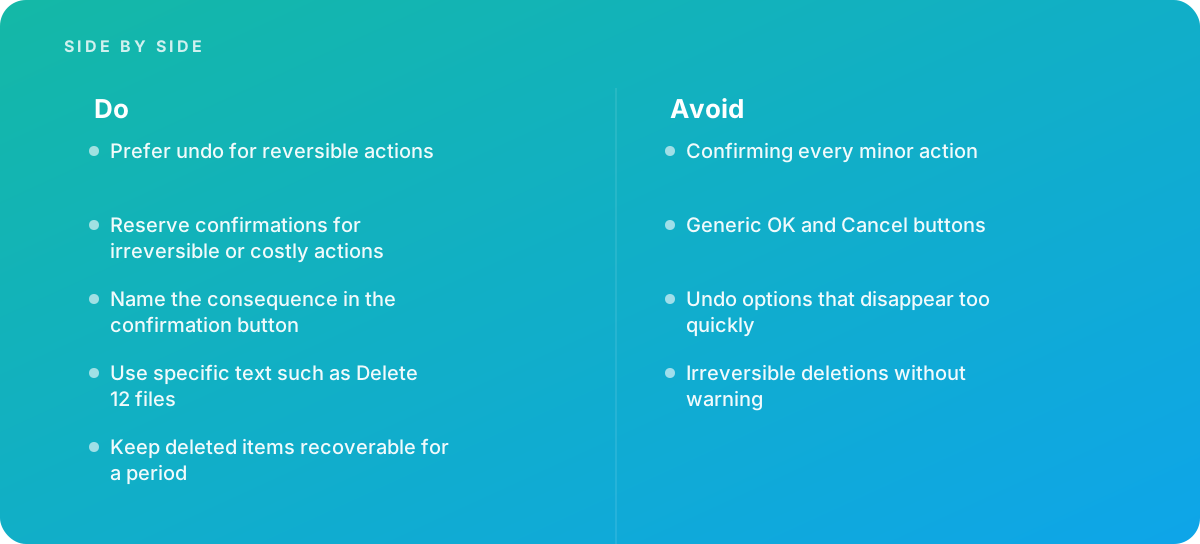
- Prefer undo for reversible actions
- Reserve confirmations for irreversible or costly actions
- Name the consequence in the confirmation button
- Use specific text such as Delete 12 files
- Keep deleted items recoverable for a period
Common pitfalls
Watch out for:
- Confirming every minor action
- Generic OK and Cancel buttons
- Undo options that disappear too quickly
- Irreversible deletions without warning
When to call in a specialist
Bottom line Bring in help when users accidentally delete data, or when confirmations appear so often they are ignored.
Where this comes from
- Nielsen Norman Group — Confirmation dialogs can prevent user errors (if not overused)
- Apple Human Interface Guidelines — Alerts
The figures and practices above come from the sources listed.
Working on something like this?
We take on UI & UX Design work for teams who want it done once, properly. Tell us what you are building and we will tell you honestly whether we are the right studio for it. Start a project.
Where to go next
Spotted something wrong? Report an error on this page. We correct on the page and say what changed.