Photo Restoration: The Decisions That Matter
Follow one illustrative photo restoration from brief to framed print: scanning, layered repair, rebuilding lost areas, colorization and family review.
 Imogen Clarke

Photo restoration is the work of repairing damaged or faded photographs, including tears, stains, cracks, fading and missing areas, while keeping the people and details true to the original. It sounds like a technical job, and much of it is: scanning, layering, cloning, tonal correction. But the real test comes afterward, when someone who knew the people in the picture looks at the result. If a grandmother's mouth has changed shape or a father's eyes now look like a stranger's, the restoration has failed, however clean the file looks.
That is why this guide is built around decisions rather than tricks. We follow one illustrative project from the first conversation with the client to the delivered print, and at each stage we explain what we chose, what we rejected and why. The project is a composite example, not a real client story, and its numbers are realistic working figures, not published benchmarks. The point is to show the reasoning a careful restorer applies, so that you can do the same work yourself or judge whether someone else is doing it properly.
It matters to three kinds of reader. Families and individuals who hold the only copy of an irreplaceable picture need to know what can go wrong. Marketers and archivists at companies with heritage collections, such as founders' portraits, early storefronts and old product shots, need a repeatable process. And retouchers moving into restoration need to unlearn some habits from beauty and product work, where smoothing and idealizing are the job rather than the danger.
The Brief: A Torn 1950s Wedding Print, Restored for an Anniversary
Here is our illustrative project. A client brings in a black-and-white wedding portrait from the mid-1950s, roughly 3.5 by 5 inches, printed on glossy fiber paper. It shows the bride and groom standing in front of a church door. The print has spent decades in a shoebox and then a damp basement. The damage is typical of prints with that history:
- A tear running diagonally from the top right edge, about an inch and a half long, with a small triangle of paper missing at the corner.
- A tide-line water stain across the lower third, covering the bride's bouquet and part of her dress.
- Silver mirroring in the dark areas, a bluish metallic sheen that appears on older gelatin silver prints as the silver migrates to the surface.
- Fine surface cracking in the emulsion, most visible across the groom's dark suit.
- Overall fading and a slight yellow cast from the paper base.
The client wants a restored print for their parents' grandchildren to give at a family anniversary, framed at 11 by 14 inches, plus digital files for sharing. They also asked, almost in passing, whether the photo could be "put into color."
The brief conversation is where most restoration projects are won or lost. Before quoting anything, we asked four questions: Who will look at this, and what do they remember? Are there other photos of the same people from around the same time? Is the print the only copy, and can it leave the client's hands? And what is the final use, including the largest size it will ever be printed? The answers shaped every later decision. The parents are alive and will see the print, which raises the bar for faces. The client has two other snapshots from the same year, which gives us reference for the damaged areas. The print is the only copy. And the 11 by 14 output means an enlargement of nearly three times the original's long side, which drives the scanning resolution.
Decision: We split the request into two deliverables, a faithful black-and-white restoration and, as a separate optional file, a colorized version. Keeping them separate means the restoration is never compromised by colorization guesses, and the family can choose which one hangs on the wall.
The full project, from intake to delivery, ran over about two and a half weeks, most of which was waiting for feedback rather than editing. The schedule below is what we would plan for a single damaged print of this kind.
- Day 1 Intake conversation, condition check of the print, collection of reference photos, agreement on deliverables and final print size.
- Day 2 Scanning at high resolution in 16-bit grayscale and RGB, saving the untouched archival master, and backing it up in two places.
- Days 3 to 5 Structural repair: tear, cracks, dust, mirroring and the water stain, all on separate layers.
- Day 6 Reconstruction of the missing corner and the damaged bouquet from surrounding detail and reference photos.
- Day 7 Tonal correction and first proof sent to the client, shown side by side with the original scan.
- Days 8 to 12 Family review, feedback collected, revisions to the bride's face and the church door.
- Days 13 to 15 Optional colorization, second proof, test print at final size.
- Days 16 to 17 Final print, delivery of files with embedded metadata, return of the original print.
Assessing the Original Before It Goes Near a Scanner
A restoration starts with the physical object, not the file. Handling the print wrongly can do more damage in five minutes than the basement did in thirty years. Our first job was to look closely, under good light, with clean hands or nitrile gloves, and decide what the print could safely go through.
What we checked
We checked whether the tear was stable or still spreading, whether any flakes of emulsion were loose, whether the print was curled or brittle, and whether the water stain had left the surface sticky or stuck to anything. We also looked at the surface with light coming from a low angle, because that reveals cracks, embossing and mirroring that flat light hides. The silver mirroring was obvious at a low angle and nearly invisible straight on, which told us that lighting geometry during scanning would matter.
What we did not do
We did not flatten the print with weight or heat, try to clean the stain with water or solvents, or tape the tear. Physical treatment of photographs is conservation work, a separate discipline with its own training, and a digital restorer who tries it on an only copy is taking a risk the client did not agree to. If the print had been cracking apart, curled so tightly that it would crack if pressed flat, or stuck to glass, we would have recommended a photograph conservator before any scanning. Our print was stable enough to lie flat on the scanner glass under its own weight, with the torn corner supported so it would not fold.
This assessment also shapes the quote. A print that can be scanned once, cleanly, is a very different job from one that needs multiple captures, a conservator's involvement or a copy-stand setup. It is also the moment to set expectations: some damage, like the missing triangle of paper, means the result will be a reconstruction rather than a recovery, and the client should know that before work starts.
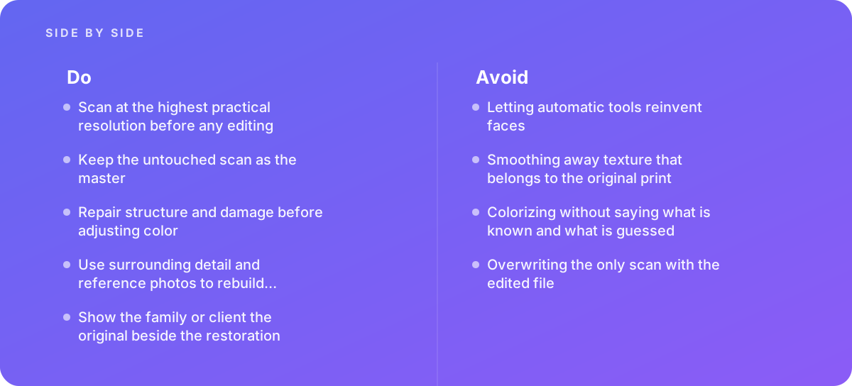
Photo Restoration Scanning: Resolution, Bit Depth and the Archival Master
Every later decision depends on the scan, and it is the one step that cannot be improved later. You can always downsample a large file, but you cannot recover detail that was never captured. The common convention is to scan small prints at 600 ppi or more, and to go higher for tiny originals such as wallet prints, contact prints and small snapshots.
Working out the resolution
We worked backward from the output. An 11 by 14 inch print at 300 ppi needs 3,300 by 4,200 pixels. The original's long side is 5 inches, and the frame's long side is 14 inches, so the enlargement is 2.8 times. At 600 ppi, the 5-inch side gives 3,000 pixels, which is not enough for a 4,200-pixel output without upsampling. At 1,200 ppi, it gives 6,000 pixels, about 430 ppi at the final size, which leaves headroom for cropping and for the fine work of cloning grain. So we scanned at 1,200 ppi, which for a 3.5 by 5 inch print produces a file of 4,200 by 6,000 pixels, about 25 megapixels.
Going higher is not automatically better. A mid-century print has a limit to how much detail it holds, set by the lens, the film and the enlargement from negative to print. Past that limit, a higher scan mainly records paper texture, grain and dust at greater size, with larger files and slower editing. For a print this size, 1,200 ppi captured everything the print contains. For a tiny contact print, we would have gone to 2,400 ppi or beyond.
Bit depth and color mode
We scanned in 16 bits per channel. Faded prints have their tones squeezed into a narrow range, and stretching that range back out in an 8-bit file breaks smooth gradients into visible bands, especially in skies, walls and skin. A 16-bit file has far more tonal steps to stretch. We made two captures: one in grayscale and one in RGB color. Even though the print is black and white, the RGB scan records the yellow stain and the bluish mirroring as color differences, and those differences can be used later to separate the damage from the image, since individual channels often show the stain much more or less strongly than others.
Scanner settings to turn off
We switched off every automatic correction the scanner software offered: auto exposure, dust removal, sharpening, descreening and color restoration. Infrared dust removal, where a scanner has it, works on color film but can fail badly on black-and-white silver images and on prints. Automatic sharpening adds halos that are painful to remove. We wanted the flattest, most honest capture possible, with no clipping at either end of the histogram, and to make every correction ourselves where we could see and undo it.
If the original had been a printed halftone, such as a newspaper clipping or a photo from a book, we would also have had to handle the dot pattern, which interferes with scanning and resizing; our guide to handling moire patterns in scanned photos covers the choices there. Our wedding print was a true continuous-tone photograph, so that problem did not arise.
The archival master
The untouched scan became the archival master: saved as a 16-bit TIFF, named clearly, and copied to two separate storage locations before any editing began. It is never opened for editing. Every working file is a copy. This sounds like obsessive housekeeping, but it is the single cheapest protection in the whole process. If a future restorer, with better tools or better reference material, wants to redo the work, the master gives them the original evidence rather than our interpretation of it.
Setting Up a Non-Destructive Working File
We built the working file so that every change could be seen, compared and reversed. Non-destructive repair means retouching on separate layers instead of painting directly on the scan. In practice our layer stack looked like this, from bottom to top:
- The scan, locked, as the base.
- A dust and spotting layer, empty, for small clone and healing work sampled from all layers.
- A crack repair layer for the emulsion cracks across the suit.
- A tear repair layer, with the tear reconstruction and the missing corner.
- A stain removal group, containing the channel-based correction and its mask.
- A reconstruction group for the bouquet and dress, with reference material on hidden layers.
- Tonal adjustment layers: levels or curves, with masks for local changes.
- A grain layer, to restore uniform texture over repaired areas.
Each layer was named for what it fixes. That matters later, in review, when a family member says "the dress looks different" and you need to switch off the reconstruction group in one click to see what changed. Adobe's documentation on retouching and repairing photos explains how its healing, patch and clone tools can sample from all layers onto an empty one, which is what makes this kind of stack practical in Photoshop; other editors have equivalents.
We also added a simple before and after comparison to the file: a copy of the master on a hidden top layer, so that anyone reviewing the working file could flip between the original and the current state. This is the same discipline you would use on high-end product or beauty work, but in restoration it is the main quality check rather than a convenience.
Trap avoided: saving over the only scan.
- The most common and least recoverable restoration mistake is editing the scan and pressing save. Once the scan is overwritten, the original evidence is gone.
- We saved the working file under a different name from the first minute, and kept the master read-only in two locations.
- If the original print is later lost or damaged further, the master scan is the family's real archive, not the restored version.
Repairing Structure First: Tears, Cracks, Stains and Mirroring
Good practice is to repair structure and damage before adjusting color or tone. There are two reasons. First, damage distorts the histogram: a bright stain or a white tear line pulls automatic and manual tonal adjustments in the wrong direction. Second, tonal changes amplify damage, so a contrast boost applied before repair makes every crack and speck more visible and harder to blend.
Dust and spotting
We started with the small stuff because it is fast and it clears the field. At 100 percent zoom, working systematically in a grid, we removed dust, lint marks and pinholes with the spot healing tool on the empty layer. On a 25-megapixel scan, this took a couple of hours. Working in a grid pattern stops you from missing areas or going over the same patch twice.
Emulsion cracks
The cracks across the groom's suit were harder. The suit is dark, textured fabric, and a healing brush tends to smear texture into a flat patch that looks like plastic. We used the clone stamp at low hardness, sampling from nearby undamaged fabric in the same direction as the weave, and changed the source point often so no pattern repeated. Where cracks crossed a fold or seam, we followed the fold's line rather than cloning across it.
The tear
The tear left a white line where the paper had separated and a slight shift in alignment, because the two sides had moved apart by a fraction of a millimeter. We first closed the gap by cloning along the line from both sides. On the upper part of the tear, which crossed the church's stone wall, we also used a small selection of one side, moved it by a few pixels to realign the mortar lines, and blended the edge. Alignment is easy to miss at normal zoom and very obvious in an enlargement.
The water stain
This is where the RGB scan earned its place. The tide-line stain was yellow-brown, and in the blue channel it was strongly visible, while in the red channel it was faint. Because the photograph itself is neutral gray, any color difference was damage, not image. We built the black-and-white restoration largely from the red channel in the stained area, where the stain was weakest, and blended it into the grayscale scan through a mask. What remained of the stain's edge, a darker line where the water had dried, we cleaned by hand with cloning and a local curves adjustment.
Silver mirroring
Mirroring appeared as a lighter, slightly blue haze in the dark areas, especially the suit and the shadowed doorway. Because it showed up in color, the same channel approach reduced it. What remained we treated with a masked curves layer to restore the depth of the shadows, checking constantly against a region where no mirroring had formed.
Throughout, we kept a simple rule: repair only what is damage. Film grain, the soft focus of a mid-century lens, a slightly blurred hand from movement during the exposure: these are part of the photograph. They are how that camera saw that moment, and removing them makes the image look less like an old photograph and more like an illustration.
Rebuilding Missing Areas Without Inventing a Face
Two areas had lost real information: the missing triangle at the top right corner, and the part of the bouquet where the stain was so dense that the channels held no usable detail. Neither involved a face, which made our job easier, but the approach is the same one we would use for facial damage, only more cautious.
The missing corner
The missing triangle contained part of the church doorframe and some stone wall. Architecture is forgiving: it follows rules. We extended the doorframe's straight edge using the undamaged part as a guide, rebuilt the stone courses from the wall's visible rhythm and matched grain and tone to the surrounding area. We checked the line of the doorframe with a guide so that it stayed straight across the repair, since the eye catches a kinked line immediately.
The bouquet
The bouquet was harder. Flowers are irregular, and we had no guarantee of what was there. This is where the client's reference snapshots helped. One of them, taken at the reception, showed the bouquet from a different angle. It confirmed the kind of flowers and roughly how they were arranged. We did not paste in pieces of the reference; the angle, the light and the resolution were all different. Instead, we used it to guide cloning from the visible flowers in our photo, so the reconstruction was built from the original print's own detail, arranged in a way the reference supported.
When faces are damaged, the stakes rise sharply. A face is the thing the family will judge first and remember longest. We would rebuild a damaged eye, for example, by mirroring or adapting the undamaged eye only after checking against reference photos that the face is not strongly asymmetrical, since most faces are. We would rather leave a small blemish visible than invent a feature. And we would always show the family the original damage beside the repair so they can judge it.
Myth: AI face restoration recovers the detail that damage destroyed.
Reality: It generates plausible detail rather than recovering the real thing. In our test on a copy of the bride's lightly cracked face, the tool returned a sharper face with subtly different eyes and lips: clean, and a different woman. The decision was simple: no AI face restoration or generative fill anywhere in the delivered portrait.
That test is worth describing, because the temptation is real. Automatic restoration tools can produce impressive results on badly damaged faces, and for a stranger's photo, the result may look convincing. But those tools generate detail rather than recover it. They fill gaps with what a face like this typically looks like, not with what this particular face looked like. For people who knew the subject, the difference is often immediately visible: a nose slightly narrower, eyes more open, teeth more even. For a heritage archive, the problem is worse, because a generated face becomes a false historical record. There is a sensible place for these tools, such as roughing in a background or suggesting texture for a large, unimportant area, but not for faces, and never without saying so.
Reconstruction is related to professional photo blending, where elements from different sources are merged seamlessly. The skills overlap: matching grain, light direction and tone across a seam. The difference is intent. In blending, the goal is a convincing new image. In restoration, the goal is the old image, and anything added is a best estimate that should be as small as possible.
Tone, Contrast and the Look of the Era
With the damage repaired, we turned to tone. The print had faded, its blacks were gray, its whites slightly yellow, and the overall contrast was flat. The question was not "how do we make this look good" but "how did this print look when it was new."
Setting black and white points
We used a curves adjustment layer to set a black point in the deepest shadow of the groom's suit and a white point in the brightest part of the bride's veil, being careful not to clip the veil's lace detail. Black-and-white prints from that era, particularly on glossy fiber paper, had rich blacks and clean highlights, so a full tonal range is justified. But we stopped short of the high-contrast look of modern digital black and white, which would have made the print look recently shot.
Local adjustments
Fading is rarely even. The edges of this print had faded more than the center, probably from handling and exposure at the edges of a stack, and the stained lower third was a little lighter even after repair. We used masked curves layers to bring those areas back into line with the center. We checked our work by comparing tones in areas that should match, such as the stone wall on both sides of the door.
Tone and paper
We removed the yellow cast for the neutral black-and-white master. For the print, we discussed with the client whether to add a very slight warm tone, since many prints of that era were not perfectly neutral. We produced both a neutral and a slightly warm version for the proof, and the family chose the warm version for the framed print, feeling it looked more like the photo they remembered. This kind of choice is subjective, and it should be the client's, informed by seeing options, not the retoucher's taste imposed silently.
If you are restoring a series, such as an album of photos from the same family, it helps to establish a consistent tonal treatment and apply it across images, the same way a colorist uses a shared look for a set; our guide to using LUTs and color lookup for photos explains how to build and apply a consistent treatment without flattening differences between images.
Grain and texture
The last tonal step was grain. Wherever we had cloned or healed a large area, the grain there could be slightly softer or patterned. We added a subtle, uniform grain layer, matched to the original's grain size at 100 percent zoom, and masked it to the repaired areas. The result is that repairs vanish into the image instead of standing out as smooth patches. This is the opposite of what a beauty retoucher does, and it is one of the habits people coming from commercial work most need to change.
Trap avoided: smoothing away texture that belongs to the original print.
- Skin in a mid-century portrait has film grain, soft focus and the print's own surface. Noise reduction or skin smoothing removes all three and makes a face look waxy and modern.
- We applied no noise reduction to faces and no frequency separation. Where cracks crossed skin, we repaired the crack line only and left the texture around it untouched.
- The test we used: at 100 percent zoom, a repaired area should be indistinguishable in texture from an undamaged area next to it.
The Colorization Decision: What Is Known and What Is Guessed
The client's question about color deserved a real answer, not a yes. Colorizing a black-and-white photograph is not restoration; it is interpretation. A grayscale print records brightness, not color. A mid-gray dress could have been pale blue, pink, or light green; the gray value alone cannot tell you.
So we started by sorting what was known from what was guessed. The family told us the bride's dress was ivory, not pure white, and that the bouquet had white and pale pink roses. The groom's suit was navy according to the mother, which the father disputed; he recalled charcoal. The church door was painted dark green, which one of the reference snapshots, a faded color print, confirmed. Skin tones we estimated from the reference snapshot and from the family, who are the only real judges.
We built the colorization on separate layers above the finished black-and-white restoration, using color and soft-light blend modes with masks, so each color could be changed individually. The suit we colored as a very dark, desaturated blue that could read as either navy or charcoal, and we told the family exactly why. We delivered the colorized file with a short note listing each color and whether it came from the family, a reference photo or our judgment. We also recorded that it is a colorized interpretation in the file's metadata so that, years from now, nobody mistakes it for an original color photograph.
The table below summarizes how we treated each choice point in the colorization, which is a useful way to present it to a client as well.
| Element | Color used | Source | Confidence |
|---|---|---|---|
| Bride's dress | Warm ivory | Family recollection | High |
| Bouquet | White and pale pink roses | Family recollection and reference snapshot | High |
| Church door | Dark green | Faded color reference snapshot | Medium to high |
| Groom's suit | Dark desaturated blue | Conflicting recollections, compromise | Low |
| Skin tones | Natural, matched to reference | Reference snapshot and family review | Medium |
| Stone wall | Warm gray | Restorer's judgment based on region and era | Low |
The same principle of honesty about what is a record and what is interpretation runs through art reproduction editing, where the goal is faithful color rather than pleasing color, and many of its methods for checking color against a reference apply directly to colorization review.
Proofing With the People Who Knew the Subjects
Restoration is judged by people who knew the subjects, so the review step is not a formality. Our first proof went to the client on day seven as a single PDF page: the untouched master scan on the left and the restoration on the right, at the same size, with a close-up of each face below. Showing the original beside the restoration does two things. It shows the family what was done, which helps them value the work, and it lets them spot anything that changed which should not have.
What the family noticed
The feedback, which is typical, came in three kinds. First, factual corrections: the bride's mother pointed out that a small mark on the bride's cheek, which we had assumed was damage and removed, was actually a beauty mark she had all her life. We restored it from the master. Second, preference: the family wanted the church door a little darker, as they remembered it. That was a tonal change and easy to make. Third, a request we declined: one family member asked whether we could "open" the groom's half-closed eyes, as he had blinked slightly. We explained that doing so would mean inventing his eyes, which would look wrong to the people who knew him, and offered to show a test. After seeing the test, they agreed to keep the original.
How we collected feedback
We asked the client to gather comments from the family in one message, rather than a stream of separate emails, and to mark areas on the PDF. This kept revisions to two rounds. For a larger project involving an album or a collection, a proper review tool with annotation and version tracking saves time; the same batch discipline described in our guide to event photo batch editing applies to restoring many photos from one occasion, where consistency across the set matters as much as each image.
- Show the untouched master scan beside the restoration at the same size, never the restoration alone.
- Include close-ups of every face at 100 percent or larger, where changes are easiest to spot.
- Ask specifically about marks, moles, scars, glasses, jewelry and hair, the details most often removed by mistake.
- Label anything reconstructed or colorized, so reviewers know what was recovered and what was estimated.
- Collect feedback in one consolidated round per proof, with the areas marked.
- Make a test print at final size before signing off, since screens hide both flaws and strengths.
Output, Printing and Metadata
With the restoration approved, we prepared the deliverables. Getting this step right is what makes the work last, both physically on the wall and digitally in the family's archive.
The file set
We delivered five files:
- The archival master scan, untouched, 16-bit TIFF.
- The layered working file, so any future restorer can see and adjust every change.
- The flattened black-and-white restoration, 16-bit TIFF, at full scan resolution.
- The colorized version, 16-bit TIFF, clearly named as colorized.
- Sharing copies of both versions as high-quality JPEGs, around 3,000 pixels on the long side, in sRGB.
Metadata
Each file carried embedded metadata recording what it is. The IPTC Photo Metadata Standard provides fields that can record the original's source and the restoration performed: a description of the photograph, the people in it, the approximate date and place, the source (the original print, held by the family), and a note on the restoration, including that the corner and bouquet are reconstructions and that the color version is an interpretation. This metadata travels with the file, so a copy shared to a cousin or uploaded to a genealogy site still says what it is. For a company restoring a heritage collection, doing this consistently across hundreds of images is its own job, covered in bulk metadata editing. If restored images go on a website or into a digital exhibit, they also need proper alternative text describing the people and the moment, which our guide to image accessibility and alt text addresses.
The print
For the 11 by 14 frame, we cropped the 3.5 by 5 aspect ratio to the frame's slightly squarer proportion, trimming from the top where there was only stone wall, and agreed the crop with the client before printing. The printed image was sharpened for output at the final size, not before, and on a separate copy, never on the master or the restoration file. We made a test print at full size on the chosen paper, a matte fiber-based inkjet paper suited to black-and-white work, and checked the shadows, which often print darker than they appear on screen. After a small curves adjustment to open the shadows, the final print was made.
The original print went back to the client in an archival sleeve, with advice to store it away from light, heat and humidity, and not in the basement.
Where the Hours Went, and What Drives the Effort
We do not quote prices as facts here, because they vary with the market and the provider, but the effort is worth understanding, because it explains why quotes for restoration differ so much. For this illustrative project, the working time broke down roughly as follows.
| Stage | Approximate hours | What drove the time |
|---|---|---|
| Intake, assessment and planning | 1 | Condition check, reference photos, agreeing deliverables |
| Scanning and archiving | 0.5 to 1 | Two captures, checking the histogram, backing up |
| Dust, spots and cracks | 2 to 3 | Cracks across textured fabric, 25 MP at 100 percent zoom |
| Tear, stain and mirroring | 2 to 3 | Channel work on the stain, tear realignment |
| Reconstruction | 1.5 to 2 | Missing corner and bouquet, checked against reference |
| Tone, grain and proofing | 1.5 | Two tonal versions, side-by-side proof |
| Revisions | 1 to 1.5 | Beauty mark, door tone, test of the eyes |
| Colorization | 3 to 4 | Separate layers per element, color notes |
| Output, metadata and print | 1 to 1.5 | Crop, test print, file set |
That adds up to roughly 14 to 18 hours for a single print, about 10 to 14 without colorization. A lightly faded print with a few specks might take an hour or two. A badly damaged photo with a torn face could take much longer, and some cannot be restored convincingly at all.
What pushes effort up
- Damage to faces, particularly eyes and mouths, which need the most care and review.
- Missing areas with no reference material, which require more estimation and more proofing.
- Large final print sizes, which reveal repairs that are invisible on screen.
- Textured areas like fabric, foliage and hair, which are harder to clone convincingly than skies or walls.
- Many reviewers with differing memories, which adds proofing rounds.
- Colorization, which is almost a second project.
What keeps it down
A good scan, clear deliverables agreed up front, reference photos supplied at the start and a single contact collecting family feedback. When a client restores a batch of photos from the same album, a consistent approach also reduces time per image after the first few.
When to Do It Yourself and When to Bring In Help
Plenty of photo restoration is well within reach of a patient amateur with a decent flatbed scanner and a layer-based editor. Faded color prints, a few dust specks, a crease through a sky: these are good places to learn, as long as you keep the master and work on layers.
Bring in help when originals are fragile or valuable, when faces are badly damaged, or when restorations will be printed large. Fragile originals need careful handling, and sometimes a conservator, before any scanning. Damaged faces need the judgment and restraint that come with experience, and the discipline to resist the automatic tools. Large prints expose every shortcut. The same applies to company collections, where hundreds of images need consistent treatment and metadata.
If you do hire, ask to see before-and-after pairs rather than finished images alone, ask what the provider does with the original scan and whether you will receive it, and ask whether they use generative or AI face tools and how they disclose it. Our guide to choosing a retouching partner covers the wider evaluation, and our own photo restoration service follows the process described in this article, from assessment and archival scanning to side-by-side proofing.
The through-line of every decision in this project is the same: capture everything first, keep the evidence, repair only what is damage, estimate as little as possible and say so when you do, and let the people who knew the subjects be the final judges. Tools will keep changing. That discipline is what makes a restoration trustworthy.
Where this comes from
- Adobe Help Center — Retouch and repair photos
- IPTC — Photo Metadata Standard
The figures and practices above come from the sources listed.
Working on something like this?
We take on Image Editing & Retouching work for teams who want it done once, properly. Tell us what you are building and we will tell you honestly whether we are the right studio for it. Start a project.
Where to go next
Spotted something wrong? Report an error on this page. We correct on the page and say what changed.