Breadcrumb Navigation Design: What Actually Works
A trail of links showing where the current page sits in the site hierarchy, usually shown near the top of the page.
 Priya Raghunathan

What is at stake
Breadcrumbs help people who land deep in a site from search understand where they are and move up a level.
The playbook
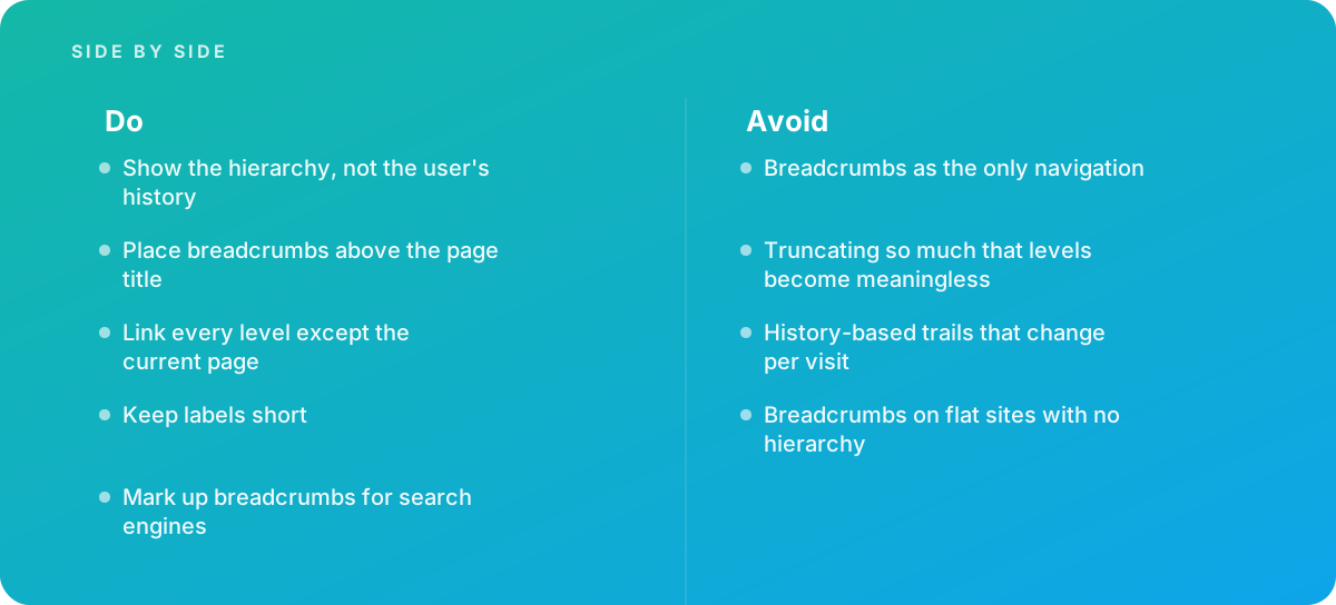
- Show the hierarchy, not the user's history
- Place breadcrumbs above the page title
- Link every level except the current page
- Keep labels short
- Mark up breadcrumbs for search engines
Where it goes wrong
Avoid:
- Breadcrumbs as the only navigation
- Truncating so much that levels become meaningless
- History-based trails that change per visit
- Breadcrumbs on flat sites with no hierarchy
The numbers behind it
| Measure | Figure |
|---|---|
| Container | a nav element with an accessible name such as Breadcrumb |
| Current page | marked with aria-current="page" |
| Types | hierarchy-based breadcrumbs, rather than history trails |
| Search | breadcrumb markup can appear in search results |
Getting outside help
When to hand it over: Bring in help when restructuring a large site's hierarchy, or when users get lost on deep pages.
Where this comes from
- W3C ARIA Authoring Practices Guide — Breadcrumb pattern
- Nielsen Norman Group — Breadcrumbs: 11 design guidelines for desktop and mobile
- GOV.UK Design System — Breadcrumbs
The figures and practices above come from the sources listed.
Working on something like this?
We take on UI & UX Design work for teams who want it done once, properly. Tell us what you are building and we will tell you honestly whether we are the right studio for it. Start a project.
Where to go next
Spotted something wrong? Report an error on this page. We correct on the page and say what changed.