A Practical Guide to Site Search Design
Designing the search box, suggestions and results page of a website or app so people can find content quickly with their own words.
 Priya Raghunathan

Where most projects go wrong
The usual mistakes:
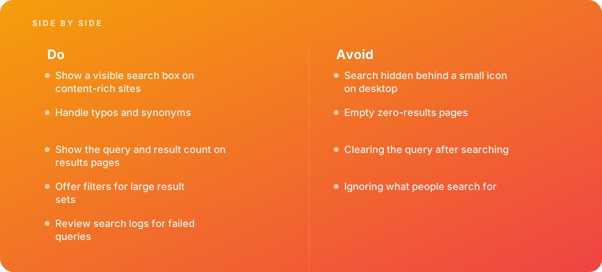
- Search hidden behind a small icon on desktop
- Empty zero-results pages
- Clearing the query after searching
- Ignoring what people search for
What good looks like instead
- Show a visible search box on content-rich sites
- Handle typos and synonyms
- Show the query and result count on results pages
- Offer filters for large result sets
- Review search logs for failed queries
Why it matters
Users who search often have high intent, and a search box that is hard to find or returns poor results loses them.
The specs that matter
| Measure | Figure |
|---|---|
| Placement | users expect search near the top of the page |
| Search landmark | role="search" or the search element identifies the region |
| Autocomplete | suggestions help users form queries |
| Zero results | results pages should offer alternatives when nothing matches |
Knowing when to hand it over
Tip: Bring in help when search logs show many zero-result queries, or when users complain they cannot find content.
Where this comes from
- Nielsen Norman Group — Search: visible and simple
- MDN Web Docs — The search element
The figures and practices above come from the sources listed.
Working on something like this?
We take on UI & UX Design work for teams who want it done once, properly. Tell us what you are building and we will tell you honestly whether we are the right studio for it. Start a project.
Where to go next
Spotted something wrong? Report an error on this page. We correct on the page and say what changed.