Information Hierarchy: What Actually Works
Arranging what is on a screen so the most important thing is the most prominent thing.
 Priya Raghunathan

Why does it matter?
Every element competing for attention equally means nothing has attention, and hierarchy is the cheapest improvement available to most interfaces.
What are the numbers?
- Tools size, weight, color, spacing, position and contrast
- Scanning people scan rather than read, particularly on the web
- Whitespace grouping by proximity is stronger than grouping by boxes
- Primary action one per screen, visually dominant
- Competing emphasis several strong elements cancel each other out
What should I do?
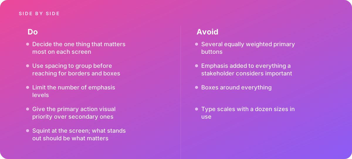
- Decide the one thing that matters most on each screen
- Use spacing to group before reaching for borders and boxes
- Limit the number of emphasis levels
- Give the primary action visual priority over secondary ones
- Squint at the screen; what stands out should be what matters
What should I avoid?
Avoid:
- Several equally weighted primary buttons
- Emphasis added to everything a stakeholder considers important
- Boxes around everything
- Type scales with a dozen sizes in use
When should I get help?
Short answer Bring in help when a screen has accumulated requirements from several teams, when users miss the main action, or when a design has drifted through incremental additions.
Where this comes from
- Nielsen Norman Group — Visual hierarchy and scanning
- Material Design — Layout and hierarchy
- Interaction Design Foundation — Visual design principles
The figures and practices above come from the sources listed.
Working on something like this?
We take on UI & UX Design work for teams who want it done once, properly. Tell us what you are building and we will tell you honestly whether we are the right studio for it. Start a project.
Where to go next
Spotted something wrong? Report an error on this page. We correct on the page and say what changed.