How to Get Accessible SVG Right
Making inline SVG graphics work for screen reader users, whether they are decorative or meaningful.
 Marcus Adeyemi

Where most projects go wrong
The usual mistakes:
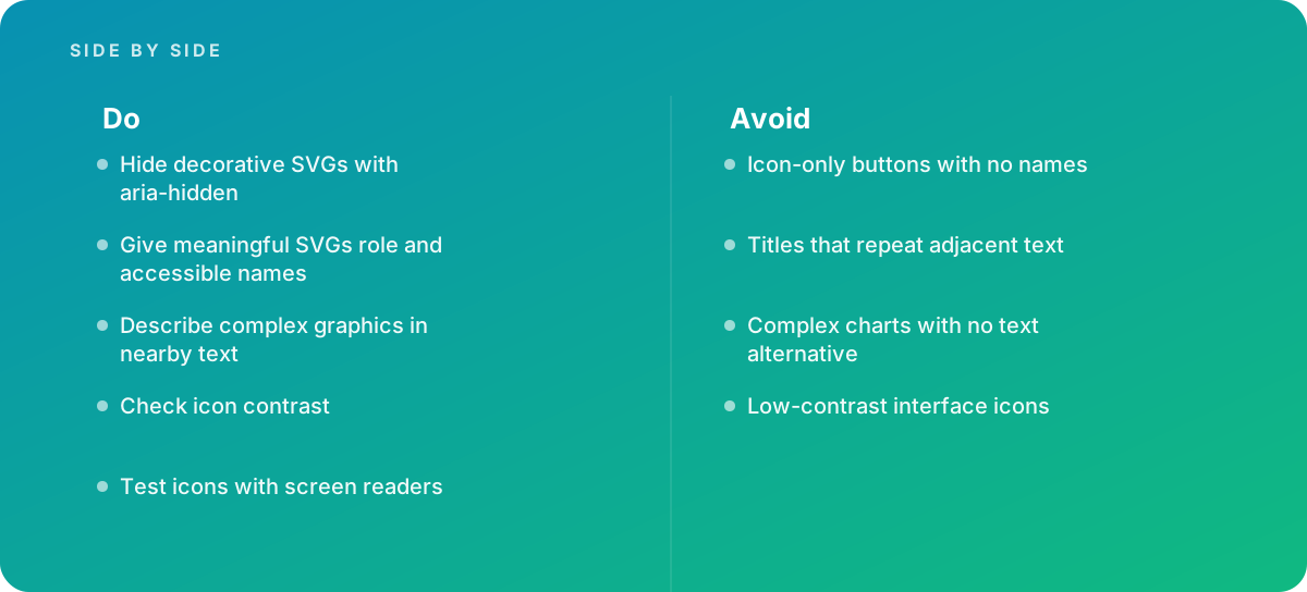
- Icon-only buttons with no names
- Titles that repeat adjacent text
- Complex charts with no text alternative
- Low-contrast interface icons
What good looks like instead
- Hide decorative SVGs with aria-hidden
- Give meaningful SVGs role and accessible names
- Describe complex graphics in nearby text
- Check icon contrast
- Test icons with screen readers
Why it matters
SVG is increasingly used for icons, charts and illustrations, and its accessibility depends on how it is marked up.
The specs that matter
| Measure | Figure |
|---|---|
| Decorative graphics | should be hidden from assistive technology |
| Meaningful graphics | need an accessible name |
| Title elements | an SVG title can provide a name |
| Contrast | icons that convey meaning need sufficient contrast |
Knowing when to hand it over
Tip: Bring in help when icon systems or charts must be accessible.
Where this comes from
- W3C Web Accessibility Initiative — Images tutorial
- MDN Web Docs — SVG: Scalable Vector Graphics
The figures and practices above come from the sources listed.
Working on something like this?
We take on Performance & Accessibility work for teams who want it done once, properly. Tell us what you are building and we will tell you honestly whether we are the right studio for it. Start a project.
Where to go next
Spotted something wrong? Report an error on this page. We correct on the page and say what changed.