Retouching Style Guides for Brands, Done Properly
Build retouching style guides for brands that vendors can follow: background values, crop templates, shadow recipes, color tolerances and clear skin limits.
 Imogen Clarke

Retouching style guides for brands are written standards that define exactly how a company's images should be finished: the background value, how much skin may be smoothed, how color is matched to the physical product, where the crop falls and what the shadow looks like. They turn a creative director's taste into instructions that a photographer in one city, a freelance retoucher in another and an outsourced production team on a third continent can all follow and arrive at the same result.
They matter to anyone whose images are produced by more than one pair of hands. An ecommerce team shooting hundreds of SKUs a month, a fashion label splitting work between a studio and two vendors, a marketing department commissioning headshots from regional photographers: all of them face the same problem. Without a written standard, every person fills the gaps with their own judgment, and the catalog slowly drifts. Backgrounds go from pure white to faintly warm, models look heavily smoothed in one collection and untouched in the next, and product crops jump around the grid. Each drift triggers a round of feedback, and feedback rounds are where retouching budgets and deadlines go to die.
This guide is organized as a checklist. It starts with the master list of what a complete brand retouching guide contains, then takes each item in turn: why it matters, what to write down and how to write it so that it cannot be misread. The goal is a document a new vendor could pick up on Monday and deliver to on Tuesday.
The Master Checklist for a Brand Retouching Style Guide
Use this list both to build a guide from scratch and to audit one you already have. If a line item is missing, or if it exists only as a sentence of adjectives rather than numbers and examples, that is where inconsistency will come from.
- Background values written as numbers (RGB or Lab), with a tolerance and a measuring method
- Crop rules: aspect ratio, pixel dimensions, margins, alignment line and anchor point per product type
- Shadow and reflection style: none, natural, drop or mirror, with opacity and falloff described
- Color workflow: working and delivery profiles, reference targets and the tolerance for matching physical product color
- Skin, body and detail limits: explicit lists of what may be removed and what must stay, plus rules for hair, eyes, teeth, garments and packaging
- Before-and-after reference images for every product type and every rule that involves judgment
- File specifications, naming, layer structure and delivery format
- A single version-controlled guide shared with every vendor, with an owner and a change log
- A review process: who approves, against what, and how rejections are logged
The rest of this article works through these items in order. The first few are the ones most brands under-specify, because they feel obvious until two vendors interpret them differently.
Item 1: Define Background Values in Numbers, Not Words
"Clean white background" is the single most common instruction in retouching briefs and one of the least useful. To one retoucher it means RGB 255, 255, 255 across every pixel outside the product. To another it means a bright, slightly textured studio sweep that reads as white but measures 245 to 250. To a third it means white with a gentle vignette. All three are defensible; only one matches your catalog.
Why it matters
Backgrounds are the most visible element of consistency on a product grid. When thumbnails sit side by side on a category page, a difference of a few values between neighbors is instantly visible as a faint gray or colored box. Marketplaces also have their own expectations. Google Merchant Center's image guidance recommends white, gray or light-colored backgrounds for product images, and other marketplaces set their own rules, so your guide should state which channels each background standard serves.
What to write down
- The exact value. For a pure white background, state RGB 255, 255, 255 in the delivery color space. For an off-white or brand-colored background, give the RGB value and, ideally, the Lab value, because Lab survives profile conversions more predictably.
- The tolerance. Decide whether any variation is acceptable. A common approach is zero tolerance for pure white ecommerce backgrounds and a small tolerance, for example plus or minus two values per channel, for tinted or lifestyle backgrounds.
- How to measure it. Specify the sampling method, such as a 5 by 5 average sample with the eyedropper, taken at the four corners and the midpoint of each edge. Retouchers can use Photoshop's Info panel and color samplers, which the Adobe Photoshop User Guide documents, to check values before export.
- How the product meets the background. State whether edges should be hard-cut with a path, softly masked, or allowed to retain a thin natural transition. This matters most for hair, fur, fabric fringes and translucent products.
- Channel variants. If your own site uses a light gray, say #F5F5F5, while marketplaces receive pure white, list both and name which output goes where.
Tip: Ask vendors to include a background check in their own quality control, and include a small script or action that flags any pixel outside the product mask that is not at the target value. Catching a 252 before delivery costs seconds; catching it after upload costs a re-delivery.
Item 2: Set Crop, Margin and Alignment Rules per Product Type
Crops are where catalogs look professional or amateur. A well-cropped grid has every product sitting on the same baseline or centered on the same point, filling a predictable share of the frame. A poorly cropped grid has shoes that float, bags that touch the edge and bottles that are half the height of the bottle next to them for no reason.
Why it matters
Fixed margins and alignment are what make a catalog read as a set rather than a collection of individual photographs. They also make downstream work predictable: web developers can design templates knowing where the product will be, and marketing teams can repurpose images into banners without re-cropping.
What to write down
Define rules for each product family rather than one universal rule. A tall bottle and a flat wallet cannot share the same margin logic. For each family, specify:
- Canvas. Aspect ratio and pixel dimensions, for example a square 2000 by 2000 pixel canvas, or a 4:5 portrait canvas for apparel on models.
- Margins. The minimum space between the product and each canvas edge, expressed in pixels or as a percentage of the canvas. Many brands use a larger bottom margin for items that sit on a surface so the shadow has room.
- Fill. Whether products are scaled to fill the safe area (every item looks the same size) or scaled relative to each other (a small item looks small). Relative scale is honest but can make small items unreadable at thumbnail size; fill-to-margin is consistent but misrepresents size. Write down which you chose.
- Anchor and alignment. Centered horizontally and vertically, or sitting on a fixed baseline. For apparel on models, a common anchor is a fixed head position or a fixed line at the top of the shoulders so that models appear the same height across the grid.
- Angle set. The required views per product (front, back, side, detail, three-quarter) and their order.
The most reliable way to communicate crop rules is a layered template file: a canvas with guides at the margins and the alignment line, plus a locked example product in place. Retouchers drop each image into the template and align to the guides. Photoshop artboards and saved guide layouts make this straightforward, and the template becomes part of the guide itself.
If your products vary widely in proportion, such as rings and handbags in the same store, build a small table of size classes, each with its own margin rule, rather than forcing a single rule that works badly for everything.
Item 3: Specify Shadows and Reflections Precisely
Shadow style is part of the brand look, and it is one of the easiest things for vendors to get subtly wrong. A product floating with no shadow reads as a cutout. A heavy, hard drop shadow reads as dated. A soft contact shadow grounded under the product reads as premium, but only if every image uses the same softness and density.
The options
- No shadow. Clean and simple to produce, common on marketplaces. It can make products look pasted on.
- Natural shadow. The shadow captured in camera, retained through the background cleanup. It looks the most real but varies with every lighting setup, which makes consistency across photographers hard.
- Created drop or contact shadow. Built in post from the product silhouette. It is consistent and controllable, and it can be written as a recipe.
- Reflection or mirror shadow. Common for jewelry, watches, cosmetics and electronics. It needs rules for opacity, falloff length and gap.
What to write down
For a created shadow, write the recipe: blend mode, starting opacity, blur radius or feather relative to canvas size, offset direction, and whether the shadow is a single layer or a combination of a tight contact shadow and a wider ambient one. For reflections, specify starting opacity, the length of the fade as a proportion of product height and whether there is any gap between product and reflection. Supply a layered example file so that retouchers can inspect the actual layers rather than trying to reverse-engineer a flattened JPEG.
State also what happens to shadows on non-white backgrounds, and whether shadows are delivered on a separate layer so that the brand's web team can remove or restyle them later without going back to the vendor.
Item 4: Write a Color Workflow Everyone Can Follow
Color complaints are the most expensive kind of feedback, because they are often discovered late (when a customer returns an item that "looked different online") and because they are hard to describe in words. The guide should remove as much subjectivity as possible.
Profiles and color spaces
Name the working space and the delivery space. A common setup is to work in a wide-gamut space such as Adobe RGB or ProPhoto RGB for retouching and to deliver sRGB with the profile embedded for web. Print and packaging work have their own requirements, typically a CMYK profile specified by the printer; if you produce packaging, link the relevant rules to your separate guidance on retouching for packaging artwork. The guide should also require that profiles be embedded, since an untagged file will be interpreted differently by different software.
Matching physical product color
For product work, color accuracy means matching the physical item, not making it look attractive. Build this into the process:
- Photographers shoot a color reference target in the first frame of each lighting setup, so the raw files can be profiled or balanced objectively.
- The brand supplies physical samples or approved reference photographs for hero colors, especially for fabrics, cosmetics and paint.
- The guide states a tolerance. Some brands express this as a maximum Delta E difference against a measured sample; others use a visual approval step under controlled lighting. Either works if it is written down and applied the same way to every vendor.
- Colorways of the same product must match each other in lighting and tonal treatment even where their hues differ, so that a customer comparing navy and black sees the real difference.
Global look versus product truth
Many brands have a "look" for lifestyle and campaign images: a warm grade, lifted blacks, a certain contrast curve. The guide must separate where that look is allowed (campaign and editorial images) from where it is forbidden (product detail images, where color truth wins). Vendors who apply the campaign grade to a product shot are following the brand's taste but breaking its promise to customers.
Finally, require retouchers to work on calibrated displays and state the calibration target, for example a white point of D65 and a luminance around 100 to 120 candelas per square meter for web work. It will not guarantee a match, but it removes the most common source of disagreement.
Item 5: Draw Clear Limits on Skin, Body and Detail Work
This is the section most guides handle with the least precision and the most adjectives: "natural," "polished," "not over-retouched." Those words mean different things to every retoucher. A useful guide replaces them with an explicit list of what may be removed and what must stay.
Why it matters
Skin standards touch brand reputation directly. Over-smoothed skin reads as fake, erases texture that customers expect to see, and can conflict with a brand's public stance on body image. Under-retouched skin in a beauty campaign looks unfinished. And inconsistency between models in the same campaign looks careless or worse. Brands that take this seriously often write their position on authenticity into the guide itself; our overview of portrait retouching ethics covers the principles most guides draw on.
A practical structure
Split the rules into three lists:
- Always remove: temporary blemishes such as spots, scratches, bruises and redness, stray hairs across the face, lint, dust and makeup smudges, and sensor dust or studio debris.
- Soften, never remove: under-eye shadows, fine lines, uneven tone and shine. Specify a degree where possible, such as reducing rather than eliminating, and retaining visible pore texture at 100 percent zoom.
- Never alter: permanent features such as moles, freckles, scars, birthmarks and tattoos, body shape and proportions, skin tone and ethnicity-related features, and natural hair texture. If exceptions exist, state who can approve them.
Name the permitted techniques, too. Frequency separation used heavily is the most common cause of plastic-looking skin, while careful local work with dodge and burn retouching keeps texture intact. Specify skin tone handling separately: tone should be evened within a face, not shifted toward a house color, and different models should keep their own undertones. Our guide to handling skin tones in retouching explains how to write that rule so it can be checked.
Above all, avoid rules that can only be judged by taste, such as "make her look fresh." If a reviewer cannot point to the rule that an image broke, the rule will produce arguments instead of consistency.
Beyond skin, a handful of detail areas account for a large share of rejected images. Each deserves its own short section in the guide.
Hair
Specify whether flyaways are removed entirely, reduced near the silhouette or kept for realism, and how hair edges meet the background on cutouts. Hair masking is slow and highly variable between vendors, so this is also a cost driver; for complex cases brands often commission dedicated hair retouching rather than leaving it to general cleanup.
Eyes and teeth
Write limits for whitening eyes and teeth, because both are easy to overdo and immediately noticeable. A typical rule is to remove visible redness and stains while keeping the natural off-white of the sclera and teeth, and never to change iris color or enlarge eyes. The trade-offs are covered in detail in our piece on eye and teeth retouching decisions.
Garments and fabric
State how far garment cleanup goes: removing lint, loose threads and pins is standard; smoothing creases may or may not be. Many brands keep natural drape on models but require flat-lay and ghost-mannequin shots to be crease-free. Specify how labels, tags and clips are handled and whether a ghost-mannequin interior (the neck label area) must be composited from a separate shot.
Hard goods, packaging and reflective products
Specify whether logos and text on packaging must be sharp and legible at a given size, how dents, scratches and dust are handled, and how reflections are controlled. Glass, chrome and transparent products have their own challenges, from gradient highlights to edge definition; the proven approaches for these materials are worth translating into explicit rules if those items are in your range.
Item 6: Build a Library of Before-and-After References
Every rule above is easier to follow when it is shown rather than described. A guide without visual examples forces vendors to interpret words, and interpretation is where inconsistency comes from. Before-and-after references show the expected standard in a way that no paragraph can.
What a good reference set contains
- One approved "golden" image per product type and view, with the raw capture and the final delivery side by side.
- Annotated examples that call out each change: background cleaned to 255, crease removed, label straightened, color matched to sample.
- "Too far" examples that show what over-retouching looks like for your brand, next to an acceptable version. These are often more instructive than the approved image alone.
- Layered source files for the most complex references, so that retouchers can inspect layer structure, masks and adjustment settings.
- Edge cases such as dark products on white, white products on white and very small items, because these are where the general rules break down.
Keep references current. When the approved standard changes, retire the old examples so that no vendor keeps matching a look the brand has moved away from.
Pros
- A detailed, prescriptive guide with numeric values and dense references produces the most consistent output across vendors.
- It shortens onboarding for new retouchers and cuts the number of feedback rounds per batch.
- Rejections become objective: an image either meets a written value or it does not.
- It makes vendors interchangeable, which protects the brand when capacity or pricing changes.
Cons
- Writing and maintaining a thorough guide takes real time from a senior person, and it goes stale if nobody owns it.
- Over-prescription can make campaign and editorial work look mechanical, where some creative latitude is valuable.
- Very long guides get skimmed; the rules that matter most can be lost among minor ones.
- Strict tolerances can raise per-image cost, because vendors price in the extra checking.
The usual resolution is to be strict where consistency is visible and commercially important (product detail images, marketplace uploads, headshot sets) and looser where creative judgment adds value (campaign hero images), and to say explicitly which images fall into which category.
Item 7: Standardize File Specifications, Naming and Delivery
A perfectly retouched image delivered with the wrong name, in the wrong format or without the layers your team needs still has to go back. File specifications are dull, which is exactly why they get skipped, and exactly why they generate rework.
| Specification | What to define | Example value (illustrative) |
|---|---|---|
| Master file | Format, bit depth, layer retention | Layered PSD or TIFF, 16-bit, retouch layers named and grouped |
| Web delivery | Format, dimensions, color profile, compression | JPEG, 2000 by 2000 pixels, sRGB embedded, quality around 80 to 90 |
| Transparent assets | Format and edge treatment | PNG with clean alpha, no halo on light or dark backgrounds |
| Clipping paths | Path naming and precision | Path named "Path 1" (or brand convention), drawn inside the edge |
| File naming | Pattern and allowed characters | SKU_colorcode_view_sequence, lowercase, no spaces |
| Metadata | Fields to retain or strip | Copyright and creator retained; location data stripped |
| Delivery | Location, folder structure, manifest | Shared folder per batch with a manifest listing every file |
The values in the right-hand column are examples of the level of precision to aim for, not recommendations for every brand; your platform and channels decide the actual numbers. Whatever you choose, it should be possible to check most of these specifications automatically. Photoshop actions and batch processing, documented in the Adobe help pages, let vendors export consistently, and a simple script on your side can validate dimensions, profiles and names on arrival.
Handover deserves its own paragraph in the guide: who receives the delivery, how quickly they review it, and how feedback is returned. Agree the turnaround for review in advance, so that vendors are not left waiting on feedback while the next batch is due.
Item 8: Share One Guide With Every Vendor and Keep It Current
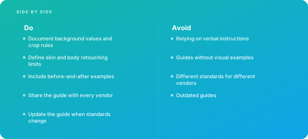
The most common failure is not a bad guide. It is several guides: the one the in-house team uses, an older PDF that the first vendor received two years ago, and a set of email instructions sent to the newest freelancer. Different standards for different vendors guarantee different results.
One source of truth
Keep a single master guide in one location, with a version number and date on every page. Vendors receive access to that location rather than a copy, or, if they must have a copy, they receive every new version with a summary of changes. Verbal instructions given on calls should be written into the guide or into a dated addendum; if an instruction exists only in someone's memory, it will not survive a change of retoucher.
Ownership and change control
- Name an owner, usually a senior retoucher, photo producer or creative operations lead, who approves every change.
- Keep a change log listing what changed, why and from which date it applies, so that batches in flight are judged against the version they were briefed on.
- Review on a schedule, for example at every new season or product launch, and whenever a marketplace or platform changes its requirements.
- Retire superseded references so that nobody matches an old look.
Tip: When a rejected image reveals an ambiguity in the guide, fix the guide, not just the image. A recurring rejection is almost always a missing or unclear rule, and each fix permanently removes one source of feedback rounds.
Onboarding a new vendor
Treat the first batch from any new vendor as a calibration exercise. Send the guide, the template files and the references, then commission a small test set that covers your hardest product types. Review it line by line against the guide and return written feedback tied to specific rules. Only then scale up. If you are selecting vendors, our breakdown of choosing a retouching partner covers what to test for beyond the guide itself.
Item 9: Build a Review Process That Checks Against the Guide
A guide only produces consistency if images are reviewed against it. Without review, standards erode image by image, and nobody notices until the grid looks wrong.
Tiered review
Separate objective checks from judgment checks. Objective checks, such as background values, dimensions, profiles, file names and margins, can be automated or done quickly by a production assistant. Judgment checks, such as skin treatment, color match against a sample and garment shape, need a trained reviewer. Running objective checks first means your expensive reviewer only sees files that already meet the mechanical standard.
Rejection coding
Give every rule in the guide a short code, such as BG-01 for background value or SK-03 for removing a permanent mark. Reviewers tag rejections with the code. Over a few batches, the codes show you which rules vendors misunderstand, which vendors struggle with which rules and where the guide needs clearer wording or a better example. This turns review from a stream of opinions into data you can act on.
Sampling
For high-volume work, reviewing every image in full may not be practical. A common approach is to check every image with automated tests, review a fixed sample of each batch in detail (for example, one image in ten), and escalate to full review of a batch if the sample fails. The sample size should rise for new vendors and fall as a vendor proves consistent.
| Guide element | Weak version | Strong version | Checkable automatically? |
|---|---|---|---|
| Background | "Clean white" | RGB 255, 255, 255, zero tolerance, sampled at edges | Yes |
| Crop | "Centered, not too tight" | 2000 px square, 8 percent side margins, fixed baseline | Mostly |
| Shadow | "Soft natural shadow" | Layered recipe with opacity and feather, sample file | Partly |
| Color | "True to product" | Reference target per setup, stated tolerance against samples | Partly |
| Skin | "Natural, polished" | Remove, soften and never-alter lists with examples | No, trained review |
| References | A mood board | Before-and-after pairs per product type, plus "too far" examples | Not applicable |
Worked Example: Retouching Style Guides for Brands With Three Vendors
The following scenario is illustrative, not a client story. It shows how the checklist plays out in practice for a mid-sized apparel and accessories brand.
The brand produces roughly 600 new SKUs per season, each with four views, so about 2,400 product images, plus around 300 on-model images. Work is split between an in-house retoucher and two outside vendors. Before writing a guide, the team tracks a single season and finds that images average about 2.5 review rounds before approval, and that most rejections fall into four areas: background not pure white, inconsistent crop height on shoes, creases left on flat-lays, and skin smoothing that varies between models.
The team builds a guide following the checklist above. Backgrounds are specified as RGB 255 with zero tolerance for marketplace files and a separate light-gray variant for the brand's own site. Crop templates are created for five size classes, each with a fixed baseline. Flat-lays must be crease-free while on-model garments keep natural drape. Skin rules are written as remove, soften and never-alter lists, with before-and-after pairs from two models with different skin tones. Every rule receives a code.
Now the arithmetic. Suppose each round of review and revision costs, on average, 3 minutes of reviewer time and 6 minutes of retoucher time per affected image. At 2.5 rounds, each image carries 1.5 revision rounds beyond the first delivery, so 2,700 images generate about 4,050 revision cycles, or about 608 hours of combined effort per season. If the guide brings the average down to 1.5 rounds, meaning half a revision round per image, that falls to about 1,350 revision cycles and roughly 203 hours. The difference, about 400 hours, is the budget that pays for writing and maintaining the guide, which in a scenario like this might take a senior person two to three weeks initially and a few days each season thereafter.
These numbers are assumptions chosen to illustrate the method; your own figures will come from tracking rounds and time for one season. The method is the point: measure rounds per image and rejection reasons before the guide, then again after, and you have a clear case for the time spent. Planning the revised workload also feeds directly into planning retouching capacity for the following season.
A recurring rejection is almost always a missing or unclear rule. Fix the guide, and that feedback round disappears for every vendor at once.
When to Bring in Help With a Brand Retouching Standard
A single in-house retoucher working to one art director can often get by on shared memory and a short document. The need for a formal guide, and often for outside help writing and enforcing it, rises sharply when several vendors retouch for one brand. That is when verbal instructions, missing examples and inconsistent standards start to compound.
Signs that it is time to bring in experienced help include: images regularly needing more than two review rounds; visible drift between batches from different vendors; a new channel, such as a marketplace or a print catalog, with requirements your current guide does not cover; or a brand refresh that changes the look of every image. An experienced production partner can audit your existing images, reverse-engineer the implicit standard from your best work, draft the guide and templates, and run the first calibration rounds with each vendor. If you are weighing that route, our practical guide to outsourcing retouching covers how to structure the engagement, and our photo retouching service works to client guides as a matter of course, or helps write one where none exists.
Whichever route you take, the guide itself remains your asset. Keep ownership of the master document, the templates and the reference library in-house, even if a partner helps write them, so that the standard stays with the brand when vendors change.
Verdict A retouching style guide earns its keep when it replaces adjectives with numbers and examples: background values with a measuring method, crop templates per product type, a shadow recipe, a color tolerance, explicit skin limits and before-and-after references for every judgment call. Share one version with every vendor, log every change, review against coded rules, and update it whenever standards shift. Done properly, it is the cheapest way to make many hands produce one brand.
Where this comes from
- Google Merchant Center Help — Image link [image_link]
- Adobe Help Center — Photoshop User Guide
The figures and practices above come from the sources listed.
Working on something like this?
We take on Image Editing & Retouching work for teams who want it done once, properly. Tell us what you are building and we will tell you honestly whether we are the right studio for it. Start a project.
Where to go next
Spotted something wrong? Report an error on this page. We correct on the page and say what changed.